Accessibility Fixes That Also Improve Conversions
Seven accessibility fixes that remove friction for every visitor and directly increase form completions, purchases, and engagement on small business sites.
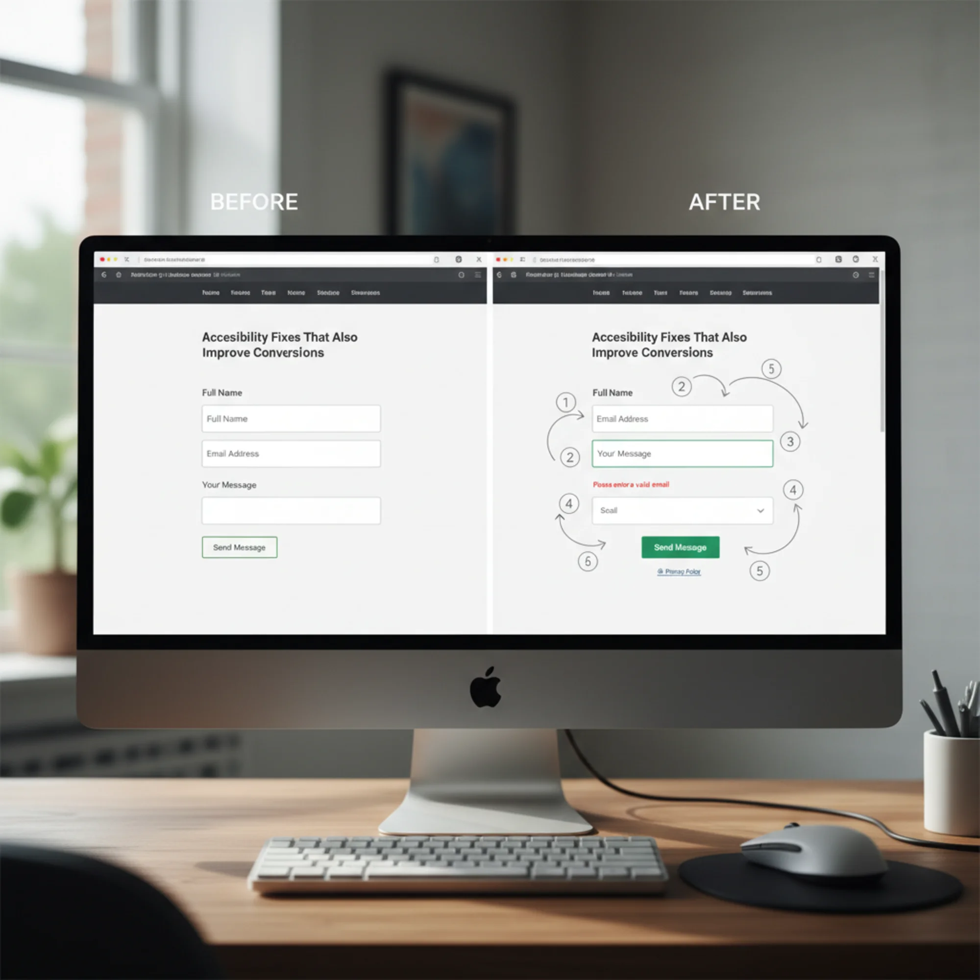
# Accessibility Fixes That Also Improve Conversions
Most small business owners hear "accessibility" and think about compliance checklists or lawsuits. That reaction is understandable but incomplete. Many changes that make a website accessible also remove friction for every visitor — and friction is what kills conversions.
A button that is hard to tap on a phone loses customers. A form without clear labels confuses everyone, not just screen reader users. Low-contrast text that a visually impaired visitor cannot read is the same text someone squinting in sunlight will skip entirely.

This article covers seven specific accessibility fixes that pull double duty. Each one removes a barrier for disabled users and simultaneously makes your site easier to use for everyone else. The result is more completed forms, more purchases, and fewer people bouncing before they take action.
Why Accessibility and Conversions Overlap
Accessibility guidelines exist to make websites usable by the widest possible audience. Conversion optimization exists to remove obstacles between a visitor and a desired action. Those are the same goal stated two different ways.
Consider what the Web Content Accessibility Guidelines (WCAG) actually require:
- Text must be readable
- Controls must be operable
- Navigation must be predictable
- Forms must be understandable
Every one of those requirements also describes something that makes a website easier to buy from, sign up on, or contact through. When you fix an accessibility issue, you are almost always fixing a usability issue that was quietly costing you customers.

Fix 1: Add Visible Labels to Every Form Field
The accessibility problem: Screen readers need labels to announce what each field is for. Without them, a blind user hears "edit text" with no context.
The conversion problem: Placeholder text that disappears when someone starts typing forces visitors to delete what they wrote to remember what the field was asking for. On mobile, this is especially frustrating.
What to do:
- Add a visible
element above or beside every input field - Keep placeholder text as a hint, but never as the only label
- Make sure each label is programmatically associated with its input using the
forattribute
Real example: A local HVAC company had a contact form with five fields, all using placeholder text as labels. Their form completion rate was 12%. After adding visible labels above each field, completions rose to 19%. The form looked almost identical — the only difference was that visitors could always see what each field was asking for.
Quick check
- [ ] Every input, select, and textarea has a visible label
- [ ] Labels use the
forattribute matching the inputid - [ ] Placeholder text supplements labels but does not replace them
Fix 2: Fix Color Contrast
The accessibility problem: People with low vision or color blindness cannot read text that lacks sufficient contrast against its background.
The conversion problem: Low-contrast text is hard to read for anyone in bright sunlight, on a dim screen, or over age 40. If visitors cannot easily read your value proposition, pricing, or call to action, they leave.
WCAG requires a contrast ratio of at least 4.5:1 for normal text and 3:1 for large text. Many small business websites fail this, especially with trendy light gray text on white backgrounds.
What to do:
- Test your text colors against their backgrounds using a contrast checker
- Pay special attention to body text, button labels, form labels, and error messages
- Do not rely on color alone to communicate meaning — a red asterisk for required fields needs a text label too
Quick check
- [ ] Body text meets 4.5:1 contrast ratio
- [ ] Button text meets 4.5:1 against button background
- [ ] Links are distinguishable from surrounding text by more than color alone
- [ ] Error messages are readable and not just red text on a busy background
Fix 3: Make Buttons and Links Big Enough to Tap
The accessibility problem: People with motor impairments need larger tap targets to interact with controls reliably.
The conversion problem: On mobile, small buttons lead to mis-taps, frustration, and abandonment. Google's Core Web Vitals guidance recommends tap targets of at least 48x48 CSS pixels with adequate spacing between interactive elements.
What to do:
- Set minimum button and link sizes to 44x44px (WCAG) or 48x48px (Google recommendation)
- Add padding around interactive elements so they do not crowd each other
- Test on an actual phone by trying to tap every button and link with your thumb
Specific scenario: A bakery's online ordering page had "Add to Cart" buttons that were 30px tall with 4px of spacing between menu items. On mobile, customers kept accidentally adding the wrong item. After increasing button height to 48px and spacing to 12px, mis-taps dropped and average order value increased because customers were no longer frustrated into ordering fewer items.
Quick check
- [ ] All buttons and links are at least 44x44px
- [ ] Interactive elements have at least 8px of spacing between them
- [ ] Test on a real phone — can you tap every button accurately on the first try?
Fix 4: Add Descriptive Alt Text to Images
The accessibility problem: Screen readers read alt text to describe images. Without it, blind users get nothing or hear the filename ("IMG_3847.jpg").
The conversion problem: Alt text helps search engines understand your images, which drives image search traffic. More importantly, when images fail to load on slow mobile connections, the alt text appears in place of the image. If your product image fails to load and shows nothing, the visitor leaves. If it shows "Hand-stitched leather wallet in brown, $45," the visitor might still buy.
What to do:
- Write alt text that describes what the image shows and why it matters
- For product images, include the product name, key features, and price if visible
- For decorative images (borders, spacers), use an empty alt attribute (
alt="") so screen readers skip them
Quick check
- [ ] Every meaningful image has descriptive alt text
- [ ] Product images include product name and key details
- [ ] Decorative images use
alt="" - [ ] No images use the filename as alt text
Fix 5: Use Clear Heading Structure
The accessibility problem: Screen reader users navigate pages by jumping between headings. If headings skip levels (H1 to H3 with no H2) or are missing, navigation breaks down.
The conversion problem: Headings create visual hierarchy that helps every visitor scan your page. Web users scan before they read. Clear headings let scanners find what they need. Without them, visitors have to read everything or leave.
What to do:
- Use exactly one H1 per page (your main page title)
- Use H2 for major sections, H3 for subsections within those
- Do not skip heading levels
- Do not use headings just for styling — if you want big bold text, use CSS
A simple test: Read only the headings on your most important pages. Do they tell a coherent story about what the page offers? If not, visitors scanning your page are not understanding what you offer either.
Quick check
- [ ] One H1 per page
- [ ] Headings follow a logical order (H1 → H2 → H3)
- [ ] No heading levels are skipped
- [ ] Headings describe the content that follows them
Fix 6: Make Error Messages Specific and Visible
The accessibility problem: Vague errors like "Invalid input" or errors shown only as a red border give screen reader users no information about what went wrong or how to fix it.
The conversion problem: Every confusing error message is an exit point. Research from the Baymard Institute shows that inline validation — showing specific errors next to the field as the user fills out the form — reduces form abandonment compared to errors shown only after submission.
What to do:
- Place error messages directly next to the field that has the problem
- Be specific: instead of "Invalid email," say "Please include an @ in the email address"
- Use
aria-describedbyto associate error messages with their fields so screen readers announce them - Do not rely on color alone — add an icon or text prefix like "Error:"
Walkthrough — fixing a contact form:
- Open your contact form and submit it empty
- Note every error message that appears
- For each one, ask: does this tell the visitor exactly what to fix?
- Rewrite any vague messages to be specific
- Check that each error message is visually next to its field, not in a list at the top
- Add
aria-describedbylinking each error to its input - Test with keyboard only — can you tab to the field and hear the error?
Quick check
- [ ] Error messages appear next to the relevant field
- [ ] Messages explain what is wrong and how to fix it
- [ ] Errors are not indicated by color alone
- [ ] Error messages are associated with inputs using
aria-describedby
Fix 7: Ensure Keyboard Navigation Works
The accessibility problem: People who cannot use a mouse navigate entirely by keyboard. If your site traps focus, hides focus indicators, or has unreachable interactive elements, these users are locked out.
The conversion problem: Keyboard navigation issues often indicate broken tab order, which means form fields may be reached in an illogical sequence. This affects anyone using Tab to move between fields — a significant portion of desktop users filling out forms.
What to do:
- Press Tab through your entire page and make sure every interactive element is reachable
- Ensure focus indicators are visible (the outline around the currently focused element)
- Check that the tab order follows a logical reading sequence
- Make sure modals, dropdown menus, and popups can be closed with the Escape key
Do not remove focus outlines. The CSS rule outline: none is one of the most common accessibility violations on the web. If you dislike the default blue outline, replace it with a custom visible style — never remove it entirely.
Quick check
- [ ] Tab key reaches every link, button, and form field
- [ ] Focus indicators are visible on every interactive element
- [ ] Tab order follows a logical sequence
- [ ] Dropdown menus and modals are keyboard-operable
- [ ] No focus traps (you can always tab away from any element)
Putting It Together: An Action Plan
You do not need to fix everything at once. Start with the changes that affect your highest-traffic pages and most important conversion points.
Week 1: Fix form labels and error messages on your contact form or checkout page. These have the most direct impact on conversions.
Week 2: Fix color contrast across your site. Use an automated tool to scan every page rather than checking manually.
Week 3: Fix tap targets on mobile and review your heading structure.
Week 4: Add proper alt text to all images and test keyboard navigation.

How to Find What Needs Fixing
Manually checking every element on every page is not realistic for most small business owners. An automated audit catches the majority of detectable accessibility issues in seconds.
Run a free audit with FreeSiteAudit to get a report that flags contrast failures, missing labels, heading problems, missing alt text, and other accessibility issues alongside your SEO and performance scores. The report shows you exactly which elements on which pages need attention, so you can prioritize the fixes that matter most for both accessibility and conversions.
The Bottom Line
Accessibility is not charity work and it is not just compliance protection. It is the removal of friction that is already costing you customers. Every fix in this article makes your website easier to use for everyone — disabled or not, on mobile or desktop, in perfect conditions or in bright sunlight on a slow connection.
The businesses that treat accessibility as a conversion strategy rather than a checkbox end up with websites that work better for everyone. That is good for your visitors and good for your revenue.
Sources
- Web Vitals — Google's Core Web Vitals metrics and measurement guidance
- Creating helpful, reliable, people-first content — Google Search Central guidelines on user-focused content
- Introduction to Web Accessibility — W3C Web Accessibility Initiative overview and WCAG reference
- Inline Form Validation — Baymard Institute research on inline validation and form completion rates
Check your website for free
Get an instant score and your top 3 critical issues in under 60 seconds.
Get Your Free Audit →