ADA Compliance Audit for Websites: A Practical Guide for Small Businesses
A plain-English guide to auditing your small business website for ADA and WCAG 2.1 AA compliance with concrete checks, real examples, and prioritized fixes.
# ADA Compliance Audit for Websites: A Practical Guide for Small Businesses
If you run a small business website, you've probably heard the phrase "ADA compliance" and felt your stomach drop. Maybe a friend got a demand letter. Maybe your insurance broker mentioned it during renewal. The topic feels legal, technical, and expensive all at once.
This guide cuts through the noise. It explains what website accessibility actually means, shows you how to audit your own site in about an hour, and gives you a prioritized fix list that lowers both legal risk and real user friction.
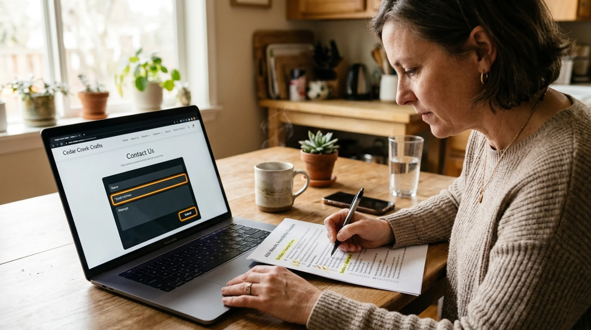
What ADA Compliance Actually Means for a Website
The Americans with Disabilities Act doesn't include a chapter for websites. There is no official "ADA website checklist" issued by the federal government. What courts and the Department of Justice have done is point to the Web Content Accessibility Guidelines (WCAG) as the practical standard. Most settlements and demand letters reference WCAG 2.1 Level AA.
So when someone says "make your site ADA compliant," they really mean: align your site with WCAG 2.1 Level AA. That's 50 specific success criteria covering color contrast, keyboard navigation, alt text, form labels, and more.
You don't need to memorize all 50. You need to understand the handful that account for almost every complaint, and audit your site for those first.
Who Actually Gets Demand Letters
Small businesses receive these more often than people realize. The pattern is consistent:
- A user with a disability (or, more commonly, a law firm running automated scans) visits your site.
- A tool flags accessibility violations.
- A demand letter arrives asking for $5,000 to $20,000 to settle.
Restaurants, retailers, fitness studios, dentists, and law firms are common targets. The plaintiffs typically focus on five or six WCAG failures that are easy to detect with software. That's good news for you: those same failures are easy to find and fix yourself.
The Six Issues That Cause Most Complaints
Before anything else, check these. They drive the vast majority of accessibility lawsuits.
1. Missing or unhelpful alt text on images
Every image that conveys meaning needs a text alternative. Decorative images should have an empty alt="" attribute. The common failure is leaving alt off entirely or stuffing it with keywords like "best plumber atlanta cheap fast."
Quick check: Right-click any image on your homepage, choose Inspect, and look for the alt attribute. If it's missing on your logo, product photos, or team headshots, that's a violation.
2. Low color contrast
Light gray text on white looks elegant. It also fails WCAG. Normal-size body text needs a contrast ratio of at least 4.5:1 against its background. Large text needs 3:1.
Quick check: Use any browser-based contrast checker on your headings, body text, and button labels. Pale buttons with white text are a frequent offender.
3. Forms without labels
Contact forms, newsletter signups, and checkout fields need proper elements connected to inputs. Placeholder text that disappears when you start typing is not a label.
Quick check: Click into a form field. Does the field name still show on screen? If the placeholder vanished and there's no visible label, screen readers can't announce what the field is for.
4. Keyboard navigation that breaks
A user who can't use a mouse should be able to reach every link, button, and form field using the Tab key. They should also see a visible focus indicator showing where they are on the page.
Quick check: Click your URL bar, then press Tab repeatedly. Can you reach every interactive element? Can you see a clear outline around the focused element? Custom-styled buttons often remove the default focus ring and never replace it.
5. Heading structure that's a mess
Headings should describe the structure of your content: one per page, then for major sections, for subsections. Skipping levels or using headings purely for visual styling confuses screen readers.
Quick check: Use a browser extension that outlines headings. If your homepage has zero tags, or jumps from to , fix it.
6. Videos without captions
Any video with spoken content needs captions. Auto-generated YouTube captions are a starting point but must be reviewed for accuracy, especially product names and proper nouns.
How to Audit Your Site in About an Hour
Here's a practical sequence that works for a small business site with under 50 pages. You don't need to be technical.

Step 1: Run an automated scan
Automated tools catch roughly 30 to 40 percent of accessibility issues. That's not enough on its own, but it's a fast way to surface low-hanging fruit. Scan your homepage, your main service or product page, your contact page, and your checkout if you have one.
You can use our free website audit to get a baseline report that includes accessibility checks alongside SEO and performance, faster than running separate tools for each.
Step 2: Walk through your top three pages with the keyboard only
Open a new browser window. Don't touch your mouse. Try to:
- Navigate to your contact page
- Fill out and submit your contact form
- Open your main navigation menu
- Click your primary call-to-action
If you get stuck, real users with motor disabilities or who rely on screen readers hit the same wall.
Step 3: Turn on a screen reader for five minutes
On Mac, press Command + F5 to start VoiceOver. On Windows, NVDA is free to download. Look away from the screen and try to understand what your homepage is offering. If the reader says "image, image, image, link, link, button" without meaningful labels, your users hear the same thing.
This feels uncomfortable the first time. Do it anyway. Ten minutes of screen reader testing teaches you more than a hundred pages of documentation.
Step 4: Check your forms
For each form on your site:
- Click into each field. Is there a visible label?
- Submit the form with errors. Are the errors announced clearly, or just shown as red borders?
- Are required fields indicated with text, not just an asterisk or color?
Step 5: Check your media
For every video and audio file:
- Does it have captions?
- If it's a podcast embed, is there a transcript on the page?
- Does it autoplay with sound? (It shouldn't.)
A Real Walkthrough: A Local Bakery Audits Its Site
Let's make this concrete. Maria runs a small bakery in Portland. Her site has a homepage, an order page, a menu page, a contact page, and a blog. Here's what an hour of auditing turned up.

Homepage: Hero image of a croissant had no alt text. The "Order Now" button was light pink text on white, contrast ratio 1.8:1. The headline was styled with a Order page: Quantity fields used placeholder-only labels. No visible focus ring on "Add to Cart." Error messages appeared as small red text below fields with no programmatic association. Menu page: Each menu item was a photo with the dish name embedded in the image. A screen reader user got nothing. Contact page: Phone number and address sat inside an image of a business card. The map embed had no text alternative. Blog: Heading hierarchy skipped from Maria spent two evenings fixing these. She added meaningful alt text, replaced the menu images with HTML text plus photos, darkened her button color to meet 4.5:1 contrast, replaced the address image with selectable text, and rebuilt her form with proper labels. Her site went from roughly 28 detected violations to three minor issues she cleaned up the following week. She also added a short accessibility statement explaining what standards she's working toward and how to report problems. That statement matters: it shows good faith and gives a real user a path that isn't a lawsuit. Not every issue carries the same weight. This order maps to both legal risk and actual user experience. Fix this week: Fix this month: Fix this quarter: You've seen the ads: a widget you paste into your site that promises automatic ADA compliance. They're cheap, they look impressive, and courts have explicitly stated they do not make a site compliant. Several lawsuits have specifically targeted sites that rely on overlays. Overlays can be useful as a complement, never as a substitute. If your underlying HTML is broken, an overlay layered on top doesn't fix it. It also can't write meaningful alt text or proper form labels. The work has to happen in your actual site. Whether or not you ever get a demand letter, write down what you audit and when. A simple log helps you: Re-audit at least quarterly, and after any major design change or template update. Most issues sneak back in during redesigns, when a new font goes light gray or a developer styles a button without a focus state. A well-audited site does more than reduce legal risk. It loads faster because it doesn't lean on JavaScript widgets to be navigable. Clean semantic HTML is also what search engines parse most reliably, which is the foundation of Google's guidance on helpful, people-first content and on article structured data. It performs better on the user-experience signals tracked by Core Web Vitals. And it converts better because customers with mild visual or motor impairments (which describes a huge chunk of the population over 50) actually finish what they came to do. You don't need to be perfect on day one. You need to be measurably better than you were last month, and you need a record showing you're working on it. If you want a starting point that takes about two minutes, run our free website audit. It checks color contrast, alt text coverage, heading structure, form labels, and a dozen other accessibility signals alongside SEO and performance. You'll get a prioritized list of issues with plain-English explanations and links to the fixes that matter most for small business sites. Then come back to this guide, work through the prioritized list, and re-audit in 30 days. That's the rhythm that works. Get an instant score and your top 3 critical issues in under 60 seconds.. to . Featured images had filenames as alt text ("IMG_2438.jpg").Prioritize Your Fixes by Impact
What an "Accessibility Overlay" Won't Do
Document What You're Doing
The Outcome When You Do This Right

Get a Free Accessibility Snapshot
Sources
Check your website for free