CLS Fixes That Won't Break Your Site's Layout
Plain-English guide to fixing Cumulative Layout Shift (CLS) without breaking your site, with checklists and a real walkthrough for small business owners.
# CLS Fixes That Won't Break Your Site's Layout
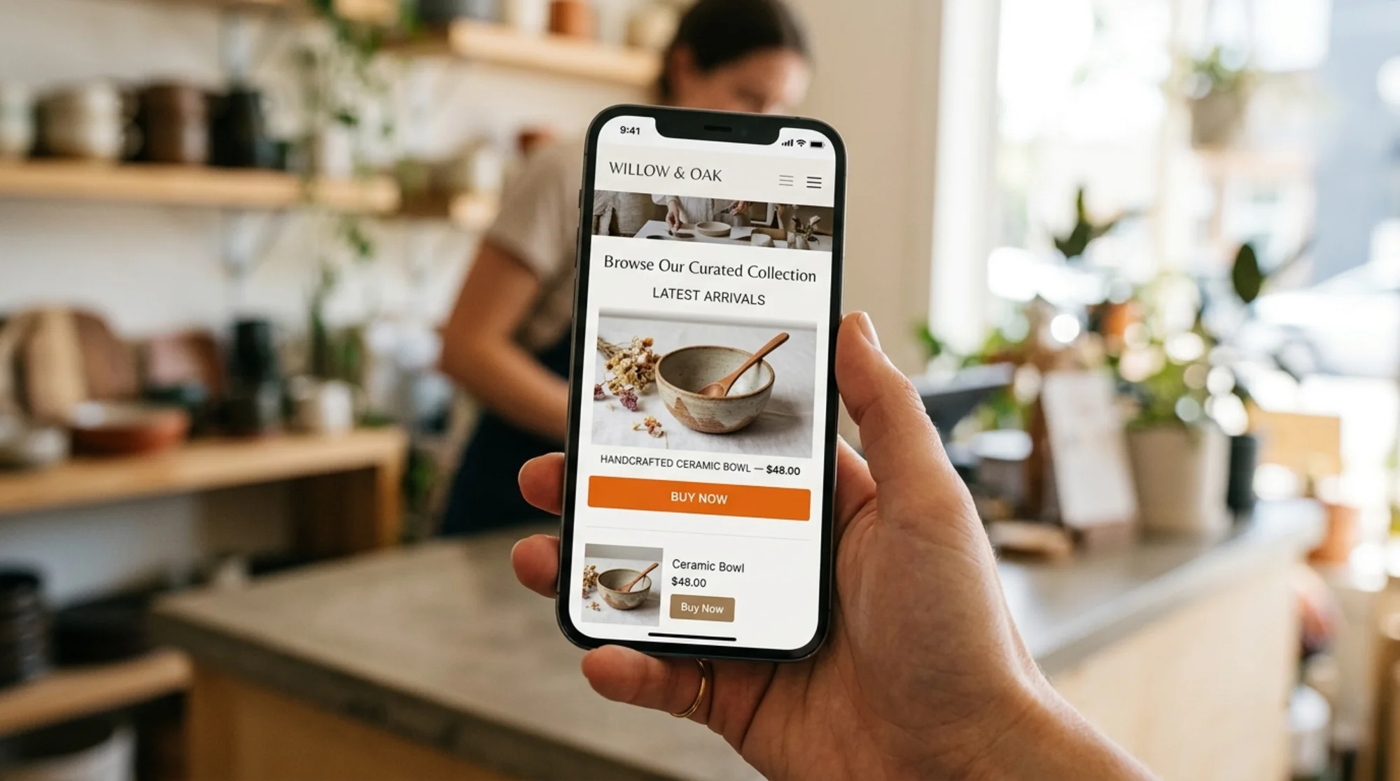
You've probably seen it on your own phone. You're reading a recipe, your thumb is heading toward "Jump to Recipe," and right before you tap, an ad loads, the page jumps down, and you hit something else. That jumpiness has a name: Cumulative Layout Shift, or CLS. Google measures it. Visitors hate it. And it quietly costs you sales.
The good news: most CLS problems on small business websites come from a handful of common mistakes, and almost all of them can be fixed without redesigning anything. The bad news: the wrong fix can leave you with weird gaps, broken images, or a site that looks fine on a laptop and falls apart on phones.
This guide covers what CLS is, why it matters for your business, the fixes that work, and how to apply them without breaking what already works.
What CLS actually measures
CLS is one of Google's Core Web Vitals. It measures how much visible content moves around unexpectedly while a page loads. Every shift is scored by how big the element is and how far it moved. Those scores add up.
The thresholds:
- 0.1 or lower — good
- 0.1 to 0.25 — needs improvement
- Above 0.25 — poor
These aren't vanity numbers. They affect how your site ranks in search, especially on mobile, and they correlate with real human frustration. A visitor who taps the wrong button because the page jumped is a visitor who's about to leave.
The important word in the definition is unexpected. If a user clicks a button and a menu expands, that's expected motion and it doesn't count. If an image loads late and shoves your headline down the page, Google counts every pixel.
Why small business sites get hit harder
Big sites have performance teams. You probably have a theme, a few plugins, and maybe a freelancer who set it up. That's where most CLS problems start:
- Ad scripts that inject banners after the page draws
- Themes that load custom fonts without reserving space for them
- Product images uploaded without width and height set
- Pop-ups, cookie banners, and review widgets that push everything down
- Embedded videos and maps that snap into place after a delay
None of these are exotic. They're the default behavior of most templates and tools you've already paid for, which is why a normal-looking small business site can score badly without anyone realizing.
The four root causes (and the fix for each)
Almost every CLS issue on a small business site traces back to one of four root causes. Fix these and you'll usually move from "poor" to "good" without touching the design.
1. Images and videos without dimensions
When the browser doesn't know how tall an image will be, it leaves a zero-pixel gap, draws the rest of the page, then bumps everything down when the image arrives.
The fix: add explicit width and height attributes (or a CSS aspect-ratio) to every image and video. Browsers use those numbers to reserve space before the image loads.
For non-developers:
- Recent WordPress versions add dimensions automatically. Older themes and custom HTML blocks often don't.
- Most Shopify native image components handle this. Custom Liquid sections and pasted HTML often don't.
- For embeds (YouTube, Vimeo, Loom), wrap them in a container with a fixed aspect ratio.
This is the single highest-impact fix. Start here.
2. Web fonts that swap in late
You upload a brand font. While it downloads, the browser shows a fallback. When your font arrives, the text changes shape and everything around it moves.
The fix: use font-display: optional or font-display: swap with a fallback font close in size. The CSS size-adjust, ascent-override, and descent-override properties let you tune the fallback so the swap is nearly invisible.
If editing CSS is out of scope, preload your main brand font and use only one or two weights. Every extra weight is another swap waiting to happen.
3. Ads, embeds, and third-party widgets
Cookie banners, chat bubbles, review carousels, email pop-ups, ad slots — anything that loads after the page does and takes up visible space. These tend to inject themselves at the top of the layout, where they cause maximum disruption.
The fix: reserve space. If your cookie banner is 80 pixels tall, give it a fixed 80-pixel container that exists before the script runs. If your ad slot is 300×250, define that box in CSS so the rest of the page doesn't move when the ad fills in.
For pop-ups: trigger them on user action (scroll depth, time, exit intent) rather than immediately. A pop-up that fires three seconds in while a visitor is reading is a guaranteed CLS hit.
4. Content injected by JavaScript
Personalization widgets, A/B testing tools, dynamic banners — anything that swaps in content after the page renders is suspect. A common pattern: an A/B test script hides the header, runs its logic, and shows a new version a moment later. That's a 100% reproducible layout shift.
The fix: run experiments at the server level when possible. If you must use client-side tools, configure them with anti-flicker snippets that hide the page until the test resolves, with a tight timeout so visitors aren't staring at a blank screen.

A real scenario: the small bakery site
Picture a bakery that sells custom cakes through a Shopify storefront. Their product page scores 0.42 on CLS — well into "poor" territory. Here's what's happening:
- Top of page (CLS contribution: 0.15) — The hero banner image is set as a CSS background with no reserved height. While it loads, the H1 and "Order Now" button sit at the top. When the banner finishes, everything below it jumps down 380 pixels.
- Product gallery (0.10) — Product images uploaded without dimensions load at slightly different speeds, shifting the description, price, and "Add to Cart" button twice before settling.
- Reviews widget (0.12) — A third-party reviews app injects a four-star carousel below the price about 1.2 seconds after everything else, pushing the FAQ section down by 220 pixels.
- Cookie banner (0.05) — A bottom-anchored cookie banner appears half a second after page load and pushes a sticky "Add to Cart" bar out of view temporarily.
The fixes, in order of impact:
- Add an explicit aspect ratio to the hero image container. The banner loads into a pre-sized box. CLS drops to ~0.27.
- Add
widthandheightto every product image. The gallery stops jumping. CLS drops to ~0.17. - Reserve a 180-pixel container for the reviews widget. It fills the box instead of expanding the layout. CLS drops to ~0.05.
- Reserve space for the cookie banner at the top of the body, or anchor it as an overlay that doesn't displace content. CLS drops to ~0.02.
Total implementation time: an afternoon. No redesign. No new theme.
A mini-checklist you can use
Work through this page by page, roughly in order of impact:
- [ ] Every
widthandheight(or a CSS aspect ratio on its container) - [ ] Every embedded video, map, or iframe is wrapped in a fixed-aspect-ratio container
- [ ] Hero banners and feature images have a reserved minimum height in CSS
- [ ] Custom fonts use
font-display: swaporoptional, with a tuned fallback - [ ] Cookie banners, announcement bars, and chat widgets either overlay content or have reserved space
- [ ] Ad slots have explicit dimensions defined before scripts run
- [ ] Pop-ups trigger on user action, not on page load
- [ ] Review widgets, social feeds, and third-party embeds have a minimum-height container
- [ ] A/B testing scripts use an anti-flicker snippet with a sensible timeout
- [ ] Any "Read more" or accordion buttons above the fold don't cause cumulative shift when tapped
How fixes break sites (and how to avoid that)
The most common way CLS fixes go wrong is overcorrection. People set fixed pixel heights everywhere, the site looks fine on a 15-inch laptop, then breaks on a phone where everything is cropped or has huge empty bands.
Three rules to keep things stable:
- Use aspect ratios, not fixed heights, for images. A
width: 100%; aspect-ratio: 16 / 9rule means the image scales with the screen, but the browser still reserves the right amount of space. Fixed pixel heights only work for elements that are genuinely fixed-size.
- Test mobile first. Open your site on your actual phone after every change. The viewport that matters for CLS scoring is the mobile one. Layout shifts invisible on desktop often dominate on mobile.
- Don't reserve more space than you need. A 600px reserved block for a 200px widget creates a big empty gap before the widget loads. That gap isn't a layout shift, but it looks broken. Measure the element's actual rendered height and reserve that.
There's also a "fix" that doesn't fix anything: lazy-loading everything aggressively. Lazy loading is great for images far below the fold, but if you lazy-load your hero image, you've made LCP (the speed at which the main content appears) worse and may have introduced new shifts. Lazy-load below the fold, never above.
Tools to measure what you actually have
You can't fix what you can't measure. Three free options:
- Google PageSpeed Insights — runs on a single URL, gives you a CLS score plus the contributing elements. Best starting point.
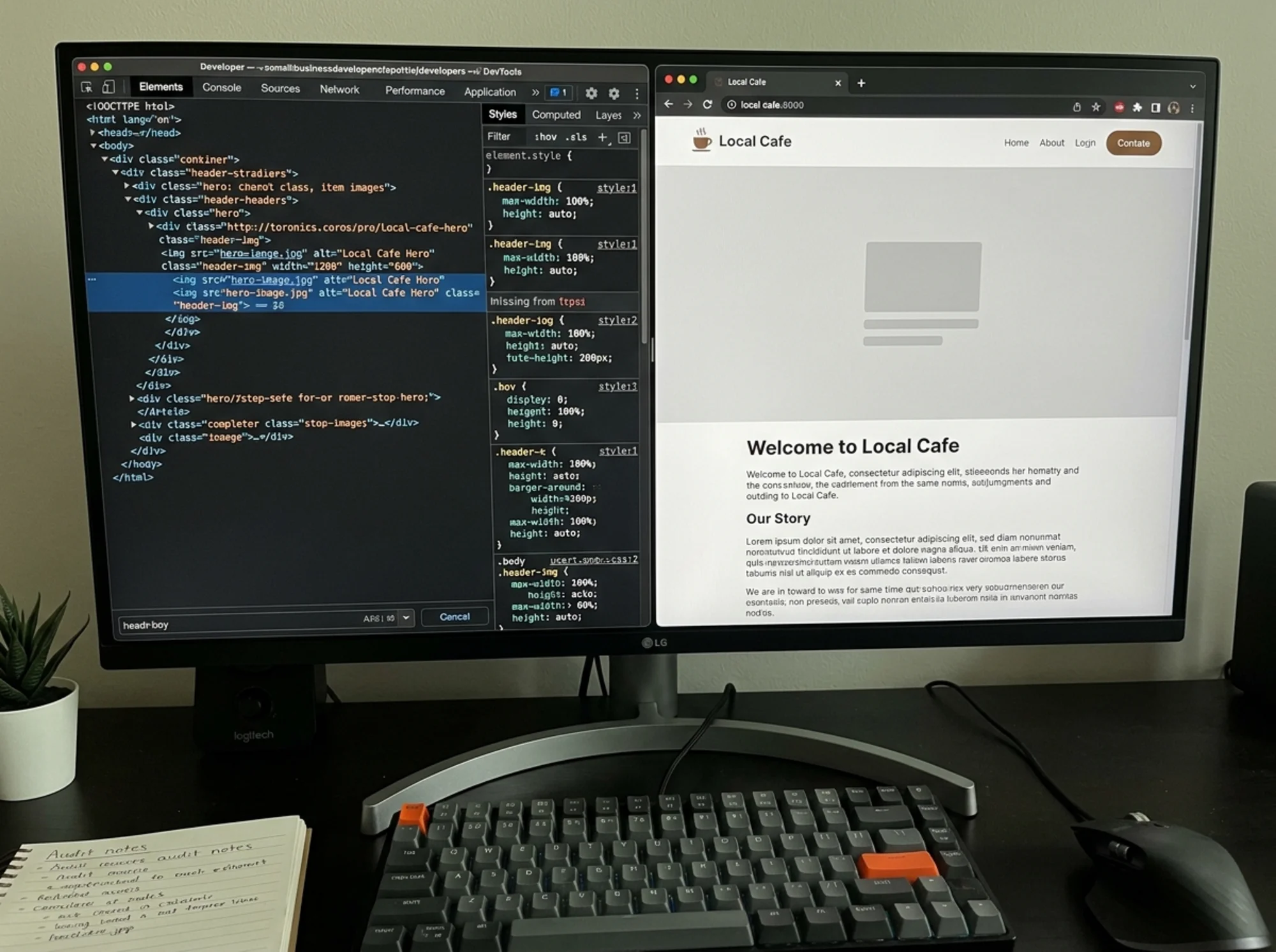
- Chrome DevTools Performance panel — record a page load and look for "Layout Shift" entries on the timeline. Shows you the exact element that moved.
- Search Console Core Web Vitals report — flags which pages across your whole site have CLS issues based on real visitor data, not lab tests.
If running these for every page sounds tedious, a free website audit will scan your pages, flag CLS-causing elements, and give you a prioritized list of fixes. Useful when you want to know which fix to do first instead of guessing.
What "good" actually looks like
After fixes, a healthy small business site should sit comfortably under 0.1 CLS on both desktop and mobile. Open your homepage on a throttled connection (Chrome DevTools Network tab lets you simulate slow 3G) and watch it draw. Nothing important should move once it's visible. Buttons should land where they belong. Text shouldn't reflow. Images should appear inside existing rectangles rather than push other elements aside.
If you run an ecommerce store, product pages deserve special attention — they're where the buying decision happens and they're often the worst offenders thanks to galleries, reviews, recommendations, and "you may also like" carousels. Our notes on ecommerce-specific layout issues cover this in more detail, and our full layout shift fix guide goes deeper into the underlying patterns.
Why this is worth your time
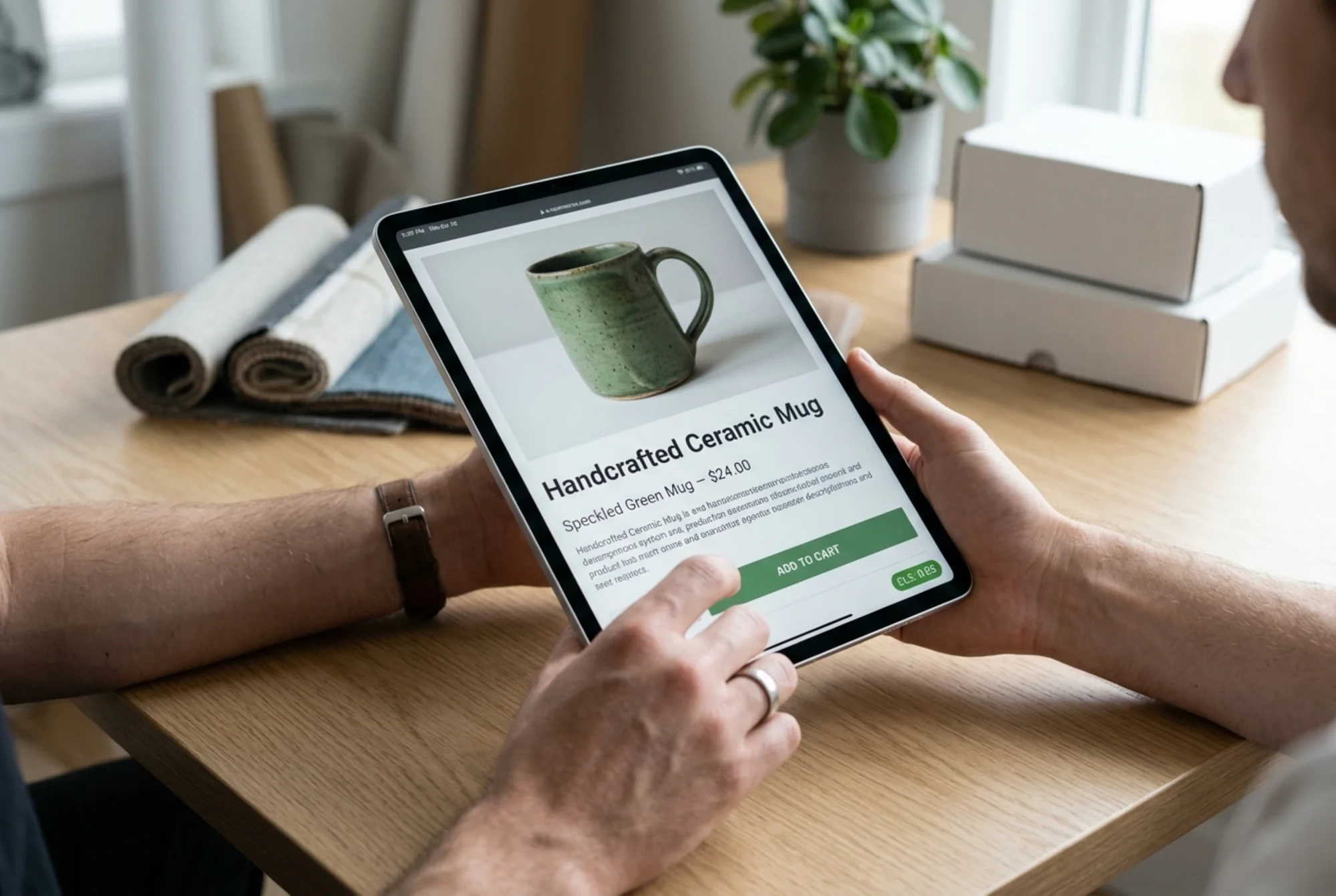
Core Web Vitals are part of how Google ranks pages, but the more immediate reason to fix CLS is conversion. Every misclicked button, every accidentally-dismissed banner, every "wait, where did that go?" moment is a tiny tax on your visitors' patience. Reduce the friction and more of them complete what they came to do — buy, book, sign up, contact you.
Google's own guidance on creating helpful, people-first content makes the same point a different way: user experience signals whether a site is genuinely trying to be useful. A site that physically resists being used falls on the wrong side of that line, no matter how good the content is.
Run a free CLS check
If reading this list and thinking "I have no idea which of these apply to my site" sounds familiar, you don't have to guess. Run a free website audit with FreeSiteAudit and you'll get a page-by-page breakdown of your CLS score, the specific elements causing each shift, and an ordered list of fixes ranked by impact. No signup gate, no credit card. For a deeper dive into specific shift patterns, see our CLS fix patterns page.
These fixes work on Shopify, WordPress, Squarespace, Webflow, and custom builds. None require a redesign. Most take less than a day. Once your site stops jumping around under your visitors' thumbs, you'll wonder how you tolerated the old version.
Sources
- Google: Core Web Vitals — https://web.dev/articles/vitals
- Google Search Central: Creating helpful, reliable, people-first content — https://developers.google.com/search/docs/fundamentals/creating-helpful-content
- Google Search Central: Article structured data — https://developers.google.com/search/docs/appearance/structured-data/article
Check your website for free
Get an instant score and your top 3 critical issues in under 60 seconds.
Get Your Free Audit →