Color Contrast Audit: The Accessibility Fix Most Sites Skip
A plain-English guide to auditing color contrast on your website, identifying the worst offenders, and fixing them in an hour without a full redesign.
# Color Contrast Audit: The Accessibility Fix Most Sites Skip
If your website has light gray text on a white background, faint placeholder text inside form fields, or pastel buttons that fade into the page, you have a color contrast problem. And you're not alone — color contrast is consistently the most common accessibility failure on the web, year after year.
The good news: it's also one of the easiest things to fix. You don't need a redesign. You don't need a developer for most of it. You usually just need to change a few hex codes.
This guide covers what color contrast actually is, why it matters for your bottom line (not just compliance), how to audit your own site in under 30 minutes, and exactly what to change.

What "color contrast" actually means
Color contrast is the difference in brightness between two colors that sit next to each other — typically text and its background. It's measured as a ratio. Pure black on pure white is 21:1, the highest possible. Light gray (#CCCCCC) on white is about 1.6:1, basically unreadable for anyone with even mild vision issues.
The Web Content Accessibility Guidelines (WCAG) set two thresholds most teams care about:
- 4.5:1 for normal body text (AA level — the standard most businesses aim for)
- 3:1 for large text (18pt+ or 14pt bold) and for "non-text" elements like button borders and form field outlines
AAA level requires 7:1 for body text, but most sites don't hit that and don't need to. AA is the practical target.
Why this matters beyond compliance
Plenty of articles will tell you that 1 in 12 men have some form of color vision deficiency, or that aging eyes need more contrast. All true. Here's what actually moves the needle for a small business:
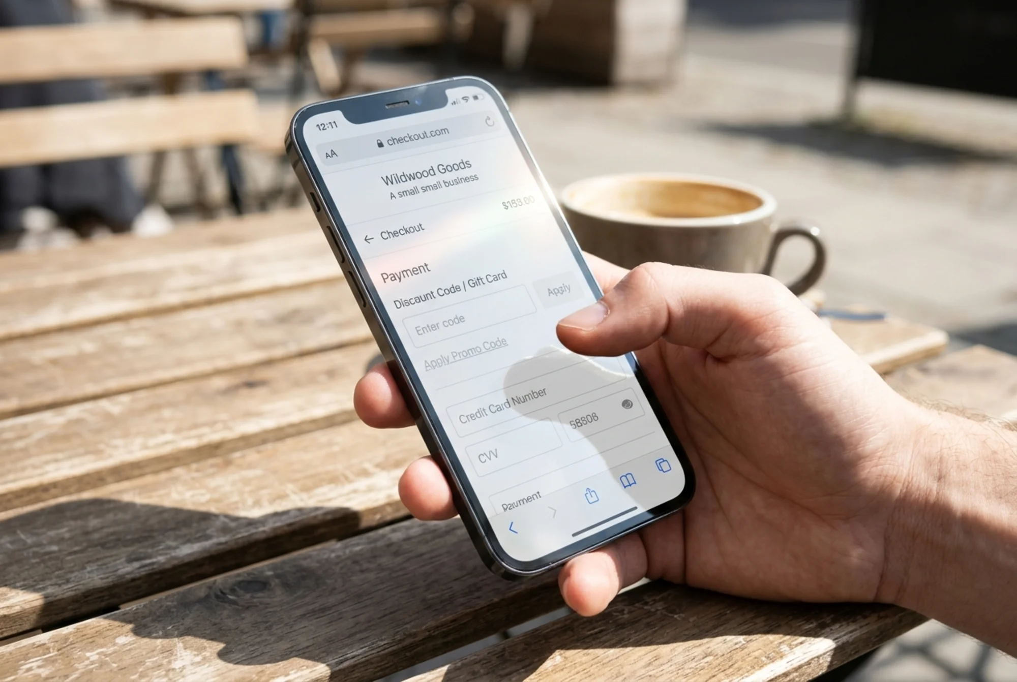
Reading on phones in sunlight is brutal. Your pale-gray subheadings look great in your office. On an iPhone screen at an outdoor cafe at noon, they vanish. If your customer is on the go, low contrast means they bounce.
Cheap monitors and budget phones flatten contrast further. The MacBook your designer uses has a calibrated, high-contrast display. Many customers are on five-year-old Android phones or office monitors that have never been calibrated.
Older customers spend more. People over 50 control more disposable income than any other age group, and their eyes need roughly twice as much light to perceive the same contrast as a 25-year-old. Faint text loses you the highest-value demographic.
Search engines indirectly reward readability. Google's helpful content guidelines emphasize content people can actually consume. While color contrast isn't a documented ranking factor, it feeds user signals like time on page, bounce rate, and Core Web Vitals interaction metrics — all of which influence rankings.
Legal risk is real. ADA-related web accessibility lawsuits have climbed for years, and color contrast is the single most-cited issue in demand letters because it's trivial to verify with automated tools. You don't want to be the small business that gets a settlement demand over a $0 fix.
The five places color contrast goes wrong
Before you audit, know where to look. These are the usual suspects:
1. Body text and subheadings
The most common mistake. Designers love #666 or #888 gray on white because it looks "softer." On white, #777 gives you a 4.48:1 ratio — failing AA. Move to #595959 or darker.
2. Buttons and CTAs
Pale brand colors as button backgrounds with white text on top. A trendy pastel teal #7FD4D4 with white text lands around 1.8:1 — fails everything. Either darken the button or switch the text to dark.
3. Form placeholder text
The "Enter your email" inside the input field is almost always rendered light gray by default. Most browsers use around #A9A9A9, which fails AA on white. People assume the field is broken or empty.
4. Link text inside paragraphs
Light blues, especially branded ones, often fail when sitting in body text. Standard #0066CC on white works (5.4:1). Mint or sky-blue brand colors usually don't.
5. Footer text
Copyright lines, secondary nav, social handles — often rendered in light gray on a slightly off-white or dark background that fails badly.
How to audit your own site in 30 minutes
You don't need to hire anyone for the first pass. Here's the workflow:
Step 1: Run an automated scan (5 minutes)
Use a free site audit tool that flags color contrast failures across every page. You'll get a list of specific elements with their current ratios. This catches the bulk of issues fast. Run a free website audit with FreeSiteAudit and look for the "Low contrast text" findings in the accessibility section.
Step 2: Manual spot-check on real devices (15 minutes)
Automated tools miss things — text over images, text with gradients, hover states. Pull out your phone, take it outside, and load these pages:
- Homepage above the fold
- Your top product or service page
- Checkout or contact form
- Pricing page
- Footer on any page
Anything you have to squint at, write down.
Step 3: Test the failing combos in a contrast checker (10 minutes)
For each failure, plug the foreground and background hex codes into a free contrast checker (WebAIM's is the most-used). It'll tell you the exact ratio and what level it passes.
Keep a simple spreadsheet:
| Element | Current colors | Ratio | Target | Suggested fix |
|---|---|---|---|---|
| Body text | #888 on #FFF | 3.5:1 | 4.5:1 | Change text to #595959 |
| Primary button | #FFF on #7FD4D4 | 1.8:1 | 4.5:1 | Darken button to #1A8585 |
| Placeholder text | #A9A9A9 on #FFF | 2.7:1 | 4.5:1 | Change to #595959 |
That spreadsheet is your fix list. Send it to your developer or do it yourself in your CMS.
A walkthrough: auditing a coffee shop site
Let's make this concrete. Imagine a small coffee shop called Roastline. Their site has:
- A hero image with white text overlaid ("Small-batch coffee, roasted in Brooklyn")
- A menu page with prices in
#999gray - A "Reserve a table" button in pastel orange
#FFA07Awith white text - A newsletter signup with default placeholder text
- A footer with light gray social icons on a cream background
Hero text on image: Over the dark coffee-bean areas, contrast is fine (15:1+). Over the lighter cream-colored beans on the right side, it drops to 2:1. Fix: add a semi-transparent dark overlay across the entire image, or move the text to the consistently dark left side.
Menu prices (#999 on white): Ratio is 2.85:1. Fails AA badly. Fix: change to #595959 (7:1) — still reads as gray, just darker. No design impact.
Pastel orange button: White on #FFA07A is 2.1:1. Fails. Two options: deepen the orange to #C0392B for 4.6:1 with white, or keep the pastel and use dark text — #1A1A1A on #FFA07A gives 8.9:1. The second option keeps the brand softer.
Placeholder text: Default browser placeholder is too light. Fix: add CSS to set placeholder color to #595959.
Footer social icons: Light gray icons on cream fail at about 2:1. Fix: darken to #404040. Still subtle, but now visible.
Total time to fix all five: under an hour for a developer. Redesign cost: zero. Impact on conversion: meaningfully positive for older users and mobile users in bright conditions.

The "but it'll ruin our brand" objection
Designers and brand-conscious owners often resist these changes. "Our brand is soft and minimal. Dark text feels harsh."
Two responses:
One: You can keep your brand colors. The fix is almost always to adjust one side of the equation, not both. If your pastel teal is a signature color, use it as a background with dark text on top instead of as text on white. Or use it for non-essential decorative elements where the 3:1 rule applies.
Two: "Soft and minimal" is not the same as "unreadable." Apple's website — about as design-conscious as it gets — uses near-black text on white throughout body content. Stripe, Linear, Notion: their actual body text is high contrast. The "soft" feel comes from generous whitespace, restrained typography, and limited color palettes, not from washing out the text.
Quick fixes for common platforms
Shopify: Theme editor → Colors → adjust "Body text" and "Secondary text" values. Most modern themes expose these settings. For buttons, look under "Buttons" or edit the theme's CSS via theme.liquid.
Squarespace: Site Styles → Colors → adjust the text and accent palette. Use preview mode to see how each section is affected.
WordPress (block themes): Appearance → Editor → Styles → Colors. For classic themes, edit style.css directly or use a CSS plugin.
Wix: Site Design → Theme → Text → adjust the text color presets. Buttons are styled separately under each button's design panel.
Webflow: Style panel for each element. Set up swatches in your color palette so changes propagate everywhere.
A mini-checklist before you ship a contrast fix
Before you call it done, verify:
- [ ] Body text is at least 4.5:1 against its background
- [ ] All buttons (including hover/active states) are at least 4.5:1
- [ ] Form placeholders are at least 4.5:1
- [ ] Form field borders are at least 3:1 against the page background
- [ ] Link text inside paragraphs is distinguishable from body text (color + underline is safest)
- [ ] Text over images has a guaranteed-contrast overlay or text shadow
- [ ] Disabled states are visibly disabled but still pass if they convey meaning
- [ ] You've checked the site in bright daylight on a phone
- [ ] You've checked the site in dark mode if your platform offers it
Run the automated audit a second time to confirm the failures cleared.

What about decorative text and logos?
WCAG carves out exceptions. Logos and brand-name wordmarks have no contrast requirement. Purely decorative text — quotes used as graphic elements, hero "watermark" numbers that aren't load-bearing — also gets a pass.
Be honest with yourself, though. If your hero says "Welcome to Roastline" in pale beige and that's the first thing customers read, it's not decorative. It's headline copy. Fix it.
How often should you re-audit?
Color contrast tends to drift back. Someone updates the brand palette. A new theme version changes default colors. A marketing campaign adds a pastel banner. Plan to:
- Run an audit any time you change your theme, palette, or major template
- Run a quarterly automated scan even if you haven't changed anything
- Spot-check new pages and landing pages before they go live
For small business sites, this can be a 10-minute monthly habit, not a project.
The bottom line
Color contrast is the highest-return accessibility fix you can make. It costs nothing, takes minimal time, helps every visitor in some way, and removes one of the most common legal and SEO risk factors for a small business website.
Start with a scan, fix the top offenders this week, and build it into your normal site maintenance going forward. Your customers — especially the ones on phones, in sunlight, over 50, or with imperfect eyesight — will read more, click more, and convert more.
Ready to find your contrast problems? Run a free FreeSiteAudit scan on your site and check the accessibility section for specific failing elements with suggested color fixes.
Sources
Check your website for free
Get an instant score and your top 3 critical issues in under 60 seconds.
Get Your Free Audit →