Contact Pages That Turn Visitors into Leads
Learn how to build contact pages that generate leads with specific fixes for forms, trust signals, and layout mistakes most small business sites make.
# Contact Pages That Turn Visitors into Leads
Your contact page is where intent meets action. Someone has browsed your site, decided you might be able to help, and landed on the one page designed to start a conversation. If that page makes them hesitate, you lose the lead.
Most small business contact pages fail quietly. They do not throw errors or look obviously broken. They just sit there with too many fields, no phone number, a generic "Submit" button, and zero reason for a visitor to trust you with their information.
This guide walks through exactly what makes a contact page convert — and what silently kills your leads.
Why Your Contact Page Matters More Than You Think
A potential customer searches for a local service, clicks through to your site, reads a service page, and navigates to your contact page. They are ready to reach out.
Then they see a form with 10 fields, no phone number, no business hours, and a CAPTCHA that takes three attempts. They leave.
Your contact page is the final step in a conversion path. Every other page on your site — homepage, service pages, about page — exists to get someone to this moment. If the contact page fails, all that upstream effort is wasted.
The fix is not complicated. It requires attention to a handful of specific details.
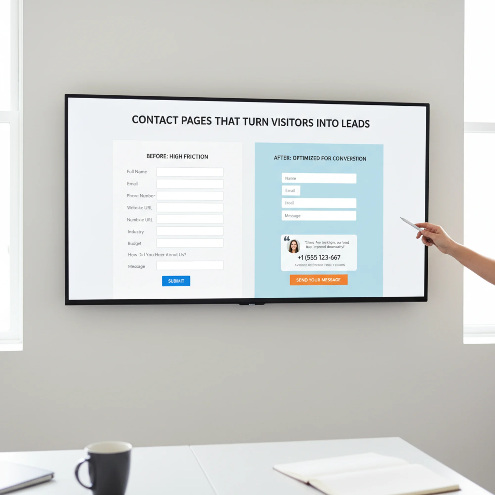
The Anatomy of a Contact Page That Converts
A high-performing contact page has five core elements working together. Miss one, and conversion rates drop.
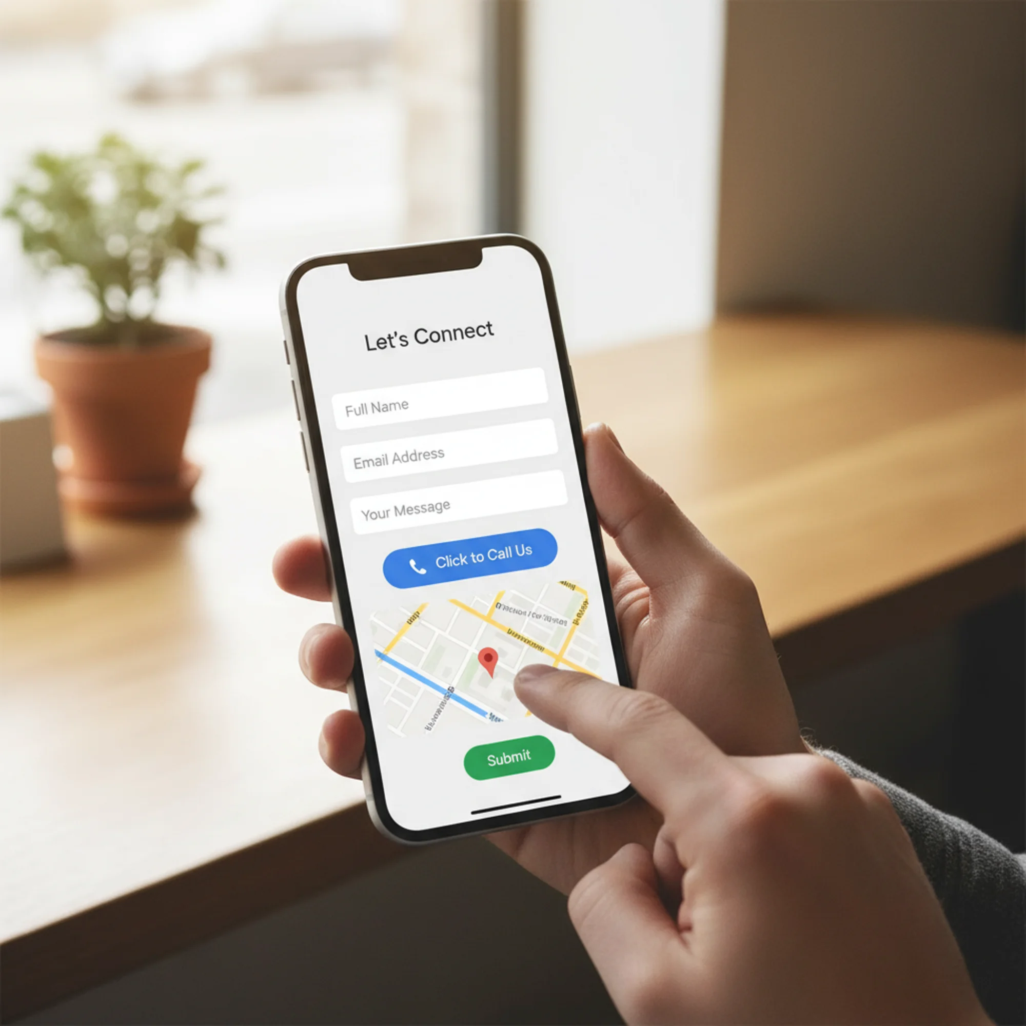
1. A Short Form With Only Essential Fields
Every field you add increases friction. For most small businesses, you need three fields:
- Name — so you can address them personally
- Email — so you can reply
- Message — so they can tell you what they need
That is it. You do not need their company name, budget range, preferred contact method, or any other qualifying information as a required field.
If you genuinely need more information to route leads, make additional fields optional and clearly label them as such. But challenge yourself first: can you gather that information in your reply instead?
The three-field rule: If you cannot justify why a field is required for your first response, remove it or make it optional.
2. Visible Contact Alternatives
Not everyone wants to fill out a form. Some people want to call. Some want to email directly.
Your contact page should show:
- Phone number — clickable (use
tel:links) so mobile visitors can tap to call - Email address — some people prefer their own email client
- Physical address — builds trust and helps with local SEO
- Business hours — so people know when to expect a response
Put these above or beside the form, not buried at the bottom.
3. A Response Time Promise
"We'll get back to you" is not a promise. Visitors who do not know when to expect a reply are more likely to contact your competitor as a backup.
State a specific, honest response time:
- "We respond to all inquiries within 2 business hours."
- "Expect a reply by the next business day."
- "For urgent requests, call us directly at [number]."
Then actually meet that promise. A response time commitment you consistently hit builds the kind of trust that generates referrals.
4. Trust Signals Near the Form
When someone is about to hand over their contact information, they are making a small trust decision. Help them feel confident.
Effective trust signals for contact pages:
- A short testimonial — one or two sentences from a real customer, placed near the form
- Review count or rating — "Rated 4.8 stars from 120 Google reviews"
- Years in business or projects completed — specific numbers, not vague claims
- Privacy note — "We never share your information with third parties"
One or two genuine trust signals near the form outperform a page full of generic badges.
5. A Specific Call-to-Action Button
"Submit" is the default button text on most forms. It is also the least compelling word you could use.
Your button text should tell the visitor what happens next:
- "Send My Message"
- "Get a Free Quote"
- "Book My Consultation"
- "Request a Callback"
The button should be visually prominent — a contrasting color, large enough to tap on mobile, and not competing with other elements nearby.

Common Contact Page Mistakes (and How to Fix Them)
Mistake 1: Hiding the Phone Number
For most local and service businesses, a phone call is the highest-intent lead you can get. Someone willing to call you is further along in their decision than someone filling out a form.
Fix: Put your phone number in large text near the top of the contact page. On mobile, make it a tap-to-call link. If you cannot take calls during certain hours, say so and offer the form as an alternative.
Mistake 2: Using CAPTCHA That Punishes Visitors
Aggressive CAPTCHAs block real leads alongside spam. If your visitors are clicking fire hydrants three times before they can send a message, some will give up.
Fix: Use invisible reCAPTCHA or a honeypot field instead of visual challenges. A honeypot is a hidden form field that real users never see — bots fill it in, and you filter those submissions server-side. It stops most spam without visitor friction.
Mistake 3: No Confirmation After Submission
A visitor fills out your form and clicks send. The page refreshes. Nothing changes. Did it work?
Fix: Show a clear confirmation message: "Thanks, [Name]. We received your message and will reply within [timeframe]." Better yet, redirect to a dedicated thank-you page where you can suggest next steps or offer additional resources.
Mistake 4: The Form Is Below the Fold on Mobile
On desktop, your layout might look fine. On a phone — which is likely how most visitors arrive — the form might be pushed below a large map, a paragraph of text, and a stock photo.
Fix: On mobile, the form or a clear path to it should be visible without scrolling. Put a prominent "Call Us" or "Send a Message" button at the top that scrolls to the form, or restructure the layout so the form comes first on small screens.
Mistake 5: Asking for Information You Will Not Use
If your form asks for a budget range but you quote every project individually, you are adding friction for nothing.
Fix: Audit your form fields against what you actually use in your first response. If a field does not change how you reply, remove it.
Walkthrough: Rebuilding a Plumber's Contact Page
A local plumbing company has a contact page with a 9-field form, no visible phone number, a stock photo of a wrench, "Submit" as the button text, and no confirmation message. Here is how to rebuild it:
Step 1: Cut the form to essentials. Keep name, phone (plumbers need to call back to schedule), and a message field. Drop everything else. Ask about service type and timing when you call back.
Step 2: Add the phone number prominently. "Need help now? Call us: (555) 123-4567" in large text above the form. Make it a tap-to-call link. Plumbing emergencies do not wait for forms.
Step 3: Add a response time promise. "We return all calls and messages within 1 hour during business hours (Mon–Sat 7am–6pm)."
Step 4: Add a trust signal. One testimonial: "Dave fixed our burst pipe in 45 minutes on a Saturday. Lifesaver." — Sarah M., [City]
Step 5: Fix the button. Change "Submit" to "Request a Callback."
Step 6: Add a confirmation. After submission: "Thanks! We'll call you back within 1 hour. For emergencies, call us directly at (555) 123-4567."
Step 7: Add LocalBusiness structured data. Add LocalBusiness schema markup so search engines display your phone number, hours, and address directly in results.
This rebuild takes an hour or two. The difference in lead volume will be measurable within weeks.
Contact Page Checklist
Use this to audit your own contact page:
Form Design
- [ ] Three to four required fields maximum
- [ ] Optional fields are clearly marked
- [ ] Button text describes the outcome, not the action
- [ ] Form works on mobile (test it yourself)
- [ ] Confirmation message appears after submission
Contact Alternatives
- [ ] Phone number is visible and clickable on mobile
- [ ] Email address is displayed
- [ ] Physical address is shown (if applicable)
- [ ] Business hours are listed
Trust and Credibility
- [ ] At least one testimonial or review near the form
- [ ] Privacy reassurance near the form
- [ ] Response time promise is specific and honest
Technical
- ] Page loads in under 3 seconds ([Core Web Vitals directly affect user experience and search ranking)
- [ ] CAPTCHA is invisible or replaced with a honeypot
- [ ] Form submissions are tested regularly
- [ ] LocalBusiness structured data is implemented
- [ ] Form uses HTTPS with no mixed content warnings
Layout
- [ ] Form or contact action is visible without scrolling on mobile
- [ ] Phone number and key details are above or beside the form
- [ ] Page is not cluttered with unnecessary images or text blocks
What Happens After the Form
Getting someone to submit your form is half the job. What happens in the next 5 to 60 minutes determines whether that lead becomes a customer.
Set up instant notifications. Form submissions should trigger an email or push notification to someone who can respond. If submissions go to an inbox nobody checks until Monday, you are losing weekend leads.
Have a response template ready. A template that acknowledges their message, confirms next steps, and includes your phone number saves time while still feeling personal.
Track your response time. If you promise 2 hours, measure it. Are you hitting that number? If not, improve your process or adjust the promise.
Does Your Contact Page Actually Work?
Here is a test most business owners skip: go to your own contact page on your phone, fill out the form, and submit it. Then check:
- Did you receive the submission?
- How long until a notification reached you?
- Was the confirmation message clear?
- Did you have to pinch and zoom?
If anything felt off, your visitors feel it too — and they do not have your motivation to push through.
For a broader look at how your contact page fits into your overall site health, run a free audit with FreeSiteAudit. It checks page speed, mobile usability, structured data, and other factors that affect whether visitors stick around long enough to reach your contact page in the first place.

Three Changes You Can Make Right Now
If you only have 30 minutes:
- Remove unnecessary form fields. Cut anything that is not essential for your first response.
- Add your phone number in large text above the form. Include a tap-to-call link. Takes 5 minutes.
- Change your button text. Replace "Submit" with something specific to what the visitor gets.
Your contact page is not just a form. It is the moment where your website earns its keep. Make it count.
Sources
Check your website for free
Get an instant score and your top 3 critical issues in under 60 seconds.
Get Your Free Audit →