CTA Audit: Are Your Calls-to-Action Actually Working?
A practical guide to auditing your website's calls-to-action, finding what's broken, and fixing the buttons that quietly cost you sales and conversions.
# CTA Audit: Are Your Calls-to-Action Actually Working?
Your website probably has buttons. "Get a Quote." "Buy Now." "Book a Call." "Sign Up." You spent time deciding what they should say. You picked a color. You placed them on the page. And then you mostly stopped thinking about them.
That's the problem.
A call-to-action (CTA) is the single moment where a visitor stops being a reader and starts being a customer. If the CTA fails, everything you did to bring that person to the site — the SEO work, the ad spend, the content writing — converts into nothing. A working CTA is not optional. It's the whole point.
This guide walks you through a plain-English CTA audit you can run on your own site this week. No analytics PhD required. No conversion-rate-optimization jargon. Just the questions that actually move the number.
What a CTA Actually Is (and Isn't)
A CTA is any element designed to prompt a specific next action. Most people think of buttons, but CTAs include:
- Buttons ("Start Free Trial")
- Text links inside paragraphs ("see pricing here")
- Forms (the submit button, plus the fields leading to it)
- Phone numbers and email addresses, especially on mobile
- Sticky bars and pop-ups
- Banner offers
- The final paragraph of a blog post
A CTA is not a wish. "I hope they contact us" is not a CTA. A CTA is a specific, visible, frictionless instruction.
If your homepage has eight different things competing for attention and no single button stands out, you have a wish, not a CTA.
The Five Failures: Why Most CTAs Don't Work
Before you audit, learn the patterns. Almost every broken CTA falls into one of these buckets.
1. It's invisible
The button blends into the page. Same color family as the background. Same weight as surrounding text. Buried below the fold on mobile. If a first-time visitor has to hunt for it, you've already lost most of them.
2. It's vague
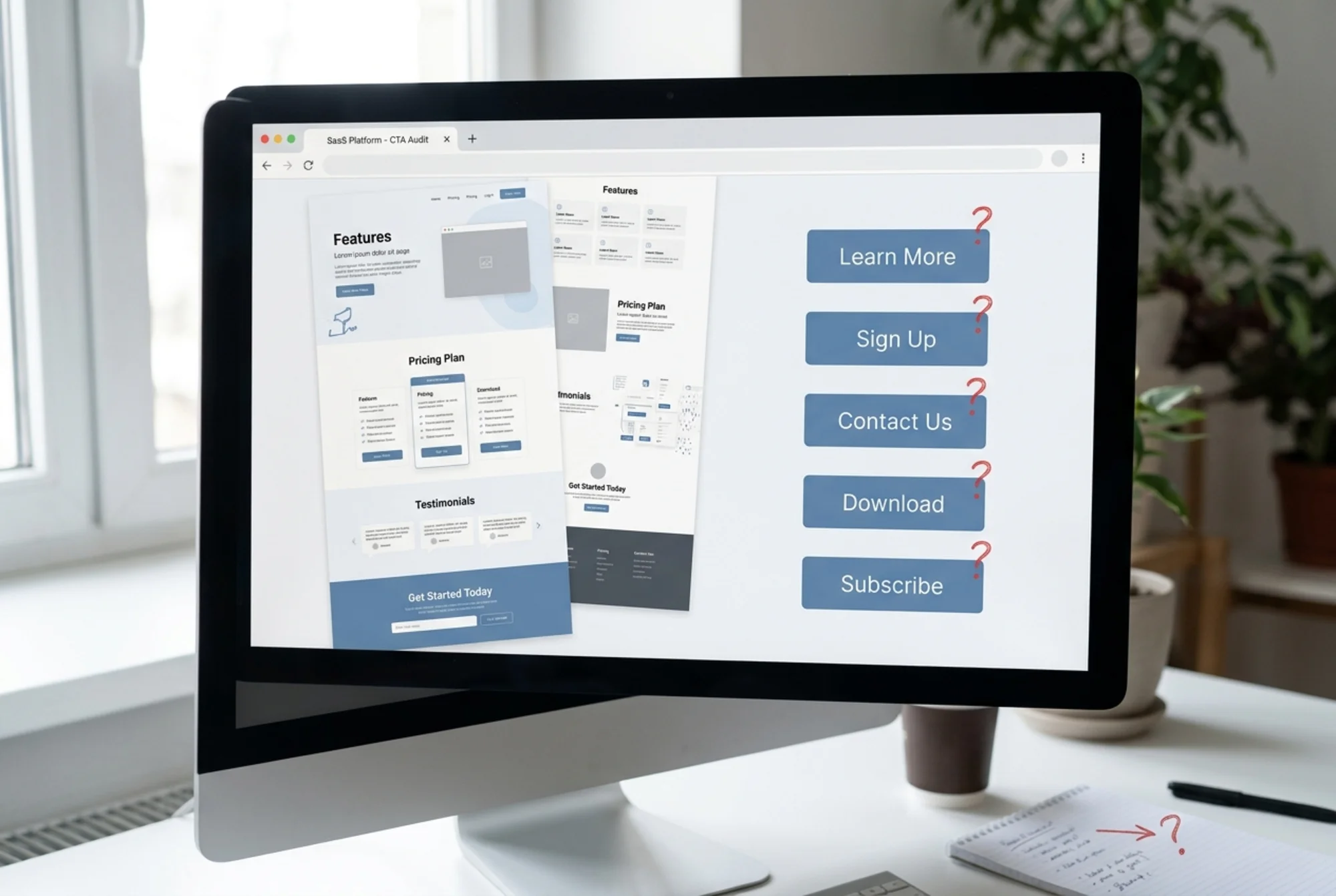
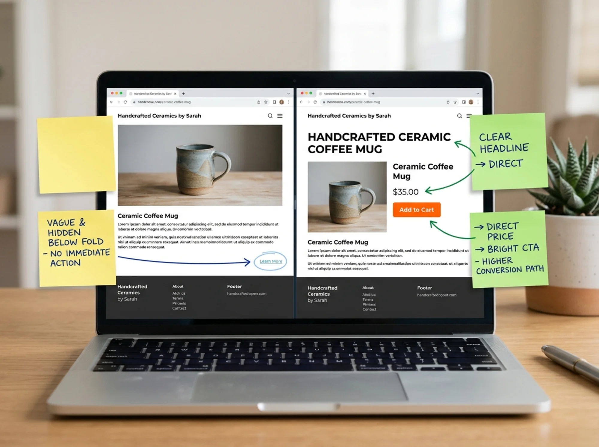
"Learn More" is the most common CTA on the internet and one of the worst. Learn more about what? At what cost? With what commitment? Vague verbs make visitors hesitate, and hesitation is the enemy.
3. It competes with itself
You have three buttons at the top: "Get a Demo," "Watch Video," and "Read Blog." All the same size. All the same color. When everything is primary, nothing is. The visitor's brain refuses to choose and chooses nothing.
4. It asks for too much, too soon
A "Schedule a 30-Minute Discovery Call" button on a first-time visitor's homepage is asking for a relationship before the introduction. The friction is enormous. People don't book calls with strangers.
5. It's broken
Literally broken. The link goes to a 404. The form submits but the email never arrives. The button works on desktop but is clipped off-screen on iPhone. The Stripe checkout throws an error. You'd be surprised how often this is the actual problem.
The Eight-Question CTA Audit
Walk through your site, page by page, and answer these for each CTA you find. Be honest.
1. Can I spot it within 3 seconds?
Open the page in a fresh browser tab. Don't squint. Don't lean in. If your eye doesn't land on the primary CTA within three seconds, it's failing.
2. Does the button text describe what happens next?
"Submit" is bad. "Send My Free Quote" is good. The visitor should be able to predict the outcome from the words alone.
3. Is there exactly one primary CTA on this screen?
You can have secondary actions, but only one should look primary. Different color, size, or weight — make the choice obvious.
4. Does the CTA match the visitor's intent at this point?
A blog post reader is not a buyer yet. A pricing page visitor probably is. Match the ask to the stage.
5. Is the friction low?
Count the steps. A "Buy Now" button that opens a 14-field form is not low-friction. Either reduce the form or rename the button to set expectations.
6. Does it work on a phone?
Open it on your actual phone, not just a browser simulator. Tap with your thumb. Is the button big enough? Does the keyboard cover the form field? Does the submit succeed?
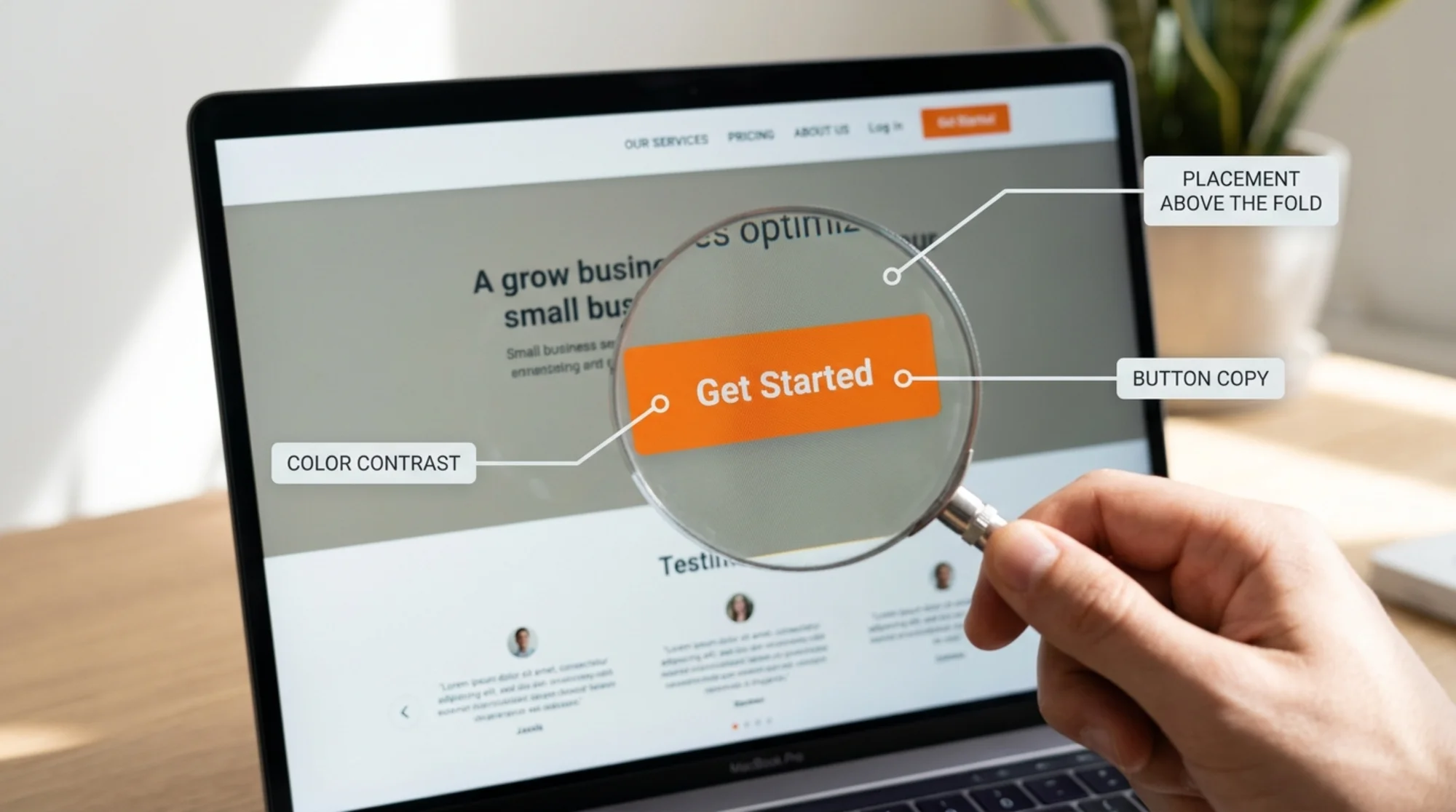
7. Is it above the fold on the most important pages?
Your homepage hero and main service pages should have a visible CTA without scrolling. On product pages, a secondary CTA should reappear after every major section.
8. When did you last test it end-to-end?
Click the button. Fill out the form. Pay the dollar. Read the confirmation email. Most CTA failures are silent — the site looks fine, but the funnel is leaking.
A Walkthrough: Auditing a Bakery Website
Let's make this concrete. Imagine you run a small bakery and your website has three goals: take online orders, accept catering inquiries, and grow an email list.
You open the homepage on your laptop. Here's what you find:
- Hero image of croissants. No button.
- A paragraph about your story.
- Three product cards with "View Details" links.
- Footer with phone number and email.
Audit results:
- No primary CTA. A visitor who wants to order has to scroll, click into a product, then find the cart. Most won't.
- "View Details" is vague. Better: "Order This" or "Add to Cart."
- The phone number isn't tappable. On mobile, it should be a
tel:link so one tap calls you. - No catering CTA at all. A high-value action is completely missing from the page.
- No email signup. The third stated goal has no surface area on the page.
Here's the rewrite, in order:
- Add a sticky "Order Online" button in the top-right of the header, present on every page.
- Change the hero to include a single big button: "See Today's Menu."
- Add a catering banner halfway down the homepage: "Hosting an event? Get a Catering Quote →"
- Make the footer phone number a clickable
tel:link. - Add an email signup after the last product card: "Get tomorrow's specials in your inbox."
None of these are clever. They're just present, visible, and specific. That's most of the battle.
Writing Better CTA Copy
The button text is the part most owners get wrong. Use these rules.
Start with a verb. "Get," "Start," "Send," "Book," "Download," "Build." Verbs create motion.
Use first-person where it fits. "Send My Quote" outperforms "Send Quote" surprisingly often, because it reframes the action from the company's perspective to the visitor's.
Be specific about the outcome. "Get My Free Site Audit in 60 Seconds" beats "Try It Free" because it tells you what, how long, and the price.
Avoid corporate verbs. "Engage," "Optimize," "Leverage," "Connect with our team" — nobody talks like this. Write the way you'd say it out loud to a customer in your shop.
This aligns with how Google describes helpful content: write for the person, not the algorithm. The same rule applies to buttons.
A quick before-and-after:
- Before: "Submit" → After: "Send My Question"
- Before: "Learn More" → After: "See Pricing"
- Before: "Get Started" → After: "Start My Free Trial"
- Before: "Contact Us" → After: "Get a Quote in 24 Hours"
Design Details That Actually Matter
You don't need to redesign your site. You need to fix a few small things.
Color contrast. Your CTA should be the most contrasting element on the screen. If your brand is blue and your CTA is also blue, the CTA loses. Use a complementary or warm color (orange, red, green) for the primary action.
Size. Buttons should be at least 44 pixels tall on mobile — the standard tap target size. Smaller buttons get mis-tapped, and mis-taps feel like a broken site.
Whitespace. A CTA surrounded by clutter looks like one of many things. A CTA surrounded by space looks like the thing. Give it room.
Loading speed. A button that takes three seconds to respond after a click feels broken. Page speed is a CTA issue. Google's Core Web Vitals matter here — particularly Interaction to Next Paint (INP), which measures how snappy your page feels when someone clicks something. If your CTA registers a click but the page freezes for half a second, visitors assume it didn't work and either rage-tap or leave.
Mobile keyboard behavior. When a form field opens the keyboard, does the submit button get hidden? On many small business sites, yes. Test it.
Forms Are CTAs Too
The submit button is only half the story. The fields leading up to it are part of the same conversion event. A few rules:
- Every field is friction. Ask for the minimum to take the next action. Name, email, message. That's often enough.
- Don't ask for the phone number unless you'll actually call. Optional phone fields kill conversions because visitors assume mandatory.
- Pre-fill or remember where you can. If someone already gave you their email on a prior form, don't ask again.
- Show errors inline, not on submit. A form that flashes a red "ERROR" after submission feels punishing. Validate as you type.
- Make the submit button confirm the action. Not "Submit." "Send My Message." Same rule as buttons.
Tracking Whether It's Working
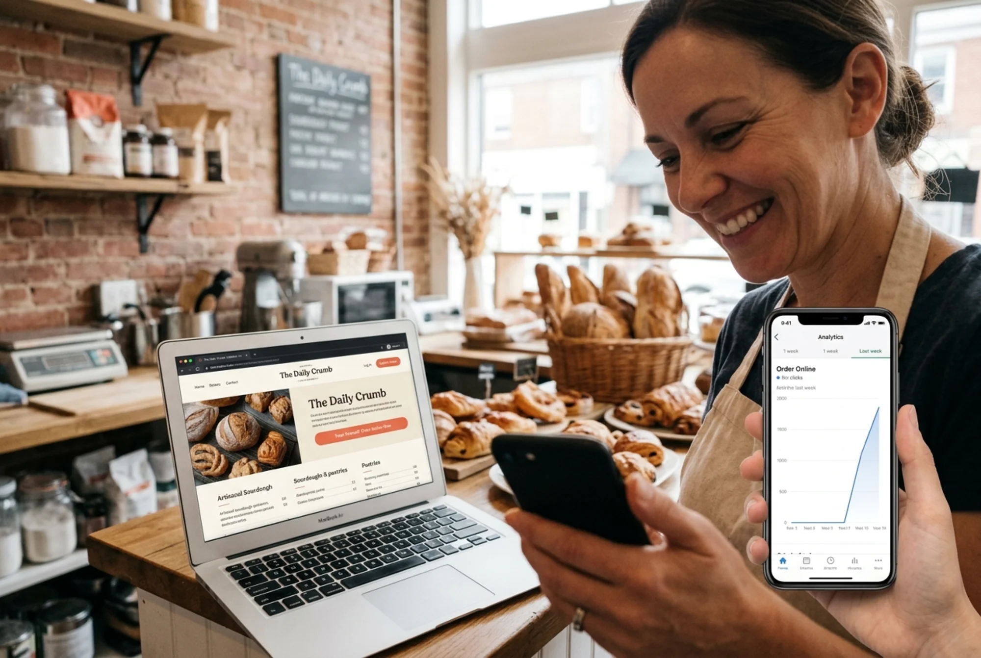
You don't need fancy tools to know if your CTA audit worked. You need three numbers:
- How many people visited the page last month?
- How many clicked the CTA?
- How many completed the action (purchase, form submit, signup)?
Compare those numbers before and after your changes. If clicks went up but completions didn't, the button is fine but the next step is broken. If clicks didn't move, the button itself is the problem.
Most analytics tools — Google Analytics, Plausible, Fathom — can show this with basic event tracking. If you don't want to set that up, use a simpler proxy: count form submissions in your inbox, count orders in your dashboard. The number doesn't have to be perfect. It just has to be directional.
A 30-Minute CTA Audit Checklist
If you've got half an hour today, do this:
- [ ] Open your homepage in a private/incognito window. Can you spot the primary CTA in 3 seconds?
- [ ] Open your homepage on your phone. Same question.
- [ ] Walk through every step of your top conversion action — order, book, sign up. Time how long it takes.
- [ ] Read every button on your top three pages out loud. Does the text describe what happens?
- [ ] Click every CTA. Does it actually work? Does the confirmation email arrive?
- [ ] Check your contact page phone number — is it a tappable
tel:link on mobile? - [ ] Look at each page: is there exactly one obvious primary CTA, or are five buttons fighting?
- [ ] Submit a test form. Does the data go where you expect? Are you notified?
You'll probably find at least three things that are quietly broken or weak. Fix the worst one this week.
Common Mistakes to Avoid
A few traps worth calling out:
Adding more CTAs to "give people options." This almost always reduces conversions. One clear path beats five fuzzy ones.
Hiding the CTA in a hamburger menu. Mobile menus hide the action from most visitors. Keep the primary CTA visible in the header, even on mobile.
Pop-ups that block the primary CTA. A subscribe pop-up that covers the "Buy Now" button is sabotaging itself.
Vanity CTAs. "Follow Us on Instagram" is rarely the most valuable next step. Don't let social media buttons compete with your real conversion goals.
Untested checkout flows. Plenty of sites have checkout flows that have been broken for weeks while the owner thinks sales are just slow.
Run Your CTA Audit With FreeSiteAudit
A manual CTA audit catches a lot. An automated audit catches the rest — the broken links, the slow pages, the mobile rendering issues, the contrast problems, the technical issues that affect whether your CTAs even get seen.
Run a free website audit at FreeSiteAudit. You'll get a plain-English report covering CTA placement, page speed, mobile usability, and the issues that quietly hurt conversions — no signup required, results in under a minute.
If you find issues in the report you want help fixing, our CTA optimization guides walk through the most common problems step by step. And if you're a small business owner trying to do this without a full marketing team, the audit gives you a prioritized list so you know what to fix first.
The Bottom Line
CTAs are the cheapest, highest-leverage thing you can fix on your website. They don't require a redesign. They don't require new content. They don't require ad spend. They require thirty minutes of honest review and the willingness to change "Submit" to "Send My Question."
Most small business websites lose customers not because the product is wrong or the price is high, but because the button is invisible, the form is intimidating, or the link is broken. Audit your CTAs. Fix what's failing. Check again next quarter, because sites change and so do customer expectations.
The button is the moment of truth. Make sure it's actually working.
Sources
Check your website for free
Get an instant score and your top 3 critical issues in under 60 seconds.
Get Your Free Audit →