Font Loading Optimization: Stop Your Text From Flashing
Stop FOUT and FOIT on your site. Learn how to preload fonts, use font-display, and reduce layout shift to improve Core Web Vitals and user experience.
# Font Loading Optimization: Stop Your Text From Flashing
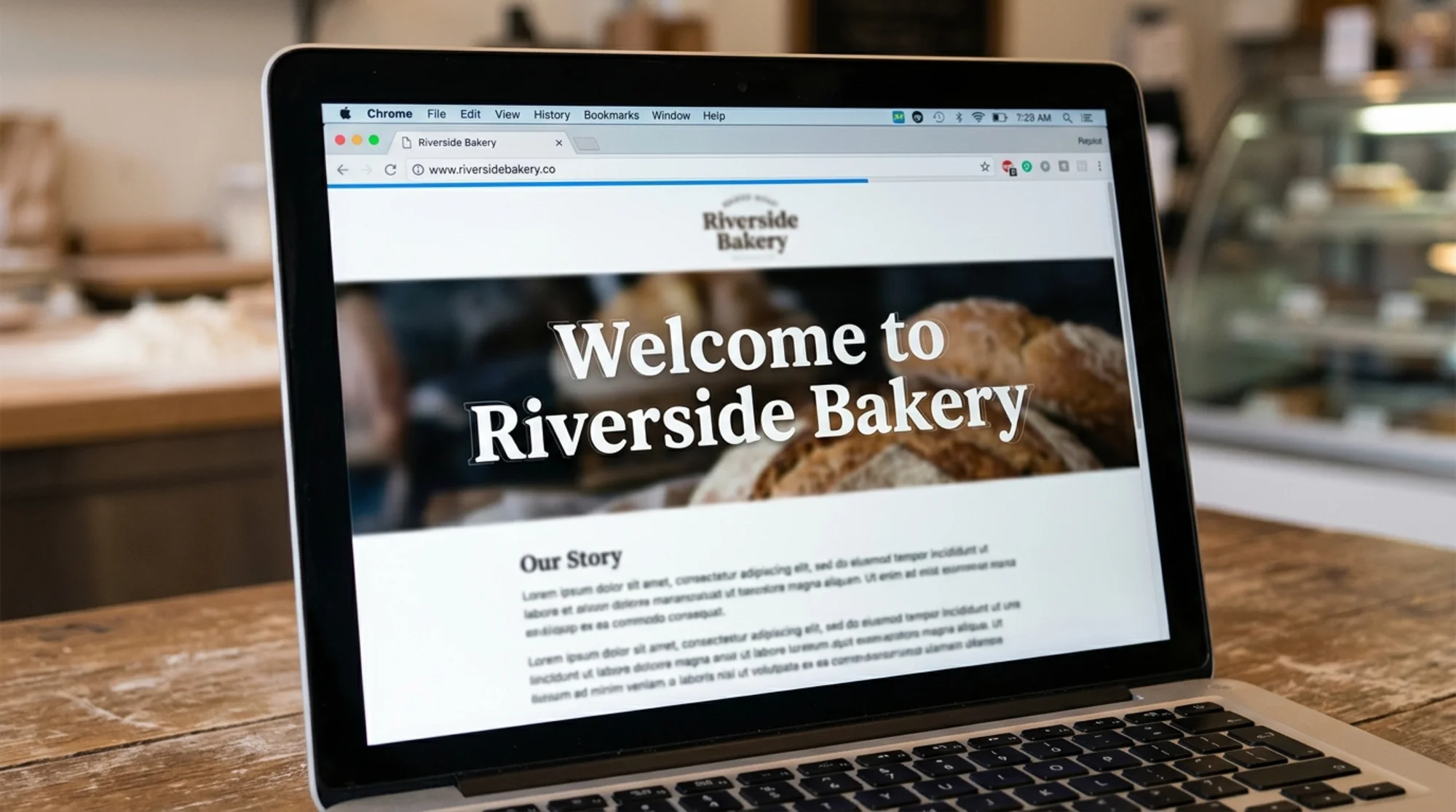
You've seen it. You open a website, and for half a second the text is a plain default font. Then it snaps into the brand's real font, often jumping the rest of the page in the process. Or worse, the text just doesn't appear at all for a moment, leaving blank rectangles where your headline should be.
That little glitch has two names: FOUT (Flash of Unstyled Text) and FOIT (Flash of Invisible Text). Both come from the same root cause: the browser is waiting on your custom fonts to download and is making awkward choices about what to show in the meantime.
For a small business, this isn't just an aesthetic annoyance. It hurts your Core Web Vitals, it makes your site feel cheap, and it pushes visitors away before they read a word. The good news: font loading is one of the more fixable speed problems on the web. You usually don't need a developer team or a rebuild. You need a handful of one-line changes.
Why fonts are slow in the first place
When someone visits your site, their browser doesn't have your custom fonts yet. It has system defaults like Arial, Times New Roman, and Helvetica. If your site uses Poppins, Montserrat, Playfair Display, or any of the thousands of web fonts out there, the browser has to download a font file before it can show text correctly.
That download isn't free. A single font file can be 30 KB to 200 KB, and most sites use multiple weights (regular, bold, italic), so the total font payload often runs 200 KB to 500 KB. Critically, fonts load after the HTML and CSS — the browser already knows what the text says but is sitting on its hands waiting to draw it.
Browsers handle the wait in one of two ways:
- Hide the text until the font arrives (FOIT). The user sees a blank space.
- Show the text in a fallback font and swap when the real font is ready (FOUT). The user sees the flash.
Neither is great. But you can control which one happens, and you can dramatically shorten either.
How this hurts your business
Google's Core Web Vitals program measures real user experience, and two of the three vitals are directly affected by how you load fonts:
- Largest Contentful Paint (LCP) measures how fast your main content appears. If your hero headline is hidden waiting on a font, your LCP gets worse.
- Cumulative Layout Shift (CLS) measures how much your page jumps around as it loads. When a fallback font is replaced by your custom font, the new font is usually a different size, and everything shifts. That's a CLS hit.
Beyond the metrics, there's a human cost. People associate flashing text and shifting layouts with broken or untrustworthy sites. For a small business trying to turn a first-time visitor into a customer, that's the wrong first impression.
The five things that actually fix this
Most font fixes fall into five buckets. You don't need all of them. Pick the ones that match your setup.
1. Use `font-display: swap` (or know when not to)
In your CSS, every @font-face rule should include a font-display property. This tells the browser what to do while the font is loading.
css
@font-face {
font-family: 'Poppins';
src: url('/fonts/poppins.woff2') format('woff2');
font-display: swap;
}
The options:
swap— show fallback immediately, swap in the real font when ready. Best for body text and most marketing copy.optional— show fallback, and only swap if the font loads almost instantly. Best for nice-to-have fonts.fallback— short hiding period, then fallback, then swap if it loads within ~3 seconds.block— hide text for a short time, then show fallback. Used when the font is critical to readability (rare).
For 95% of small business sites, swap is the right answer. If you're loading from Google Fonts via a tag, modern Google Fonts URLs include &display=swap by default — confirm yours does.
2. Self-host your fonts
This one surprises people. Google Fonts has a great CDN, right? Yes, but every request to fonts.googleapis.com still needs a fresh DNS lookup, TLS handshake, and HTTP round trip. On a slow phone, that handshake alone can take 300ms before the first byte of your font even starts downloading.
When you host fonts on your own domain, those requests reuse the connection your site already opened. Tools like google-webfonts-helper let you download the exact subsets you need and drop them into your project. The typical result is 100–400ms faster font appearance with no other changes — and it removes a third-party request, which is also a small privacy win.
3. Preload your one critical font file
If you have one font weight that's used in your above-the-fold headline, preload it. This tells the browser to start downloading it immediately, before it even finishes parsing your CSS.
html
Two warnings:
- Only preload one or two fonts. Preloading everything cancels the benefit because they compete for bandwidth.
- The
crossoriginattribute is required, even for same-origin fonts. Without it, the browser ignores the preload.
Preloading is the single highest-leverage change for LCP when your hero text uses a custom font.
4. Use WOFF2 only
If you're still serving .ttf, .eot, or .otf files, you're shipping fonts that are 30–50% larger than necessary. The modern format is WOFF2, supported by every browser used in the last decade.
Convert your fonts to WOFF2 with a free converter and remove the other format references from your CSS:
css
src: url('/fonts/poppins.woff2') format('woff2');
One file per weight. That's it.
5. Subset your fonts
A typical font file includes characters for Latin, Cyrillic, Greek, Vietnamese, and a dozen other scripts. If your bakery's website is in English, you don't need any of those except Latin. Subsetting strips out the unused characters and can cut file sizes by 40–70%.
Most modern font tooling handles this automatically. If you're downloading from Google Fonts directly, choose the "Latin" subset (or "Latin Extended" if you use European accents).

A walkthrough: fixing a small business homepage
Say you run a small dental practice. Your site was built on WordPress with a popular theme. You use two fonts: Playfair Display for headings and Open Sans for body text. Each has regular and bold weights — four font files total.
Here's what's likely happening today:
- Browser requests your HTML.
- HTML loads, browser finds the Google Fonts
tag in the. - Browser opens a new connection to fonts.googleapis.com.
- CSS file from Google Fonts comes back, listing four font URLs.
- Browser opens another connection to fonts.gstatic.com to fetch the actual font files.
- While all this happens, your headline "Schedule Your Cleaning Today" is either invisible or showing in Times New Roman.
- The fonts finally arrive. Text snaps to Playfair Display. The layout shifts. The "Book Appointment" button moves down 12 pixels.
The fixed version:
- You download the four fonts as WOFF2 files, Latin subset only.
- You upload them to
/wp-content/uploads/fonts/(or wherever your theme expects). - You replace the Google Fonts
with local@font-facerules usingfont-display: swap. - You add one preload tag for
playfair-display-700.woff2— that's your hero headline weight. - You use
size-adjustandascent-overrideon your fallback so it occupies almost the same space as Playfair Display, eliminating the layout shift on swap.
The result: text appears almost immediately in a system font that's visually close to your brand font. When Playfair Display loads, it swaps in without any visible layout shift. LCP improves. CLS approaches zero. Visitors don't notice anything except that your site feels fast.
A 10-minute audit you can do right now
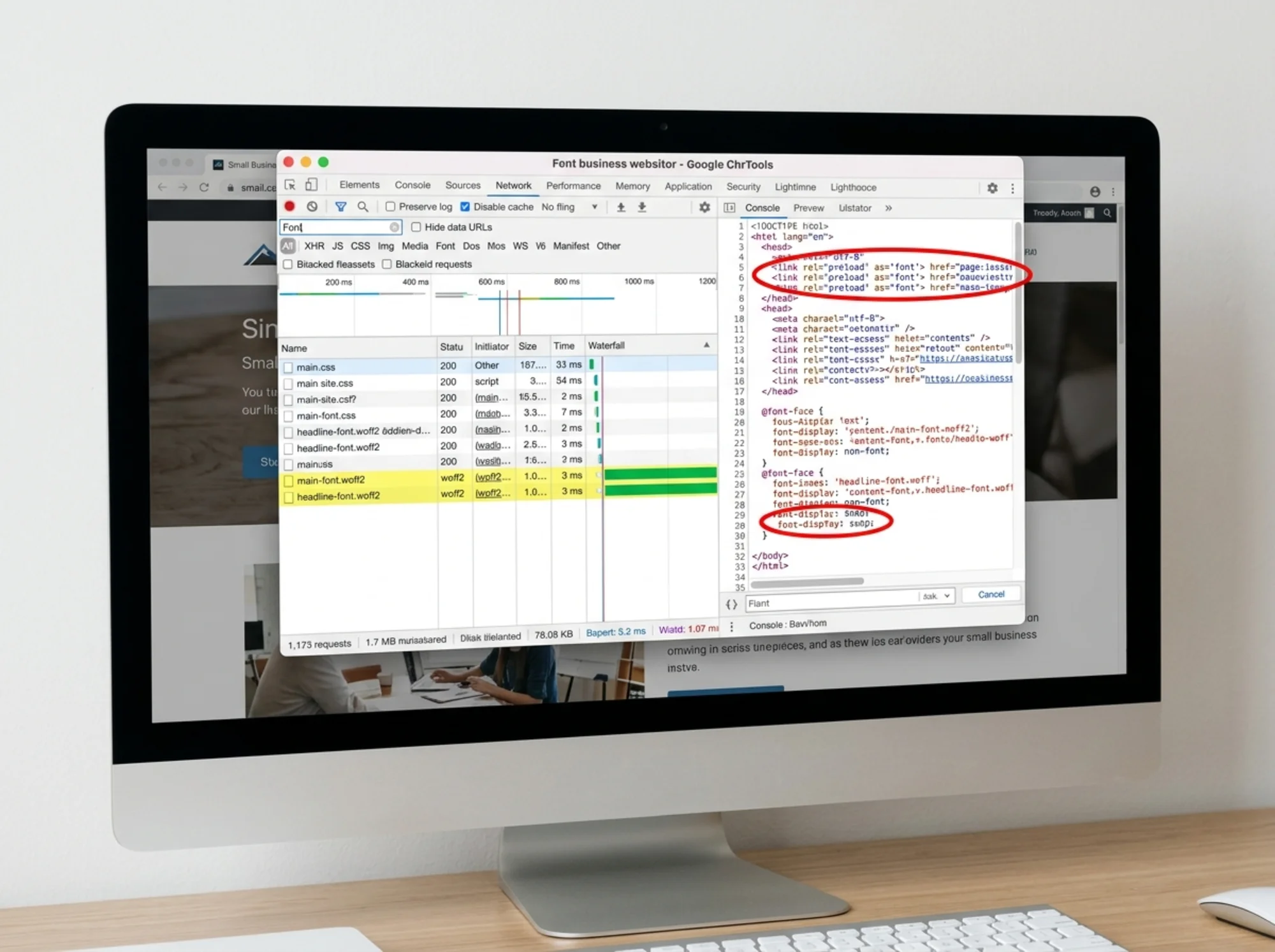
Before changing anything, do this quick audit. Open your homepage in Chrome, right-click, choose Inspect, and open the Network tab. Reload, then filter by "Font."
Red flags:
- More than four font files loading
- Any file ending in
.ttf,.eot, or.otf - Files larger than 100 KB
- Files served from a third-party domain (especially fonts.gstatic.com)
- No
tags for fonts in your page source - Fonts loading after your main CSS bundle finishes
Three or more checked? You have meaningful room to improve.
The fallback trick that eliminates layout shift
This is the most overlooked optimization. Even with font-display: swap, you still get a CLS hit when the fallback is replaced by your custom font, because the two have different character widths and line heights.
Modern CSS solves this with three properties on a custom @font-face rule:
css
@font-face {
font-family: 'Poppins Fallback';
src: local('Arial');
size-adjust: 107%;
ascent-override: 90%;
descent-override: 22%;
}
body {
font-family: 'Poppins', 'Poppins Fallback', sans-serif;
}
You're creating a synthetic font family that uses Arial as its source but tweaks its size and metrics to match Poppins almost exactly. When the browser swaps from "Poppins Fallback" to real Poppins, the text doesn't move because the metrics are nearly identical.
You can calculate the exact percentages with a free tool called Font Style Matcher. Plug in your custom font and a system fallback, and it gives you the override values.
This single technique can take CLS from 0.15 (poor) to 0.01 (excellent) on a font-heavy page.
Common mistakes to avoid
A few patterns we see on small business sites all the time:
- Loading six weights when you use three. Audit which weights actually appear in your CSS. Most sites need regular, semibold, and bold.
- Loading italic versions you never use. If you don't have
orstyled with the custom italic, drop the italic file. - Using
@importin CSS for fonts. Slower than atag because it waits for the CSS to parse first. Always usein the HTML head. - Preloading every font. Preload is a precious resource. Reserve it for one or two critical fonts.
- Icon fonts. Font Awesome and friends ship 100+ KB of font data for icons. Inline SVG or a tree-shaken SVG icon library is dramatically faster.
When fonts are not your problem
Don't fix what isn't broken. If your site loads in under 2 seconds on a mid-range phone and your Core Web Vitals are green, font optimization probably isn't your highest-leverage move. Per Google's helpful content guidance, you should spend your time on the things that genuinely improve the visitor experience first.
To find out, run a free website audit. It checks your fonts, your Core Web Vitals, and a hundred other things in about 60 seconds, then gives you a prioritized list of what to fix. If fonts aren't your bottleneck, you'll know — and you can focus on bigger wins like page speed or Web Vitals.

Bringing it together
Font loading optimization sounds technical, but most of it is just being deliberate. Pick your fonts on purpose. Self-host them. Preload the one your hero needs. Use font-display: swap. Match your fallback's metrics to your real font so the swap is invisible.
You don't have to do all of this at once. If you only have 30 minutes this week, do these three:
- Add
&display=swapto your Google Fonts URL (orfont-display: swapto your@font-facerules). - Remove any font weights or styles you don't actually use in your CSS.
- Convert any non-WOFF2 font files to WOFF2.
That alone will measurably improve LCP and CLS on most small business sites. Then, when you have more time, tackle preloading, self-hosting, and fallback metric overrides for the full effect.
Your visitors won't consciously notice that your text doesn't flash anymore. They'll just notice that your site feels solid, fast, and trustworthy. That's the whole point.
Run a free website audit to see exactly which fonts are slowing your site down and what to fix first.
Sources
- https://web.dev/articles/vitals
- https://developers.google.com/search/docs/fundamentals/creating-helpful-content
Check your website for free
Get an instant score and your top 3 critical issues in under 60 seconds.
Get Your Free Audit →