Heading Hierarchy Mistakes Screen Readers Hate
Screen readers depend on heading order to navigate — discover the most common h1-h6 hierarchy mistakes on small business sites and how to fix them fast.
# Heading Hierarchy Mistakes Screen Readers Hate
Your website has headings. Every page does. But if those headings skip levels, repeat where they shouldn't, or exist only because someone liked the font size, you're creating a barrier for visitors who use screen readers.
The World Health Organization estimates over 2.2 billion people worldwide have some form of vision impairment. Many navigate the web using screen readers — software that reads page content aloud and lets users jump between headings like chapters in a book. According to the WebAIM Screen Reader User Survey, nearly 70% of screen reader users navigate pages by headings as their primary strategy. That makes headings the single most important navigation mechanism for a significant portion of your audience.
When your heading hierarchy is broken, those users can't find what they need. They leave. And search engines, which parse headings to understand page structure, get confused too. The result is worse accessibility, lower engagement, and missed ranking opportunities — all from a problem that typically takes minutes to fix once you know what to look for.
Here's what goes wrong and how to fix it.
What Heading Hierarchy Actually Means
HTML provides six heading levels: through . They form an outline of your page's content. Your is the page title — the single top-level topic. tags mark the main sections beneath that title. Within those sections, tags break things down further, and so on.
Think of it like a book:
- H1 — Book title (one per page)
- H2 — Chapter titles
- H3 — Sections within chapters
- H4 — Subsections within sections
- H5 — Sub-subsections (rarely needed on most small business pages)
- H6 — Deepest level (almost never used in practice)
The rule: don't skip levels going down. An can be followed by an , but jumping to an breaks the structure. You can skip levels going back up — moving from an directly to an is fine because you're starting a new major section.
Screen readers let users pull up a list of all headings on a page and jump to any one. JAWS, NVDA, and VoiceOver all support this with a single keystroke — pressing H moves to the next heading, and users can filter by level (pressing 2 jumps to the next ). When the hierarchy has gaps, that navigation falls apart. Users lose confidence in the page structure and can't predict where content lives.
To understand why this matters so much, consider how a sighted user experiences a web page. They glance at the layout, spot bold headlines, and scroll to the section they want in a second or two. A screen reader user doesn't have that luxury. Their equivalent of "glancing at the page" is pulling up the headings list and scanning it. If the list is garbled with skipped levels and misleading entries, it's like handing a sighted user a page where all the section titles are scrambled and some are missing entirely.

The Five Most Common Mistakes
Mistake 1: Picking Headings by How They Look
This is the most widespread problem. Someone building a page in WordPress, Squarespace, or Wix sees that looks like the right size for a section title, so they use it — even though the previous heading was an .
The result:
H1: Welcome to Main Street Bakery
H2: Our Story
H4: How We Started ← skipped H3
H4: Our Ingredients ← still no H3
H2: Menu
H5: Breakfast Items ← skipped H3 and H4
H5: Lunch Items
A screen reader user scanning this page sees gaps. They wonder whether there's content under H3 that they're missing, or whether the page is broken. Most will leave.
This mistake is so common because every visual website editor displays headings at different default sizes. In many WordPress themes, looks nearly the same as body text, while has a distinctive smaller bold style that designers find appealing. The visual appearance leads people to pick headings by aesthetics instead of document structure.
The fix: Choose headings by level, then style them with CSS. Every website builder lets you customize how each heading level looks. In WordPress, you can define custom styles in your theme's CSS or through the Customizer. In Squarespace, use the Design > Fonts panel to adjust heading sizes. Set your to whatever font size and weight you want, then use it where it belongs structurally. The visual appearance should follow from the structure, not dictate it.
Mistake 2: Multiple H1 Tags
Your page should have one . It's the title — the single phrase that tells visitors and machines what this page is about. When a page has three or four tags, screen reader users lose the ability to quickly identify the page's primary topic.
This happens often on small business homepages where each section gets its own :
H1: Best Plumber in Austin
H1: Our Services
H1: Why Choose Us
H1: Contact Today
To a screen reader, this page has four competing titles. A user pressing 1 to jump between H1 headings expects to land on the page title once, then move on to scanning H2 sections. Instead they get four stops that all feel like page titles, with no clear hierarchy beneath any of them.
To Google, it's unclear which represents the page's primary topic. While Google can handle multiple H1 tags without penalizing a page, their documentation on creating helpful content emphasizes clear page structure — and four H1 tags on a single page is the opposite of clear.
The fix: One per page. Make "Our Services," "Why Choose Us," and "Contact Today" into tags. If the page is a homepage, choose the single most important phrase as your — typically your business name or primary value proposition. Everything else becomes a section beneath it.
Mistake 3: Skipping Levels
Jumping from to or from to breaks the implied document structure. The W3C Web Accessibility Initiative is explicit: headings should be nested by level, and skipping levels should be avoided.
This commonly happens when:
- A developer copies content between pages and doesn't adjust heading levels to match the new context
- A theme applies heading styles inconsistently across templates
- Someone bumps a heading down "to make it smaller"
- A page builder's drag-and-drop blocks default to different heading levels
- Content is imported from a Word document or Google Doc where heading levels were used inconsistently
The fix: After editing any page, check the heading outline. Every should have an parent above it. Every should sit under an . If you find a gap, insert the missing level or promote the heading to fill it. For example, a lonely under an should almost always become an .

Mistake 4: Using Headings for Styling Non-Heading Text
Sometimes headings get applied to text that isn't a section title — a pull quote, a call-to-action, a promotional line, a testimonial, or a decorative phrase. If "Free Shipping on Orders Over $50" is wrapped in an because someone wanted it bold and large, it pollutes the heading structure.
Screen reader users jumping between headings will land on that promotional line expecting a new content section. Instead, they get a dead end with no related content beneath it. Imagine reading a book's table of contents and finding "50% Off This Weekend Only!" listed between "Chapter 3: Installation" and "Chapter 4: Configuration." It's disorienting.
Other common offenders include:
- Sidebar widget titles marked as
orwhen they should use a lower level or a styled- Footer section titles wrapped in heading tags
- "Read More" or "Learn More" links styled as headings
- Testimonial quotes given heading markup for visual prominence
The fix: Use CSS classes for visual emphasis. A
tag with a class likehighlight-textorpromo-bannercan look identical to a heading without breaking the document outline. If your page builder doesn't support custom classes, use bold text inside aorinstead.Mistake 5: Missing Headings Entirely
The opposite problem: long sections of content with no headings at all. An 800-word services page of continuous paragraphs gives screen reader users nothing to grab onto. They can't scan or skip to the section they need.
Sighted users visually scan bold text, spacing, and layout to orient themselves on a page. Screen reader users depend entirely on headings for the same purpose. A wall of text with no headings forces them to listen to the entire page linearly — a frustrating experience that almost always ends with the user leaving.
This problem is particularly common on:
- About Us pages that tell the company's story in one long narrative
- Services pages that list everything in a single flowing description
- FAQ pages that use bold text for questions instead of heading tags
- Blog posts that were drafted in a text editor and pasted without formatting
The fix: Break content into sections. If a block of text covers a distinct sub-topic, give it a heading. A useful test: if you were writing a table of contents for the page, would this section earn its own entry? If yes, it needs a heading. Aim for a heading roughly every 200-300 words for long-form content.
Fixing a Real Page: Before and After
Take a typical small business services page for a landscaping company. Here's what the heading outline looks like in a common broken state versus a corrected version:
Before (broken hierarchy):
H1: Johnson's Landscaping Services
H3: Lawn Care ← skipped H2
H3: Tree Trimming ← skipped H2
H5: Seasonal Pricing ← skipped H4
H2: Contact Us
H4: Business Hours ← skipped H3
A screen reader user hearing this outline would be confused. Why does it jump from H1 to H3? Is there a missing H2 section they can't access? The "Seasonal Pricing" at H5 seems buried under nothing — a user pressing
5to navigate H5 headings would find this single orphaned entry with no logical context.After (clean hierarchy):
H1: Johnson's Landscaping Services
H2: Lawn Care
H3: Weekly Maintenance
H3: Seasonal Cleanup
H2: Tree Trimming
H3: Pruning
H3: Removal
H3: Seasonal Pricing
H2: Contact Us
H3: Business Hours
H3: Service Area
Now every section nests logically. A screen reader user can jump to "Tree Trimming" and drill into its subsections without uncertainty. They can press
2to hop between major service categories, then3to explore details within whichever category interests them. Google can parse the page and understand that "Seasonal Pricing" relates to tree trimming, not lawn care — which helps the page match more specific search queries.The structural changes here took about five minutes in WordPress. The content didn't change at all — only the heading levels were adjusted and a couple of additional subsection headings were added to give logical structure to content that previously existed as unbroken paragraphs.
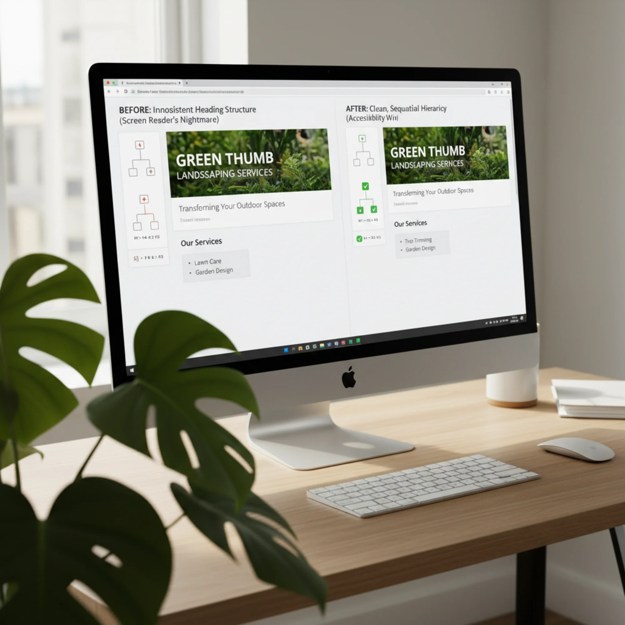
A split-screen WordPress block editor: the left side shows headings picked by font size with an inconsistent H1-H4-H2-H5 outline, the right side shows the same landscaping services page restructured into a clean sequential H1-H2-H3 hierarchy How to Check Your Heading Hierarchy
You don't need to read code. Here are three methods, from simplest to most thorough:
Method 1: Browser Extension (2 Minutes)
Install the HeadingsMap extension (available for Chrome and Firefox). Click the icon on any page and you'll see every heading listed with its level. Gaps and skips become obvious immediately — missing levels show up as indentation jumps in the outline, and many extensions flag these with warning icons.
Step-by-step:
- Go to the Chrome Web Store or Firefox Add-ons and search for "HeadingsMap"
- Install the extension
- Navigate to any page on your website
- Click the HeadingsMap icon in your browser toolbar
- Review the outline — every heading should nest sequentially without gaps
- Repeat for your most important pages (homepage, services, contact, top blog posts)
Another useful extension is the WAVE Web Accessibility Evaluation Tool, which flags heading issues alongside other accessibility problems like missing alt text and low-contrast text.
Method 2: Manual Check in Your CMS
In WordPress, switch to the "Code" editor view and search for
What to look for:
- Does each page have exactly one H1?
- Do headings descend in order (H1 → H2 → H3) without skipping?
- Are any non-heading text elements incorrectly tagged as headings?
- Are there long stretches of content (300+ words) with no headings at all?
Method 3: Run an Automated Audit
Tools like FreeSiteAudit scan your entire site and flag heading hierarchy issues page by page. This catches problems across dozens or hundreds of pages that manual checking would miss. Automated audits are especially valuable for sites with many blog posts, product pages, or location pages where heading problems can multiply quickly.
An automated audit will typically flag:
- Pages with zero or multiple H1 tags
- Skipped heading levels on every page
- Headings used on non-structural content
- Pages with no headings at all
- Inconsistencies between pages of the same type (e.g., one blog post uses H2 for sections while another uses H3)
Quick Self-Audit Checklist
Use this checklist to review your most important pages:
- [ ] Every page has exactly one
- [ ] The
describes the page's primary topic - [ ] No heading levels are skipped going down (H2 → H3, not H2 → H4)
- [ ] Every heading introduces a content section (not used for visual styling)
- [ ] Long content blocks are broken up with sub-headings every 200-300 words
- [ ] Heading text is descriptive and specific (not "Read More" or "Click Here")
- [ ] Navigation menus and footers use lists, not heading tags
- [ ] Sidebar widget titles don't disrupt the main content heading flow
- [ ] Heading levels are consistent across similar pages (all blog posts use the same structure)
- [ ] The heading outline makes sense when read on its own, without the surrounding content
Why This Matters for SEO
Google's documentation on creating helpful content emphasizes clear page structure. While heading levels aren't a direct ranking factor like title tags, Google has confirmed that headings help their systems understand page content and the relationship between sections.
The practical benefit: a page with clear headings can rank for more long-tail queries because Google can identify distinct sections that answer specific questions. If your tree trimming page has a well-structured
for "Seasonal Pricing," that section has a better chance of surfacing for searches like "tree trimming seasonal pricing" — including as a featured snippet.Headings also contribute to what Google calls "passage ranking," where the search engine identifies and ranks specific passages within a page rather than the page as a whole. A clean heading hierarchy helps Google isolate these passages accurately. A page about landscaping services with properly structured headings for each service type can rank for queries about lawn maintenance, tree removal, and seasonal pricing — all from a single page.
Beyond direct search benefits, heading structure affects Core Web Vitals indirectly. According to web.dev's documentation on web vitals, pages with clear semantic structure tend to have better Cumulative Layout Shift (CLS) scores because browsers can render the layout predictably. Screen readers and assistive technologies also process semantically structured pages more efficiently, reducing the processing overhead that can affect Interaction to Next Paint (INP) in accessibility-focused browsing modes.
Accessibility and SEO aren't competing priorities. They share the same goal: making your content understandable to every visitor and every system that reads it. A page that works well for screen readers almost always works well for search engine crawlers, because both rely on semantic HTML structure rather than visual appearance.
Common Questions
Does heading hierarchy affect Google ranking directly?
Not as a standalone factor. But poor structure makes content harder for Google to parse, which can affect how well pages match search intent. The larger impact is on user experience — visitors who can't find what they need leave faster, and engagement signals do affect rankings. A high bounce rate and low time-on-page from frustrated screen reader users sends negative signals regardless of how well-optimized the rest of the page is.
What about headings in sidebars and footers?
They count in the document outline. An
for "Recent Posts" in a sidebar is fine as long as it doesn't disrupt the main content hierarchy. Best practice is to use a lower heading level for sidebar content (e.g.,or) so your main content headings remain dominant in the outline. If your theme usesfor sidebar widgets and you can't change it, consider whether those widgets are truly necessary — or whether a styledwith arole="heading"and appropriatearia-levelattribute would serve the same purpose without cluttering the heading tree.My theme adds headings I can't control. What do I do?
Common with WordPress themes and page builders. First check if the theme has settings to change heading levels in widgets. Many themes include a "Heading Tag" dropdown for section titles. If not, a small CSS snippet can visually style a
orto look like a heading without being one in the document outline. For structural changes that CSS alone can't solve, ask your developer to adjust the theme template — this is usually a quick edit to change anto awith the appropriate class. If you're using a page builder like Elementor or Divi, check each widget's advanced settings — most allow you to change the HTML heading tag independently of the visual style.Is it okay to go from H3 back to H2?
Yes. Jumping back up means you're starting a new major section. The rule only restricts going down: don't skip from H2 to H4. Going from an H4 back to an H2 is perfectly fine and expected — it means you've finished one detailed section and are beginning a new top-level topic.
Do single-page sites need heading hierarchy too?
Absolutely — and they often need it more. Single-page sites pack multiple topics onto one URL, which means the heading structure is the only mechanism for screen reader users to navigate between sections. A long single-page site with no headings or broken hierarchy is essentially unusable with assistive technology. Treat each visual "section" of a single-page site as a chapter and assign sequential headings accordingly.
How do headings interact with ARIA landmarks?
ARIA landmarks (like
,,, and) define the broad regions of a page, while headings define the content structure within those regions. They complement each other. A screen reader user might first jump to thelandmark to skip the navigation, then use headings to navigate within the main content. Both systems working together provide the most complete navigation experience.Fix Your Headings This Week
Heading hierarchy is one of the most fixable accessibility problems on any website. Unlike complex ARIA implementations or dynamic content challenges, fixing headings usually means changing a dropdown selection in your page editor. Most corrections take under a minute per heading.
Here's a practical plan to get your site's headings in order:
Day 1: Audit your top pages. Start with your homepage and top five most-visited pages. Pull up the heading outline using HeadingsMap or an automated tool. Note every skipped level, duplicate H1, and heading tag applied to non-heading content.
Day 2: Fix the homepage. Your homepage is the page most visitors — and screen reader users — see first. Make sure it has one H1, sequential H2 sections, and H3 subsections where needed. Remove heading tags from promotional text and calls-to-action.
Day 3-4: Fix high-traffic pages. Work through your services pages, about page, and contact page. Apply the same checks: one H1, sequential nesting, no decorative headings, no long content blocks without subheadings.
Day 5: Fix blog posts and templates. Check your most recent blog posts for heading consistency. If your blog template defaults to a heading level that causes skipping (e.g., post titles as H2 when the page already has an H1), fix the template so all future posts inherit the correct structure.
Run a free audit on your site with FreeSiteAudit to see exactly where your heading hierarchy breaks down. The report flags every page with heading issues and shows the specific problems — skipped levels, multiple H1 tags, and missing structure. It takes 30 seconds and you'll know exactly what to fix, with a prioritized list that lets you tackle the most impactful pages first.

A small business owner viewing a FreeSiteAudit accessibility report on a widescreen monitor, the heading hierarchy section showing all green checkmarks and a sequential H1-H2-H3 outline for every audited page Every heading you fix makes your site work better for screen reader users, clearer for search engines, and easier for all visitors to navigate. It's a small change with outsized impact — and once you've trained yourself to think in terms of document structure rather than visual appearance, you'll naturally build better pages from the start.
Sources
- W3C Web Accessibility Initiative — Page Structure: Headings — https://www.w3.org/WAI/tutorials/page-structure/headings/
- MDN Web Docs — HTML Heading Elements — https://developer.mozilla.org/en-US/docs/Web/HTML/Element/Heading_Elements
- web.dev — Headings and Landmarks — https://web.dev/articles/headings-and-landmarks
- Google Search Central — Creating Helpful Content — https://developers.google.com/search/docs/fundamentals/creating-helpful-content
- WebAIM — Screen Reader User Survey #10 — https://webaim.org/projects/screenreadersurvey10/
Check your website for free
Get an instant score and your top 3 critical issues in under 60 seconds.
Get Your Free Audit →