How a Non-Profit Doubled Organic Traffic After a Site Audit
A plain-English walkthrough of how one small non-profit fixed slow pages, broken structure, and thin content to double its organic traffic in six months.
# How a Non-Profit Doubled Organic Traffic After a Site Audit
Small non-profits live and die by attention. If people can't find your programs, your volunteer signups, or your donation page, the mission stalls. That's exactly where one community-focused non-profit was last year when they ran a site audit. Six months later, their organic traffic had doubled. No paid ads. No agency. No expensive rebrand.
This is the story of what the audit found, what they fixed, and what you can copy.

The starting point
The non-profit runs a regional food security program. Their site had been built in 2019 by a volunteer web designer, tweaked by three different staff members since, and never seriously reviewed. It looked fine. It loaded. People clicked the donate button often enough to keep the lights on.
But the numbers told a different story:
- About 1,800 organic visits per month
- Average position around 38 for their main service terms
- Bounce rate over 70% on the homepage
- Donation conversion rate of 0.4%
The executive director suspected the site was the problem but didn't know where to start. She wasn't a developer. The communications coordinator wasn't either. They had a small budget and a smaller appetite for jargon.
So they did one thing: they ran a free site audit and read the report carefully.
What the audit surfaced
The audit returned a long list, but the issues clustered into four real problems. If you operate a small site, you've probably got at least two of these.
1. Core Web Vitals were failing on mobile
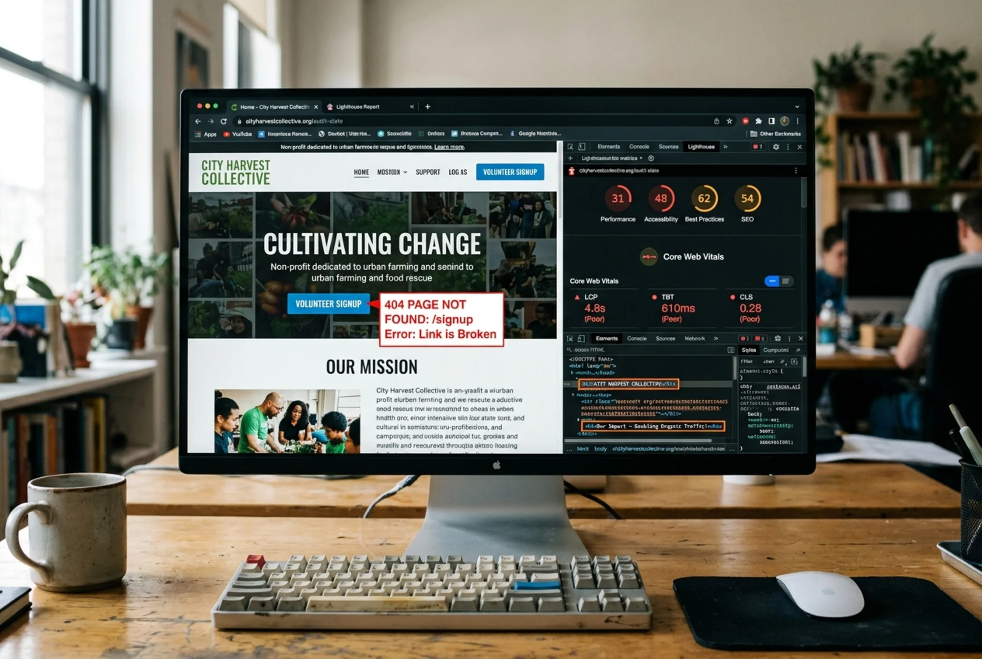
The homepage and the program pages were loading in 5–7 seconds on a mid-range Android phone. Largest Contentful Paint (LCP) was consistently over 4 seconds. Google's thresholds treat anything above 2.5 seconds as poor.
The culprit was familiar: a 2.4 MB hero image, an autoplaying background video on the homepage, and three web font families loaded synchronously.
2. Site structure was confused
The audit flagged 14 pages with duplicate or missing H1 tags, 31 broken internal links (mostly pointing to deleted blog posts), and a navigation menu that had grown to 11 top-level items.
Worse, the most important page on the site — the volunteer signup page — was three clicks deep from the homepage. The donation page was buried under a "Get Involved" dropdown that mobile users could barely tap.
3. The content was thin and unfocused
Twenty-two blog posts, most under 300 words, most written in 2020, most never updated. Page titles were things like "Our Newsletter" and "Big News!" Meta descriptions were either missing or identical across multiple pages.
Google's guidance on helpful content is explicit: pages should be created for people first, demonstrate first-hand experience, and provide substantial value. The non-profit's blog was failing that test on every dimension.
4. No structured data anywhere
The site had zero schema markup. No Article schema on the blog. No Organization schema on the homepage. No Event schema for their monthly food drives. Search engines were guessing what the pages were, and they were guessing wrong.
The plan they actually followed
Here's the part most case studies skip: the team had limited hours. The communications coordinator could give this maybe six hours a week. The executive director could approve changes but not write code. A volunteer developer could spend one Saturday a month.
So they ranked the audit's findings by impact and effort, then worked in two-week sprints.
Sprint 1: stop the bleeding (weeks 1–2)
- Replaced the 2.4 MB hero image with a 180 KB compressed WebP version
- Removed the autoplaying background video entirely
- Cut the web fonts down to one family with two weights
- Fixed all 31 broken internal links by redirecting or updating them
That single sprint dropped homepage LCP from 4.6 seconds to 2.1 seconds. Mobile bounce rate fell from 74% to 58% within two weeks.
Sprint 2: rebuild the structure (weeks 3–4)
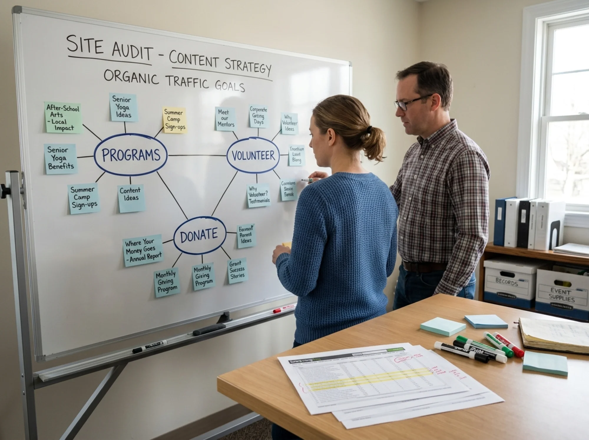
Navigation got collapsed from 11 items to 5: Programs, Volunteer, Donate, About, Contact. Everything else became a footer link or moved under a clear parent page.
The volunteer signup page moved to one click from the homepage, with a prominent button on every page. The donate button moved out of a dropdown and into the main navigation as a visually distinct call-to-action.
Every page got a unique H1, a unique title tag, and a hand-written meta description. This took the communications coordinator about eight hours total, working from a spreadsheet.
Sprint 3: fix the content (weeks 5–10)
They didn't write 22 new blog posts. They did something smarter.
They picked the five blog posts that were already getting any organic traffic at all. For each one, they:
- Expanded the post to 800–1,200 words
- Added a clear takeaway section at the top
- Added two or three internal links to the relevant program page
- Updated the publish date and added a "last reviewed" note
- Added one original photo from a real program event
They deleted twelve outdated announcement posts, redirecting them to the most relevant program page. The remaining five went on a "to-be-reviewed" backlog.
Sprint 4: add structured data (weeks 11–12)
The volunteer developer added Organization schema to the homepage with the non-profit's name, logo, address, and social profiles. Article schema went on every blog post following Google's published guidelines. Event schema went on the monthly food drive page.
Within six weeks, the food drive event was showing up in Google's event-rich results. That single change drove a measurable lift in event signups.
What changed in six months
Numbers, six months after the audit:
- Organic visits: 1,800/month → 3,700/month
- Average position for main service terms: 38 → 16
- Mobile bounce rate: 74% → 49%
- Donation conversion rate: 0.4% → 1.1%
- Volunteer signups per month: roughly tripled
The traffic doubling matters less than the conversion lift. Doubling traffic to a broken page is a vanity metric. Doubling traffic to a page that now converts at nearly three times the previous rate is real income for the mission.
The executive director's summary, when she briefed the board: "We didn't get more famous. We just got easier to use, easier to find, and easier to understand."
A mini-checklist you can run this week
If you're staring at your own small site wondering where to start, here's a compressed version of what worked:
Performance
- Check your largest images. Anything over 300 KB on a key landing page is a candidate for compression.
- Look for autoplaying video, hero carousels, and big embedded widgets. They almost always hurt more than they help.
- Run a Lighthouse report from Chrome DevTools. Note the LCP and CLS scores.
Structure
- Count your top navigation items. If it's more than seven, you have too many.
- Click from your homepage to your most important conversion page. If it takes more than two clicks, that's a problem.
- Look for duplicate H1s, missing meta descriptions, and broken links.
Content
- Find your five blog posts with any organic traffic. Expand and update them.
- Delete or redirect outdated announcements that no longer serve a reader.
- Make sure every page has a unique title and meta description written for a human.
Markup
- Add Organization schema to your homepage.
- Add Article schema to your blog posts.
- If you run events, add Event schema. The rich results are worth the effort.
This isn't an exhaustive list. It's the 20% that produced 80% of the results for this non-profit, and it'll do the same for most small sites.
What the team would do differently
Two regrets came out of the post-mortem.
First, they wished they had set up Google Search Console properly before they started. It was installed, but nobody was reading it. A clean baseline of clicks, impressions, and average position for the month before changes would have made the after-picture sharper.
Second, they over-invested in one big blog post in month three that targeted a high-volume keyword they couldn't realistically rank for. Three weeks of writing for zero traffic. The lesson: start with terms where you have a realistic shot, not the terms you wish you could win.

Why this works for non-profits specifically
Non-profit sites have a structural advantage most small businesses don't: people genuinely want to help. The friction is almost always technical, not motivational. When someone Googles "food bank volunteer near me" and lands on a page that loads fast, says clearly what you do, and has a one-click signup form, they sign up.
The audit didn't create demand. It removed the obstacles between existing demand and the action that mattered.
If you run a non-profit site — or any small site where the goal is to convert real human intent into real human action — an audit is the cheapest experiment you can run. It tells you what to fix, in what order, with what payoff.
Run your own audit
You don't need a $5,000 agency engagement to find these problems. You need an honest look at what your site is doing and what it isn't.
Run a free website audit with FreeSiteAudit and get the same kind of report this non-profit acted on. If you operate in the non-profit space, the non-profit site checklist walks through the patterns we see most often. If the audit flags performance issues, the Core Web Vitals fix guide explains each metric in plain English with concrete remedies. And if your internal links are a mess like this team's were, the internal linking guide is a good next stop.
The non-profit in this story didn't have unusual talent or unusual luck. They had a clear list and the patience to work it. That's a strategy any small operator can copy.
Sources
Check your website for free
Get an instant score and your top 3 critical issues in under 60 seconds.
Get Your Free Audit →