How a SaaS Startup Cut Bounce Rate by 40% With a Site Audit
A plain-English case study showing how one B2B SaaS startup used a website audit to find the real reasons visitors were leaving — and how they fixed them.
# How a SaaS Startup Cut Bounce Rate by 40% With a Site Audit
Most SaaS founders know their bounce rate is too high. They just don't know why. The analytics dashboard says "71% of visitors leave from your homepage" and that's the end of the story. No reason. No fix. Just a number that nags at you every Monday morning.
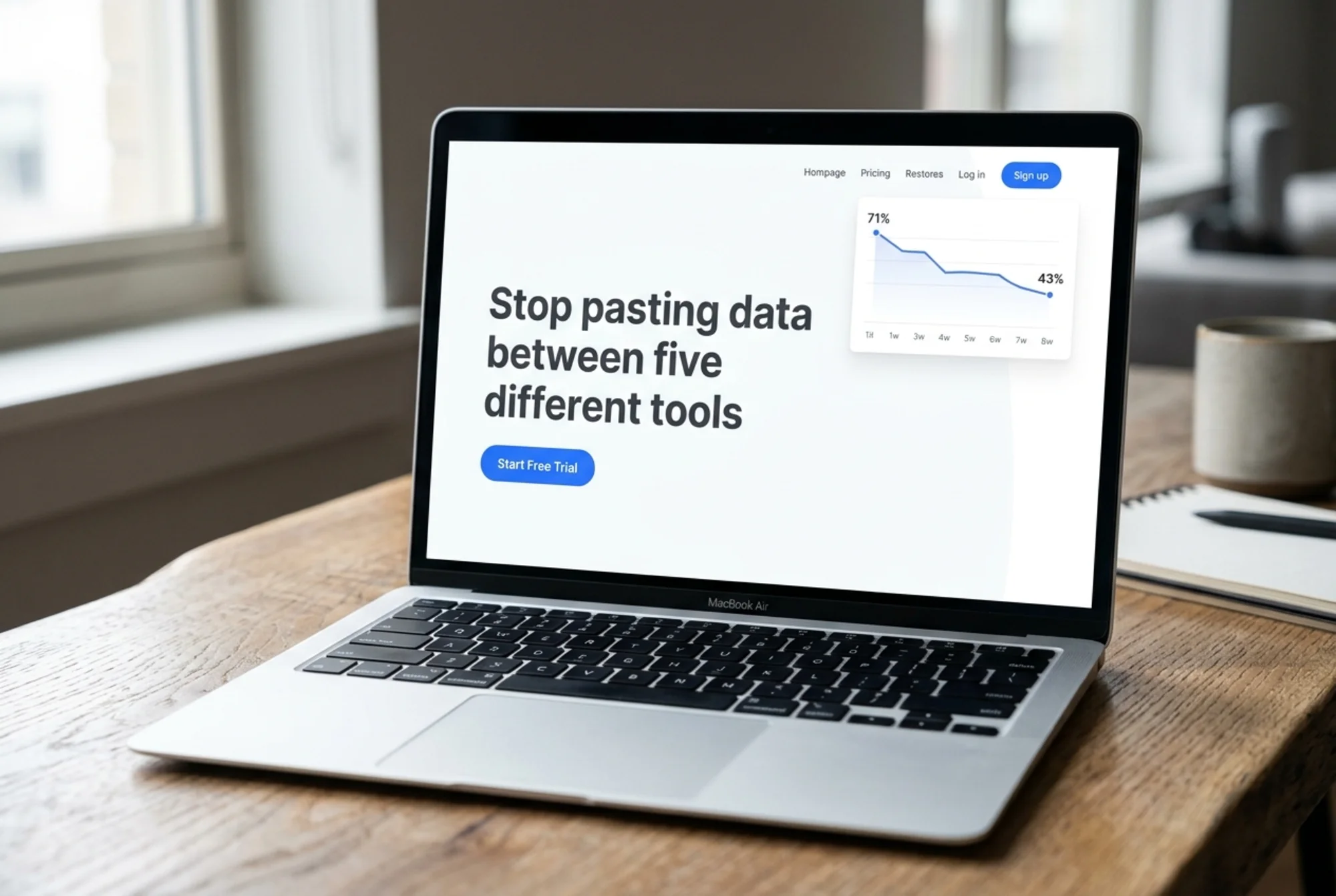
This is a walkthrough of how one small B2B SaaS startup — five people, pre-Series A, selling a workflow tool to operations teams — cut their homepage bounce rate from 71% to 43% in eight weeks. They didn't redesign the site. They didn't hire an agency. They ran a website audit, fixed the five things it surfaced, and watched the numbers move.
Names and specifics have been changed, but the audit findings, the fixes, and the order they did them in are exactly what happened.

The starting point: a bounce rate that wouldn't budge
The startup — we'll call them Pipevault — had been live for about 14 months. They were getting around 8,000 organic visits a month, mostly from blog content and a handful of comparison pages. Conversion to free trial was sitting at 1.2%. Not catastrophic. Not good.
Their analytics looked like this:
- Homepage bounce rate: 71%
- Average time on page: 14 seconds
- Pricing page bounce rate: 64%
- Blog → homepage click-through: 3.1%
The founder kept asking the same question: are we getting the wrong traffic, or are we losing the right traffic? She suspected the second, but had no evidence either way. The team had spent two months tweaking ad copy and rewriting the headline. Nothing moved.
That's when they decided to stop guessing and run a full website audit.
What the audit actually surfaced
A website audit isn't magic. It crawls your site, runs it against a set of rules (performance, accessibility, SEO, content clarity, technical errors), and tells you what's broken or weak. The value isn't in the score — it's in the prioritized list of things you can actually fix.
Pipevault ran a free audit, and the report came back with 47 issues. Most were minor (missing alt text on three images, a slightly oversized hero image). Five issues were marked critical or high, and these are the ones that mattered:
- Largest Contentful Paint (LCP) on homepage: 4.8 seconds. Google considers anything over 2.5 seconds poor. Mobile visitors were staring at a half-loaded page for nearly five seconds.
- Hero section had no clear value proposition above the fold. The audit flagged that the headline used internal jargon ("orchestrate your ops stack") and the primary CTA button was below the fold on most laptop screens.
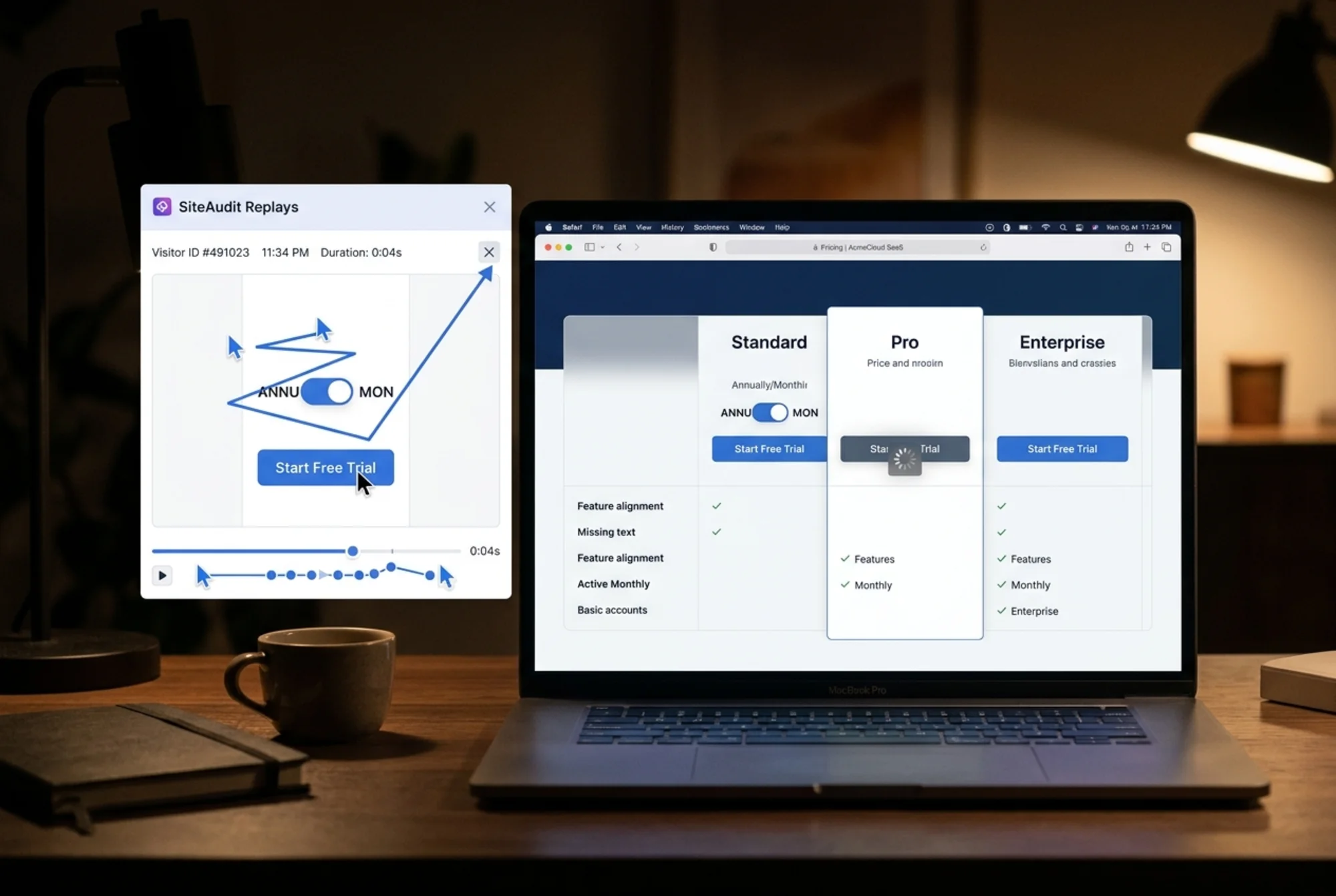
- Pricing page had a broken JavaScript widget. The pricing toggle (monthly/annual) was failing silently on Safari, leaving the page looking empty for roughly 18% of visitors.
- Mobile tap targets too small. The nav menu collapsed into a hamburger, but the "Start Free Trial" button shrank to 28px tall — below the 44px minimum recommended for touch.
- No structured data on blog posts. Blog traffic was significant, but posts weren't eligible for rich results in search, which depressed click-through from search.
None of this was glamorous. None of it required a redesign. All of it was fixable in a sprint.
The walkthrough: what they fixed, in what order
Here's the part most case studies skip — the actual sequencing. Pipevault's team was small and busy, so they couldn't do everything at once. They picked fixes based on two questions: how much will this move the needle? and how cheap is this to do?
Week 1–2: Fix the page speed
LCP was the obvious priority. The audit pointed to two specific culprits: a 1.4MB hero image and a render-blocking JavaScript file from an analytics tool loaded in the .
What they did:
- Replaced the hero image with a properly sized, compressed WebP version (down to 84KB)
- Moved the analytics script to load asynchronously
- Added
preconnecthints for their CDN and font provider
LCP dropped from 4.8s to 1.9s. Core Web Vitals are part of Google's page experience signals, and the web.dev guidance on Vitals explains why these thresholds matter.
For a deeper walkthrough of LCP fixes specifically, our guide on Core Web Vitals fixes covers the common culprits in more detail.
Week 3: Rewrite the hero
This was the cheapest fix and probably the highest-impact one. The original hero said:
> Orchestrate your ops stack with intelligent workflow automation
>
> Pipevault unifies your disparate tools into a single source of truth.
The audit flagged this as low-clarity. The team did a 30-minute exercise: write what the product does in one sentence, as if explaining it to a friend's parent. The new hero said:
> Stop pasting data between five different tools
>
> Pipevault connects your sales, support, and finance apps so updates flow automatically. No more copy-paste at month-end.
They also moved the "Start Free Trial" button up by 80px so it sat above the fold on a standard laptop screen. Google's helpful content guidance is explicit about this: pages should clearly demonstrate what the user is going to get, in language they actually understand.
A short above-the-fold checklist they used:
- One sentence describing what the product does, in customer language
- One sentence describing the outcome (not the feature)
- One primary CTA, visible without scrolling on a 13" laptop
- A piece of social proof (logo strip, user count, or single quote)
For more on this, see above-the-fold optimization.
Week 4: Fix the broken pricing widget and mobile tap targets
The pricing toggle bug was a simple JavaScript error caught by the audit's browser checks. A developer fixed it in about 45 minutes. The mobile tap target issue was a CSS fix — bumping button padding so the "Start Free Trial" button hit 48px on mobile.
Mobile-specific bounce on the pricing page dropped from 78% to 51% over the following two weeks. The team had no idea Safari users were seeing a broken page. The audit caught what their own QA hadn't.
Week 5–6: Add structured data to blog posts
This one wasn't directly about bounce rate — it was about getting more qualified traffic. The blog was getting visits, but click-through from search was weak because posts didn't have Article structured data, so they were missing rich result eligibility (author, date, image).
The team added Article schema to all blog templates. Click-through from search on blog posts went up about 18% over the next month, and blog-to-homepage flow improved as a result.
Week 7–8: Watch and adjust
This is the part founders skip and then wonder why nothing sticks. Pipevault didn't ship and move on. They watched the analytics weekly for two weeks, looking for:
- Did bounce rate hold, or was the drop a fluke?
- Did time-on-page increase too, or did people leave just as fast — they just took slightly longer to do it?
- Did free trial signups actually go up, or did the bounce rate drop without conversion improvement?
All three checks came back positive. Time on page rose from 14 to 38 seconds. Free trial conversion moved from 1.2% to 1.9%. Bounce rate landed at 43%.

Why this worked (and why most audit attempts don't)
Three things made this work that are worth calling out, because they're the difference between an audit that gets results and an audit that gets filed in a Drive folder forever.
They didn't try to fix everything. The report flagged 47 issues. They fixed 5. The other 42 were minor — alt text, a missing meta description on a help doc, an unoptimized favicon. Those things matter eventually, but they don't move bounce rate this week. If you treat an audit as a to-do list, you'll burn out by issue 12.
They tied each fix to a metric. Every fix had a number they expected to move. LCP → bounce rate. Hero rewrite → time on page. Pricing widget → mobile pricing conversion. When a fix didn't move its metric, they revisited it. When it did, they kept going.
They didn't redesign. This is the temptation every time a founder looks at their site. "Maybe we just need a whole new homepage." Redesigns are slow, expensive, and you lose your existing baselines. Pipevault changed maybe 200 lines of code and 60 words of copy. That's it.
A mini-checklist if you're in the same spot
If your bounce rate is stuck and you're trying to figure out where to start, here's a compressed version of what Pipevault did. Work through it in order:
- Run a website audit. Look specifically for: LCP over 2.5s, render-blocking scripts, missing or weak above-the-fold content, broken interactive elements, mobile tap targets under 44px.
- Open your homepage on a phone, on a 4G connection. Count the seconds until you can actually read the headline. If it's more than 3, you have a performance problem, full stop.
- Read your hero out loud to someone outside your industry. If they can't tell you what the product does in one try, the hero is the bottleneck.
- Check your pricing page on Safari and Firefox, not just Chrome. Cross-browser bugs are invisible until they're not.
- Look at mobile-specific bounce, not just overall. Most SaaS B2B traffic is desktop, but mobile bounce is often 15–20 points higher and pulls the average up.
- Pick the top 3 critical issues, fix them, then re-measure for two weeks. Don't ship 20 changes at once — you won't know what worked.
What this case study isn't
A few honest caveats, because case studies usually skip these.
This worked for a B2B SaaS with a clear value proposition and an existing audience. If your traffic is wrong — for example, you're getting clicks from an ad campaign targeting the wrong keywords — no audit will fix that. The audit assumes your visitors want what you're selling and just can't tell what it is or can't access it.
A 40% bounce rate drop is also at the high end. Pipevault had room to move because their site had real, fixable problems. If you've already done the basics — fast site, clear hero, working pages — an audit will surface smaller, more incremental wins. That's fine. A 5% bounce rate improvement on 50,000 monthly visits is still 2,500 more people staying on your site.
And finally: bounce rate is a signal, not a goal. The reason Pipevault cared about it was that high bounce was a proxy for "people who could be customers are leaving without seeing what we do." If your bounce is high because people get the answer they need from your homepage and leave (think: a contact page or a single-FAQ landing page), that's a different conversation.
Run an audit on your own site
If you've read this far, the next step is obvious. You don't need an agency, you don't need a redesign, and you don't need a fancy tool. You need a list of what's actually broken on your site, prioritized by impact.
You can run a free website audit on FreeSiteAudit in about two minutes. It'll check your Core Web Vitals, content clarity, structured data, mobile usability, and broken elements — the same categories that surfaced Pipevault's five fixes. If you run a SaaS specifically, our industry guide for SaaS sites covers the patterns we see most often.
You'll probably get a longer list than you expected. That's normal. Focus on the critical issues first, fix them in a sprint, measure for two weeks, and repeat. Pipevault did it in eight weeks with five people. You can do it too.
Sources
Check your website for free
Get an instant score and your top 3 critical issues in under 60 seconds.
Get Your Free Audit →