How to Audit Navigation and Information Architecture (Plain-English Guide)
Learn how to audit your website's navigation and information architecture in plain English—spot confusing menus, fix broken paths, and guide visitors to action.
# How to Audit Navigation and Information Architecture
Most small business websites lose customers not because the product is bad, but because people can't find what they came for. They land on your homepage, scan the menu for something familiar, and if it's not obvious in about three seconds, they leave.
Navigation and information architecture (IA) is the structure underneath your site. Navigation is what people click on. IA is how your pages are grouped, named, and connected. When either one is off, traffic doesn't convert, search engines get confused, and your support inbox fills up with questions that should have been answered by a page nobody could find.
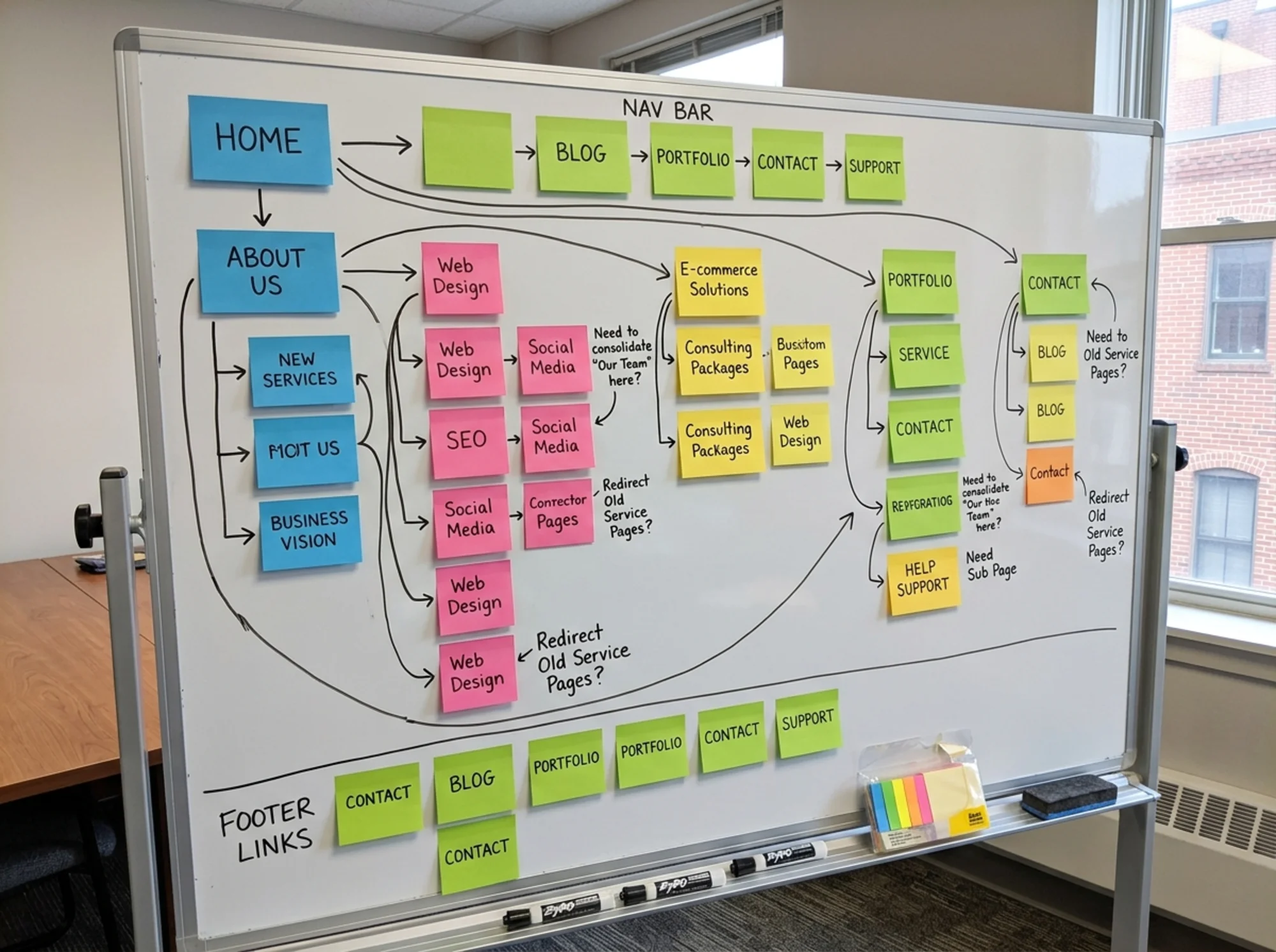
You don't need a UX degree to audit this. You need a list of pages, a clear head, and about an hour. This guide walks through exactly how.

Why navigation matters more than design
Google's guidance on helpful content says people should be able to find the information they need without effort. If a visitor has to think about where to click, you've already lost half of them.
Three things break when navigation is bad:
- Conversions drop. People can't reach the pricing page, the contact form, or the product they wanted.
- SEO suffers. Search engines use your internal links to understand which pages matter. Bad structure means important pages get less authority.
- Trust erodes. A confusing site feels unprofessional, even when the content is excellent.
A clean structure does the opposite. It tells visitors "we understand what you need" before they read a single word.
The five-part navigation audit
Here's the framework. Each part takes 10 to 20 minutes.
1. List every page
Open a spreadsheet. Make three columns: URL, current menu location, and purpose.
Then go through your site and list every page that exists — not just what's in the menu. Old landing pages, blog posts, the legacy "About the Founder" page from 2022, the half-finished services page.
You'll usually find one of two problems:
- Orphan pages: pages that exist but aren't linked from anywhere in the navigation.
- Duplicate pages: two pages doing almost the same job (e.g., "Services" and "What We Do").
Mark both. Orphans need a home or a redirect. Duplicates need a decision: merge or kill.
2. Test the menu out loud
Read your menu labels out loud, one by one. Then ask: "Would a brand new visitor know exactly what's behind this link?"
Common label problems on small business sites:
- Jargon: "Solutions" instead of "Services" or "Products"
- Cute names: "The Lab" instead of "Blog," "Our Tribe" instead of "Team"
- Vague nouns: "Resources" that contains case studies, blog posts, white papers, and pricing calculators all mixed together
- Too many labels: Seven or more top-level items, which makes the menu feel like a content dump
A clear menu uses words your customers would use. If you sell accounting services, "Bookkeeping" beats "Financial Optimization." If you run a bakery, "Order a Cake" beats "Custom Confectionery."
3. Check the three-click rule (loosely)
The old rule says any page should be reachable in three clicks. Don't treat it as gospel, but use it as a smell test.
Pick your five most important pages:
- Homepage
- Main service or product
- Pricing
- Contact
- Whichever blog post or case study brings the most traffic
For each one, count the clicks from the homepage. If anything important takes four or more, your structure is hiding it.
4. Audit the footer
Footers are where small businesses dump everything they couldn't fit in the header. That's fine, but it should still be organized.
A good footer has clear groups:
- Company (About, Team, Careers, Contact)
- Product or Services (with specific offerings)
- Resources (Blog, FAQ, Help)
- Legal (Privacy, Terms, Refund Policy)
A bad footer is a 40-link soup of every page on the site, alphabetized or in random order. If your footer looks like that, group it.
5. Check breadcrumbs and internal links
Breadcrumbs are the small trail at the top of a page ("Home > Services > Web Design"). They help users orient themselves and they help Google understand your hierarchy.
If you have more than two levels of pages (parent category, then child pages), you almost certainly need breadcrumbs. Most modern themes can turn them on with a toggle.
Internal links inside content matter too. Every blog post should link to at least one service page or related article. Every service page should link to relevant case studies or pricing. If your content lives in isolated silos, both readers and search engines struggle.

A real walkthrough: a plumbing company website
Let's run the audit on a typical example: a local plumbing business with a website built three years ago and edited piecemeal ever since.
Current top menu: Home | About | Solutions | Resources | Get In Touch | Blog | Emergencies
Page list reveals:
- 4 service pages (Repair, Installation, Drain Cleaning, Water Heaters), all buried under "Solutions"
- 2 "About" pages (one with team, one without — duplicates)
- A "Resources" page that contains 3 PDF downloads and the FAQ
- An orphan landing page from a 2024 promo, still indexed by Google
- 17 blog posts, none linked from any service page
Problems found:
- "Solutions" is jargon. Visitors looking for a plumber don't think "I need a solution."
- "Get In Touch" is two words longer than "Contact" and means the same thing.
- "Emergencies" in the top nav is actually good for a plumber. Keep it.
- Service pages are three clicks deep (Home → Solutions → Repair). They should be one.
- Blog posts are isolated from service pages, which hurts SEO for both.
- The orphan landing page is still ranking but going nowhere useful.
Recommendations:
- Rename "Solutions" to "Services" and expose the four service pages as a dropdown.
- Rename "Get In Touch" to "Contact."
- Merge the duplicate About pages, redirect the old URL.
- Add a "Related Services" block to each blog post.
- 301-redirect the orphan landing page to the matching service page.
- Add breadcrumbs.
New menu: Home | Services (with 4 children) | About | Blog | Contact | Emergencies
Six items, all clear, and every important page is one click from home.
Common navigation mistakes to avoid
After auditing hundreds of small business sites, the same mistakes appear:
Hiding the contact page. If you want customers to call or email, "Contact" needs to be in the top nav, not buried in the footer.
Letting cart or login icons compete with content. Icons in the nav should be small, clear, and never the largest thing on the screen.
Mega-menus on a 10-page site. If you have eight services, a dropdown is fine. If you have three services and a blog, just list them flat.
Sticky headers that cover the page. A sticky nav is useful, but it should be thin. If it covers a third of the screen on mobile, kill the stickiness on smaller viewports.
Inconsistent menu order across pages. The menu should be identical on every page. If "About" is second on the homepage and fifth on the blog, fix it.
Hamburger menus on desktop. Hiding the navigation behind a single icon on a large screen is a measurable conversion killer. Only use the hamburger on mobile, where space forces it.
A mini-checklist you can use today
Print this and run through it once a quarter:
- [ ] Every page on the site has a single, obvious place in the navigation
- [ ] No orphan pages (every page is linked from at least one menu or content area)
- [ ] No duplicate pages doing the same job
- [ ] Menu labels use customer words, not internal jargon
- [ ] Top nav has 4 to 7 items
- [ ] Important pages (services, pricing, contact) are one click from home
- [ ] Contact is in the top nav, not just the footer
- [ ] Footer is grouped into clear sections
- [ ] Breadcrumbs appear on any page deeper than two levels
- [ ] Every blog post links to at least one service or product page
- [ ] Every service page links to at least one case study or supporting content
- [ ] Mobile menu is tested on an actual phone, not just a desktop preview
If you check off every box, your structure is probably solid. If three or more are unchecked, you have measurable money on the table.
Information architecture beyond the menu
The menu is the visible layer. Underneath it, your IA also includes:
URL structure. URLs like /services/plumbing-repair are better than /page-id-47. Clean URLs help users (they can guess what's there) and help search engines (they signal hierarchy).
Category and tag systems. If you have a blog, your categories should match what visitors actually search for. Five clear categories beats 30 random tags. Most small business blogs use way too many tags and zero categories.
Search functionality. If you have more than 30 pages, add a search bar. If you have a blog with more than 50 posts, you need one. Make sure it actually returns useful results.
Related content links. At the bottom of every blog post, link to 3 related posts. At the bottom of every service page, link to relevant case studies or testimonials. These small in-content links carry a lot of weight for both UX and SEO.
How navigation affects performance
There's a less obvious side to this audit: navigation affects how fast your site loads.
Mega-menus with images, large dropdown JavaScript files, animated hamburger transitions, and third-party search widgets all add weight. Google's Core Web Vitals measure how fast your largest content paints and how stable your layout is during load. A heavy navigation bar can push both metrics into the red.
When auditing, check whether your menu is:
- Loaded as plain HTML and CSS (good)
- Dependent on a heavy JavaScript library (often slow)
- Pulling in images or icons that aren't optimized (fixable)
If your menu adds 200ms to your load time on mobile, simplify it.
When to rebuild vs. when to fix
Sometimes an audit reveals that the structure isn't fixable with small edits. Signs you need a rebuild rather than tweaks:
- More than 30% of your pages are orphans or duplicates
- Your top-level menu has more than 10 items and none can be cut
- You're on a CMS where reorganizing means recreating every page
- Your URL structure is fundamentally messy (mixed slugs, IDs, dates)
For most small businesses, though, the answer is editing, not rebuilding. Rename three menu items. Redirect five orphan pages. Add breadcrumbs. Group the footer. That's usually enough.

Run a free audit to see your structure clearly
A navigation audit done by hand is valuable, but it's slow. And it's easy to miss problems on your own site because you already know where everything is — you have to imagine being a first-time visitor.
That's where an automated audit helps. FreeSiteAudit scans your site, maps your link structure, flags orphan pages, identifies broken internal links, and surfaces UX issues that affect conversion and SEO. You get a clear, prioritized list of what to fix, written in plain English.
Run a free audit on your site and see exactly how your navigation and information architecture stack up. The free report covers structural issues, page-by-page recommendations, and the biggest wins you can make this week.
If you've already run an audit and want help acting on it, browse the fixes library for step-by-step guides on the most common navigation, IA, and conversion problems.
Most small business websites are one short audit and three small changes away from being significantly easier to use. The hard part isn't the work — it's noticing what to look at. That's what this checklist is for.
Sources
- https://developers.google.com/search/docs/fundamentals/creating-helpful-content
- https://developers.google.com/search/docs/appearance/structured-data/article
- https://web.dev/articles/vitals
Check your website for free
Get an instant score and your top 3 critical issues in under 60 seconds.
Get Your Free Audit →