How to Format Comparison Pages for AI Search and Buyer Intent
Learn how to structure comparison pages so AI search tools and real buyers both find clear, trustworthy answers — with tables, schema, and honest verdicts.
# How to Format Comparison Pages for AI Search and Buyer Intent
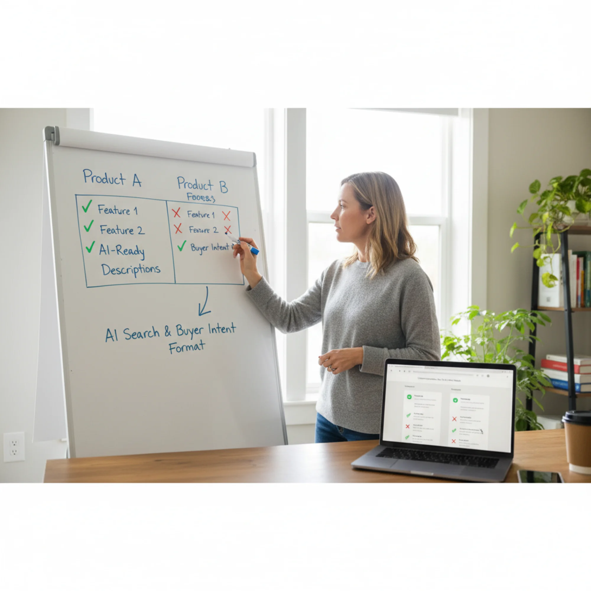
Comparison pages are some of the most valuable pages on a small business website. When someone searches "X vs Y" or "best [product] for [use case]," they are close to a buying decision. They want clear answers, not marketing copy.
The problem is that most comparison pages are formatted in ways that neither AI search tools nor human buyers can use well. They bury the actual comparison in long paragraphs, skip important details, or lean so hard into selling that the page loses credibility.
This guide covers how to format comparison pages so they work for AI-powered search (ChatGPT, Perplexity, Google AI Overviews) and real buyers who want honest, structured information before they spend money.
Why Comparison Pages Matter More Now
Two things have changed in how people find and evaluate businesses:
AI search tools summarize and cite pages directly. When someone asks an AI assistant "what's the difference between acrylic and gel nails," it pulls from pages with clear, structured answers. If your comparison page is a wall of promotional text, it gets skipped. If it has a clean table with specific details, it gets quoted.
Buyers expect faster answers. People scanning comparison pages on their phones do not read 3,000-word essays. They scroll to the table, check the key differences, and decide. If your page makes that hard, they leave.
Google's helpful content guidelines emphasize that pages should provide "a substantial, complete, or comprehensive description of the topic" and deliver value beyond the obvious. A comparison page that just says "we're the best" fails that test. One that gives honest, specific, structured detail passes it.
The Anatomy of a Good Comparison Page
A strong comparison page includes:
- A clear title that names both options — "Acrylic vs Gel Nails: Cost, Durability, and Maintenance Compared"
- A summary answer in the first paragraph — who should pick which option and why
- A structured comparison table — the core of the page
- Detailed sections for each comparison point — expanding on what the table shows
- A verdict or recommendation — honest, with caveats
- Sources or basis for claims — why should anyone trust this comparison
Start With a Direct Answer
AI search tools prioritize pages that answer the question quickly. Do not open with a history lesson or a paragraph about "in today's competitive landscape."
Bad opening:
> "Choosing the right option can be overwhelming. There are many factors to consider, and every business is different. In this article, we'll explore..."
Good opening:
> "Gel nails last 2–3 weeks and look glossy without chipping. Acrylic nails are stronger, last 3–4 weeks, and cost less per session. If your clients want low-maintenance shine, gel is the better fit. If they want durability and length, go with acrylic."
The good version answers the question immediately. An AI tool can extract and cite it directly. A human reader knows within five seconds whether to keep reading.
How to Write Your Summary
Ask yourself: "If someone only reads this one paragraph, do they have enough to make a preliminary decision?" If yes, your summary works.
Include:
- The key difference between the two options
- Who each option is best for
- One or two specific numbers (price, duration, a measurable outcome)
Build a Comparison Table That Machines Can Read
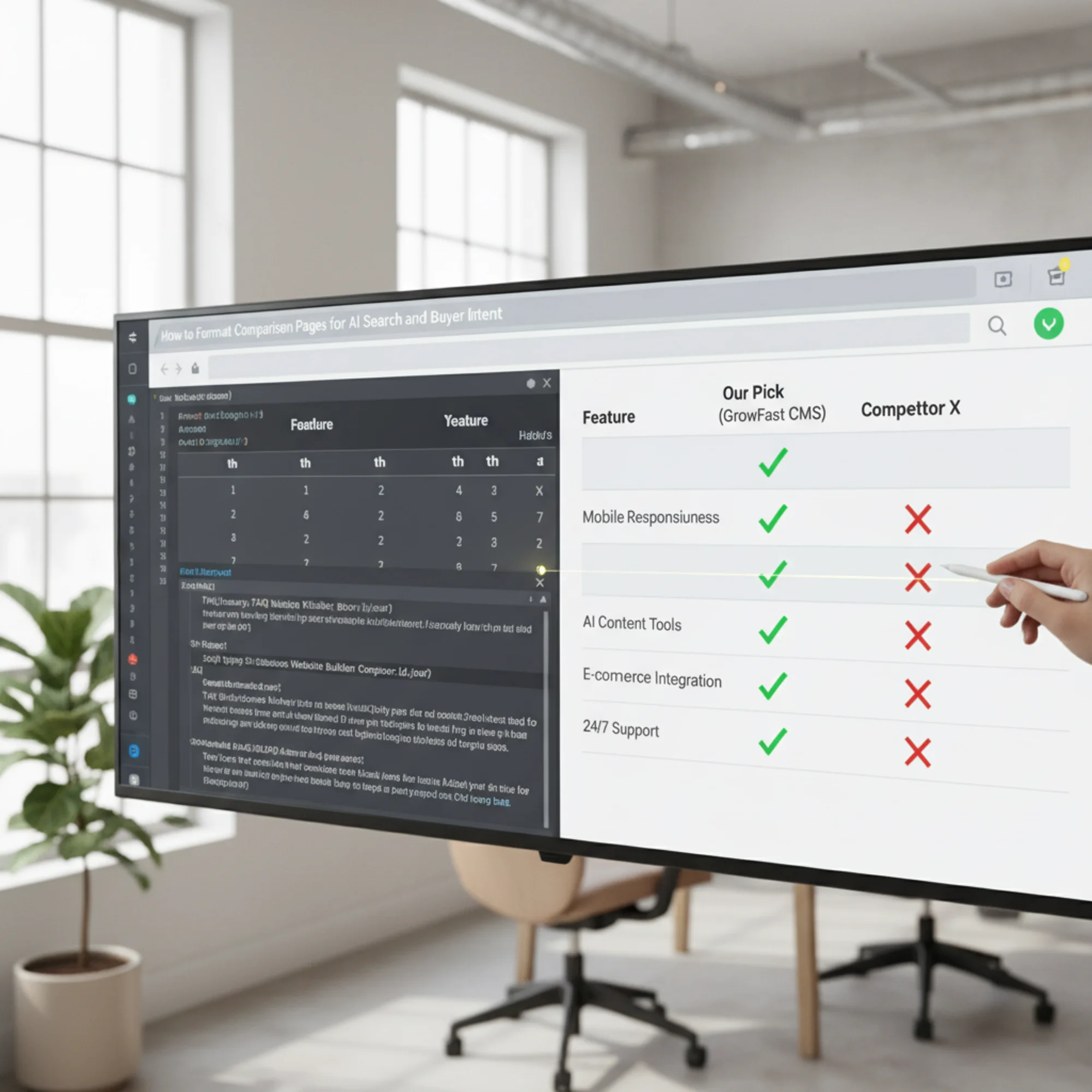
The comparison table is the most important element on the page. It is also the part most often done poorly.
What Makes a Table AI-Friendly
AI tools parse HTML tables well, but only when the tables are properly structured:
Use actual HTML tables, not images of tables. If your comparison is a screenshot or a graphic, AI tools cannot read it. Neither can screen readers. Use a real Use clear header rows. The first row should label the columns. Use One fact per cell. Do not cram paragraphs into table cells. Keep each cell to a single data point. Use consistent formatting. If one column uses "Yes/No," all columns should use "Yes/No" for that row. Do not mix "Yes," "Available," "Included," and "✓" for the same concept. Here is an example for a local dog grooming business comparing their service packages: That table is scannable, honest, and machine-readable. An AI assistant asked "does the basic groom include a haircut" can pull the answer directly. After the table, expand on the most important comparison points. Each point gets its own section with a clear heading. Use H2 or H3 headings that name the comparison point directly: Specific headings help AI tools understand what each section covers. They also help readers skip to the part they care about. For every comparison point you expand on, cover: Example: > Durability: How Long Each Option Lasts > > Acrylic nails typically last 3–4 weeks before needing a fill. Gel nails last 2–3 weeks before they start peeling at the edges. However, gel is less prone to breakage during the time it lasts, making it better for clients who work with their hands but want a polished look. Acrylic suits clients who want length and are willing to come in for regular fills. That paragraph is useful whether a human reads it or an AI summarizes it. Structured data helps search engines and AI tools understand your page. For comparison pages, two types of schema are most useful: Article schema tells search engines this is an editorial piece with an author, date, and topic. Google's structured data documentation for articles covers the required and recommended fields. FAQ schema works when your page answers common questions like "Which is cheaper?" or "Which lasts longer?" Wrapping those in FAQ schema can help them appear in search results and get picked up by AI tools. Here is a simplified example of FAQ schema for a comparison page: { "@context": "https://schema.org", "@type": "FAQPage", "mainEntity": [ { "@type": "Question", "name": "Which is cheaper, acrylic or gel nails?", "acceptedAnswer": { "@type": "Answer", "text": "Acrylic nails are typically cheaper, averaging $35–$50 per session compared to $45–$65 for gel." } } ] } You do not need to be a developer to add this. Most CMS platforms have plugins or fields for structured data. If yours does not, a freelancer can add it in under an hour. The verdict is where many comparison pages lose credibility. If you are comparing your product to a competitor, the temptation is to declare yourself the obvious winner. Readers and AI tools can both detect bias. A credible verdict includes: Example verdict for a pet grooming comparison: > "For most dog owners who visit every 4–6 weeks, the Full Groom package is the best value — it covers the essentials plus de-shedding, which reduces cleanup at home. The Basic Groom works well for short-haired breeds that just need a wash between seasonal trims. The Premium Spa is worth it for dogs with skin sensitivities or owners who want the full treatment before a special occasion." This matches each option to a real scenario instead of declaring the most expensive option "the best." Say you own a bakery and want to create a comparison page for "Custom Cakes vs. Cupcake Towers for Events." Title: Custom Cakes vs. Cupcake Towers: Which Is Better for Your Event? Summary: "Custom cakes create a dramatic centerpiece and work best for formal events like weddings. Cupcake towers are easier to serve, cost 15–20% less for the same guest count, and suit birthdays and corporate events. For events over 100 guests, cupcake towers also eliminate the need for a cake-cutting service." Write 2–3 sentences for each row that matters most to your customers. For this bakery, cost and serving ease are probably the biggest decision factors — give those sections specific detail with real numbers. "For weddings and milestone celebrations where presentation matters most, a custom cake is the way to go. For everything else — kids' birthdays, office parties, graduation open houses — cupcake towers give you more flexibility, easier serving, and a lower price. If you are not sure, we offer a free consultation where we walk through your event details and recommend the best fit." Before publishing, verify: A well-formatted comparison page that takes six seconds to load will not rank well and will not get cited by AI tools. Google's Core Web Vitals set the benchmarks: Largest Contentful Paint under 2.5 seconds, Interaction to Next Paint under 200 milliseconds, and Cumulative Layout Shift under 0.1. For comparison pages specifically, watch out for: Use this before publishing any comparison page: Content: Formatting: Technical: If you already have comparison pages on your site — or you are about to publish new ones — run a free audit with FreeSiteAudit to catch the technical issues that undermine even great content: slow load times, missing structured data, mobile formatting problems, and more. It takes less than a minute and gives you a clear picture of what to fix before those pages compete in AI-powered and traditional search. Get an instant score and your top 3 critical issues in under 60 seconds. element.
tags for headers, not just bold text in regular cells. Feature Basic Groom ($45) Full Groom ($75) Premium Spa ($110) Bath & dry Yes Yes Yes Haircut & styling No Yes Yes Nail trim Yes Yes Yes Teeth brushing No No Yes De-shedding treatment No Yes Yes Aromatherapy & paw balm No No Yes Session time 30 min 60 min 90 min Booking required No Yes Yes Common Table Mistakes

Structure Your Headings for Scannability
## Price Comparison: Acrylic vs Gel per Session## Let's Talk About Cost## Durability: How Long Each Option Lasts## The Durability FactorWhat Each Section Should Include
Add Schema Markup for Search Engines
Write an Honest Verdict
Walkthrough: Building a Comparison Page for a Local Bakery
Step 1: Write the Title and Summary
Step 2: Build the Table
Factor Custom Cake Cupcake Tower Cost (50 guests) $250–$400 $200–$325 Serving ease Needs cutting and plating Self-serve Visual impact High (centerpiece) Medium (stacked display) Flavor variety 1–2 flavors per cake Multiple flavors per tower Lead time needed 2–3 weeks 1–2 weeks Dietary accommodations Harder (one cake for all) Easier (mixed options) Best for Weddings, formal events Birthdays, corporate, casual Step 3: Expand Key Points
Step 4: Add the Verdict
Step 5: Check the Formatting
headers Page Performance Matters Too
table-layout: fixed
Quick-Reference Checklist
header cells Check Your Comparison Pages With a Free Audit
Sources
Check your website for free