Image Optimization Playbook: WebP, AVIF, srcset, and Lazy Loading
Image Optimization Playbook: WebP, AVIF, srcset, and Lazy Loading: practical guidance for small-business owners who want to audit SEO, speed, accessibility, and
# Image Optimization Playbook: WebP, AVIF, srcset, and Lazy Loading
Images account for roughly half the total weight of most web pages. According to the HTTP Archive, the median page now ships over 1 MB of images alone, and pages in the top quartile exceed 3 MB. If your site loads slowly, oversized or poorly formatted images are almost certainly the main reason.
This guide covers the four pillars of image optimization: modern formats (WebP and AVIF), responsive images with srcset, lazy loading, and a practical workflow that ties them together. Each section includes what to do, why it matters, and how to verify results. Whether you run a local bakery website or a 500-product ecommerce store, these techniques apply the same way.

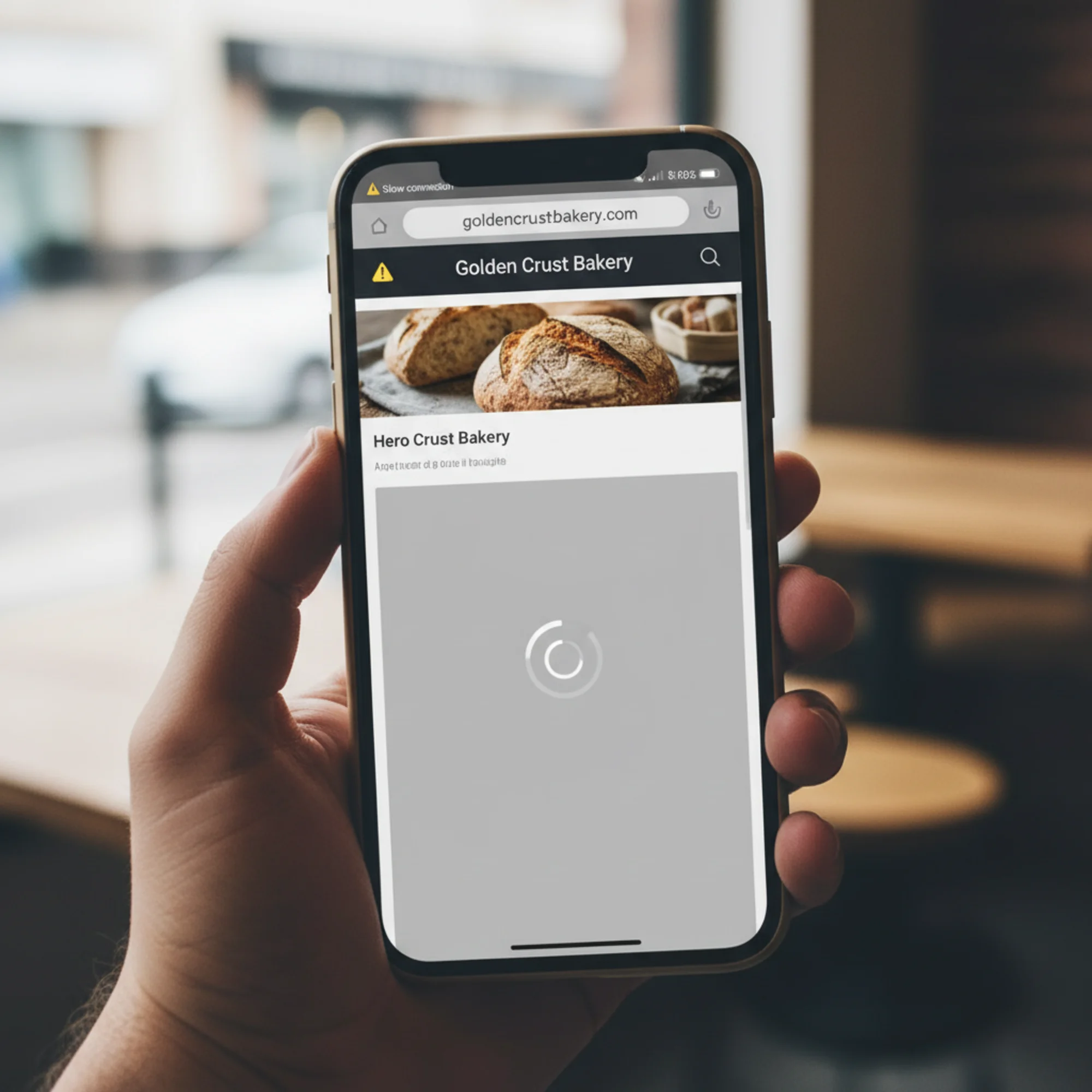
Why Image Optimization Matters for Your Business
When someone visits your website, their browser downloads every image on the page. If your homepage has a 3 MB hero banner, a visitor on a mobile connection might wait five or more seconds for that single image. During those seconds, they see either a blank space or a slowly painting rectangle, and many of them leave before it finishes.
Here is what that costs you:
- Slower page loads hurt conversions. Google research shows that as page load time increases from one to three seconds, the probability of a visitor leaving increases by 32 percent. At five seconds, that probability jumps to 90 percent.
- Core Web Vitals include image metrics. Largest Contentful Paint (LCP) frequently measures your biggest above-the-fold image. A slow LCP score can directly hurt your search rankings, because Google uses Core Web Vitals as a ranking signal.
- Mobile users get hit hardest. Over 60 percent of web traffic is mobile, and mobile connections are slower and more variable than broadband. Serving desktop-sized images to phones wastes bandwidth and frustrates visitors who are paying for data.
- Cumulative Layout Shift (CLS) is often caused by images. When an image loads without explicit width and height attributes, it pushes content around the page. Visitors click the wrong link or lose their reading position. Google measures this as CLS, and poor scores hurt rankings.
Image optimization is one of the highest-impact improvements you can make. You do not need to redesign your site. You do not need a developer on retainer. You need to serve the right images in the right format at the right size, and the techniques in this guide will show you exactly how.
Modern Image Formats: WebP and AVIF
Why Move Beyond JPEG and PNG?
JPEG was standardized in 1992. PNG arrived in 1996. Both still work, but both use compression methods that are now decades old. A JPEG photo that is 500 KB could be 250 KB as a WebP file with no visible quality difference. A PNG icon that is 200 KB might compress to 80 KB in WebP with identical appearance. That gap adds up fast when you have dozens of images per page.
The web has moved forward, and browsers have followed. Every major browser now supports at least WebP, and AVIF support is catching up rapidly.
WebP: The Practical Default
WebP is a format developed by Google that supports lossy and lossless compression, plus transparency (replacing PNG for many uses). It has been around since 2010 but only reached universal browser support when Safari added it in version 14, released in 2020. Today, WebP works everywhere your customers browse.
Key facts:
- Typically 25 to 35 percent smaller than equivalent JPEG at the same visual quality
- Supported by every major browser including Chrome, Firefox, Safari 14+, Edge, and all Chromium-based browsers
- Handles transparency (alpha channel), replacing PNG in most cases
- Supports animation, serving as a far more efficient alternative to GIF
- Encoding is fast, making it practical for on-the-fly conversion
When to use it: For nearly everything. Product photos, team headshots, blog images, background images, icons with transparency, even animated elements that currently use GIF. If you adopt only one modern format, make it WebP. You will immediately cut your image payload by roughly a third with no visible quality loss.
AVIF: Maximum Compression
AVIF is based on the AV1 video codec and compresses even further than WebP. In typical benchmarks, AVIF produces files 30 to 50 percent smaller than JPEG at equivalent visual quality, and often 20 percent smaller than WebP. For large, high-resolution photographs, the savings can be dramatic.
Key facts:
- Best compression available for web images today
- Supported in Chrome 85+, Firefox 93+, and Safari 16.4+
- Encoding is significantly slower than WebP, which matters if you generate images in real time
- Some older browsers and devices still lack support, making fallbacks essential
- Supports HDR and wide color gamut for future-proofing
When to use it: As your first-choice format when you can provide fallbacks. AVIF shines for large hero images, photo-heavy portfolio pages, and product photography where extra compression savings add up to hundreds of kilobytes. A 1.8 MB JPEG hero image might compress to 95 KB in AVIF — a savings that directly improves LCP.
Serving Both with Fallbacks
The HTML
html

width="1200" height="800">
The browser reads top to bottom. If it supports AVIF, it uses that. If not, it tries WebP. If neither works, it falls back to JPEG. Every visitor gets the best format their browser handles. There is no JavaScript involved, no user-agent sniffing, and no compatibility issues. This is the standard, reliable approach.
Format conversion checklist:
- [ ] Convert JPEG photos to WebP (and optionally AVIF)
- [ ] Convert PNG graphics with transparency to WebP
- [ ] Convert animated GIFs to animated WebP (often 80 percent smaller)
- [ ] Keep the original JPEG or PNG as a fallback in your
- [ ] Set quality to 75-80 for lossy WebP (visually identical to JPEG at 85-90)
- [ ] Set quality to 60-70 for AVIF (its perceptual quality holds up better at lower settings)
- [ ] Use lossless WebP only where every pixel matters (logos, screenshots with text, technical diagrams)
- [ ] Compare before and after visually — compression artifacts are easier to spot in some images than others
Tools for Converting Images
You do not need to be a developer to convert images. Tools range from free browser apps to fully automated CDN solutions:
- Squoosh (squoosh.app): Free browser-based tool from Google. Drag in an image, pick a format, adjust quality with a live side-by-side comparison, and download. Perfect for small batches.
- ShortPixel or Imagify: WordPress plugins that automatically convert uploads to WebP and serve fallbacks with the correct
- Cloudflare Polish or Cloudinary: CDN-level services that convert and serve modern formats automatically based on browser support. Best for high-traffic sites or those with large image libraries.
- Command line (cwebp and avifenc): For batch-converting entire directories. Useful if you manage hundreds of images and want scripted automation. A single command like
for f in *.jpg; do cwebp -q 78 "$f" -o "${f%.jpg}.webp"; doneconverts an entire folder. - Photoshop and GIMP: Both support WebP export. Photoshop requires a plugin for AVIF. Useful if your workflow already involves editing images before upload.
Responsive Images with srcset
The One-Size Problem
A hero image that is 2400 pixels wide looks great on a 27-inch monitor. But when someone visits on a phone with a 375-pixel screen, their browser still downloads the full 2400-pixel file and shrinks it to fit. That visitor downloaded four to six times more data than they needed, and the image looks no better than a properly sized 800-pixel version would.
This problem multiplies across your site. If every page has five to ten images and each one is oversized for mobile, you could be sending 5 MB of unnecessary data to over half your visitors. Responsive images with srcset solve this problem cleanly.
How srcset Works
The srcset attribute provides multiple sizes of the same image. The browser chooses the best one based on screen size, resolution, and even network conditions:
html

srcset="product-400.webp 400w,
product-800.webp 800w,
product-1200.webp 1200w,
product-1600.webp 1600w"
sizes="(max-width: 600px) 100vw,
(max-width: 1024px) 50vw,
33vw"
alt="Handmade ceramic coffee mug in sage green"
width="1600" height="1200">
- srcset lists available files and their pixel widths (the
wdescriptor) - sizes tells the browser how wide the image will display at different viewport breakpoints
- The browser picks the smallest file that still looks sharp for the visitor's screen
- The
srcattribute serves as the fallback for very old browsers that do not understand srcset
The sizes attribute in the example above says: on screens up to 600 pixels wide, the image fills the full viewport width. On screens up to 1024 pixels, it fills half. On larger screens, it fills a third. The browser uses this information, combined with the device pixel ratio, to pick the right file from srcset.

Combining picture and srcset for Full Optimization
You can use srcset for size selection together. This is the gold standard for image delivery:
html
hero-2400.avif 2400w"
type="image/avif" sizes="100vw">
hero-2400.webp 2400w"
type="image/webp" sizes="100vw">

srcset="hero-800.jpg 800w,
hero-1200.jpg 1200w,
hero-2400.jpg 2400w"
sizes="100vw"
alt="Handmade ceramic collection on a rustic wooden shelf"
width="2400" height="1600">
The browser first picks the format it supports best (AVIF, then WebP, then JPEG), then picks the right size within that format. A mobile visitor on Chrome gets an 800-pixel AVIF. A desktop visitor on an older Safari gets a 1200-pixel WebP. Every visitor gets the optimal combination.
Real Example: Optimizing a Product Page
Say you run an online store selling handmade ceramics. Your product page has a hero banner, four product thumbnails, and a lifestyle photo.
Before optimization:
- Hero: 2400 × 1600 JPEG — 1.8 MB
- Each thumbnail: 1200 × 1200 JPEG — 450 KB
- Lifestyle photo: 2000 × 1333 JPEG — 1.2 MB
- Total: 4.8 MB
After optimization with
Thumbnails (displayed at 300px in the grid):
html

srcset="mug-01-300.webp 300w,
mug-01-600.webp 600w"
sizes="(max-width: 600px) 50vw, 300px"
alt="Sage green ceramic mug"
width="600" height="600"
loading="lazy">
Mobile visitor results:
- Hero: 800px AVIF → ~95 KB (from 1.8 MB)
- Each thumbnail: 300px WebP → ~18 KB (from 450 KB)
- Lifestyle photo: 800px AVIF → ~80 KB (from 1.2 MB)
- Total on mobile: ~247 KB (from 4.8 MB — a 95 percent reduction)
That is not a theoretical number. A 95 percent reduction in image weight is entirely achievable when you combine format conversion with responsive sizing. The visual quality remains identical to the visitor — the only difference is speed.
srcset Checklist
- [ ] Generate 3-4 sizes for each image (400, 800, 1200, and original width)
- [ ] Include a
sizesattribute so the browser can choose correctly - [ ] Include
widthandheightattributes on every - [ ] Write descriptive
alttext for every image - [ ] Test on mobile using Chrome DevTools Network tab (filter by "Img") to confirm smaller files load
- [ ] Verify with a throttled connection (DevTools lets you simulate 3G) that the page still loads acceptably
Lazy Loading: Only Load What Visitors See
By default, browsers download every image on a page immediately, even the ones far below the fold that visitors may never scroll to. On a page with 20 product images, a visitor who only views the top four still downloads all 20. Lazy loading tells the browser to fetch images only when they are about to scroll into view.
Native Lazy Loading
Modern browsers support lazy loading with a single HTML attribute:
html

alt="Blue ceramic bowl"
width="600" height="400"
loading="lazy">
One attribute. No JavaScript library. No Intersection Observer code. The browser handles the rest, typically starting the download when the image is roughly 1250 pixels (or a few viewport heights) from the visible area, giving it time to load before the visitor scrolls to it.
Rules for lazy loading:
- Never lazy load above-the-fold images. Your hero image and header logo should load eagerly (the default behavior). Lazy loading them delays LCP because the browser waits until layout to decide to fetch them.
- Lazy load everything below the fold. Product grids, blog images, testimonial photos, footer logos, partner badges — anything the visitor has to scroll to see.
- Always include width and height. Without explicit dimensions, the browser cannot reserve space for the image. When the image eventually loads, everything below it jumps down. That layout shift hurts your CLS score and frustrates visitors trying to read or click.
- Use
loading="eager"explicitly on critical images. While eager loading is the default, being explicit makes your intent clear and prevents accidental lazy-loading if someone later adds a blanket lazy-loading rule.
Quick Reference
| Image Type | Lazy Load? | Reason |
|---|---|---|
| Hero banner | No | Above the fold, directly affects LCP |
| Header logo | No | Above the fold, small file anyway |
| Product grid below fold | Yes | Not immediately visible to visitors |
| Blog post body images | Yes | Readers scroll to them progressively |
| Testimonial photos | Yes | Typically in lower page sections |
| Footer logos and badges | Yes | Rarely seen by most visitors |
| Background decorative images | Yes | Non-essential, can load late |
Preloading Critical Images
For your most important above-the-fold image, you can tell the browser to start downloading it as early as possible by adding a preload hint in the :
html
This is especially useful in two situations. First, when your hero image is set as a CSS background rather than an
Preloading tells the browser to start fetching the image immediately, without waiting for CSS or JS to execute. For LCP-critical images, this can shave hundreds of milliseconds off your score.
Important: Only preload one or two images. Preloading too many resources defeats the purpose and can actually slow down your page by competing for bandwidth with other critical resources like fonts and stylesheets.
Your Optimization Workflow
Here is a step-by-step workflow you can follow regardless of your technical skill level or CMS platform:
Step 1: Audit your current images.
Run your site through a free audit to identify which images are slowing you down. Look for flags under "Serve images in next-gen formats," "Properly size images," and "Efficiently encode images." Note which images are the largest and which appear above the fold.
Step 2: Prioritize by impact.
Sort your images by file size. The largest images give you the biggest wins when optimized. Focus on your hero image first, then any large product or portfolio photos, then smaller supporting images.
Step 3: Convert to modern formats.
Start with your largest images. Convert them to WebP and optionally AVIF. Keep originals as JPEG or PNG fallbacks. Use Squoosh for a few images, or set up an automated tool like ShortPixel if you have many.
Step 4: Generate responsive sizes.
Create 3-4 width variants for each image (400, 800, 1200, and original). Many CMS platforms and image CDNs do this automatically. If you use WordPress, plugins like ShortPixel or Jetpack handle this. If you use Shopify, the platform generates srcset variants by default.
Step 5: Update your HTML.
Use srcset and sizes for responsive sizing. Add loading="lazy" to everything below the fold. Include width and height on every image. Add fetchpriority="high" to your LCP image for an extra boost.
Step 6: Verify your results.
Re-run your audit. Check that LCP improved. Use Chrome DevTools (Network tab, filter by "Img") to confirm that smaller modern-format files are loading on mobile viewport sizes. Test on a throttled connection to simulate real mobile conditions.
Step 7: Automate for the future.
Set up your CMS or CDN to automatically convert and resize future uploads. This prevents regression — new images added by you or your team will be optimized from day one without manual work.
Quick Wins for Right Now
If a full overhaul is not feasible yet, these three changes take minutes and deliver most of the benefit:
- Add
loading="lazy"to every image below the fold. One attribute per image tag, immediate improvement. No image processing required. - Convert your three largest images to WebP. Open Squoosh, drag in the image, select WebP at quality 78, download. Five minutes per image, and you will typically cut each file by 30 percent or more.
- Add width and height to every
These three changes alone can cut page weight by 30 to 50 percent and meaningfully improve your Core Web Vitals scores.
Common Mistakes to Avoid
Lazy loading the hero image. The most common error. Your main above-the-fold image must load eagerly — it is typically the element that determines your LCP score. Lazy loading it tells the browser to deprioritize the most important visual on the page.
Converting formats without reducing dimensions. A 4000-pixel-wide WebP is still a large file. If it displays at 800 pixels on screen, you are sending five times more pixels than needed. Format conversion and proper sizing work together — do both.
Skipping alt text. Every image needs descriptive alt text for accessibility (screen readers), search engines (image indexing and context), and fallback display when images fail to load. "IMG_4392.jpg" is not alt text. "Sage green ceramic mug on a wooden table" is.
Using CSS backgrounds for meaningful content. Search engines cannot easily index CSS background images, and screen readers skip them entirely. If an image carries meaning — products, team photos, portfolio work — use an
Missing width and height attributes. Without explicit dimensions, the browser cannot reserve space during page layout. When the image eventually loads, everything below it jumps down. That layout shift hurts your CLS score and makes your page feel broken, especially on slower connections.
Over-compressing images. Dropping quality too low creates visible artifacts — blocky patches, color banding, blurry text. Always compare before and after visually. For WebP, quality 75-80 is usually the sweet spot. For AVIF, 60-70 works well. Go lower only if the image is decorative and artifacts are acceptable.
Forgetting about retina displays. A 2x retina screen needs twice the pixels for a sharp image. If your image displays at 400 CSS pixels, you need an 800-pixel source file. Your srcset should include sizes that account for this — the browser handles the selection automatically.
Check Your Site's Image Health

You do not have to guess whether your images are optimized. Run a free audit with FreeSiteAudit to see exactly which images need attention, whether you are serving modern formats, and how image loading affects your Core Web Vitals scores.
The audit checks for oversized images, missing modern formats, lazy loading implementation, missing dimensions, layout shift caused by images, and other image-specific issues that affect page speed and search rankings. It takes about 30 seconds and gives you a prioritized list of what to fix first, so you can focus your effort where it matters most.
Sources
Check your website for free
Get an instant score and your top 3 critical issues in under 60 seconds.
Get Your Free Audit →