Keyboard Navigation Audit: Can Users Tab Through Your Site?
A plain-English guide to auditing your website's keyboard navigation, finding the broken spots, and fixing the issues that quietly lock real customers out.
# Keyboard Navigation Audit: Can Users Tab Through Your Site?
Most small business owners have never pressed the Tab key on their own website. That's not a criticism — it just means there's a whole category of customers you may be quietly turning away without knowing it.
People who navigate the web with a keyboard instead of a mouse include those with motor impairments, low-vision users who rely on screen readers, people with temporary injuries like a sprained wrist or broken finger, power users who prefer keyboards, and anyone using a device where the mouse is broken or awkward. If your site looks great with a mouse but breaks when someone presses Tab, those visitors hit a wall — and they leave.
The good news: auditing keyboard navigation does not require a developer or expensive tools. You need a keyboard, fifteen minutes, and a clear sense of what to look for. This guide walks you through exactly that.
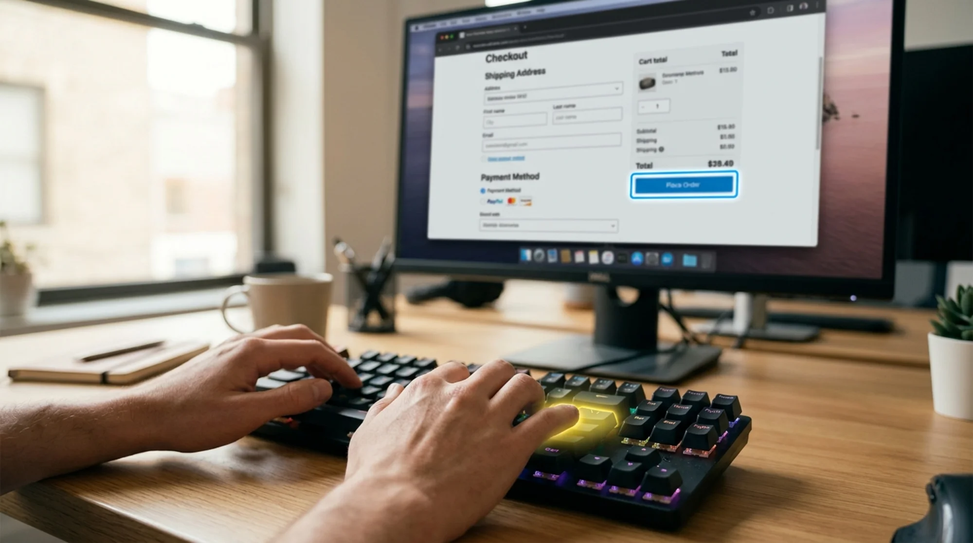
Why Keyboard Navigation Matters For Small Businesses
If you run a bakery, a Shopify store, a consulting site, or a local services business, you might assume keyboard accessibility is something only big enterprises need to worry about. Three reasons that's wrong.
You lose real customers. Roughly one in four U.S. adults has some form of disability. Many shop online specifically because physical stores are harder to access. If your "Add to Cart" button cannot receive focus, that sale never happens.
It affects search rankings. Google's guidance on creating helpful, people-first content treats usability as part of quality. A site that's broken for a real chunk of visitors is, by definition, not serving people first. Accessibility issues also overlap with Core Web Vitals signals — layout shifts, hidden interactive elements, and confusing focus order all hurt experience scores.
It's the law in many places. ADA-related web lawsuits against small businesses have grown sharply year over year. Most settlements come from sites where basic keyboard navigation simply doesn't work. You don't need a perfect site, but you do need a usable one.
What "Keyboard Navigation" Actually Means
Keyboard users rely on a small set of keys:
- Tab — moves forward through interactive elements (links, buttons, form fields)
- Shift + Tab — moves backward
- Enter — activates the focused element
- Space — toggles checkboxes, activates buttons, scrolls the page
- Arrow keys — move within components like dropdowns, sliders, or menus
- Escape — closes modals, dropdowns, and popups
The user needs to see where they are on the page at all times. That visual indicator is called a focus ring — usually a blue or dark outline around the currently active element. If that ring is missing or hidden, the user is navigating blind.
The 15-Minute Keyboard Audit
Open your homepage in any browser. Put your mouse aside. Click the address bar once to set focus, then press Tab. Move through your site like a real customer would.
Step 1: Tab Through The Homepage
Press Tab repeatedly from the top of the page. After each press, ask:
- Can I clearly see where focus landed?
- Does the order make sense (top to bottom, left to right)?
- Did focus skip anything important?
- Did focus get trapped in a header or sidebar?
Write down anything that feels wrong. Don't fix it yet — just observe.
Step 2: Test The Main Navigation
Most small business sites have dropdown menus (Services, Shop, About). Tab into the main nav. When you reach a dropdown trigger, press Enter or the down arrow. Does the menu open? Can you Tab into the sub-items? Can you close it with Escape?
A common failure: dropdowns that only open on mouse hover. Keyboard users can never reach the sub-items.
Step 3: Test Forms
Tab into your contact form, newsletter signup, or checkout form. Check:
- Every field receives focus clearly
- Labels are readable and connected to their inputs
- Error messages appear when you submit invalid data
- You can submit with Enter without using the mouse

Step 4: Test Popups, Modals, And Chat Widgets
When a popup opens (email signup, cookie banner, chat bot), check:
- Focus moves into the popup automatically
- Focus stays inside the popup while it's open (this is called a focus trap, and it's a good thing)
- Escape closes the popup
- Focus returns to where you were when the popup closes
A surprising number of sites open popups that the keyboard user can't even interact with. The popup overlays the page, the user keeps tabbing through hidden background elements, and the experience is completely broken.
Step 5: Test The Checkout Or Booking Flow
If you sell anything or take bookings, complete the flow with only the keyboard. This is the single highest-value test you can run. If you can't complete a purchase with the keyboard, you've lost every keyboard-dependent customer who tried.
The Most Common Failures
The same patterns show up over and over across small business sites. Here are the ones to watch for.
Missing Focus Indicators
Many themes strip out the default browser focus ring "for design reasons." The result: when you Tab through the site, nothing visibly changes.
How to spot it: Tab through your homepage. If you can't tell where you are after each press, your focus styles have been removed or hidden.
Skipped Or Hidden Interactive Elements
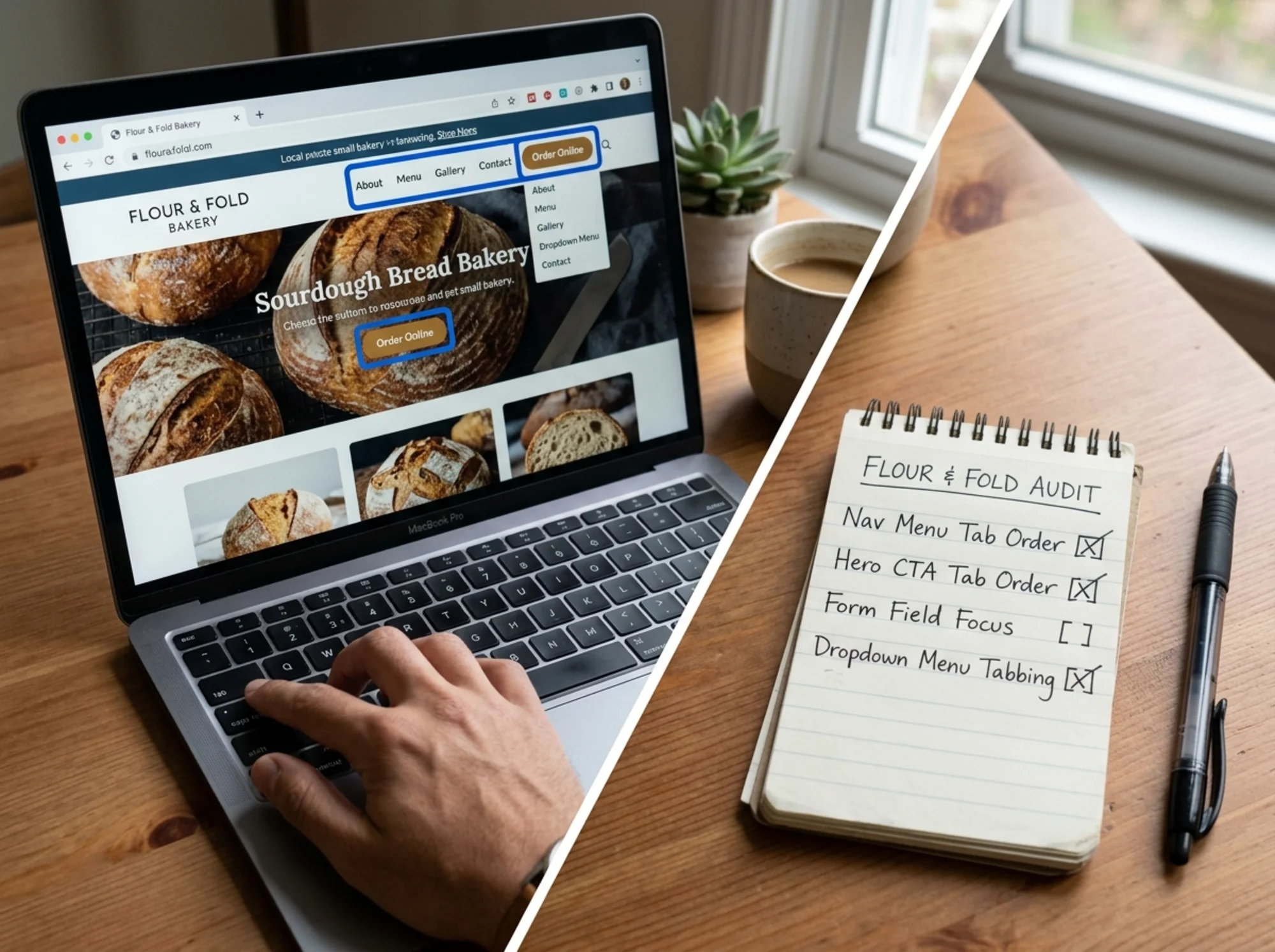
Sometimes a button or link is visible on screen but isn't reachable by keyboard. This usually happens when developers use How to spot it: Your eye lands on something interactive (a "Buy Now" button, a slider arrow) and Tab never reaches it. Focus jumps around the page in a way that doesn't match the visual layout — usually because CSS positioning moved elements without updating the underlying HTML order. How to spot it: Focus moves from the header to a footer link, then to the hero, then back to the navigation. You Tab into a component (often a custom widget like a video player, date picker, or chat widget) and can't Tab out. The only way to escape is to refresh the page. How to spot it: You press Tab repeatedly and focus keeps cycling inside one element. Image carousels are a common offender. The previous/next arrows are often invisible to the keyboard, and the slides themselves aren't reachable. Large navigation menus often work fine with a mouse but fall apart with a keyboard. Sub-items aren't reachable, the menu doesn't close, or focus jumps unpredictably. Let's make this concrete. Imagine a small bakery called "Flour & Stone." Their site has a homepage with a hero image, a product grid, an order form, and an Instagram feed at the bottom. Test 1: Tab through the homepage. Tab lands on the logo (good). Then jumps directly to the Instagram feed at the bottom (bad — it skipped the entire navigation, hero CTA, and product grid). The focus ring is barely visible, just a faint dotted outline. Test 2: Open the order form. The "Order Now" button is reachable but the focus ring is invisible against the cream background. Inside the form, the date picker is a custom widget — Tab goes into it but won't come out. Pressing Escape does nothing. Test 3: Test the cookie banner. The banner appears when the page loads, but focus doesn't move into it. The user keeps tabbing through hidden elements behind the banner. The "Accept" button is never reached. The fix plan: None of these fixes require a redesign. They take a developer a few hours. The manual Tab test catches most issues, but a few free tools can confirm what you found and surface issues you missed. Automated tools catch maybe 30 to 40 percent of accessibility issues. The manual keyboard test catches the rest. You need both. If you're handing this off to a developer or agency, share this checklist. It maps directly to the issues most small business sites have. Not every issue is equal. If you have a long list and limited time, work in this order: Fix only the first three and you've addressed the issues affecting 80 percent of keyboard users on a typical small business site. "My customers don't use keyboards." You don't know that. You see the customers who completed a purchase. You don't see the ones who hit a broken focus state and left silently. "My site is small. It doesn't matter." Lawsuits against small businesses for accessibility issues have grown faster than against large companies, because small sites are easier targets and rarely fight back. Fixing keyboard navigation is one of the cheapest legal-risk reductions you can make. "My theme should handle this." Most themes don't. They prioritize visual design over keyboard accessibility, and many actively remove default browser focus styles. Always test. "This sounds like a lot of work." The audit takes 15 minutes. Fixing the top issues usually takes a developer half a day. Block 15 minutes this week. Open your homepage. Put your mouse aside. Press Tab. If you find issues — and you almost certainly will — make a list, prioritize by the conversion path, and either fix them yourself if you're comfortable with CSS, or send the list to whoever maintains your site. For a broader view of your site's health, including accessibility, performance, SEO, and security in one report, run a free website audit with FreeSiteAudit. It flags keyboard navigation issues alongside everything else that affects how real customers experience your site — and gives you a prioritized fix list you can hand to a developer. Keyboard accessibility is one of the few site improvements that costs almost nothing, helps a real group of customers, reduces legal risk, and improves search visibility. It's worth the fifteen minutes. Get an instant score and your top 3 critical issues in under 60 seconds. instead of proper or tags, or when an element has tabindex="-1" set.Illogical Tab Order
Keyboard Traps
Carousels And Sliders
Mega Menus And Mobile Menus
A Real Walkthrough: Auditing A Bakery Website
Tools That Help (Beyond Just Tabbing)
A Quick Fix Checklist For Developers
, all links use with href
What To Prioritize First
Common Objections, Answered
Run The Audit This Week
Sources
Check your website for free