Landing Page Audit: Elements That Kill Conversion Rate
A plain-English landing page audit checklist for small business owners covering headlines, CTAs, forms, speed, and trust signals that silently kill conversions.
# Landing Page Audit: Elements That Kill Conversion Rate
You spent money getting people to your landing page. Ads, email, social, SEO — none of it is free, even when it looks free. Then most visitors leave without doing the one thing the page was built for.
That gap between "they arrived" and "they converted" is where small businesses bleed money. The good news: the leaks are usually obvious once you know where to look. This guide walks you through a landing page audit you can run today, in plain English.
We'll focus on the elements that silently kill conversion: the headline, the offer, the form, the CTA, the page speed, the trust signals, and the structure. By the end you'll have a checklist you can run on any page you own.
What a Landing Page Actually Is
A landing page is not a homepage. A homepage is a lobby — people wander in from a dozen directions and look around. A landing page is a hallway with one door at the end. You're paying to send someone down that hallway, and your only job is to make the door easy to open.
If your "landing page" has six navigation links, three promotions, a chat widget, a popup, a video, and four different things to sign up for — it's not a landing page. It's a homepage in disguise. That alone kills conversion.
The first audit question is the simplest: what is the one action you want a visitor to take on this page? If you can't answer that in five seconds, neither can your visitor.
Element 1: The Headline
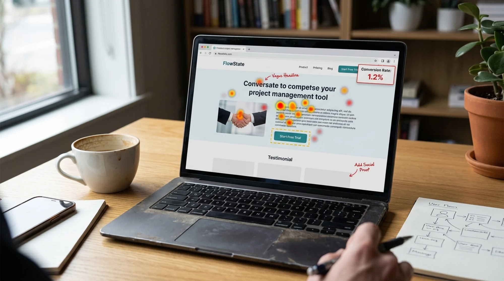
Your headline does about 70% of the work. If a visitor reads it and doesn't immediately understand what you do and why they should care, they leave. They don't scroll. They don't watch your video. They just leave.
Bad headlines tend to fall into a few patterns:
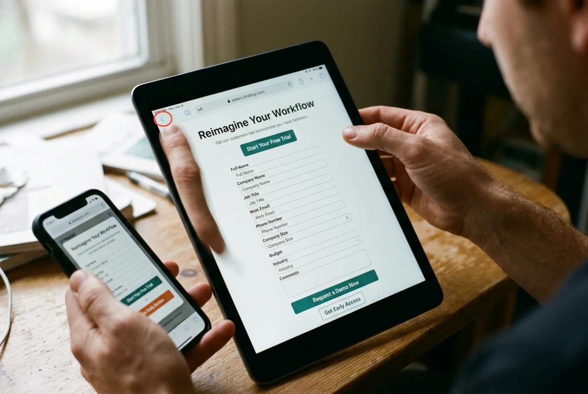
- Clever but unclear: "Reimagine your workflow." Reimagine it how? For what?
- Feature-led: "Now with AI-powered sync." Nobody woke up wanting AI-powered sync.
- Internal-speak: "The world's leading B2B engagement platform." That's investor copy, not customer copy.
- Vague benefit: "Grow your business." Every page says this. It means nothing.
Good headlines do one of three things: name the specific outcome the visitor wants, name the specific problem they have, or name the specific shortcut you offer. "Get a website audit in 60 seconds" works because it names both the outcome and the time.
Quick headline check:
- Could a competitor swap their logo above your headline and have it still work? If yes, it's too generic.
- Does it pass the "so what?" test? Read it aloud, then say "so what?" If you don't have a good answer, rewrite it.
- Does it match the ad or email that brought them here? If the ad promised "5-minute setup" and the headline talks about "enterprise solutions," you broke the promise.
Element 2: The Above-the-Fold Mess
Above the fold means what someone sees before scrolling. On a phone, that's about 600 pixels. On a laptop, around 800. You don't get to choose what they look at first — gravity does.
Common above-the-fold killers:
- A giant hero image that pushes the headline down off the screen
- Auto-playing videos that distract from the actual offer
- Cookie banners and chat widgets covering the CTA
- Three "primary" buttons fighting for attention
- A navigation bar with ten links inviting people to wander away
The fix is brutal: above the fold, the visitor should see exactly one headline, one short subhead, and one button. Everything else is decoration. If you can remove something and the page still makes sense, remove it.
Element 3: The CTA Button
The call-to-action button is where the conversion happens or doesn't. Most CTAs are broken in one of three ways.
Weak verbs. "Submit." "Continue." "Click here." These describe the mechanics, not the value. Use verbs that describe what the visitor gets: "Get my audit," "Start my free trial," "Send my quote."
Wrong contrast. Your CTA button needs to be the highest-contrast element on the page. Not because blue converts better than green (it doesn't — that's a myth). Because if your CTA visually competes with five other buttons, none of them win.
Tiny tap targets. On mobile, your button should be at least 44 pixels tall. Anything smaller and people will mis-tap. Test it with your thumb, not your mouse.
No CTA above the fold. If a visitor has to scroll to find out how to convert, you've already lost a meaningful percentage of them. The CTA goes above the fold, period. Then again further down. Then again at the bottom.
For a tighter walkthrough, see our guide on CTA button optimization.
Element 4: The Form
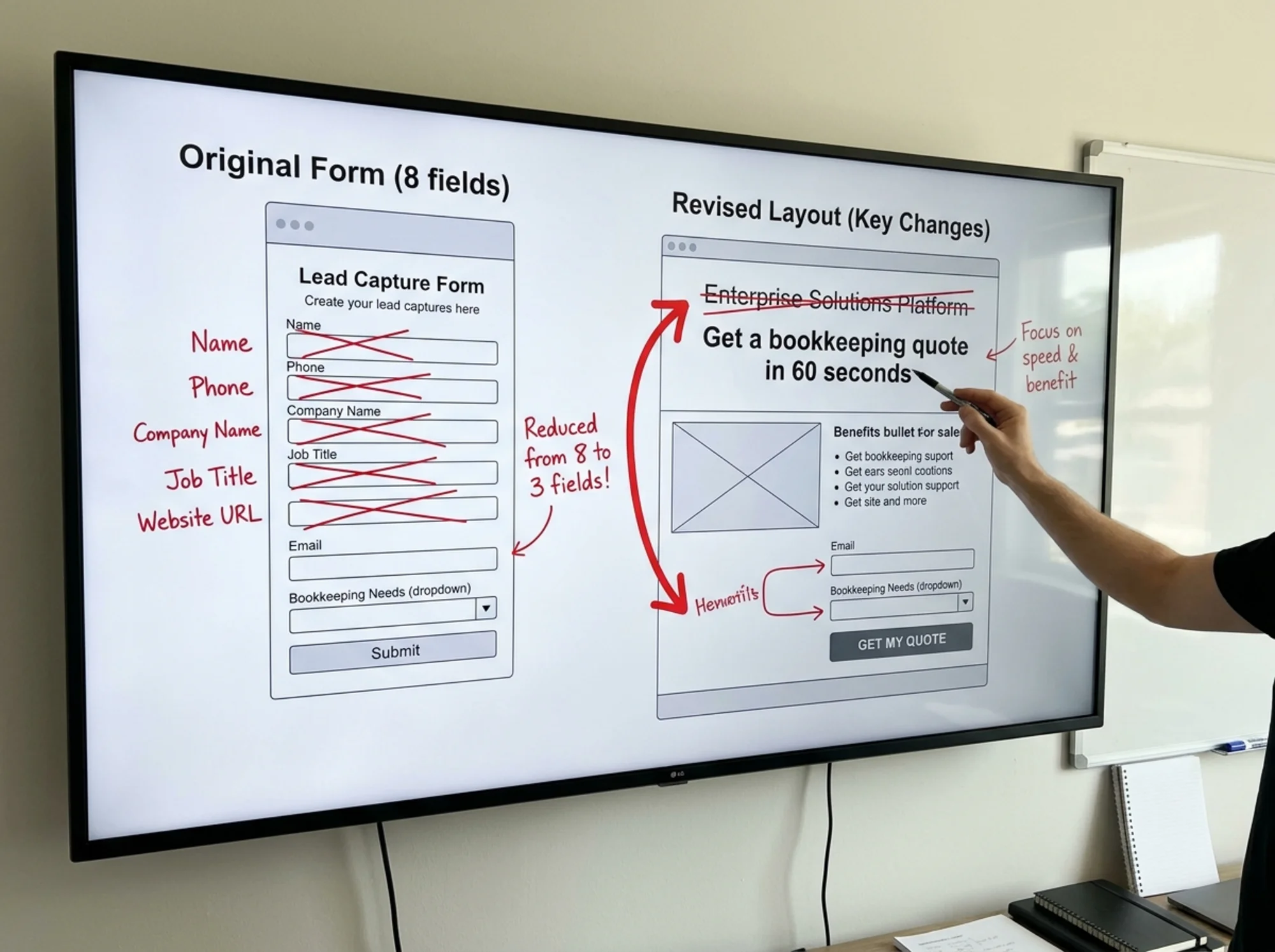
Forms are conversion graveyards. Every field you add is a small reason to give up. The math is unforgiving — fewer fields, more conversions, almost without exception.
Audit your form by asking, for each field: do I need this to make the next step happen, or do I want it because it's nice to have?
- Need: email (you need a way to follow up).
- Want: phone number, company size, job title, how they heard about you.
Most B2B forms collect five to nine fields because someone in marketing wanted lead scoring data. The cost of that data is the leads you didn't get. If you're maximizing top-of-funnel conversion, ask for the email and nothing else. You can enrich later, ask in a follow-up email, or use a tool that infers company data from the email domain.
For ecommerce landing pages, the same rule applies to checkout — every extra field between cart and confirmation is an exit.
Mini form checklist:
- Remove every field that isn't strictly required
- Inline validation (show the error next to the field, not at the top after submit)
- Don't reset the form on error — that's a special kind of cruel
- Use proper input types on mobile (
type="email"brings up the email keyboard) - Skip the captcha unless you have a real spam problem; it costs conversions
Element 5: Trust Signals
Visitors are skeptical. They don't know you. They've been burned before. Your job is to reduce that uncertainty fast.
Trust signals that actually work:
- Real customer logos, ideally ones the visitor recognizes from their industry
- Specific testimonials with full name, photo, company, and role — "Sarah, marketing lead at Acme" beats "Anonymous, 5 stars"
- Numbers you can back up: "Used by 4,200 small businesses" — only if it's true
- Third-party badges (G2, Trustpilot, BBB) where the rating is genuinely good
- Privacy and security signals near the form: "We never share your email" reduces friction more than you'd expect
Trust signals that don't work:
- Stock photos of smiling "customers"
- Made-up press logos for outlets you weren't actually featured in
- Generic five-star quotes with no attribution
Google's guidance on helpful, people-first content explicitly rewards pages that demonstrate expertise and trust. The same signals help conversion and help SEO — you don't have to pick one.
Element 6: Page Speed
If your landing page takes more than three seconds to become usable, you lose visitors before they ever see your headline. Speed is a conversion problem before it's a technical problem.
The Core Web Vitals from Google's web.dev framework give you three numbers to watch:
- LCP (Largest Contentful Paint): how fast the biggest thing on screen loads. Target: under 2.5 seconds.
- INP (Interaction to Next Paint): how fast the page responds when you tap or click. Target: under 200ms.
- CLS (Cumulative Layout Shift): how much the page jumps around as it loads. Target: under 0.1.
The biggest landing page speed offenders, in roughly the order you should fix them:
- Huge uncompressed hero images
- Auto-playing video backgrounds
- Third-party scripts (chat widgets, marketing tags, A/B test tools)
- Custom fonts loading late and shifting the layout
- Embedded YouTube or social widgets
A beautiful page that takes nine seconds to load converts worse than an ugly page that loads in two. See our page speed fixes for the specific changes that move the needle.
Element 7: Mobile Experience
More than half of small business landing page traffic is mobile. Your audit needs to start with mobile, not end with it.
What to check on a real phone (not just a dev tools simulator):
- Can you read the headline without zooming?
- Is the CTA button reachable with one thumb?
- Does the form keyboard cover the input field?
- Do popups make the page impossible to use?
- Does the page scroll smoothly, or does it jank?
The phone is the harshest review your page will get. If your conversion rate on mobile is half what it is on desktop, the page isn't working — and most of your traffic is mobile.
A 20-Minute Walkthrough on a Real Page
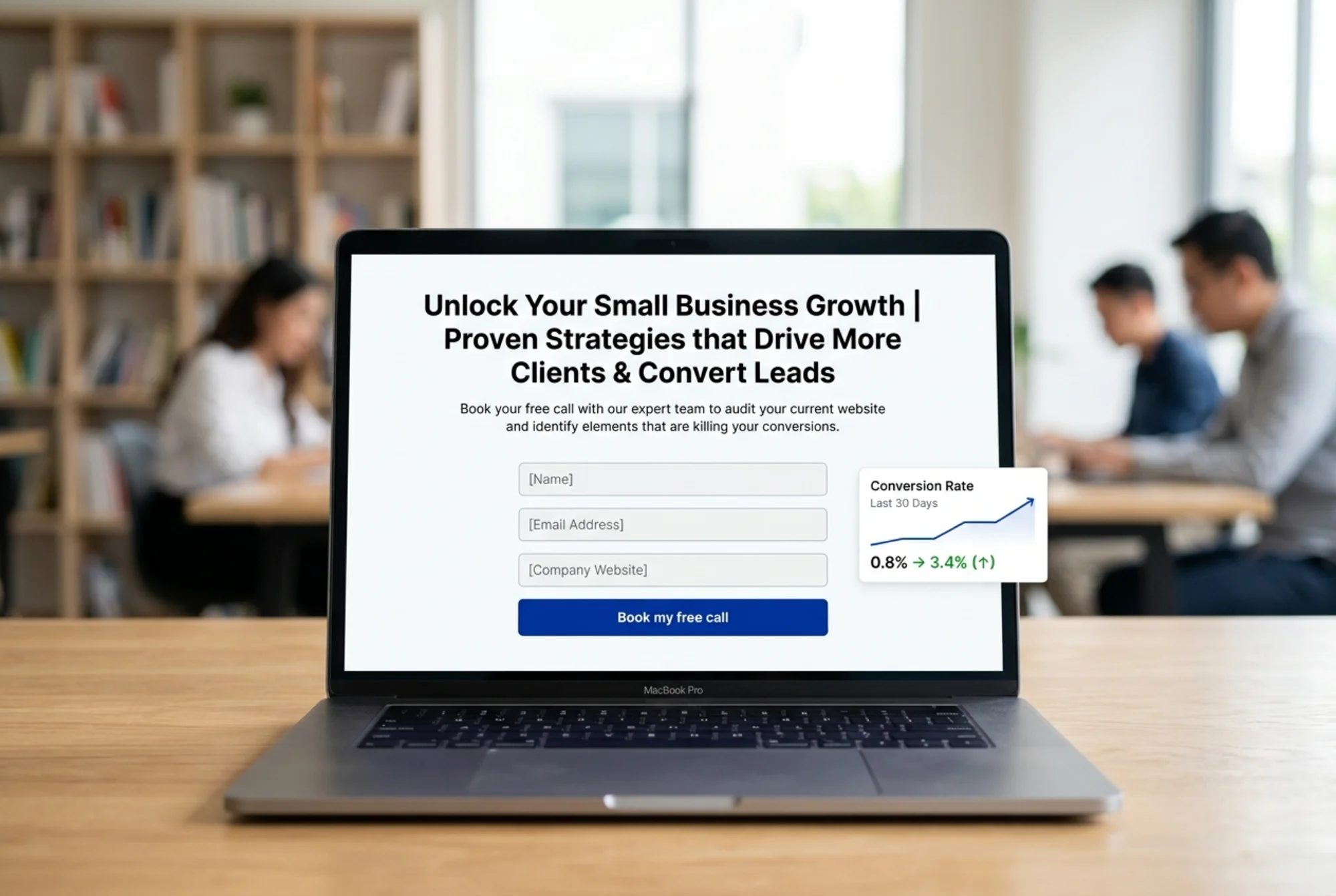
Imagine you run a small accounting firm with a landing page targeting "bookkeeping for restaurants." You're running Google Ads to it and the conversion rate is 0.8%, well below what you need.
Minute 1–3 — The five-second test. Open the page in an incognito window. Look at it for five seconds. Close it. Can you say what's offered and who it's for? If not, the headline is broken. Fix: rewrite to "Bookkeeping built for restaurant owners — taxes, payroll, and tips handled."
Minute 4–6 — The CTA path. What's the one action? Probably "book a free consultation." Is there a button above the fold that says that? Or does it say "Learn more" or "Contact us"? Change it to "Book my free 15-minute call."
Minute 7–10 — The form. Open the booking form. Count the fields. If it's more than three (name, email, restaurant name), strip it down. The phone number can come after they book.
Minute 11–13 — Trust signals. Are there real testimonials from restaurant owners — real names, real photos, real restaurants? If they're generic or missing, add three.
Minute 14–17 — Speed. Run the page through a speed audit. Check LCP and CLS. If the hero image is over 500KB, compress it. If there's an embedded video, replace it with a thumbnail that loads on click.
Minute 18–20 — Mobile. Pull it up on your phone. Try to book a consultation with one thumb. Note every place you have to pinch, zoom, or scroll. Fix those.
That's an audit. Twenty minutes, no special tools, focused on the elements that actually move the needle.
Element 8: Message Match
Message match is the single most underrated landing page concept. It means the headline on your landing page matches the promise of whatever brought the visitor there.
If your Google ad says "Free website audit in 60 seconds" and the landing page headline says "Enterprise-grade website intelligence platform," you've broken the match. The visitor's brain registers the mismatch as "this isn't what I clicked on" and bounces.
How to audit message match:
- List every traffic source pointing at the page (each ad, each email, each social post)
- Open the page from each source and read the headline
- If the headline doesn't echo the promise of the source, fix one of them
For high-volume campaigns, you may need a separate landing page per ad group. That sounds like work because it is. It's also where the biggest conversion lifts hide.
Element 9: Friction You Didn't Notice
Some friction is invisible to you because you built the page. Ask someone who has never seen the page to use it while narrating their thoughts. You'll discover things like:
- The pricing isn't visible without clicking "Learn more"
- The free trial requires a credit card and nobody mentioned that
- The "Get started" button leads to a generic signup, not the specific offer
- The page works fine in Chrome but breaks the form on Safari
- The success message after submit is so quiet that people resubmit five times
Tools can flag broken links and slow images. People catch the things that make other people feel confused.
The 10-Point Landing Page Audit Checklist
- The headline names a specific outcome, problem, or shortcut
- There's exactly one primary CTA above the fold
- The CTA button uses an action verb tied to the value
- The form has no more than three fields (or four if absolutely required)
- There are real testimonials with names, photos, and companies
- The page loads in under 2.5 seconds on mobile
- There are no layout shifts after the page becomes visible
- The page works one-thumb on a phone with no zoom required
- The headline matches the promise of the ad, email, or post that sent traffic
- Someone unfamiliar with the page can use it without asking questions
If you can check all ten, your page is doing its job. Most pages check three or four.
After the Audit: What to Actually Do
You don't fix everything at once — you'll get lost. Pick the highest-impact, lowest-effort fix and ship it this week. Watch the conversion rate for two weeks. Then move to the next.
A rough priority order that usually works:
- Headline rewrite — biggest impact, no engineering
- CTA copy and contrast — small change, big lift
- Form field reduction — usually unblocked once a stakeholder agrees
- Page speed — slower to fix, compounds over time
- Trust signals — easy to add once you collect them
- Mobile polish — finer-grained but matters most
Run a Free Audit on Your Landing Page
Going through the checklist by hand works, but it's faster to start with a baseline scan that flags the technical issues — page speed, broken links, mobile usability, missing tags, layout shift — so you can spend your time on the copy and design problems that actually need a human.
Run a free landing page audit with FreeSiteAudit and you'll get a report in under a minute. It'll show you the technical issues, prioritized by severity, with plain-English explanations of what to fix and why.
The conversion rate on your landing page isn't an unsolvable mystery. It's the sum of the choices you made on that page. Most of those choices can be made better with thirty minutes and a checklist.
Sources
Check your website for free
Get an instant score and your top 3 critical issues in under 60 seconds.
Get Your Free Audit →