Mobile-First Indexing: Is Your Site Ready in 2026?
A plain-English guide for small business owners: what mobile-first indexing means in 2026, what trips sites up, and how to check your own site quickly.
# Mobile-First Indexing: Is Your Site Ready in 2026?
The short version: Google looks at the mobile version of your site first. Not the desktop version. That has been the rule for years, and in 2026 it is the only rule that matters for how your pages get crawled, indexed, and ranked.
The longer version is where most small business owners get stuck. They built a "responsive" site five years ago, the menu collapses into a hamburger icon on their phone, and they assume that is enough. Sometimes it is. Often it is not. This guide walks through what mobile-first indexing actually means in 2026, what trips small sites up, and how to check your own site without needing a developer to translate.

What "mobile-first indexing" actually means
Google sends two main types of crawlers to your site: a smartphone crawler and a desktop crawler. Mobile-first indexing means the smartphone crawler is the primary one. Whatever it can see on your mobile pages is what Google uses to decide what your site is about and how to rank it.
In practice that means three things:
- If a piece of content only appears on your desktop site, Google treats it as if it does not exist.
- If your mobile site is slower, harder to read, or missing images compared to desktop, that is the version Google judges you on.
- If your structured data, headings, internal links, or image alt text only exist in the desktop version, you are leaving signals on the floor.
The fix is not "make a mobile site." The fix is making sure your mobile site is the same site, with the same content, structure, and metadata, just laid out for a smaller screen.
Why this still trips up small businesses
Most small business sites are built on WordPress, Squarespace, Shopify, or Wix. They all advertise as mobile-friendly. So why is this still an issue?
A few common reasons:
- Hidden content on mobile. Some themes hide entire sections (testimonials, FAQs, secondary navigation) on smaller screens using
display: none. If they are not in the mobile DOM in a meaningful way, Google may discount them. - Different images. Mobile versions sometimes load lower-quality images without alt text, or skip product gallery images entirely.
- Lazy-loaded content that never loads. Aggressive lazy loading can keep content from rendering for the crawler if it depends on user scroll or interaction.
- Intrusive interstitials. A full-screen newsletter modal that covers content on mobile is both a ranking problem and a usability problem.
- Outdated separate mobile sites. A handful of older sites still serve a separate
m.yoursite.comversion that has not been touched since 2019.
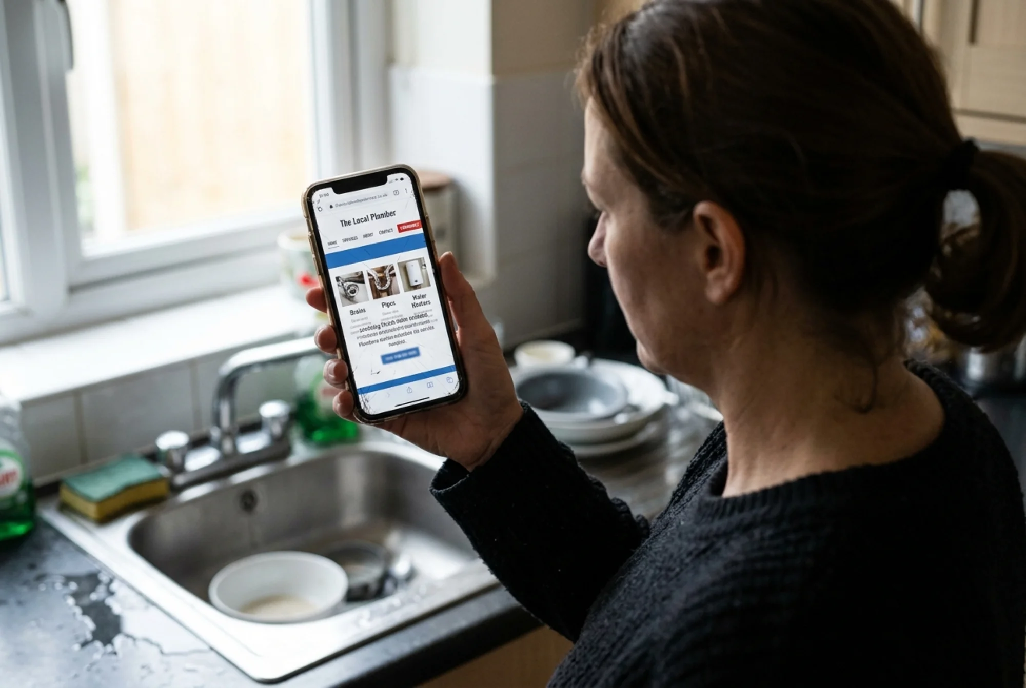
A real scenario: the local plumbing site
A two-person plumbing company in Cleveland built a WordPress site in 2020 using a free theme. On desktop, the homepage has:
- A hero banner with "24/7 Emergency Plumbing"
- Six service cards (drain cleaning, water heater repair, etc.)
- A "Recent Jobs" gallery with 12 photos and captions
- A testimonials carousel with eight quotes
- A footer with service area, hours, license number, and a Google Map
On mobile, what actually renders:
- The hero banner, cropped, with the headline cut to "24/7 Emergency"
- Three of the six service cards (the others hidden by a CSS rule the theme inherited)
- The gallery, without captions
- A single testimonial (the carousel does not auto-load on mobile)
- A footer with the phone number, but service area and hours collapsed inside an accordion that does not expand for the crawler
When Google indexes this site, it sees roughly half the content the owner thinks it sees. The gallery photos have no alt text, so they do not contribute to image search. The service areas, which are the most important local SEO signal for a plumbing business, are effectively missing.
The owner cannot figure out why competitors three blocks away outrank him. The reason is sitting in his mobile DOM.
A practical mobile-first checklist
You do not need developer tools for most of this. A phone, a laptop, and a free audit will get you 90% of the way.
1. Open your site on your phone and compare it to desktop
Pull up your homepage and your three most important pages on your phone. Then open the same pages on a laptop. Look for:
- Headings that appear on desktop but not mobile
- Images that are missing or smaller on mobile
- Buttons, forms, or calls to action that are hidden behind menus
- Footer information (hours, address, phone) that requires extra taps to find
If something important is one screen on desktop and three taps deep on mobile, that is a signal problem.
2. Check your mobile load speed
Use PageSpeed Insights and run your homepage with the mobile tab selected, not desktop. The three Core Web Vitals you care about are LCP (Largest Contentful Paint), INP (Interaction to Next Paint), and CLS (Cumulative Layout Shift). Google's documentation on Core Web Vitals explains each in detail.
Targets on mobile:
- LCP under 2.5 seconds
- INP under 200 milliseconds
- CLS under 0.1
If your mobile LCP is above 4 seconds, that is a top-priority fix. Most small business sites fail LCP because of oversized hero images, slow hosting, or render-blocking scripts.
3. Verify your structured data shows up on mobile
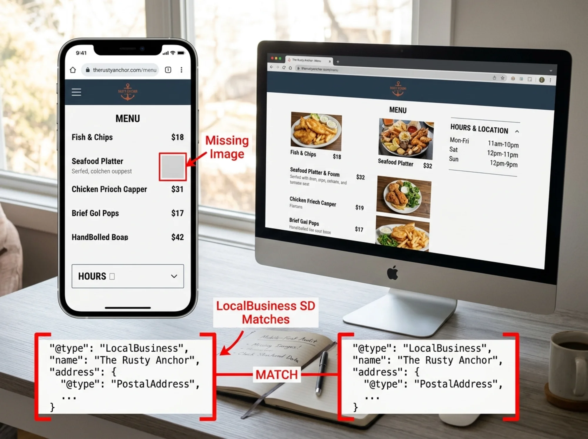
If you use structured data, and for a local business you should, check that it is present in the mobile HTML. The easiest way: load your page on mobile, view source, and search for application/ld+json. If it is there, good. If your structured data only loads in the desktop version, that is a serious gap. Google's Article structured data guide and its LocalBusiness equivalent are worth bookmarking.
4. Check tap target sizes
Tap targets (buttons, links, form fields) should be at least 48 by 48 pixels with enough spacing that a thumb does not hit two at once. The biggest offenders are footer link clusters and inline "read more" links.
5. Audit your images on mobile
For every important image, ask:
- Does it actually load on mobile?
- Does it have alt text?
- Is it sized appropriately, not a 4000-pixel-wide hero on a 400-pixel phone?
- Is lazy loading set up so it loads when the user scrolls to it, not so aggressively that the crawler skips it?
6. Make sure your content is the same
This is the big one. Open your mobile site and your desktop site side by side. Are the headings the same? Are the body paragraphs identical? Are the internal links the same? Are testimonials and FAQs present in both? If not, fix that first.
Common myths worth dropping
- "I need a separate mobile site." No. A single responsive site is better in every measurable way.
- "AMP is required." It is not, and has not been required for years. If you removed AMP, you did the right thing.
- "Mobile-friendliness is just one of many ranking factors." Mobile-first indexing is not one factor among many; it is the lens through which every other factor is evaluated.
- "My traffic is mostly desktop, so this does not apply." Even if your audience uses desktop, Google still indexes your site through the mobile crawler. Your mobile version is what gets your desktop traffic ranked.
What Google cares about on mobile
Beyond raw mobile-friendliness, Google's broader content guidance still applies. Their guide on creating helpful, reliable, people-first content sets the bar: content should be made for people, demonstrate real experience and expertise, and answer the question someone actually had when they searched.
On mobile, that means:
- Get to the point quickly. Mobile users do not scroll through a 300-word intro to find your prices.
- Make the important answers visible without taps. Hours, phone number, address, and main services should be on the first screen.
- Avoid auto-playing video, intrusive pop-ups, and chat widgets that cover the content.
- Use real headings (
,,), not styledtext. Crawlers use heading structure to understand your page.A 15-minute test you can run right now
- On your phone, open your homepage in Chrome.
- Tap the menu, then "Desktop site." Note three things you can see that you could not before.
- Switch back to mobile view. Are those three things actually missing, or were they just laid out differently?
- Open the page source (Chrome on Android: type
view-source:before the URL). Search for one of the missing items. If it is in the source, great. If it is not, you have a real indexing problem. - Repeat for your two highest-revenue pages.
If you find content missing from the mobile source on those pages, fix that before anything else.
When to call a developer
Most issues on this list a small business owner can fix through theme settings on WordPress, Squarespace, or Shopify. The ones worth paying a developer for:
- Hidden content removed by CSS rules you cannot find
- Structured data that only renders on desktop
- A separate
m.mobile site that needs to be retired - Lazy loading that is blocking the crawler
- Server response times that are slow regardless of page weight
Two or three hours of a developer's time is usually enough. Bring them the specific problem and the specific page, not "make my site better."

A confident florist owner at her shop counter receiving a booking notification on her phone, with her mobile-optimized website visible showing a fast-loaded hero image, large tap-friendly "Book Consultation" button, and visible store hours, warm shop interior with arranged bouquets, realistic photo style What "ready" looks like
A small business site that is genuinely ready for mobile-first indexing has these properties:
- The mobile version contains the same content as the desktop version, in the same structure.
- Core Web Vitals pass on mobile (LCP under 2.5s, INP under 200ms, CLS under 0.1).
- Structured data is present in the mobile HTML.
- All images load, have alt text, and are sized for mobile.
- Tap targets are large enough and spaced out.
- No intrusive interstitials block content.
- Headings use real tags and follow a logical order.
- Phone numbers and addresses are click-to-call and click-to-map.
If you can check all of those off, you are ahead of the majority of small business sites.
A short, specific next step
The fastest way to find out where you stand is to run an audit that looks at your mobile version specifically. You can run a free website audit with FreeSiteAudit and get back a list of mobile-first issues sorted by priority, plus the specific pages they appear on. It takes a few minutes and does not require installing anything.
If the audit flags mobile usability or Core Web Vitals problems, those have dedicated fix guides at /fixes/mobile-usability and /fixes/core-web-vitals. For local businesses, the mobile signals around hours, address, and click-to-call are usually where the biggest gains hide.
You do not need a perfect site to rank. You need a mobile site that says the same things as your desktop site, loads fast, and lets a thumb do the work without zooming in.
Sources
- Google Search Central: Creating helpful, reliable, people-first content
- Google Search Central: Article structured data
- web.dev: Core Web Vitals
Related Tools
Check your website for free
Get an instant score and your top 3 critical issues in under 60 seconds.
Get Your Free Audit →