Mobile Page Weight Audit: What to Remove First
Learn how to audit your mobile page weight and prioritize removing heavy images, unused scripts, and third-party widgets that slow load times the most.
# Mobile Page Weight Audit: What to Remove First
Your website might look fine on your laptop. But on a phone over a mediocre cell connection, it could force visitors to download 5, 8, even 12 megabytes of data before they see a single word. That is not a minor inconvenience — it is the reason people leave.
Page weight is the total size of everything a browser downloads to display your page: HTML, CSS, JavaScript, images, fonts, videos, and every third-party widget you have ever installed. On mobile, where connections are slower and data plans still matter, every unnecessary kilobyte costs you time, patience, and customers.

This guide walks you through how to audit your mobile page weight and what to cut first for the biggest improvement.
Why Page Weight Matters More on Mobile
Desktop users on fiber connections rarely notice a bloated page. Mobile users notice immediately.
Slower connections amplify the problem. A 4 MB page on a 50 Mbps connection takes under a second. On a 5 Mbps mobile connection, it takes over six seconds. On a congested network — a crowded coffee shop, a rural area — much longer.
Mobile users are less patient. Google's research on web performance shows that as load time increases from one to three seconds, the probability of a visitor leaving rises by 32%. At five seconds it jumps to 90%.
Google uses mobile performance for ranking. With mobile-first indexing, Google crawls and evaluates the mobile version of your site. A heavy, slow mobile page directly affects where you appear in search results. Google's guidance on creating helpful content emphasizes that page experience matters alongside content quality.
It affects your Core Web Vitals. Largest Contentful Paint (LCP), one of Google's three Core Web Vitals, measures how quickly the main content becomes visible. Heavy pages push LCP well beyond the 2.5-second "good" threshold.
What Page Weight Actually Includes
Before you can cut anything, you need to understand the composition. Here is a typical breakdown for a small business site:
- Images: 50–70% of total weight. Hero images, product photos, backgrounds, icons.
- JavaScript: 15–30%. Your own scripts plus every third-party tool — analytics, chat widgets, social embeds, ad trackers, A/B testing.
- CSS: 3–8%. Stylesheets including unused rules from themes or frameworks.
- Fonts: 2–5%. Custom typefaces from Google Fonts or self-hosted.
- Video: Varies wildly. An auto-playing background video can add 5–20 MB alone.
- HTML: Under 1%. The document structure is almost never the problem.
According to the HTTP Archive page weight report, the median mobile page now exceeds 2 MB. But many small business sites built with page builders and heavy themes land between 4 and 8 MB — two to four times the median.

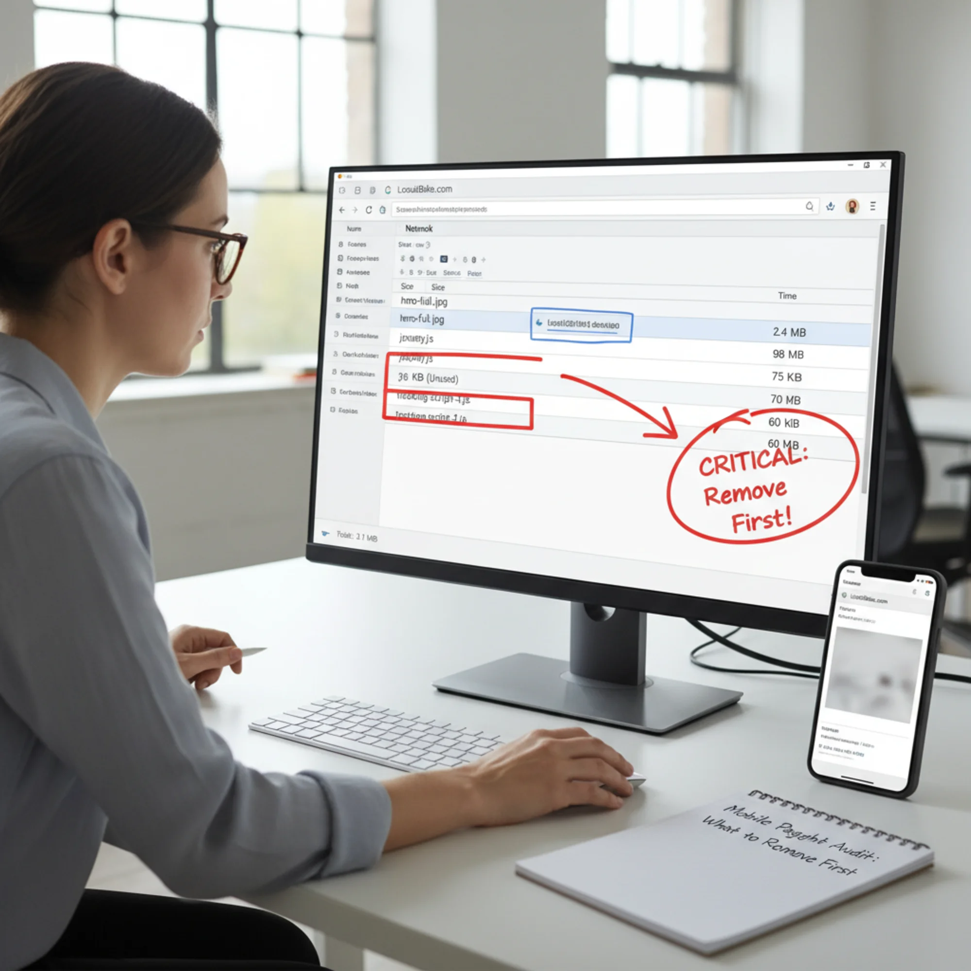
How to Measure Your Mobile Page Weight
You need actual numbers before you start cutting.
Method 1: Chrome DevTools
- Open Chrome and navigate to your website.
- Press F12 to open DevTools.
- Click the Network tab.
- Click the device icon to enable mobile simulation. Select a phone model like iPhone 12 or Pixel 5.
- Set the throttling dropdown to Fast 3G.
- Hard-reload with Ctrl+Shift+R.
- At the bottom of the Network panel, note the total requests and transfer size.
The transfer size is your mobile page weight. Sort the list by Size to see your biggest offenders ranked largest to smallest.
Method 2: Google PageSpeed Insights
Go to pagespeed.web.dev, enter your URL, and run the test. In the Diagnostics section, look for:
- Avoid enormous network payloads — total weight and biggest files
- Properly size images — oversized images
- Remove unused JavaScript — loaded but never executed
- Remove unused CSS — rules that apply to nothing on the page
You can also run a free audit with FreeSiteAudit to get a plain-English breakdown of what is weighing down your pages and what to fix first.
The Priority List: What to Remove First
Not all page weight is equal. Some cuts deliver massive improvement with minimal effort. Here is the order that gets you the most speed for the least work.
1. Oversized Images (Highest Impact, Easiest Fix)
This is almost always the single biggest win. Most small business sites have at least one image far larger than it needs to be.
Common problems:
- A 4000×3000 pixel photo uploaded straight from a camera, displayed at 400×300 on screen
- PNG screenshots that should be JPEG or WebP
- Hero images at maximum quality when 80% quality is visually identical
- Desktop-sized images served to mobile screens a third the width
What to do:
- Resize images to their actual display size. A hero image on mobile rarely needs to exceed 800 pixels wide.
- Convert to WebP. WebP files are 25–35% smaller than equivalent JPEGs with no visible quality loss.
- Set quality to 80–85%. The difference from 100% is invisible to human eyes but can halve file size.
- Add
loading="lazy"to below-the-fold images so they load only when scrolled into view. - Use the
srcsetattribute to serve different sizes to different screen widths.
Realistic savings: 1–3 MB from a typical small business page. For details, see our image optimization guide.
2. Unused JavaScript (High Impact, Moderate Effort)
JavaScript is especially expensive on mobile because the browser must download, parse, compile, and execute it. A 200 KB JavaScript file costs far more in load time than a 200 KB image.
Common culprits:
- jQuery loaded by your theme when nothing uses it (90 KB)
- Full Bootstrap JS bundle when you only need the dropdown (60 KB)
- Deactivated plugins that still load scripts
- Analytics for services you no longer check
What to do:
- Check your Network tab for
.jsfiles. Note each one's size. - Count