Mobile Website SEO Audit: What Small Businesses Need to Check in 2026
Audit your mobile site for SEO issues costing you traffic — covers Core Web Vitals, mobile usability, structured data, and a prioritized fix checklist for 2026.
# Mobile Website SEO Audit: What Small Businesses Need to Check in 2026
More than 60% of Google searches happen on phones. If your website doesn't work well on mobile, you're not just losing visitors — you're invisible to Google.
Google has used mobile-first indexing since 2019. That means the mobile version of your site is the version Google evaluates first when deciding rankings. A polished desktop site with a broken mobile experience will rank poorly everywhere — including on desktop search results. In 2026, there is no separate "mobile SEO" strategy. Mobile is the strategy.
This guide is a practical mobile SEO audit for small business websites. Each section covers what to check, why it matters, and how to fix it — whether you built your site yourself, hired a developer, or used a platform like WordPress, Wix, or Squarespace.

Why Mobile SEO Directly Affects Revenue
When someone searches "plumber near me" on their phone, here's what happens:
- Google ranks results based on the mobile version of each site
- The searcher taps a result and expects it to load in under 3 seconds
- If the site is slow, hard to read, or frustrating to navigate, they hit back
- Google registers that bounce as a signal your page wasn't helpful
- Your ranking drops slightly — and the competitor they visited next gets a boost
This cycle compounds. Every lost visitor reinforces a negative signal. Every week you ignore mobile issues, the gap between you and competitors widens.
Most business owners never test their site on a phone. They built it on a laptop, review it on a laptop, and assume it works everywhere.
It usually doesn't.
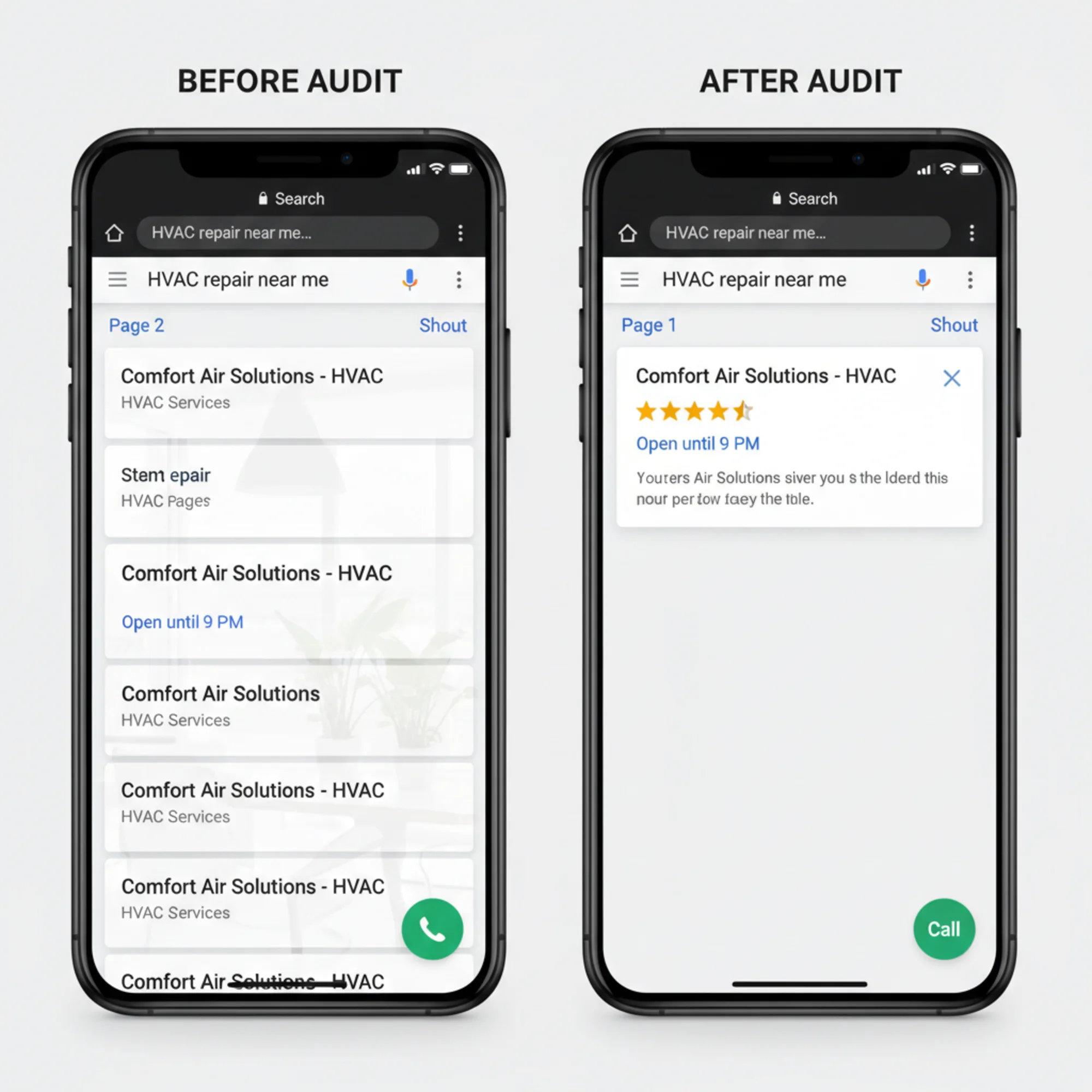
A landscaping company in Austin had a clean, professional desktop site. On mobile, the navigation couldn't be closed, the "Request a Quote" button was hidden behind a photo, the page took 7 seconds to load, and the phone number wasn't tappable. They were spending $800/month on Google Ads sending traffic to this broken experience. After fixing just these mobile issues, quote requests rose 40% — with zero change in ad spend. The fix took a weekend. The broken version had been live for 14 months.
The Mobile SEO Audit Checklist
Work through these checks in order. Each one includes what to look for and how to fix it.
1. Viewport Configuration
The viewport meta tag tells the browser how to scale your page on different screen sizes. View your page source and look for this in the :
html
If this tag is missing or set to a fixed width like width=1024, mobile visitors see a tiny, zoomed-out desktop layout they have to pinch and scroll to use. Every modern website builder includes this by default, but custom-built sites and older templates sometimes omit it.
How to check: Right-click your homepage, select "View Page Source," and search for "viewport." If you don't find it, or it contains a fixed pixel width, that's your first fix.
How to fix: Add or correct the tag in your site's . In WordPress, this is usually in header.php or your theme's settings. In Wix and Squarespace, the viewport tag is managed automatically — but custom code injections can sometimes override it.

2. Page Speed on Mobile
Speed is a direct Google ranking factor, and it hits harder on mobile where connections are slower and processors are less powerful. Google measures three Core Web Vitals from real user visits:
- Largest Contentful Paint (LCP): Time until the main content is visible. Target: under 2.5 seconds. This is usually your hero image or main headline.
- Interaction to Next Paint (INP): How quickly the page responds when someone taps a button or link. Target: under 200 milliseconds. Slow INP makes your site feel frozen.
- Cumulative Layout Shift (CLS): How much the page jumps around while loading. Target: under 0.1. Layout shift is what happens when you try to tap a button and it moves just as an ad loads above it.
Common speed killers on small business sites:
- Uncompressed images (the single most common issue — often accounting for 70% or more of page weight)
- Multiple custom font families loading at once
- Third-party scripts — chat widgets, social embeds, redundant analytics tags
- Auto-playing hero videos that load megabytes of content before anyone asks for it
- Large JavaScript bundles that block rendering while the browser parses them
Fixes that move the needle:
- Convert images to WebP and serve mobile-appropriate sizes. A 3MB hero JPEG converted to a properly sized WebP can cut 2–3 seconds off your load time alone. Aim for images under 100KB on mobile.
- Limit fonts to one or two families. Each additional font family can add 100–300KB of downloads.
- Defer non-essential scripts so main content loads first. Chat widgets, social share buttons, and analytics don't need to load before your visitor can read the page.
- Replace auto-playing video heroes with static images on mobile. Use the
- Lazy-load any image below the fold so the browser only downloads what's visible.
3. Tap Targets and Touch Usability
On a phone, people use their thumbs. Buttons and links need to be large enough to tap without surgical precision.
What to check:
- Buttons are at least 48×48 pixels (Google's minimum recommendation)
- At least 8px of spacing between adjacent clickable elements to prevent mis-taps
- Phone number, email, and address are tappable — not just displayed as plain text
- Navigation menus work on touch (no hover-dependent dropdowns)
- Form fields are large enough to tap into on the first try
Common problems: Footer links jammed together with no spacing. Tiny "Read more" text links. Form fields too narrow to tap. Dropdown menus that require a mouse hover to reveal options. Social media icon rows where icons are 20px wide and touching each other.
Fix: Increase button padding to at least 12px on all sides. Add margin between adjacent links. Wrap phone numbers in tel: links and addresses in Google Maps links so visitors can tap to call or tap to navigate. Replace hover dropdowns with tap-to-expand menus.
4. Text Readability
If visitors have to pinch-zoom to read your content, they leave. Google considers this a usability failure.
- Body text should be at least 16px — the default browser size. Anything smaller forces zooming on most phones.
- Lines must fit the screen width without horizontal scrolling
- Sufficient contrast between text and background colors (minimum 4.5:1 ratio for body text)
- Short paragraphs — a five-line desktop paragraph becomes a dense wall of text that fills an entire phone screen
Use relative font sizes (rem or em) instead of fixed pixels so text scales with user preferences. Set a maximum content width and let text reflow with responsive CSS. Break up long paragraphs into two or three shorter ones. Use bullet lists and subheadings to create visual breathing room.
5. Mobile Content Structure
Google evaluates whether your content is helpful and accessible on mobile specifically. Content that's easy to scan on a laptop can be impenetrable on a phone.
Check for:
- Clear heading hierarchy (H1 → H2 → H3) that lets visitors scan for what they need
- Images that resize within the viewport instead of overflowing and causing horizontal scroll
- Tables that are scrollable or that reflow on small screens
- Embedded content (maps, videos, forms) that resizes properly
- Accordions or expandable sections for long FAQ lists
Real example: A dental practice had a services page with a wide comparison table showing four columns of procedures, descriptions, estimated costs, and insurance notes. On desktop, it was clear and easy to scan. On mobile, patients couldn't see the price column without horizontal scrolling — which most never tried. They assumed prices weren't listed and called the competitor who showed pricing clearly. Converting the table to a stacked card layout per service increased time on page by 55% and drove more online bookings.
6. Structured Data for Mobile Search
Structured data helps Google display rich results — star ratings, business hours, FAQ answers, price ranges — directly in search. On mobile, where screen space is tight, rich results dominate the viewport and get significantly more taps than plain blue links.
Every small business should have LocalBusiness schema on their homepage at minimum:
{
"@context": "https://schema.org",
"@type": "LocalBusiness",
"name": "Your Business Name",
"telephone": "+1-555-123-4567",
"address": {
"@type": "PostalAddress",
"streetAddress": "123 Main St",
"addressLocality": "Your City",
"addressRegion": "ST",
"postalCode": "12345"
},
"openingHours": "Mo-Fr 08:00-18:00",
"priceRange": "$$"
}
Also add schema for products, services, FAQ content, and reviews where relevant. Most website builders have plugins or built-in settings for this. In WordPress, plugins like Yoast SEO or Rank Math can generate structured data without touching code.
How to validate: Use Google's Rich Results Test to confirm your markup is being detected. Errors in structured data mean Google ignores it entirely — partial or malformed JSON-LD does more harm than no schema at all.
7. Mobile Navigation
Your desktop menu with 12 items and nested dropdowns doesn't work on a 6-inch screen. Complex navigation is the most common reason mobile visitors can't find what they need.
Check that:
- The mobile menu opens and closes reliably on every page
- Visitors can reach key pages (services, contact, booking) in two taps or fewer
- Your phone number or primary CTA is visible without opening the menu
- The browser back button works correctly on every page (single-page apps often break this)
- Search functionality works if your site has more than ten pages
Fix: Prioritize three to five top pages in your mobile menu. Put your phone number or main CTA in a sticky header that stays visible as visitors scroll. Consider bottom navigation for critical actions like "Call Now" or "Book Online" — that's where thumbs naturally rest. Test on both iOS and Android, since touch behavior and browser rendering differ.
8. Redirects and Mobile URLs
Some older sites serve a separate mobile version at m.yourdomain.com or redirect mobile users to different pages.
If you're still running a separate mobile site, consolidate to a single responsive design. Separate mobile sites fall out of sync, create duplicate content issues, are harder to maintain, and Google strongly prefers responsive layouts. If you must keep separate URLs temporarily, ensure mobile users land on the correct equivalent page (not the mobile homepage for every request) and that canonical tags point correctly between paired pages.
Also check for redirect chains — situations where one redirect leads to another, then another. Each redirect adds latency. On mobile connections, a chain of three redirects can add a full second of load time before any content appears.
Running Your Audit: A 30-Minute Walkthrough
You don't need to hire an agency to run a mobile audit. Set aside 30 minutes and follow these steps.
Step 1: Test on your actual phone. Don't use a desktop browser's responsive mode — use your real phone on a cellular connection, not Wi-Fi. Navigate your five most important pages and try to complete your primary conversion action (fill a form, make a call, book an appointment). Note every friction point. If you have both an iPhone and an Android device, test on both.
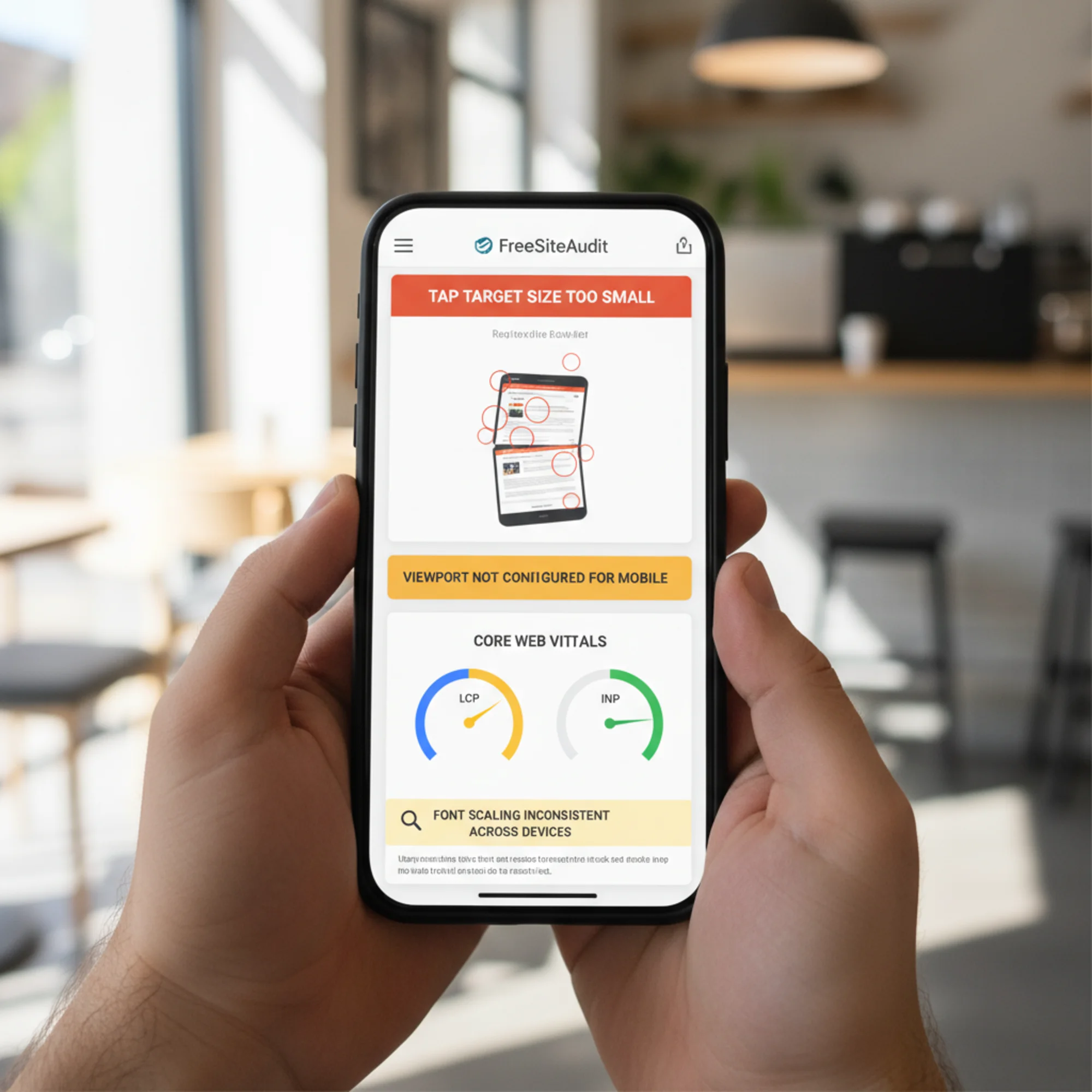
Step 2: Run an automated scan. Use FreeSiteAudit to get a detailed mobile report. It flags tap target sizes, viewport problems, speed metrics, and content accessibility issues — prioritized by severity so you know what to fix first.
Step 3: Check Core Web Vitals. Review your LCP, INP, and CLS scores for mobile specifically. Anything in the "poor" range is your top priority. Pay particular attention to LCP — it's the metric most directly tied to perceived speed and ranking.
Step 4: Validate structured data. Confirm Google is picking up your business info, reviews, and schema markup. Missing structured data means missing rich results — and on mobile, rich results are often the only thing above the fold.
Step 5: Test every form and CTA. Complete every form on your phone. Fill in every field, submit it, and verify the confirmation page loads. If any step is frustrating — a dropdown that's hard to select, a field that doesn't auto-advance, a submit button hidden below the keyboard — fix it. Test every button and link on your top pages.
Step 6: Prioritize and fix. Use this matrix to triage:
| Priority | Issue | Impact |
|---|---|---|
| Critical | Missing viewport tag | Site unusable on mobile |
| Critical | LCP over 4 seconds | Ranking penalty, high bounce rate |
| High | Tap targets too small | Visitors can't interact |
| High | Text requires zooming | Immediate abandonment |
| Medium | No structured data | Missing rich results in search |
| Medium | Unoptimized images | Slow loads on cellular |
| Low | Minor CLS shifts | Annoying but tolerable |
Start with the critical items. Even fixing one critical issue can produce a measurable ranking improvement within weeks.
Platform-Specific Pitfalls
Every website platform has its own common mobile issues. Here's what to watch for on each.
WordPress: Heavy themes with dozens of plugins loading JavaScript on every page are the primary offender. Deactivate unused plugins — many sites accumulate 20+ plugins when five would suffice. Switch to a lightweight theme or use a performance plugin like WP Rocket or Autoptimize to defer non-critical scripts. Check that your theme's mobile menu actually works after plugin updates, since conflicts are common.
Wix: Uncompressed images and heavy animations tank mobile performance. Use Wix's built-in image optimizer and disable animations on mobile via the mobile editor. Verify your Wix mobile editor layout matches what visitors actually see — Wix sometimes renders mobile differently than the preview suggests. Avoid Wix's "hidden on mobile" feature as a layout band-aid; restructure the content instead.
Squarespace: Custom fonts and large background videos slow mobile loading significantly. Limit yourself to one or two fonts and replace video backgrounds with static images at mobile breakpoints. Squarespace's built-in mobile preview is reasonably accurate but still test on a real phone. Check that Squarespace's auto-generated mobile navigation doesn't bury your most important pages.
Shopify: Unoptimized product image galleries and accumulated app scripts are the main culprits. Remove unused apps — each one may inject JavaScript on every page load. Compress product images before uploading rather than relying on Shopify's on-the-fly resizing. Test your checkout flow on mobile end-to-end, since cart abandonment on phones is significantly higher than on desktop.
What Good Mobile SEO Looks Like
After completing these fixes, your mobile site should meet these benchmarks:
- LCP under 2.5 seconds on real mobile connections
- INP under 200 milliseconds so taps feel instant
- CLS under 0.1 so the page stays stable while loading
- Tap targets at least 48px with proper spacing between them
- Readable text on every screen size without any zooming
- Navigation that reaches key pages in two taps or fewer
- Structured data generating rich results in mobile search
- Tap-to-call phone numbers and tap-to-map addresses on every page
- Forms completable with a thumb on a small screen
- Page weight under 1.5MB total for a typical page on mobile
Make It a Recurring Practice
Mobile SEO isn't a one-time project. Google updates ranking criteria, your site accumulates changes from content edits and plugin updates, and user expectations shift as phones and browsers evolve.
Build a simple schedule:
- Monthly: Quick phone check of your top five pages. Load each one on cellular, tap every button, and complete your main conversion action. Takes five minutes.
- Quarterly: Full automated audit with FreeSiteAudit to catch issues that manual testing misses — degraded Core Web Vitals, new broken links, schema errors.
- After any major site update: Complete mobile walkthrough and speed test before you consider the update finished. Theme changes, plugin updates, and new page sections can break mobile layouts in ways that aren't obvious until a customer encounters them.
Start Your Free Mobile Audit
You don't need to guess whether your mobile site has problems. Run a free audit with FreeSiteAudit and get a prioritized report of your mobile SEO issues in minutes. The report covers viewport configuration, Core Web Vitals, tap target sizing, content structure, and structured data — everything in this checklist, scored and ranked so you know where to start.
Your competitors ranking above you on mobile have likely already done this work. The gap between you and them may be smaller than you think — a few targeted fixes can be the difference between page two and the top three.
Sources
Related Tools
Check your website for free
Get an instant score and your top 3 critical issues in under 60 seconds.
Get Your Free Audit →