Product Page Copy Audit: What's Missing and Hurting Conversions
A practical product page copy audit framework that finds the gaps costing you sales—headlines, specs, objections, social proof, and CTAs to fix today.
# Product Page Copy Audit: What's Missing and Hurting Conversions
Most product pages don't fail because the product is bad. They fail because the copy doesn't answer the questions a real buyer has in the ten seconds they spend deciding whether to scroll, leave, or click "Add to Cart."
If you sell anything online — physical goods, services, software, courses — your product page copy is doing more work than your homepage. It has to convince a stranger who arrived from a Google search or an ad that this specific thing solves their specific problem, is worth the money, and won't be a hassle to return.
This guide walks through a practical copy audit you can run today. We'll cover what's typically missing, how to spot it, and what to put in its place.
Why product page copy is different from homepage copy
A homepage answers: "What is this company and should I care?"
A product page answers: "Should I buy this specific thing, right now, from you?"
That's a completely different job. The visitor has already decided they want something in this category. They're not browsing — they're comparing. Your copy is competing with three other tabs open in their browser. If your page reads like a brochure instead of a salesperson, the other tabs win.
The good news: most competitors are also bad at this. A serious audit will almost always uncover gaps that, once fixed, move conversions measurably.
The seven things buyers need to see
When I audit a product page, I look for seven specific elements. Missing or weak versions of any of these tend to cost sales.
1. A headline that names the outcome, not the object
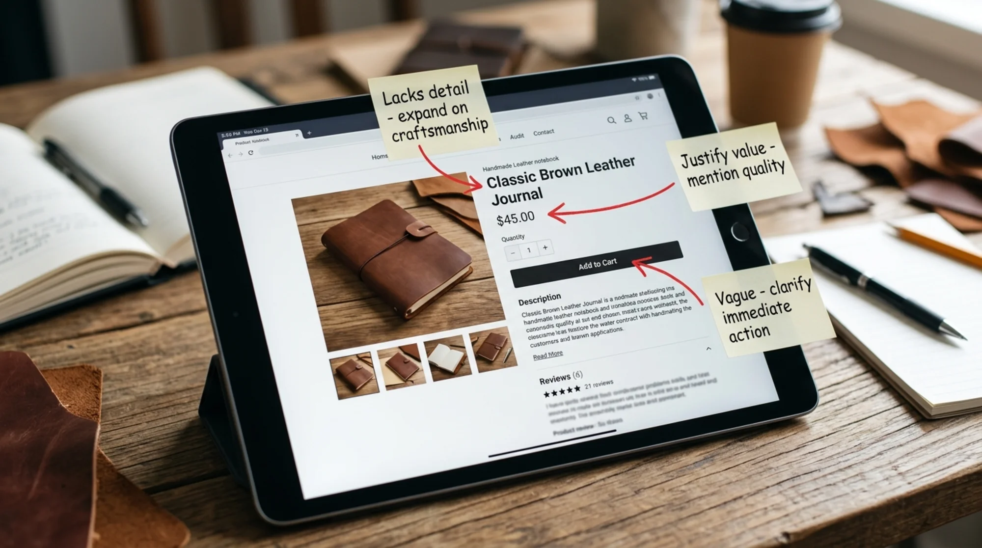
Most product page headlines read like a SKU description: "Premium Stainless Steel Water Bottle — 32oz." That's the product name, not a reason to buy.
A stronger headline names the result. "32oz Insulated Bottle That Keeps Coffee Hot for 12 Hours" is the same product, but the second version sells the outcome.
Audit check: Read your headline out loud. Does it describe a thing or a result? If it's a thing, you're leaving work on the table.
2. A sub-headline that handles the obvious objection
Under the headline, you have one line to address the doubt that just popped into the buyer's head. For a $90 water bottle, that doubt is "Why does this cost three times more than the one at Target?" For a SaaS product, it's usually "Is this for people like me?"
Good sub-headlines name the buyer or the constraint. "For people who hate reheating coffee at 10am." "Built for solo founders, not enterprise teams." That kind of specificity feels like the page is speaking to one reader.
3. Specs that answer real questions, not marketing fluff
"Premium materials" is not a spec. "304 food-grade stainless steel" is.
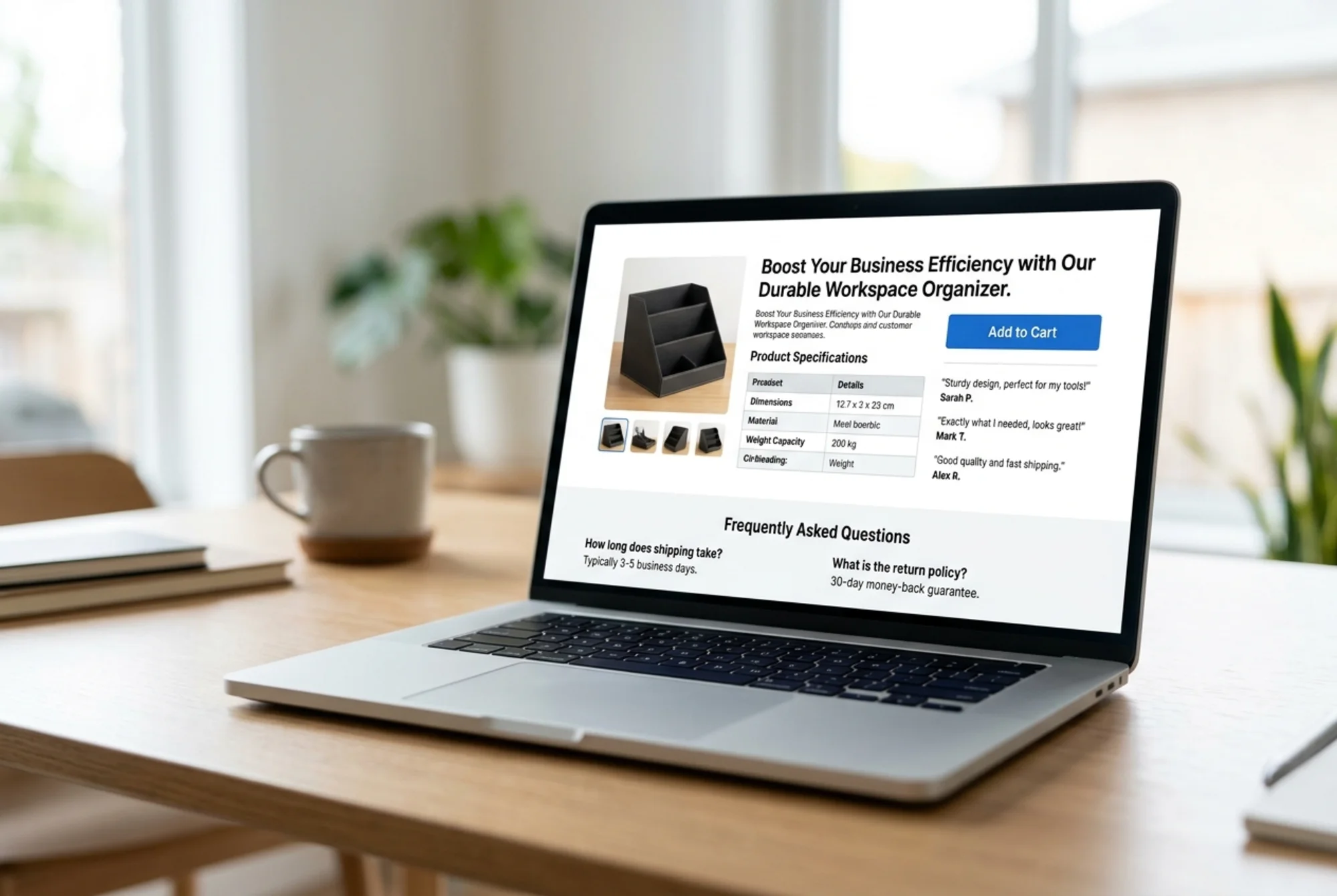
Buyers want concrete numbers, dimensions, materials, compatibility, warranty terms, shipping times. A scannable specs block — bullets or a small table — is one of the highest-converting elements on a product page, and most small business sites either skip it entirely or bury it under three tabs.
Mini-checklist for specs:
- Exact dimensions or sizing chart
- Material or ingredient list
- What's included in the box / subscription / package
- Compatibility (if applicable)
- Shipping timeline
- Return policy in plain English
4. Benefits expressed in the buyer's own words
There's a difference between "Reduces bounce rate" and "Stops visitors from leaving your site after one page." Both are accurate. Only the second sounds like something a small business owner would actually say.
The fix is to read your reviews, support tickets, and sales call transcripts — anywhere customers describe the product in their own language — and use those exact phrases on the page. This is the single biggest copy improvement most small businesses can make.
5. Objection-handling, usually in FAQ format
Every product has the same three or four questions almost-buyers ask before purchasing. For physical goods: "How long does shipping take?" "Can I return it?" "Does it fit X?" For services: "What if it doesn't work?" "How long does setup take?" "Do I need technical skills?"
A short FAQ section near the buy button answers these without making the reader hunt. Don't make them email you to find out — they won't.
6. Social proof tied to the specific claim
"5 stars from 200 reviews" is fine. "Sarah from Portland says the bottle survived a 6-foot drop onto concrete" is better, because it's tied to a specific concern. Pull individual review quotes that handle individual objections, and place them next to the claim they support — not in a generic carousel at the bottom.
7. A call-to-action that names what happens next
"Submit" is the worst button copy ever invented. "Add to Cart" is fine. "Start My 14-Day Trial" is better. The button should describe the action from the buyer's perspective, and the area around it should reduce friction: shipping cost, return window, payment options.
How to run the audit on your own page
Here's a walkthrough using a representative example: a small business that sells handmade leather notebooks for $48.
Current page (before audit):
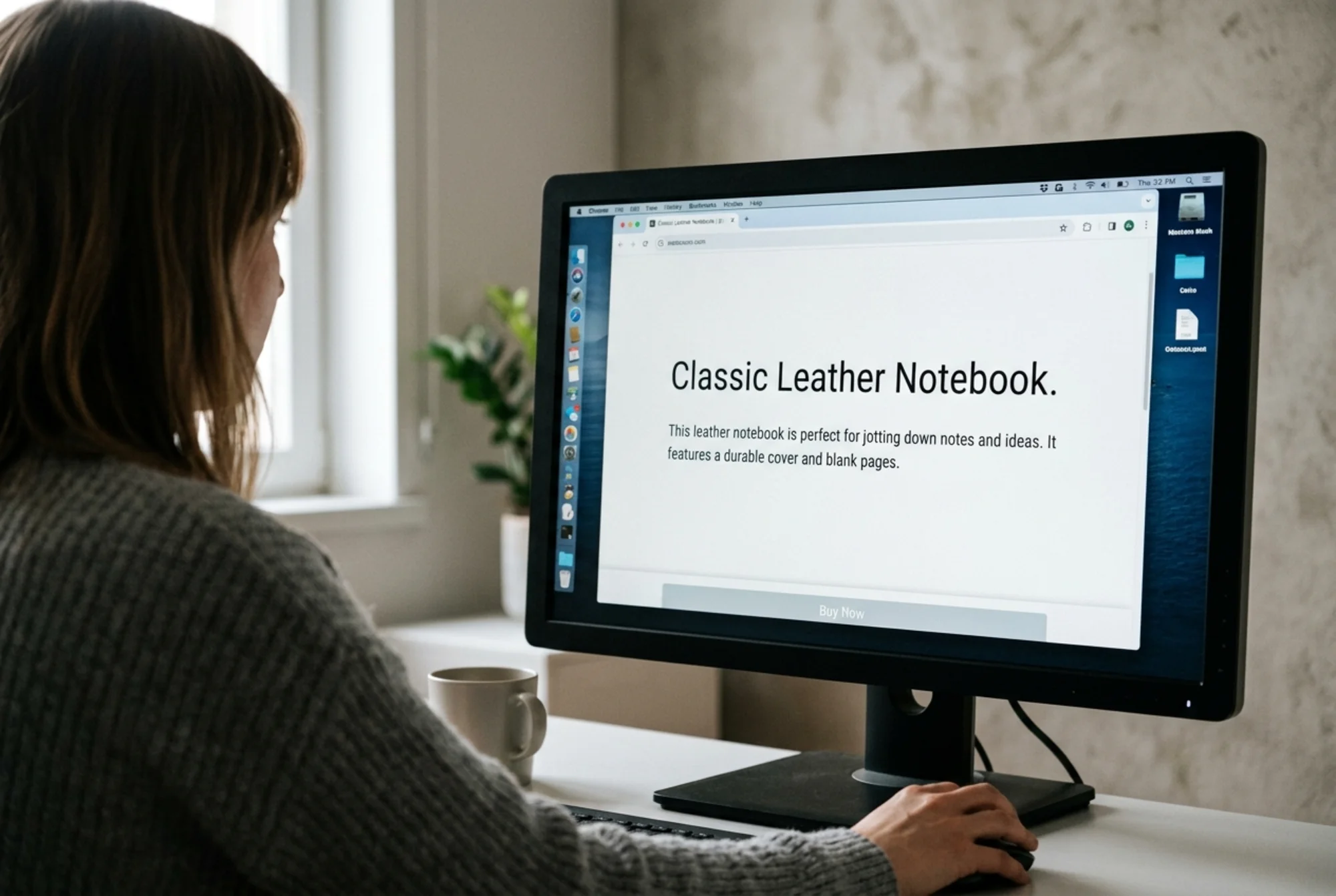
- Title: "Classic Leather Notebook"
- One paragraph of description: "Our notebooks are crafted from premium leather by skilled artisans. Each notebook features hand-stitched binding and a timeless design. Available in three colors."
- Three product photos
- Price and "Add to Cart" button
- No reviews visible
- No shipping info above the fold
- No FAQ
Walking through the seven checks:
Headline. Names the object, not the outcome. There's no reason to choose this notebook over the dozen others a buyer found on Google. Rewrite: "A Leather Notebook That Lasts Longer Than Your Phone."
Sub-headline. Missing. Add: "Hand-stitched in Portland. 5-year guarantee on the binding."
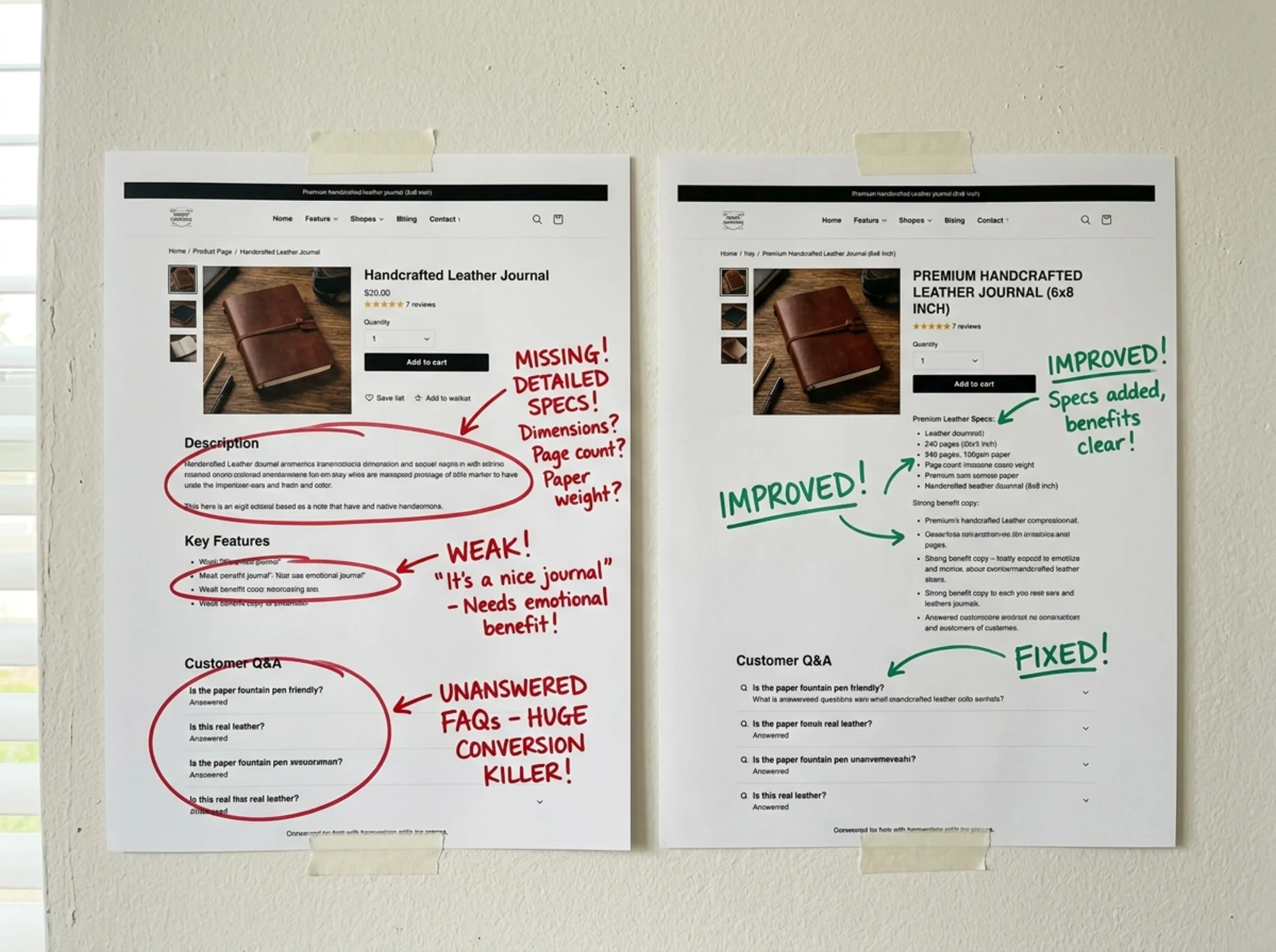
Specs. Missing. The buyer doesn't know the page count, paper weight, dimensions, whether it lies flat, or whether the paper is fountain-pen friendly. Add a scannable bullet block.
Benefits in customer language. The current copy is generic. Pulling from reviews, we might find phrases like "the paper doesn't bleed through" and "the leather actually smells like leather." Use those.
Objection handling. Buyers of $48 notebooks ask: "Will the binding hold up?" "Can I refill it?" "Is it heavy?" Add a short FAQ near the buy button.
Social proof. No reviews visible. Even if they exist elsewhere on the site, they need to be on the page. Pull two or three short quotes next to the buy button.
CTA. "Add to Cart" is fine, but the surrounding area is bare. Add: "Free shipping over $50. 30-day returns. Ships in 2 business days."
That's the entire audit. It takes about 30 minutes per page and the rewrite usually takes another hour. You don't need a copywriter — you need to read your own page like a stranger would.
The technical layer most copy audits miss
Copy lives on a page, and the page has to load. Google's Core Web Vitals — particularly Largest Contentful Paint — measure how quickly your main content appears. If your hero image is 3MB and your above-the-fold copy takes 4 seconds to render, the best copy in the world doesn't matter. Most of your visitors are already gone.
Two technical checks worth doing alongside the copy audit:
Is your main product copy visible without scrolling on mobile? Open your page on a phone. If the headline, price, and primary buy button aren't visible without scrolling, you're losing buyers before they read a word.
Is your product marked up with structured data? Schema.org's Product markup tells Google your price, availability, and review count, which can show up directly in search results. Google's structured data documentation is the canonical reference. This doesn't change your conversion rate on the page itself, but it changes how many people click through in the first place.
The intersection of copy and technical health is where small businesses tend to under-invest, partly because the two skills don't usually sit in the same person's head. A copy audit that ignores load times misses the reason half the readers never see the copy.
A note on "helpful content"
Google's guidance on creating helpful content is worth reading in full, but the short version is: write for the person, not the search engine. Pages built primarily to rank — keyword-stuffed, thin on actual information, full of filler — get demoted. Pages that genuinely answer the buyer's question and reflect real expertise tend to do better in search over time.
This matters for product pages in two ways. First, the copy that converts buyers is also the copy that signals helpfulness to Google: specifics, real benefits, honest answers. Second, you can stop trying to game the system. A clear, specific, useful product page is the SEO strategy.
Common copy mistakes on small business sites
A few patterns show up over and over when I audit small business product pages:
- Adjective stacking. "Premium, high-quality, artisan, hand-crafted, beautiful." Five adjectives in a row mean nothing. Pick one specific claim and back it with evidence.
- Hiding the price. If buyers have to email you for pricing on a productized service, you've lost most of them. Show the price. If pricing is genuinely complex, show a starting price and a clear next step.
- Assuming context. Your team knows what your product does. A stranger arriving from Google does not. Re-read your page assuming the reader has never heard of you.
- Burying the buy button. If the buyer has to scroll past four sections of "Our Story" to find the price and the button, you're designing for browsers who won't buy.
- No reason to buy today. This doesn't have to be manipulative. "Free shipping if you order by Friday" or "Only 4 left in this size" is honest and effective when true.
The 20-minute audit checklist
If you only have 20 minutes per page, do this:
- Read the page out loud on your phone. Time how long it takes to find the price.
- Write down the three questions a first-time buyer would have. Check if your page answers them above the buy button.
- Find one customer review or support email. Pull two phrases the customer used. Add them to the page.
- Check that your specs block contains real, specific information — not adjectives.
- Make sure your CTA button says what happens next, not "Submit."
Five steps, repeatable across every product page on your site.
When to audit, and when to rewrite
Not every page needs a rewrite. A useful rule: audit your top three highest-traffic product pages first. If a page gets 100 visitors a week and converts at 1%, doubling the conversion rate is meaningful. If a page gets 5 visitors a week, fix it after the bigger ones.
Re-audit any page where you've changed the product, the price, or the offer. Re-audit twice a year regardless, because your understanding of who buys from you changes and the copy should reflect that.
Run a free audit on your product pages
If you'd rather have a structured report than work through this by hand, run a free audit with FreeSiteAudit. It checks the copy, technical, and content signals on any page you give it — including the specs, structured data, and load-time issues that affect whether your buyers ever read your copy in the first place. You can also browse our product page copy fixes for specific patterns by industry, or see ecommerce-specific examples.
Most product pages have three to five fixable problems sitting right above the buy button. Find them, fix them, and you'll see the difference in your numbers — not because of a marketing trick, but because the copy is finally doing the job it was supposed to do.
Sources
Check your website for free
Get an instant score and your top 3 critical issues in under 60 seconds.
Get Your Free Audit →