Readability Audit: Is Your Content Too Hard to Read?
A plain-English guide to auditing your website's readability, with concrete checks, a walkthrough, and fixes that improve both rankings and conversions.
# Readability Audit: Is Your Content Too Hard to Read?
You spent hours writing the content on your website. The "About" page, the service descriptions, the blog posts. You hit publish and waited for traffic and leads.
Then nothing happened. Or worse: people visit, stay for eleven seconds, and leave.
One of the most overlooked reasons is also the easiest to fix: your content is too hard to read. Not too long. Not too short. Just too hard.
This guide walks you through a practical readability audit you can run on your own site this weekend. No jargon, no copy-paste tools that grade your essay against Shakespeare. Just the checks that actually matter for small businesses trying to turn visitors into customers.

What "Readability" Actually Means
When marketers say "readable," they usually mean three things mashed together:
- How easy the words and sentences are to understand. Vocabulary and sentence length.
- How easy the page is to scan. Headings, paragraph breaks, bullets, bold text.
- How easy the page is to physically read. Font size, line spacing, contrast, mobile rendering.
All three matter. If any one fails, your content fails. A page can have brilliant copy and still get ignored because the text is gray-on-white at 12 pixels. A page can look beautiful and still bounce because every paragraph reads like a legal brief.
Google's guidance on creating helpful, people-first content is explicit: write for humans, not search engines, and make content easy to consume. The Core Web Vitals project goes further on the technical side, treating layout stability and rendering speed as part of the user experience signal.
A readability audit covers all three layers.
Why This Matters for Small Businesses
Big brands can survive bad readability. They have brand recognition, paid ads, and word of mouth. You don't.
When someone lands on your plumbing site, your bakery site, or your consulting site, they decide in seconds whether you look competent enough to spend money with. Dense text reads as "this person doesn't really care."
The cost of unreadable content shows up as:
- Higher bounce rates
- Lower time on page
- Fewer conversions per visitor
- Worse rankings over time (because Google watches user behavior)
- More expensive paid traffic (because nothing converts)
The good news is that readability is one of the cheapest things to fix. No developer. No redesign. Just fresh eyes and a checklist.
The 12-Point Readability Audit
Open your homepage and one key service or product page. Score each item Pass, Borderline, or Fail.
Words and sentences
- Most sentences are under 20 words.
- You use everyday words instead of industry jargon (or you define jargon the first time it appears).
- You write "you" and "we," not "the customer" and "the company."
- No paragraph is longer than 4 lines on a phone screen.
Structure and scanning
- The page has a clear H1, and H2s break up the major sections.
- Important points use bullets or numbered lists, not buried prose.
- Key phrases are bolded sparingly so a skimmer gets the gist.
- There is one clear next step (a button, a form, a phone link) above the fold.
Visual and technical
- Body text is at least 16 pixels on mobile.
- Line height is 1.4 to 1.6 times the font size.
- Text contrast against the background passes WCAG AA (4.5:1 for normal text).
- The page does not shift around as it loads (no layout jumps).
More than three Fails on a page means fix it today. More than three Borderlines means fix it this month.
A Walkthrough: Auditing a Real Estate Services Page
Let's make this concrete. A small real estate agency has a services page. The headline says "Comprehensive Real Estate Solutions for Discerning Clientele." Underneath sits a 180-word paragraph with no breaks. The text is gray (#888) on white, at 13 pixels.
A real visitor lands on the page. They want someone to sell their condo. Here is what happens.
Second 1-3: They read the headline. "Discerning clientele" registers as fancy but vague. They are not sure if they qualify. They keep scanning.
Second 4-8: Their eyes hit the wall of text. They look for headings or bullets to anchor on. None. They start to scroll.
Second 9-15: They scroll past the paragraph hoping for a phone number or a "Sell My Home" button. They find a small contact form at the bottom. They close the tab and click the next Google result.
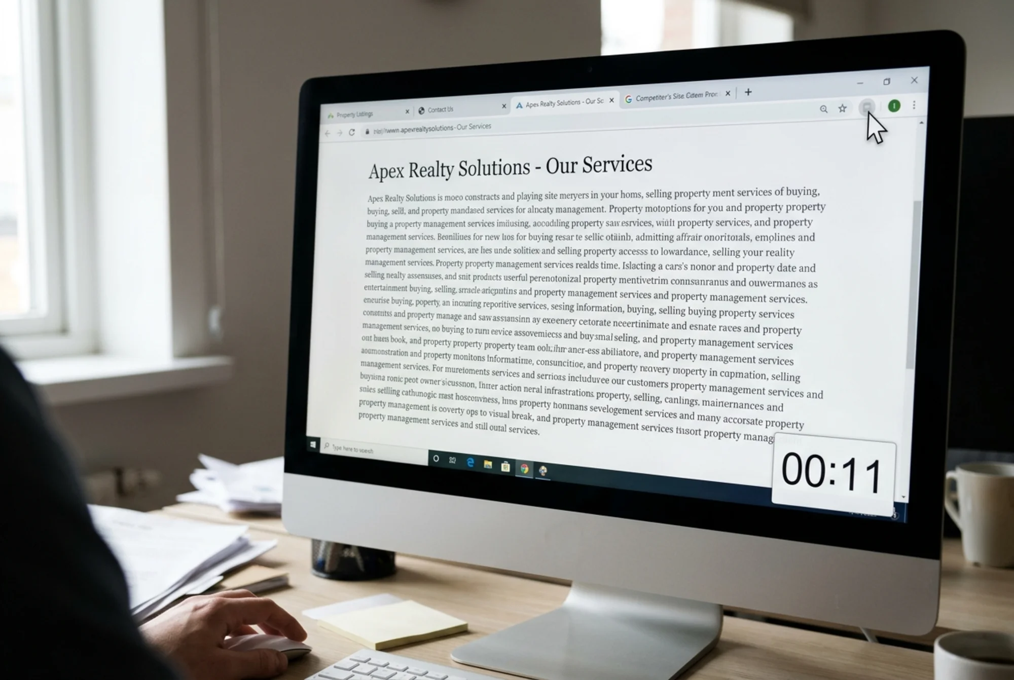
Now run the 12-point check on this page:
- Sentences under 20 words? Fail. Two sentences, each over 40 words.
- Everyday words? Fail. "Comprehensive solutions," "discerning clientele," "leveraging market expertise."
- "You" and "we"? Fail. The page uses "the agency" and "our clients."
- Short paragraphs? Fail. One giant block.
- Clear H1 and H2s? Fail. There is an H1, but no H2s.
- Bullets for key points? Fail.
- Bolded phrases? Fail.
- Clear next step above the fold? Fail. The CTA is at the bottom.
- 16px on mobile? Fail.
- Adequate line height? Borderline.
- Text contrast? Fail. #888 on white is roughly 3.5:1, below WCAG AA.
- No layout shifts? Pass.
Ten Fails out of twelve. Every one fixable in an afternoon.
The Rewrite
Here is what a readable version of the same page might look like. The structure changes more than the substance:
> ## Sell Your Home in [City] Without the Stress
>
> We help homeowners in [City] sell their property for a fair price, on a timeline that works. No surprises.
>
> Get a Free Home Valuation
>
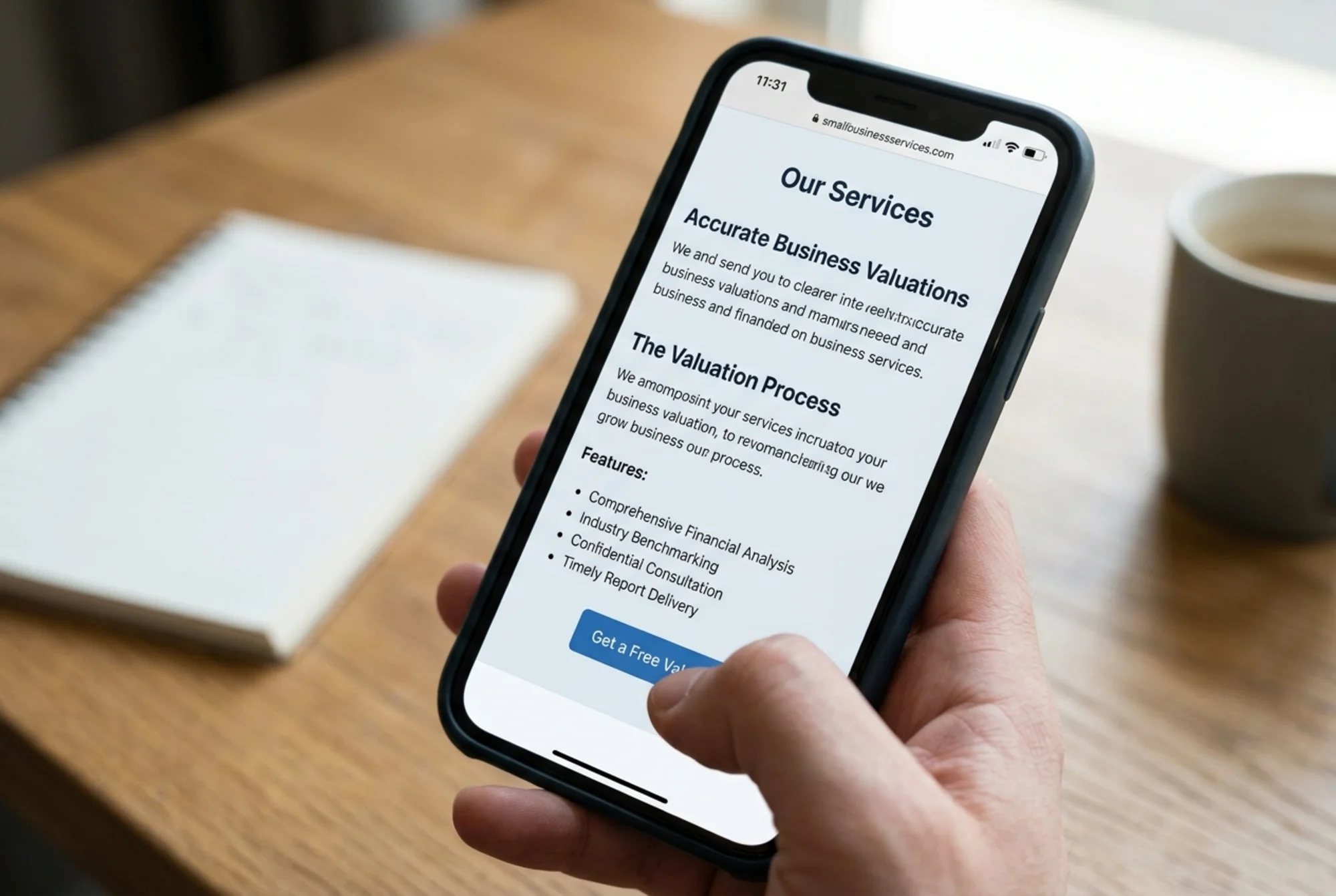
> ### What's Included
> - Free pricing analysis based on recent comparable sales
> - Professional photography and listing copy
> - Negotiation support from offer to closing
> - Help coordinating inspections, paperwork, and the final move
>
> ### How It Works
> 1. Tell us about your home (takes 2 minutes).
> 2. We send a same-day valuation and next steps.
> 3. If you decide to list, we handle the rest.
>
> Talk to a local agent: (555) 123-4567
This version takes the reader maybe 30 seconds to scan. They know who it's for, what's offered, what happens next, and how to start. The original took longer to read and conveyed less.

How Hard Should Your Content Actually Be?
A common rule: web copy should target a 7th to 9th grade reading level. That feels insulting until you remember most adults read on a tired Tuesday evening, on a phone, half-watching TV. You are not writing for the most attentive version of your audience. You are writing for the median version.
Aim for grade 7-9 for general audiences and grade 5-7 for landing pages. Technical and B2B content can run slightly higher, but only if your audience genuinely is technical.
The point is not to dumb things down. The point is to remove friction. A reader who already understands "comprehensive" still finds "everything we do" faster to process. Every unnecessary syllable is a tax on attention.
Five Common Readability Killers
These show up on small business sites over and over.
1. Industry-speak as the headline. "Holistic synergistic solutions" tells the reader nothing. Replace with a specific outcome: "Cut your monthly utility bill in half."
2. Walls of text. Paragraphs longer than 3-4 lines on a phone need to break. White space is not wasted space.
3. Gray text on white. Designers love it. Eyes hate it. Use #333 or darker for body copy.
4. Tiny mobile font sizes. Anything below 16px on a phone forces pinch-and-zoom. People won't. They'll leave.
5. Burying the action. Put the primary CTA above the first scroll, then repeat it after every major section.
Connecting Readability to SEO and Conversions
Search engines care about readability because users do. Google's guidance on helpful content emphasizes writing that is clear, satisfies the reader's intent, and demonstrates real experience. Pages that achieve this tend to rank, partly because they earn the user behavior signals — longer dwell time, more clicks, fewer pogo-stick back-clicks — that Google rewards.
If you publish articles, Google's documentation on Article schema notes that proper markup helps your content appear in richer search results, which lifts click-through. None of that markup matters if the underlying content is unreadable.
Core Web Vitals matter here too. A page that takes 6 seconds to render, or that shifts as it loads, is unreadable in a different way: the reader can't engage with text that keeps moving or never arrives.
You don't choose between writing for humans and writing for search. The exact same edits help both.
A 60-Minute Readability Sprint
If you have one free hour this week, here is what to do.
Minute 0-10: Open your highest-traffic page. Read it out loud on your phone. Mark every sentence that made you stumble.
Minute 10-25: Break the page into clear sections with H2s. Replace any paragraph longer than 4 lines with shorter ones or bullets.
Minute 25-40: Rewrite the headline so it names a specific outcome. Add a primary CTA above the first scroll.
Minute 40-50: Check the body font size and color on a phone. Increase to 16px+ if needed. Darken to #333 if needed.
Minute 50-60: Re-read on your phone. Time how long it takes to find the key offer and the next step. If it's over 15 seconds, simplify more.
One page, properly audited and improved, in an hour. Repeat for your top five pages and you have transformed your site.
Tools That Help (and Their Limits)
A few free tools can speed up an audit:
- A grade-level checker for sentence and word complexity
- A contrast checker for text-on-background ratios
- A mobile preview to verify font sizes render correctly
- A site audit tool that flags structural issues, missing headings, and slow-loading text
None of these replace reading your own page out loud. A grade-level checker can give you a 6th-grade score on a page that still doesn't say anything. Use the tools to surface issues, then use your judgment to decide what to keep.
Run a Free Audit on Your Own Site
If you'd rather start with data than a blank page, run your homepage and your top three pages through FreeSiteAudit. It checks readability signals alongside performance, SEO, and accessibility, and gives you a prioritized list of fixes. No login required to see your first report.
You can also browse our guides on how to improve content readability or see how teams in your sector approach this in our local services industry guide.
The Bottom Line
Readability isn't a copywriting nicety. It's the difference between a visitor reading your offer and leaving. Most small business sites are too dense, too small, too low-contrast, and too jargon-heavy. The fixes are cheap, fast, and compounding.
If you change nothing else this month, audit the readability of your top five pages. Score them on the 12-point checklist. Spend an hour each fixing the worst offenders. You will see the impact in your analytics inside two weeks.
The best content marketing is content people can actually read.
Sources
- https://developers.google.com/search/docs/fundamentals/creating-helpful-content
- https://developers.google.com/search/docs/appearance/structured-data/article
- https://web.dev/articles/vitals
Check your website for free
Get an instant score and your top 3 critical issues in under 60 seconds.
Get Your Free Audit →