# Screen Reader Compatibility Audit for Business Websites: A Plain-English Guide
If a customer can't read your website, they can't buy from you. That's obvious for sighted visitors, but a surprising number of small business sites are effectively invisible to anyone using a screen reader — the software that reads web pages aloud for people who are blind, have low vision, or have certain cognitive or motor conditions.
This guide is for small business owners and operators who aren't developers. It walks through what a screen reader compatibility audit is, what to check, how to run one yourself in under an hour, and what to fix first.
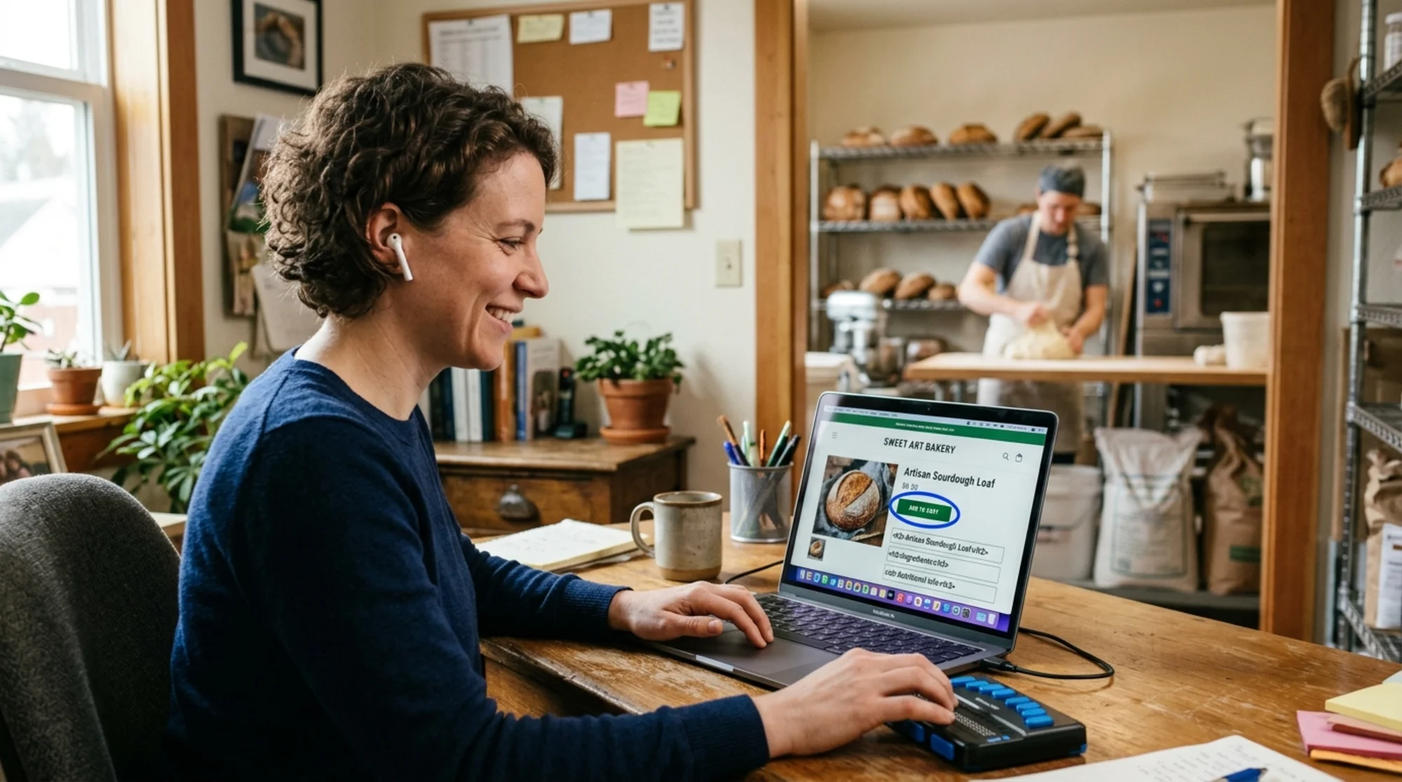
A blind professional woman in a small bakery office wearing earbuds, smiling as she navigates a bakery's product page on her laptop using VoiceOver, with the screen showing clear focus outlines around an "Add to cart" button and structured headings visible in the page What a Screen Reader Actually Does (and Why You Should Care) A screen reader takes the HTML on your page and announces it out loud, in order. The popular ones are NVDA and JAWS on Windows, VoiceOver on Mac and iPhone, and TalkBack on Android.
Users navigate by jumping between headings, links, buttons, form fields, and landmarks (like "main", "navigation", "footer"). If your site doesn't expose those things properly in the code, the user gets a confusing audio mess — or silence where a button should be.
Three reasons this matters for a small business:
Real customers can't reach you. WebAIM's annual analysis of the top million homepages consistently finds detectable accessibility failures on the vast majority of them. That's revenue walking past your door.Legal exposure. Lawsuits over inaccessible business websites have been filed in every US state, and small businesses are common targets because they're easier ones.It overlaps with SEO. Many of the same fixes — proper headings, alt text, clear link text — also help Google understand your page. Google's guidance on creating helpful content emphasizes clear structure and meaningful labels, which is exactly what screen readers need.The Plain-English Checklist A full WCAG audit has hundreds of checks. You don't need to do all of them today. Start with this short list, which catches the issues that cause the worst real-world failures.
1. Page title Every page needs a unique, descriptive </code>. Screen readers announce it the moment a page loads.</p><ul class="list-disc pl-5 space-y-1.5 my-4 text-text-secondary"><li>Bad: "Home" or "Untitled"</li><li>Good: "Wedding Cakes & Custom Desserts — Bluebird Bakery, Austin TX"</li></ul><h3 class="text-xl font-semibold text-text-primary mt-8 mb-3">2. Headings in order</h3><p class="text-text-secondary leading-relaxed my-4">Headings are how screen reader users skim. They press a single key to jump from heading to heading. If your "headings" are just bold text, or if you skip from H1 to H4, that navigation breaks.</p><ul class="list-disc pl-5 space-y-1.5 my-4 text-text-secondary"><li>One <code class="bg-surface-panel px-1.5 py-0.5 rounded text-sm text-accent-strong"><h1></code> per page (the page's main subject).</li><li><code class="bg-surface-panel px-1.5 py-0.5 rounded text-sm text-accent-strong"><h2></code> for major sections, <code class="bg-surface-panel px-1.5 py-0.5 rounded text-sm text-accent-strong"><h3></code> for subsections under those.</li><li>Pick heading levels based on hierarchy, not font size.</li></ul><h3 class="text-xl font-semibold text-text-primary mt-8 mb-3">3. Alt text on meaningful images</h3><p class="text-text-secondary leading-relaxed my-4">Every <code class="bg-surface-panel px-1.5 py-0.5 rounded text-sm text-accent-strong"><img></code> needs an <code class="bg-surface-panel px-1.5 py-0.5 rounded text-sm text-accent-strong">alt</code> attribute. The content depends on what the image is doing.</p><ul class="list-disc pl-5 space-y-1.5 my-4 text-text-secondary"><li>Product photo of a navy hoodie: <code class="bg-surface-panel px-1.5 py-0.5 rounded text-sm text-accent-strong">alt="Navy cotton hoodie, front view"</code></li><li>Pure decoration (a background swoosh): <code class="bg-surface-panel px-1.5 py-0.5 rounded text-sm text-accent-strong">alt=""</code> (intentionally empty)</li><li>A logo that's also a home link: <code class="bg-surface-panel px-1.5 py-0.5 rounded text-sm text-accent-strong">alt="Bluebird Bakery, home"</code></li><li>An infographic with numbers: describe the data, not "infographic"</li></ul><p class="text-text-secondary leading-relaxed my-4">If you're unsure, ask: "If I removed this image, what would the user lose?" That's your alt text.</p><h3 class="text-xl font-semibold text-text-primary mt-8 mb-3">4. Buttons that say what they do</h3><p class="text-text-secondary leading-relaxed my-4">A screen reader announces "button" plus its label. If the label is "click" or just an icon with no text, the user has no idea what the button does.</p><ul class="list-disc pl-5 space-y-1.5 my-4 text-text-secondary"><li>Bad: an icon-only trash button with no aria-label</li><li>Good: a button labeled "Remove item from cart"</li><li>Bad: "Click here" or "Read more" (especially when six of these are on the page)</li><li>Good: "Read our pricing guide"</li></ul><h3 class="text-xl font-semibold text-text-primary mt-8 mb-3">5. Form labels</h3><p class="text-text-secondary leading-relaxed my-4">Every input — name, email, address, search — needs a visible label wired to the input using <code class="bg-surface-panel px-1.5 py-0.5 rounded text-sm text-accent-strong">for</code> and <code class="bg-surface-panel px-1.5 py-0.5 rounded text-sm text-accent-strong">id</code>, or by wrapping the input inside the <code class="bg-surface-panel px-1.5 py-0.5 rounded text-sm text-accent-strong"><label></code>. Placeholder text is not a label; it disappears the moment someone starts typing.</p><h3 class="text-xl font-semibold text-text-primary mt-8 mb-3">6. Link text that makes sense out of context</h3><p class="text-text-secondary leading-relaxed my-4">Screen reader users often pull up a list of every link on the page. If 12 of them all say "Learn more", that list is useless.</p><h3 class="text-xl font-semibold text-text-primary mt-8 mb-3">7. Focus order and visible focus</h3><p class="text-text-secondary leading-relaxed my-4">Press Tab on your keyboard, starting from the address bar. Watch where the highlight goes. It should travel through the page in a sensible order, and every focused element should have a clearly visible outline. If the outline is invisible or focus jumps around erratically, screen reader and keyboard users are lost.</p><h3 class="text-xl font-semibold text-text-primary mt-8 mb-3">8. Landmarks</h3><p class="text-text-secondary leading-relaxed my-4">Modern HTML has tags like <code class="bg-surface-panel px-1.5 py-0.5 rounded text-sm text-accent-strong"><header></code>, <code class="bg-surface-panel px-1.5 py-0.5 rounded text-sm text-accent-strong"><nav></code>, <code class="bg-surface-panel px-1.5 py-0.5 rounded text-sm text-accent-strong"><main></code>, and <code class="bg-surface-panel px-1.5 py-0.5 rounded text-sm text-accent-strong"><footer></code>. Use them. Screen readers let users jump straight to "main content," skipping the menu they've already heard ten times today.</p><figure class="my-8"><img src="/blog-images/blog-screen-reader-compatibility-audit-for-business-websites-2-close-up-of-a-frustrated-small-business-owner-at-a-coffee-sh.webp" alt="Close-up of a frustrated small business owner at a coffee shop counter looking at a customer complaint email on a tablet, with the email visibly mentioning "couldn't check out with my screen reader" and the shop's homepage open on a nearby monitor showing unlabeled icon buttons and empty alt attributes in dev tools" class="w-full rounded-lg border border-border" loading="lazy"/><figcaption class="text-sm text-text-muted italic mt-2 text-center">Close-up of a frustrated small business owner at a coffee shop counter looking at a customer complaint email on a tablet, with the email visibly mentioning "couldn't check out with my screen reader" and the shop's homepage open on a nearby monitor showing unlabeled icon buttons and empty alt attributes in dev tools</figcaption></figure><h2 class="text-2xl font-bold text-text-primary mt-10 mb-4">How to Actually Run the Audit (45 Minutes, No Code)</h2><p class="text-text-secondary leading-relaxed my-4">Here's the workflow for a non-technical owner. You'll need a laptop and about an hour.</p><h3 class="text-xl font-semibold text-text-primary mt-8 mb-3">Step 1: Run an automated scan first (5 minutes)</h3><p class="text-text-secondary leading-relaxed my-4">Automated tools catch the obvious failures fast — missing alt text, missing labels, low color contrast, broken heading order. They won't catch everything, but they'll find the long pole in the tent.</p><p class="text-text-secondary leading-relaxed my-4">Use a free site audit (you can <a href="/tools/free-audit" class="text-accent hover:text-accent-strong underline">run one with FreeSiteAudit</a>) to get a baseline report across your pages. Save it. You'll come back to it.</p><h3 class="text-xl font-semibold text-text-primary mt-8 mb-3">Step 2: Turn on a screen reader and use your site (20 minutes)</h3><p class="text-text-secondary leading-relaxed my-4">This is the step most owners skip. It's also the one that teaches the most.</p><p class="text-text-secondary leading-relaxed my-4"><strong class="text-text-primary">On Mac:</strong> Press <code class="bg-surface-panel px-1.5 py-0.5 rounded text-sm text-accent-strong">Cmd + F5</code> to toggle VoiceOver. Run Apple's VoiceOver tutorial first if you've never tried it.</p><p class="text-text-secondary leading-relaxed my-4"><strong class="text-text-primary">On Windows:</strong> Download NVDA (free). Start it. Press <code class="bg-surface-panel px-1.5 py-0.5 rounded text-sm text-accent-strong">Insert + N</code> to open the menu and toggle speech.</p><p class="text-text-secondary leading-relaxed my-4"><strong class="text-text-primary">On iPhone:</strong> Settings → Accessibility → VoiceOver. Once on, swipe right to move forward and double-tap to activate. Set the Accessibility Shortcut so you can triple-click the side button to toggle it.</p><p class="text-text-secondary leading-relaxed my-4">Now look away from the screen and try to do these tasks on your site using only the screen reader and the keyboard:</p><ol class="list-decimal pl-5 space-y-1.5 my-4 text-text-secondary"><li>Find your phone number or contact info.</li><li>Find your most important product or service page.</li><li>Add an item to the cart, or fill out and submit your contact form.</li><li>Read your homepage hero section.</li></ol><p class="text-text-secondary leading-relaxed my-4">Note every place you get stuck, hear something confusing, or hit a dead end. Those are your real bugs.</p><h3 class="text-xl font-semibold text-text-primary mt-8 mb-3">Step 3: Cross-reference (10 minutes)</h3><p class="text-text-secondary leading-relaxed my-4">Take your notes from Step 2 and the automated report from Step 1. Anything appearing in both is top priority. Anything that only showed up in Step 2 — like a checkout flow that doesn't work without a mouse — is also top priority, even if the scanner missed it.</p><h3 class="text-xl font-semibold text-text-primary mt-8 mb-3">Step 4: Make a ranked fix list (10 minutes)</h3><p class="text-text-secondary leading-relaxed my-4">Group your issues into three buckets:</p><ul class="list-disc pl-5 space-y-1.5 my-4 text-text-secondary"><li><strong class="text-text-primary">Blocks a purchase or contact:</strong> broken forms, unreachable buttons, modal dialogs that trap focus, "Add to cart" that doesn't announce. Fix this week.</li><li><strong class="text-text-primary">Confuses navigation:</strong> missing headings, no landmarks, vague link text. Fix this month.</li><li><strong class="text-text-primary">Polish:</strong> decorative images with verbose alt text, slightly low contrast on secondary text, missing skip-link. Fix this quarter.</li></ul><h2 class="text-2xl font-bold text-text-primary mt-10 mb-4">A Real Walkthrough: Fixing a Florist's Product Page</h2><p class="text-text-secondary leading-relaxed my-4">Let's make this concrete. Imagine a small florist site, "Petalwise."</p><p class="text-text-secondary leading-relaxed my-4">The owner runs an audit and listens to her own product page in VoiceOver. Here's what she hears, in order:</p><p class="text-text-secondary leading-relaxed my-4">> "Petalwise dot com. Image. Image. Image. Heading level one, Spring Bouquet. Button. Button. Twenty-five dollars. Edit text."</p><p class="text-text-secondary leading-relaxed my-4">That's the entire experience. The problems:</p><ul class="list-disc pl-5 space-y-1.5 my-4 text-text-secondary"><li><strong class="text-text-primary">"Image. Image. Image."</strong> Three product photos with no alt text. Fix: give each a short, specific alt — <code class="bg-surface-panel px-1.5 py-0.5 rounded text-sm text-accent-strong">"Spring bouquet with pink peonies and white roses, top view"</code>.</li><li><strong class="text-text-primary">"Button. Button."</strong> Two icon-only buttons (probably a heart for "save" and a share icon). Fix: add an accessible name to each — <code class="bg-surface-panel px-1.5 py-0.5 rounded text-sm text-accent-strong">aria-label="Save to wishlist"</code> and <code class="bg-surface-panel px-1.5 py-0.5 rounded text-sm text-accent-strong">aria-label="Share this bouquet"</code>.</li><li><strong class="text-text-primary">"Twenty-five dollars."</strong> Good — price is announced. But notice it didn't say "price." Fix: place it inside semantic markup so it's clearly associated with the product.</li><li><strong class="text-text-primary">"Edit text."</strong> That's an unlabeled input — probably the quantity field. Fix: add a visible <code class="bg-surface-panel px-1.5 py-0.5 rounded text-sm text-accent-strong"><label for="qty">Quantity</label></code> tied to the input.</li><li><strong class="text-text-primary">Missing entirely: the "Add to Cart" button.</strong> It exists visually, but in code it's a <code class="bg-surface-panel px-1.5 py-0.5 rounded text-sm text-accent-strong"><div></code> with a click handler, not a real button. Fix: change it to a real <code class="bg-surface-panel px-1.5 py-0.5 rounded text-sm text-accent-strong"><button></code> element.</li></ul><p class="text-text-secondary leading-relaxed my-4">After the fixes, the same page reads:</p><p class="text-text-secondary leading-relaxed my-4">> "Petalwise. Link, home. Main. Heading level one, Spring Bouquet. Image, spring bouquet with pink peonies and white roses, top view. Button, save to wishlist. Button, share this bouquet. Price, twenty-five dollars. Quantity, edit text, one. Button, add to cart."</p><p class="text-text-secondary leading-relaxed my-4">That's a customer who can actually buy.</p><figure class="my-8"><img src="/blog-images/blog-screen-reader-compatibility-audit-for-business-websites-3-split-screen-workspace-showing-a-marketer-running-nvda-on-a-.webp" alt="Split-screen workspace showing a marketer running NVDA on a Windows laptop with the speech viewer open, listing aloud "button, button, button" for an unlabeled navigation, next to a printed audit checklist with items like "alt text", "form labels", "heading order" being ticked off with a pencil" class="w-full rounded-lg border border-border" loading="lazy"/><figcaption class="text-sm text-text-muted italic mt-2 text-center">Split-screen workspace showing a marketer running NVDA on a Windows laptop with the speech viewer open, listing aloud "button, button, button" for an unlabeled navigation, next to a printed audit checklist with items like "alt text", "form labels", "heading order" being ticked off with a pencil</figcaption></figure><h2 class="text-2xl font-bold text-text-primary mt-10 mb-4">Common Mistakes Small Business Sites Make</h2><p class="text-text-secondary leading-relaxed my-4">A few patterns show up over and over. Fix these before anything else:</p><ul class="list-disc pl-5 space-y-1.5 my-4 text-text-secondary"><li><strong class="text-text-primary">Modal popups that trap or lose focus.</strong> Newsletter pop-ups, age gates, and cookie banners are the worst offenders. The popup should pull focus to itself when it opens, restore focus when it closes, and be dismissible with Escape.</li><li><strong class="text-text-primary">Carousels with no controls.</strong> Auto-rotating sliders are a usability disaster for everyone. Replace with a static hero if you can. If you can't, make sure it can be paused and each slide is reachable by keyboard.</li><li><strong class="text-text-primary">PDF-only menus, schedules, or price lists.</strong> Restaurants and clinics often post a PDF and nothing else. PDFs are frequently inaccessible. Always have an HTML version of the same information.</li><li><strong class="text-text-primary">Decorative icons treated as content.</strong> Tiny social media icons with <code class="bg-surface-panel px-1.5 py-0.5 rounded text-sm text-accent-strong">alt="facebook icon"</code> get read aloud repeatedly. If the link text is "Facebook", the icon's alt should be empty.</li><li><strong class="text-text-primary">Inaccessible video.</strong> Captions are mandatory for embedded product videos or testimonials. A transcript is even better.</li><li><strong class="text-text-primary">Color-only signals.</strong> Red text saying "out of stock" is invisible to a screen reader unless the words "out of stock" are actually there. Don't rely on color alone.</li></ul><h2 class="text-2xl font-bold text-text-primary mt-10 mb-4">What "Done" Looks Like</h2><p class="text-text-secondary leading-relaxed my-4">You'll never reach 100% on every accessibility check on every page, and you don't need to. A good target for a small business site is:</p><ul class="list-disc pl-5 space-y-1.5 my-4 text-text-secondary"><li>Every page has a unique title and an H1.</li><li>Every image either has meaningful alt text or is explicitly marked decorative.</li><li>Every form field has a label.</li><li>Every button and link has a clear, unique purpose announced.</li><li>The full purchase or contact flow can be completed using only the keyboard.</li><li>A screen reader can read the page top to bottom without saying anything bare like "image" or "button" with no further information.</li></ul><p class="text-text-secondary leading-relaxed my-4">Once that's true, re-run the audit every quarter, after any major design change, and after you launch a new product page or campaign landing page. Regressions are easy to introduce when a designer adds a new section without thinking about labels.</p><figure class="my-8"><img src="/blog-images/blog-screen-reader-compatibility-audit-for-business-websites-4-a-florist-owner-happily-packing-an-online-order-in-her-shop-.webp" alt="A florist owner happily packing an online order in her shop, with her phone open to a confirmation screen reading "Order placed successfully," and a small printout taped to the wall showing a screen reader audit scoring 96/100 with green checkmarks next to "labels," "landmarks," and "focus order"" class="w-full rounded-lg border border-border" loading="lazy"/><figcaption class="text-sm text-text-muted italic mt-2 text-center">A florist owner happily packing an online order in her shop, with her phone open to a confirmation screen reading "Order placed successfully," and a small printout taped to the wall showing a screen reader audit scoring 96/100 with green checkmarks next to "labels," "landmarks," and "focus order"</figcaption></figure><h2 class="text-2xl font-bold text-text-primary mt-10 mb-4">The SEO Bonus</h2><p class="text-text-secondary leading-relaxed my-4">Almost every fix on this list also helps Google. Search engines parse the same HTML that screen readers do. Clear headings, descriptive link text, real button elements, alt text on images, and a logical landmark structure all feed into how well a crawler understands and ranks your content. Google's Core Web Vitals work on web.dev is complementary — together with accessibility hygiene, it covers most of what makes a small business site both findable and usable.</p><p class="text-text-secondary leading-relaxed my-4">The time you spend making your site work for a screen reader user isn't charity time. It's the same work that helps every other visitor and the search engine that brings them to you.</p><h2 class="text-2xl font-bold text-text-primary mt-10 mb-4">Quick-Start Action Plan</h2><p class="text-text-secondary leading-relaxed my-4">If you only have an hour this week, do this:</p><ol class="list-decimal pl-5 space-y-1.5 my-4 text-text-secondary"><li>Run a free audit on your homepage and your top-converting page. <a href="/tools/free-audit" class="text-accent hover:text-accent-strong underline">Start here.</a></li><li>Fix every missing alt text and every missing form label first. These are usually one-line changes.</li><li>Turn on VoiceOver or NVDA and try to complete a purchase on your own site. Note every place you fail.</li><li>Hand the audit report and your notes to whoever maintains your site, with the three-bucket priority list above.</li><li>Re-audit in 30 days.</li></ol><p class="text-text-secondary leading-relaxed my-4">Accessibility isn't a one-time project; it's a hygiene practice. But the first pass — the one that catches the worst blockers — is genuinely doable in an afternoon. Most of the customers you're losing to this issue right now are losing you to a competitor whose site they can actually use. Fix that, and you get them back.</p><p class="text-text-secondary leading-relaxed my-4"><strong class="text-text-primary">Ready to find out where your site stands?</strong> <a href="/tools/free-audit" class="text-accent hover:text-accent-strong underline">Run a free accessibility-aware site audit with FreeSiteAudit</a> and get a prioritized report you can hand straight to your developer — or work through yourself.</p><h2 class="text-2xl font-bold text-text-primary mt-10 mb-4">Sources</h2><ul class="list-disc pl-5 space-y-1.5 my-4 text-text-secondary"><li>Web Content Accessibility Guidelines (WCAG) — https://www.w3.org/WAI/standards-guidelines/wcag/</li><li>WebAIM Million annual accessibility report — https://webaim.org/projects/million/</li><li>Google Search Central: Creating helpful, reliable, people-first content — https://developers.google.com/search/docs/fundamentals/creating-helpful-content</li><li>web.dev Core Web Vitals — https://web.dev/articles/vitals</li></ul></div><div class="mt-12"></div><div class="mt-6 bg-gradient-to-r from-accent-subtle to-accent-subtle/50 border border-accent-border rounded-xl p-8 text-center"><h2 class="text-2xl font-bold mb-2">Check your website for free</h2><p class="text-text-muted mb-6">Get an instant score and your top 3 critical issues in under 60 seconds.</p><a class="inline-block bg-accent hover:bg-accent-strong text-text-inverse font-semibold px-10 py-3.5 rounded-lg transition-colors" href="/#free-audit">Get Your Free Audit →</a></div></article><footer class="border-t border-border mt-auto"><nav aria-label="Footer navigation" class="max-w-6xl mx-auto px-4 py-8 sm:py-12"><div class="grid grid-cols-2 md:grid-cols-3 gap-8 lg:flex lg:flex-row lg:flex-wrap lg:justify-between lg:gap-x-6"><div class="col-span-2 md:col-span-1 lg:max-w-[14rem]"><a class="text-lg font-bold tracking-tight" href="/"><span class="text-accent">Free</span>SiteAudit</a><p class="text-text-muted text-sm mt-3 leading-relaxed">Website audits for business owners and agencies. Find issues, fix them, grow.</p></div><div><h4 class="text-sm font-semibold text-text-secondary mb-3 lg:whitespace-nowrap">Solutions</h4><ul class="space-y-2"><li><a class="text-sm text-text-muted hover:text-text-secondary transition-colors lg:whitespace-nowrap" href="/#free-audit">Free Website Audit</a></li><li><a class="text-sm text-text-muted hover:text-text-secondary transition-colors lg:whitespace-nowrap" href="/agencies">For Agencies</a></li><li><a class="text-sm text-text-muted hover:text-text-secondary transition-colors lg:whitespace-nowrap" href="/pricing">Pricing</a></li><li><a class="text-sm text-text-muted hover:text-text-secondary transition-colors lg:whitespace-nowrap" href="/demo">Demo Report</a></li><li><a class="text-sm text-text-muted hover:text-text-secondary transition-colors lg:whitespace-nowrap" href="/dashboard">Dashboard</a></li></ul></div><div><h4 class="text-sm font-semibold text-text-secondary mb-3 lg:whitespace-nowrap">Industries</h4><ul class="space-y-2"><li><a class="text-sm text-text-muted hover:text-text-secondary transition-colors lg:whitespace-nowrap" href="/industries/saas">SaaS Apps</a></li><li><a class="text-sm text-text-muted hover:text-text-secondary transition-colors lg:whitespace-nowrap" href="/industries/dev-portfolios">Dev Portfolios</a></li><li><a class="text-sm text-text-muted hover:text-text-secondary transition-colors lg:whitespace-nowrap" href="/industries/blogs">Blogs & Content</a></li><li><a class="text-sm text-text-muted hover:text-text-secondary transition-colors lg:whitespace-nowrap" href="/industries/courses">Course Sites</a></li><li><a class="text-sm text-text-muted hover:text-text-secondary transition-colors lg:whitespace-nowrap" href="/industries/agency-sites">Agency Sites</a></li><li><a class="text-sm text-text-muted hover:text-text-secondary transition-colors lg:whitespace-nowrap" href="/industries">All Industries</a></li></ul></div><div><h4 class="text-sm font-semibold text-text-secondary mb-3 lg:whitespace-nowrap">Compare & Results</h4><ul class="space-y-2"><li><a class="text-sm text-text-muted hover:text-text-secondary transition-colors lg:whitespace-nowrap" href="/blog/freesiteaudit-vs-semrush">vs Semrush</a></li><li><a class="text-sm text-text-muted hover:text-text-secondary transition-colors lg:whitespace-nowrap" href="/blog/freesiteaudit-vs-seoptimer-vs-seo-site-checkup">vs SEOptimer</a></li><li><a class="text-sm text-text-muted hover:text-text-secondary transition-colors lg:whitespace-nowrap" href="/case-studies">Success Stories</a></li><li><a class="text-sm text-text-muted hover:text-text-secondary transition-colors lg:whitespace-nowrap" href="https://findbackflowtesters.com">FindBackflowTesters.com</a></li><li><a class="text-sm text-text-muted hover:text-text-secondary transition-colors lg:whitespace-nowrap" href="https://freesiteaudit.com">FreeSiteAudit.com</a></li></ul></div><div><h4 class="text-sm font-semibold text-text-secondary mb-3 lg:whitespace-nowrap">Resources</h4><ul class="space-y-2"><li><a class="text-sm text-text-muted hover:text-text-secondary transition-colors lg:whitespace-nowrap" href="/blog">Blog</a></li><li><a class="text-sm text-text-muted hover:text-text-secondary transition-colors lg:whitespace-nowrap" href="/tools">Free Tools</a></li><li><a class="text-sm text-text-muted hover:text-text-secondary transition-colors lg:whitespace-nowrap" href="/fixes">Fix Library</a></li><li><a class="text-sm text-text-muted hover:text-text-secondary transition-colors lg:whitespace-nowrap" href="/about">About</a></li><li><a class="text-sm text-text-muted hover:text-text-secondary transition-colors lg:whitespace-nowrap" href="mailto:hello@freesiteaudit.com">Contact</a></li></ul></div><div><h4 class="text-sm font-semibold text-text-secondary mb-3 lg:whitespace-nowrap">Legal</h4><ul class="space-y-2"><li><a class="text-sm text-text-muted hover:text-text-secondary transition-colors lg:whitespace-nowrap" href="/privacy">Privacy Policy</a></li><li><a class="text-sm text-text-muted hover:text-text-secondary transition-colors lg:whitespace-nowrap" href="/terms">Terms of Service</a></li></ul></div><div><h4 class="text-sm font-semibold text-text-secondary mb-3 lg:whitespace-nowrap">Platforms</h4><ul class="space-y-2"><li><a class="text-sm text-text-muted hover:text-text-secondary transition-colors lg:whitespace-nowrap" href="/platforms/wordpress">WordPress</a></li><li><a class="text-sm text-text-muted hover:text-text-secondary transition-colors lg:whitespace-nowrap" href="/platforms/shopify">Shopify</a></li><li><a class="text-sm text-text-muted hover:text-text-secondary transition-colors lg:whitespace-nowrap" href="/platforms/webflow">Webflow</a></li><li><a class="text-sm text-text-muted hover:text-text-secondary transition-colors lg:whitespace-nowrap" href="/platforms/wix">Wix</a></li><li><a class="text-sm text-text-muted hover:text-text-secondary transition-colors lg:whitespace-nowrap" href="/platforms/squarespace">Squarespace</a></li></ul></div></div><div class="border-t border-border-subtle mt-10 pt-6 flex flex-col sm:flex-row items-center justify-between gap-3 text-xs text-text-muted"><span>© <!-- -->2026<!-- --> FreeSiteAudit. All rights reserved.</span><div class="flex items-center gap-4"><a class="hover:text-text-secondary transition-colors" href="/privacy">Privacy</a><a class="hover:text-text-secondary transition-colors" href="/terms">Terms</a></div></div></nav></footer></div><!--$--><!--/$--></main><button aria-label="Contact us" class="fixed right-4 z-40 flex items-center gap-2 rounded-full bg-accent text-accent-foreground font-semibold text-sm h-12 px-5 shadow-accent-glow hover:bg-accent-strong hover:shadow-accent-glow-lg transition-all duration-200 bottom-[calc(1rem+env(safe-area-inset-bottom))] sm:bottom-6"><svg class="w-5 h-5" fill="none" viewBox="0 0 24 24" stroke="currentColor" stroke-width="2"><path stroke-linecap="round" stroke-linejoin="round" d="M8.625 12a.375.375 0 11-.75 0 .375.375 0 01.75 0zm4.125 0a.375.375 0 11-.75 0 .375.375 0 01.75 0zm4.125 0a.375.375 0 11-.75 0 .375.375 0 01.75 0zM2.25 12.76c0 1.6 1.123 2.994 2.707 3.227 1.087.16 2.185.283 3.293.369V21l4.076-4.076a1.526 1.526 0 011.037-.443 48.282 48.282 0 005.68-.494c1.584-.233 2.707-1.626 2.707-3.228V6.741c0-1.602-1.123-2.995-2.707-3.228A48.394 48.394 0 0012 3c-2.392 0-4.744.175-7.043.513C3.373 3.746 2.25 5.14 2.25 6.741v6.018z"></path></svg><span class="hidden sm:inline">Contact Us</span></button></div><button aria-label="Switch to light mode" aria-pressed="false" class="fixed right-4 z-40 flex items-center justify-center rounded-full w-10 h-10 border border-border bg-surface-elevated text-text-secondary hover:text-text-primary hover:bg-surface-panel shadow-panel-sm transition-all duration-200 bottom-[calc(1rem+env(safe-area-inset-bottom)+3.75rem)] sm:bottom-[5.25rem]"><svg class="w-[18px] h-[18px]" fill="none" viewBox="0 0 24 24" stroke="currentColor" stroke-width="2"><path stroke-linecap="round" stroke-linejoin="round" d="M12 3v2.25m6.364.386l-1.591 1.591M21 12h-2.25m-.386 6.364l-1.591-1.591M12 18.75V21m-4.773-4.227l-1.591 1.591M5.25 12H3m4.227-4.773L5.636 5.636M15.75 12a3.75 3.75 0 11-7.5 0 3.75 3.75 0 017.5 0z"></path></svg></button><script src="/_next/static/chunks/webpack-092588108e816234.js" id="_R_" async=""></script><script>(self.__next_f=self.__next_f||[]).push([0])</script><script>self.__next_f.push([1,"1:\"$Sreact.fragment\"\n8:I[57150,[],\"\"]\n:HL[\"/_next/static/media/4473ecc91f70f139-s.p.woff\",\"font\",{\"crossOrigin\":\"\",\"type\":\"font/woff\"}]\n:HL[\"/_next/static/media/463dafcda517f24f-s.p.woff\",\"font\",{\"crossOrigin\":\"\",\"type\":\"font/woff\"}]\n:HL[\"/_next/static/css/ce06d03cd29772c1.css\",\"style\"]\n:HL[\"/_next/static/css/5adad2ac1ae9f57d.css\",\"style\"]\n2:Tbac,"])</script><script>self.__next_f.push([1,"{\"@context\":\"https://schema.org\",\"@type\":\"FAQPage\",\"mainEntity\":[{\"@type\":\"Question\",\"name\":\"Is the free audit really free?\",\"acceptedAnswer\":{\"@type\":\"Answer\",\"text\":\"Yes, completely free. Just enter your URL — no account, no email, no credit card. You get your overall score and top issues instantly. Want more? Create a free account to save your report and get 2 pro scan credits.\"}},{\"@type\":\"Question\",\"name\":\"How long until I get my report?\",\"acceptedAnswer\":{\"@type\":\"Answer\",\"text\":\"The Quick Scan is typically under 60 seconds. Paid reports are generated and emailed within 2–3 minutes of payment.\"}},{\"@type\":\"Question\",\"name\":\"What do you analyze?\",\"acceptedAnswer\":{\"@type\":\"Answer\",\"text\":\"9 categories: SEO \u0026 Search Visibility, Website Performance \u0026 Speed, Mobile Experience, Security \u0026 Privacy, Accessibility, Content \u0026 Messaging, Technical Health, Trust \u0026 Credibility, and Local SEO \u0026 Google Business. Each category is scored independently, and we provide specific evidence and fix instructions for every issue found.\"}},{\"@type\":\"Question\",\"name\":\"Do I need technical knowledge?\",\"acceptedAnswer\":{\"@type\":\"Answer\",\"text\":\"Not at all. Reports are written in plain language with prioritized, step-by-step recommendations. Each issue is labeled with who can fix it, and many are things you can do yourself without touching code.\"}},{\"@type\":\"Question\",\"name\":\"How accurate is the analysis?\",\"acceptedAnswer\":{\"@type\":\"Answer\",\"text\":\"We analyze your actual live website, checking real page speed, real HTML structure, and real content. Every finding comes with specific evidence from your site, so you can verify it yourself.\"}},{\"@type\":\"Question\",\"name\":\"Is my data safe?\",\"acceptedAnswer\":{\"@type\":\"Answer\",\"text\":\"Absolutely. We only use your email to deliver your report. No spam, no sharing with third parties. We analyze publicly accessible pages (the same thing Google sees). We never store passwords, we don't access admin panels, and we never sell your data. All connections are encrypted with 256-bit SSL. See our Privacy Policy for full details.\"}},{\"@type\":\"Question\",\"name\":\"Can I see a sample report before buying?\",\"acceptedAnswer\":{\"@type\":\"Answer\",\"text\":\"Yes! Check out our interactive demo report to see exactly what a full audit looks like, with real findings, evidence, and fix instructions you can explore.\"}},{\"@type\":\"Question\",\"name\":\"How do I cancel my subscription?\",\"acceptedAnswer\":{\"@type\":\"Answer\",\"text\":\"You can cancel anytime from your dashboard. Just click \\\"Manage Subscription\\\" to open the billing portal. Your audit access continues until the end of your current billing period.\"}},{\"@type\":\"Question\",\"name\":\"Who built FreeSiteAudit?\",\"acceptedAnswer\":{\"@type\":\"Answer\",\"text\":\"FreeSiteAudit was built by web professionals who wanted to make professional-grade website audits accessible to every business owner. We combined real-world SEO and web development experience with automation to deliver clear, actionable reports.\"}}]}"])</script><script>self.__next_f.push([1,"0:{\"P\":null,\"b\":\"23djxc4YWdrEwqJ0FoqV6\",\"p\":\"\",\"c\":[\"\",\"blog\",\"screen-reader-compatibility-audit-for-business-websites\"],\"i\":false,\"f\":[[[\"\",{\"children\":[\"blog\",{\"children\":[[\"slug\",\"screen-reader-compatibility-audit-for-business-websites\",\"d\"],{\"children\":[\"__PAGE__\",{}]}]}]},\"$undefined\",\"$undefined\",true],[\"\",[\"$\",\"$1\",\"c\",{\"children\":[[[\"$\",\"link\",\"0\",{\"rel\":\"stylesheet\",\"href\":\"/_next/static/css/ce06d03cd29772c1.css\",\"precedence\":\"next\",\"crossOrigin\":\"$undefined\",\"nonce\":\"$undefined\"}],[\"$\",\"link\",\"1\",{\"rel\":\"stylesheet\",\"href\":\"/_next/static/css/5adad2ac1ae9f57d.css\",\"precedence\":\"next\",\"crossOrigin\":\"$undefined\",\"nonce\":\"$undefined\"}]],[\"$\",\"html\",null,{\"lang\":\"en\",\"suppressHydrationWarning\":true,\"children\":[[\"$\",\"head\",null,{\"children\":[[\"$\",\"script\",null,{\"dangerouslySetInnerHTML\":{\"__html\":\"(function(){try{var t=localStorage.getItem('theme');if(!t)t='dark';document.documentElement.classList.add(t);document.documentElement.style.colorScheme=t;var m=document.querySelector('meta[name=\\\"theme-color\\\"]');if(m)m.content=t==='light'?'#faf9fe':'#09090b'}catch(e){document.documentElement.classList.add('dark');document.documentElement.style.colorScheme='dark'}})()\"}}],[\"$\",\"link\",null,{\"rel\":\"icon\",\"href\":\"/favicon.ico\",\"sizes\":\"any\"}],[\"$\",\"meta\",null,{\"name\":\"theme-color\",\"content\":\"#09090b\"}],[\"$\",\"link\",null,{\"rel\":\"preconnect\",\"href\":\"https://js.stripe.com\"}],[\"$\",\"link\",null,{\"rel\":\"dns-prefetch\",\"href\":\"https://js.stripe.com\"}],[\"$\",\"link\",null,{\"rel\":\"preconnect\",\"href\":\"https://api.stripe.com\"}],[\"$\",\"link\",null,{\"rel\":\"dns-prefetch\",\"href\":\"https://api.stripe.com\"}],[[\"$\",\"script\",\"0\",{\"type\":\"application/ld+json\",\"dangerouslySetInnerHTML\":{\"__html\":\"{\\\"@context\\\":\\\"https://schema.org\\\",\\\"@type\\\":\\\"Organization\\\",\\\"@id\\\":\\\"https://freesiteaudit.com/#organization\\\",\\\"name\\\":\\\"FreeSiteAudit\\\",\\\"url\\\":\\\"https://freesiteaudit.com\\\",\\\"logo\\\":{\\\"@type\\\":\\\"ImageObject\\\",\\\"url\\\":\\\"https://freesiteaudit.com/logo.png\\\",\\\"width\\\":\\\"200\\\",\\\"height\\\":\\\"60\\\"},\\\"description\\\":\\\"Free instant website audit tool for small businesses. Check your SEO, speed, mobile-friendliness \u0026 security in seconds.\\\",\\\"sameAs\\\":[],\\\"contactPoint\\\":{\\\"@type\\\":\\\"ContactPoint\\\",\\\"contactType\\\":\\\"Customer Service\\\",\\\"availableLanguage\\\":[\\\"English\\\"]}}\"}}],[\"$\",\"script\",\"1\",{\"type\":\"application/ld+json\",\"dangerouslySetInnerHTML\":{\"__html\":\"{\\\"@context\\\":\\\"https://schema.org\\\",\\\"@type\\\":\\\"ProfessionalService\\\",\\\"@id\\\":\\\"https://freesiteaudit.com/#business\\\",\\\"name\\\":\\\"FreeSiteAudit\\\",\\\"url\\\":\\\"https://freesiteaudit.com\\\",\\\"logo\\\":\\\"https://freesiteaudit.com/logo.png\\\",\\\"description\\\":\\\"Professional website audit and SEO analysis service for small businesses. Get instant insights and actionable recommendations.\\\",\\\"priceRange\\\":\\\"Free - $$\\\",\\\"areaServed\\\":{\\\"@type\\\":\\\"Place\\\",\\\"name\\\":\\\"Worldwide\\\"},\\\"hasOfferCatalog\\\":{\\\"@type\\\":\\\"OfferCatalog\\\",\\\"name\\\":\\\"Website Audit Services\\\",\\\"itemListElement\\\":[{\\\"@type\\\":\\\"Offer\\\",\\\"itemOffered\\\":{\\\"@type\\\":\\\"Service\\\",\\\"name\\\":\\\"Free Website Audit\\\",\\\"description\\\":\\\"2 free website audits per week with AI-powered analysis\\\"},\\\"price\\\":\\\"0\\\",\\\"priceCurrency\\\":\\\"USD\\\"},{\\\"@type\\\":\\\"Offer\\\",\\\"itemOffered\\\":{\\\"@type\\\":\\\"Service\\\",\\\"name\\\":\\\"Starter Plan\\\",\\\"description\\\":\\\"5 website audits per week with priority support\\\"},\\\"price\\\":\\\"19.00\\\",\\\"priceCurrency\\\":\\\"USD\\\"}]}}\"}}],[\"$\",\"script\",\"2\",{\"type\":\"application/ld+json\",\"dangerouslySetInnerHTML\":{\"__html\":\"{\\\"@context\\\":\\\"https://schema.org\\\",\\\"@type\\\":\\\"WebSite\\\",\\\"@id\\\":\\\"https://freesiteaudit.com/#website\\\",\\\"url\\\":\\\"https://freesiteaudit.com\\\",\\\"name\\\":\\\"FreeSiteAudit\\\",\\\"description\\\":\\\"Free website audit tool for small businesses\\\",\\\"publisher\\\":{\\\"@id\\\":\\\"https://freesiteaudit.com/#organization\\\"}}\"}}],[\"$\",\"script\",\"3\",{\"type\":\"application/ld+json\",\"dangerouslySetInnerHTML\":{\"__html\":\"$2\"}}]]]}],\"$L3\"]}]]}],{\"children\":[\"blog\",\"$L4\",{\"children\":[[\"slug\",\"screen-reader-compatibility-audit-for-business-websites\",\"d\"],\"$L5\",{\"children\":[\"__PAGE__\",\"$L6\",{},null,false]},null,false]},null,false]},null,false],\"$L7\",false]],\"m\":\"$undefined\",\"G\":[\"$8\",[]],\"s\":false,\"S\":true}\n"])</script><script>self.__next_f.push([1,"9:I[7143,[\"7177\",\"static/chunks/app/layout-2ca08483bb34668c.js\"],\"GoogleAnalytics\"]\na:I[43347,[\"7177\",\"static/chunks/app/layout-2ca08483bb34668c.js\"],\"PostHogProvider\"]\nb:I[47212,[\"7177\",\"static/chunks/app/layout-2ca08483bb34668c.js\"],\"WebVitals\"]\nc:I[63479,[\"7177\",\"static/chunks/app/layout-2ca08483bb34668c.js\"],\"ThemeProvider\"]\nd:I[9766,[],\"\"]\ne:I[98924,[],\"\"]\nf:I[65534,[\"7177\",\"static/chunks/app/layout-2ca08483bb34668c.js\"],\"ConditionalFooter\"]\n10:I[28923,[\"7177\",\"static/chunks/app/layout-2ca08483bb34668c.js\"],\"default\"]\n11:I[49196,[\"7177\",\"static/chunks/app/layout-2ca08483bb34668c.js\"],\"ThemeToggle\"]\n13:I[24431,[],\"OutletBoundary\"]\n15:I[15278,[],\"AsyncMetadataOutlet\"]\n17:I[24431,[],\"ViewportBoundary\"]\n19:I[24431,[],\"MetadataBoundary\"]\n1a:\"$Sreact.suspense\"\n"])</script><script>self.__next_f.push([1,"3:[\"$\",\"body\",null,{\"className\":\"__variable_1e4310 __variable_c3aa02 antialiased bg-surface-body text-text-primary\",\"children\":[[\"$\",\"a\",null,{\"href\":\"#main-content\",\"className\":\"sr-only focus:not-sr-only focus:fixed focus:top-4 focus:left-4 focus:z-[100] focus:bg-accent focus:text-accent-foreground focus:px-4 focus:py-2 focus:rounded-lg focus:font-semibold focus:text-sm focus:outline-none focus:shadow-lg\",\"children\":\"Skip to main content\"}],[\"$\",\"$L9\",null,{}],[\"$\",\"$La\",null,{}],[\"$\",\"$Lb\",null,{}],[\"$\",\"$Lc\",null,{\"children\":[[\"$\",\"div\",null,{\"className\":\"flex flex-col min-h-screen\",\"children\":[[\"$\",\"main\",null,{\"id\":\"main-content\",\"children\":[\"$\",\"$Ld\",null,{\"parallelRouterKey\":\"children\",\"error\":\"$undefined\",\"errorStyles\":\"$undefined\",\"errorScripts\":\"$undefined\",\"template\":[\"$\",\"$Le\",null,{}],\"templateStyles\":\"$undefined\",\"templateScripts\":\"$undefined\",\"notFound\":[[[\"$\",\"title\",null,{\"children\":\"404: This page could not be found.\"}],[\"$\",\"div\",null,{\"style\":{\"fontFamily\":\"system-ui,\\\"Segoe UI\\\",Roboto,Helvetica,Arial,sans-serif,\\\"Apple Color Emoji\\\",\\\"Segoe UI Emoji\\\"\",\"height\":\"100vh\",\"textAlign\":\"center\",\"display\":\"flex\",\"flexDirection\":\"column\",\"alignItems\":\"center\",\"justifyContent\":\"center\"},\"children\":[\"$\",\"div\",null,{\"children\":[[\"$\",\"style\",null,{\"dangerouslySetInnerHTML\":{\"__html\":\"body{color:#000;background:#fff;margin:0}.next-error-h1{border-right:1px solid rgba(0,0,0,.3)}@media (prefers-color-scheme:dark){body{color:#fff;background:#000}.next-error-h1{border-right:1px solid rgba(255,255,255,.3)}}\"}}],[\"$\",\"h1\",null,{\"className\":\"next-error-h1\",\"style\":{\"display\":\"inline-block\",\"margin\":\"0 20px 0 0\",\"padding\":\"0 23px 0 0\",\"fontSize\":24,\"fontWeight\":500,\"verticalAlign\":\"top\",\"lineHeight\":\"49px\"},\"children\":404}],[\"$\",\"div\",null,{\"style\":{\"display\":\"inline-block\"},\"children\":[\"$\",\"h2\",null,{\"style\":{\"fontSize\":14,\"fontWeight\":400,\"lineHeight\":\"49px\",\"margin\":0},\"children\":\"This page could not be found.\"}]}]]}]}]],[]],\"forbidden\":\"$undefined\",\"unauthorized\":\"$undefined\"}]}],[\"$\",\"$Lf\",null,{}],[\"$\",\"$L10\",null,{}]]}],[\"$\",\"$L11\",null,{}]]}]]}]\n"])</script><script>self.__next_f.push([1,"4:[\"$\",\"$1\",\"c\",{\"children\":[null,[\"$\",\"$Ld\",null,{\"parallelRouterKey\":\"children\",\"error\":\"$undefined\",\"errorStyles\":\"$undefined\",\"errorScripts\":\"$undefined\",\"template\":[\"$\",\"$Le\",null,{}],\"templateStyles\":\"$undefined\",\"templateScripts\":\"$undefined\",\"notFound\":\"$undefined\",\"forbidden\":\"$undefined\",\"unauthorized\":\"$undefined\"}]]}]\n5:[\"$\",\"$1\",\"c\",{\"children\":[null,[\"$\",\"$Ld\",null,{\"parallelRouterKey\":\"children\",\"error\":\"$undefined\",\"errorStyles\":\"$undefined\",\"errorScripts\":\"$undefined\",\"template\":[\"$\",\"$Le\",null,{}],\"templateStyles\":\"$undefined\",\"templateScripts\":\"$undefined\",\"notFound\":\"$undefined\",\"forbidden\":\"$undefined\",\"unauthorized\":\"$undefined\"}]]}]\n6:[\"$\",\"$1\",\"c\",{\"children\":[\"$L12\",null,[\"$\",\"$L13\",null,{\"children\":[\"$L14\",[\"$\",\"$L15\",null,{\"promise\":\"$@16\"}]]}]]}]\n7:[\"$\",\"$1\",\"h\",{\"children\":[null,[[\"$\",\"$L17\",null,{\"children\":\"$L18\"}],[\"$\",\"meta\",null,{\"name\":\"next-size-adjust\",\"content\":\"\"}]],[\"$\",\"$L19\",null,{\"children\":[\"$\",\"div\",null,{\"hidden\":true,\"children\":[\"$\",\"$1a\",null,{\"fallback\":null,\"children\":\"$L1b\"}]}]}]]}]\n"])</script><script>self.__next_f.push([1,"1c:I[41654,[\"5953\",\"static/chunks/app/blog/%5Bslug%5D/page-594ce9f3ae4ecbe2.js\"],\"MarketingNav\"]\n1d:I[23732,[\"5953\",\"static/chunks/app/blog/%5Bslug%5D/page-594ce9f3ae4ecbe2.js\"],\"default\"]\n"])</script><script>self.__next_f.push([1,"12:[[[\"$\",\"script\",\"0\",{\"type\":\"application/ld+json\",\"dangerouslySetInnerHTML\":{\"__html\":\"{\\\"@context\\\":\\\"https://schema.org\\\",\\\"@type\\\":\\\"Article\\\",\\\"headline\\\":\\\"Screen Reader Compatibility Audit for Business Websites: A Plain-English Guide\\\",\\\"description\\\":\\\"A no-jargon walkthrough for small business owners on auditing and fixing screen reader compatibility issues that quietly block real customers from buying today.\\\",\\\"author\\\":{\\\"@type\\\":\\\"Person\\\",\\\"name\\\":\\\"FreeSiteAudit\\\"},\\\"publisher\\\":{\\\"@id\\\":\\\"https://freesiteaudit.com/#organization\\\"},\\\"datePublished\\\":\\\"2026-01-12T00:00:00.000Z\\\",\\\"dateModified\\\":\\\"2026-01-12T00:00:00.000Z\\\",\\\"mainEntityOfPage\\\":{\\\"@type\\\":\\\"WebPage\\\",\\\"@id\\\":\\\"https://freesiteaudit.com/blog/screen-reader-compatibility-audit-for-business-websites\\\"}}\"}}],[\"$\",\"script\",\"1\",{\"type\":\"application/ld+json\",\"dangerouslySetInnerHTML\":{\"__html\":\"{\\\"@context\\\":\\\"https://schema.org\\\",\\\"@type\\\":\\\"BreadcrumbList\\\",\\\"itemListElement\\\":[{\\\"@type\\\":\\\"ListItem\\\",\\\"position\\\":1,\\\"name\\\":\\\"Home\\\",\\\"item\\\":\\\"https://freesiteaudit.com\\\"},{\\\"@type\\\":\\\"ListItem\\\",\\\"position\\\":2,\\\"name\\\":\\\"Blog\\\",\\\"item\\\":\\\"https://freesiteaudit.com/blog\\\"},{\\\"@type\\\":\\\"ListItem\\\",\\\"position\\\":3,\\\"name\\\":\\\"Screen Reader Compatibility Audit for Business Websites: A Plain-English Guide\\\",\\\"item\\\":\\\"https://freesiteaudit.com/blog/screen-reader-compatibility-audit-for-business-websites\\\"}]}\"}}]],[\"$\",\"div\",null,{\"className\":\"min-h-screen\",\"children\":[[\"$\",\"$L1c\",null,{}],[\"$\",\"article\",null,{\"className\":\"max-w-3xl mx-auto px-4 py-16\",\"children\":[[\"$\",\"$L1d\",null,{\"items\":[{\"label\":\"Blog\",\"href\":\"/blog\"},{\"label\":\"Screen Reader Compatibility Audit for Business Websites: A Plain-English Guide\"}]}],[\"$\",\"div\",null,{\"className\":\"mb-8\",\"children\":[[\"$\",\"div\",null,{\"className\":\"flex items-center gap-3 text-sm text-text-muted mb-4\",\"children\":[[\"$\",\"time\",null,{\"children\":\"January 12, 2026\"}],[\"$\",\"span\",null,{\"children\":\"·\"}],[\"$\",\"span\",null,{\"children\":\"13 min read\"}],[[\"$\",\"span\",null,{\"children\":\"·\"}],[\"$\",\"span\",null,{\"className\":\"text-accent/70\",\"children\":\"Checklists\"}]]]}],[\"$\",\"h1\",null,{\"className\":\"text-3xl sm:text-4xl font-bold tracking-tight mb-4\",\"children\":\"Screen Reader Compatibility Audit for Business Websites: A Plain-English Guide\"}],[\"$\",\"p\",null,{\"className\":\"text-lg text-text-muted\",\"children\":\"A no-jargon walkthrough for small business owners on auditing and fixing screen reader compatibility issues that quietly block real customers from buying today.\"}]]}],[\"$\",\"div\",null,{\"className\":\"border-t border-border pt-8\",\"children\":[[\"$\",\"p\",\"0\",{\"className\":\"text-text-secondary leading-relaxed my-4\",\"dangerouslySetInnerHTML\":{\"__html\":\"# Screen Reader Compatibility Audit for Business Websites: A Plain-English Guide\"}}],[\"$\",\"p\",\"2\",{\"className\":\"text-text-secondary leading-relaxed my-4\",\"dangerouslySetInnerHTML\":{\"__html\":\"If a customer can't read your website, they can't buy from you. That's obvious for sighted visitors, but a surprising number of small business sites are effectively invisible to anyone using a screen reader — the software that reads web pages aloud for people who are blind, have low vision, or have certain cognitive or motor conditions.\"}}],[\"$\",\"p\",\"4\",{\"className\":\"text-text-secondary leading-relaxed my-4\",\"dangerouslySetInnerHTML\":{\"__html\":\"This guide is for small business owners and operators who aren't developers. It walks through what a screen reader compatibility audit is, what to check, how to run one yourself in under an hour, and what to fix first.\"}}],[\"$\",\"figure\",\"img-7\",{\"className\":\"my-8\",\"children\":[[\"$\",\"img\",null,{\"src\":\"/blog-images/blog-screen-reader-compatibility-audit-for-business-websites-1-a-blind-professional-woman-in-a-small-bakery-office-wearing-.webp\",\"alt\":\"A blind professional woman in a small bakery office wearing earbuds, smiling as she navigates a bakery's product page on her laptop using VoiceOver, with the screen showing clear focus outlines around an \\\"Add to cart\\\" button and structured headings visible in the page\",\"className\":\"w-full rounded-lg border border-border\",\"loading\":\"lazy\"}],\"$L1e\"]}],\"$L1f\",\"$L20\",\"$L21\",\"$L22\",\"$L23\",\"$L24\",\"$L25\",\"$L26\",\"$L27\",\"$L28\",\"$L29\",\"$L2a\",\"$L2b\",\"$L2c\",\"$L2d\",\"$L2e\",\"$L2f\",\"$L30\",\"$L31\",\"$L32\",\"$L33\",\"$L34\",\"$L35\",\"$L36\",\"$L37\",\"$L38\",\"$L39\",\"$L3a\",\"$L3b\",\"$L3c\",\"$L3d\",\"$L3e\",\"$L3f\",\"$L40\",\"$L41\",\"$L42\",\"$L43\",\"$L44\",\"$L45\",\"$L46\",\"$L47\",\"$L48\",\"$L49\",\"$L4a\",\"$L4b\",\"$L4c\",\"$L4d\",\"$L4e\",\"$L4f\",\"$L50\",\"$L51\",\"$L52\",\"$L53\",\"$L54\",\"$L55\",\"$L56\",\"$L57\",\"$L58\",\"$L59\",\"$L5a\",\"$L5b\",\"$L5c\",\"$L5d\",\"$L5e\",\"$L5f\",\"$L60\",\"$L61\",\"$L62\",\"$L63\",\"$L64\",\"$L65\",\"$L66\",\"$L67\",\"$L68\",\"$L69\"]}],\"$L6a\",\"$L6b\",\"$L6c\"]}],\"$L6d\"]}]]\n"])</script><script>self.__next_f.push([1,"6e:I[25266,[\"5953\",\"static/chunks/app/blog/%5Bslug%5D/page-594ce9f3ae4ecbe2.js\"],\"default\"]\n6f:I[52619,[\"5953\",\"static/chunks/app/blog/%5Bslug%5D/page-594ce9f3ae4ecbe2.js\"],\"\"]\n1e:[\"$\",\"figcaption\",null,{\"className\":\"text-sm text-text-muted italic mt-2 text-center\",\"children\":\"A blind professional woman in a small bakery office wearing earbuds, smiling as she navigates a bakery's product page on her laptop using VoiceOver, with the screen showing clear focus outlines around an \\\"Add to cart\\\" button and structured headings visible in the page\"}]\n1f:[\"$\",\"h2\",\"9\",{\"className\":\"text-2xl font-bold text-text-primary mt-10 mb-4\",\"children\":\"What a Screen Reader Actually Does (and Why You Should Care)\"}]\n20:[\"$\",\"p\",\"11\",{\"className\":\"text-text-secondary leading-relaxed my-4\",\"dangerouslySetInnerHTML\":{\"__html\":\"A screen reader takes the HTML on your page and announces it out loud, in order. The popular ones are NVDA and JAWS on Windows, VoiceOver on Mac and iPhone, and TalkBack on Android.\"}}]\n21:[\"$\",\"p\",\"13\",{\"className\":\"text-text-secondary leading-relaxed my-4\",\"dangerouslySetInnerHTML\":{\"__html\":\"Users navigate by jumping between headings, links, buttons, form fields, and landmarks (like \\\"main\\\", \\\"navigation\\\", \\\"footer\\\"). If your site doesn't expose those things properly in the code, the user gets a confusing audio mess — or silence where a button should be.\"}}]\n22:[\"$\",\"p\",\"15\",{\"className\":\"text-text-secondary leading-relaxed my-4\",\"dangerouslySetInnerHTML\":{\"__html\":\"Three reasons this matters for a small business:\"}}]\n"])</script><script>self.__next_f.push([1,"23:[\"$\",\"ol\",\"ol-20\",{\"className\":\"list-decimal pl-5 space-y-1.5 my-4 text-text-secondary\",\"children\":[[\"$\",\"li\",\"0\",{\"dangerouslySetInnerHTML\":{\"__html\":\"\u003cstrong class=\\\"text-text-primary\\\"\u003eReal customers can't reach you.\u003c/strong\u003e WebAIM's annual analysis of the top million homepages consistently finds detectable accessibility failures on the vast majority of them. That's revenue walking past your door.\"}}],[\"$\",\"li\",\"1\",{\"dangerouslySetInnerHTML\":{\"__html\":\"\u003cstrong class=\\\"text-text-primary\\\"\u003eLegal exposure.\u003c/strong\u003e Lawsuits over inaccessible business websites have been filed in every US state, and small businesses are common targets because they're easier ones.\"}}],[\"$\",\"li\",\"2\",{\"dangerouslySetInnerHTML\":{\"__html\":\"\u003cstrong class=\\\"text-text-primary\\\"\u003eIt overlaps with SEO.\u003c/strong\u003e Many of the same fixes — proper headings, alt text, clear link text — also help Google understand your page. Google's guidance on creating helpful content emphasizes clear structure and meaningful labels, which is exactly what screen readers need.\"}}]]}]\n"])</script><script>self.__next_f.push([1,"24:[\"$\",\"h2\",\"21\",{\"className\":\"text-2xl font-bold text-text-primary mt-10 mb-4\",\"children\":\"The Plain-English Checklist\"}]\n25:[\"$\",\"p\",\"23\",{\"className\":\"text-text-secondary leading-relaxed my-4\",\"dangerouslySetInnerHTML\":{\"__html\":\"A full WCAG audit has hundreds of checks. You don't need to do all of them today. Start with this short list, which catches the issues that cause the worst real-world failures.\"}}]\n26:[\"$\",\"h3\",\"25\",{\"className\":\"text-xl font-semibold text-text-primary mt-8 mb-3\",\"children\":\"1. Page title\"}]\n27:[\"$\",\"p\",\"27\",{\"className\":\"text-text-secondary leading-relaxed my-4\",\"dangerouslySetInnerHTML\":{\"__html\":\"Every page needs a unique, descriptive \u003ccode class=\\\"bg-surface-panel px-1.5 py-0.5 rounded text-sm text-accent-strong\\\"\u003e\u003ctitle\u003e\u003c/code\u003e. Screen readers announce it the moment a page loads.\"}}]\n28:[\"$\",\"ul\",\"ul-31\",{\"className\":\"list-disc pl-5 space-y-1.5 my-4 text-text-secondary\",\"children\":[[\"$\",\"li\",\"0\",{\"dangerouslySetInnerHTML\":{\"__html\":\"Bad: \\\"Home\\\" or \\\"Untitled\\\"\"}}],[\"$\",\"li\",\"1\",{\"dangerouslySetInnerHTML\":{\"__html\":\"Good: \\\"Wedding Cakes \u0026 Custom Desserts — Bluebird Bakery, Austin TX\\\"\"}}]]}]\n29:[\"$\",\"h3\",\"32\",{\"className\":\"text-xl font-semibold text-text-primary mt-8 mb-3\",\"children\":\"2. Headings in order\"}]\n2a:[\"$\",\"p\",\"34\",{\"className\":\"text-text-secondary leading-relaxed my-4\",\"dangerouslySetInnerHTML\":{\"__html\":\"Headings are how screen reader users skim. They press a single key to jump from heading to heading. If your \\\"headings\\\" are just bold text, or if you skip from H1 to H4, that navigation breaks.\"}}]\n"])</script><script>self.__next_f.push([1,"2b:[\"$\",\"ul\",\"ul-39\",{\"className\":\"list-disc pl-5 space-y-1.5 my-4 text-text-secondary\",\"children\":[[\"$\",\"li\",\"0\",{\"dangerouslySetInnerHTML\":{\"__html\":\"One \u003ccode class=\\\"bg-surface-panel px-1.5 py-0.5 rounded text-sm text-accent-strong\\\"\u003e\u003ch1\u003e\u003c/code\u003e per page (the page's main subject).\"}}],[\"$\",\"li\",\"1\",{\"dangerouslySetInnerHTML\":{\"__html\":\"\u003ccode class=\\\"bg-surface-panel px-1.5 py-0.5 rounded text-sm text-accent-strong\\\"\u003e\u003ch2\u003e\u003c/code\u003e for major sections, \u003ccode class=\\\"bg-surface-panel px-1.5 py-0.5 rounded text-sm text-accent-strong\\\"\u003e\u003ch3\u003e\u003c/code\u003e for subsections under those.\"}}],[\"$\",\"li\",\"2\",{\"dangerouslySetInnerHTML\":{\"__html\":\"Pick heading levels based on hierarchy, not font size.\"}}]]}]\n"])</script><script>self.__next_f.push([1,"2c:[\"$\",\"h3\",\"40\",{\"className\":\"text-xl font-semibold text-text-primary mt-8 mb-3\",\"children\":\"3. Alt text on meaningful images\"}]\n2d:[\"$\",\"p\",\"42\",{\"className\":\"text-text-secondary leading-relaxed my-4\",\"dangerouslySetInnerHTML\":{\"__html\":\"Every \u003ccode class=\\\"bg-surface-panel px-1.5 py-0.5 rounded text-sm text-accent-strong\\\"\u003e\u003cimg\u003e\u003c/code\u003e needs an \u003ccode class=\\\"bg-surface-panel px-1.5 py-0.5 rounded text-sm text-accent-strong\\\"\u003ealt\u003c/code\u003e attribute. The content depends on what the image is doing.\"}}]\n"])</script><script>self.__next_f.push([1,"2e:[\"$\",\"ul\",\"ul-48\",{\"className\":\"list-disc pl-5 space-y-1.5 my-4 text-text-secondary\",\"children\":[[\"$\",\"li\",\"0\",{\"dangerouslySetInnerHTML\":{\"__html\":\"Product photo of a navy hoodie: \u003ccode class=\\\"bg-surface-panel px-1.5 py-0.5 rounded text-sm text-accent-strong\\\"\u003ealt=\\\"Navy cotton hoodie, front view\\\"\u003c/code\u003e\"}}],[\"$\",\"li\",\"1\",{\"dangerouslySetInnerHTML\":{\"__html\":\"Pure decoration (a background swoosh): \u003ccode class=\\\"bg-surface-panel px-1.5 py-0.5 rounded text-sm text-accent-strong\\\"\u003ealt=\\\"\\\"\u003c/code\u003e (intentionally empty)\"}}],[\"$\",\"li\",\"2\",{\"dangerouslySetInnerHTML\":{\"__html\":\"A logo that's also a home link: \u003ccode class=\\\"bg-surface-panel px-1.5 py-0.5 rounded text-sm text-accent-strong\\\"\u003ealt=\\\"Bluebird Bakery, home\\\"\u003c/code\u003e\"}}],[\"$\",\"li\",\"3\",{\"dangerouslySetInnerHTML\":{\"__html\":\"An infographic with numbers: describe the data, not \\\"infographic\\\"\"}}]]}]\n"])</script><script>self.__next_f.push([1,"2f:[\"$\",\"p\",\"49\",{\"className\":\"text-text-secondary leading-relaxed my-4\",\"dangerouslySetInnerHTML\":{\"__html\":\"If you're unsure, ask: \\\"If I removed this image, what would the user lose?\\\" That's your alt text.\"}}]\n30:[\"$\",\"h3\",\"51\",{\"className\":\"text-xl font-semibold text-text-primary mt-8 mb-3\",\"children\":\"4. Buttons that say what they do\"}]\n31:[\"$\",\"p\",\"53\",{\"className\":\"text-text-secondary leading-relaxed my-4\",\"dangerouslySetInnerHTML\":{\"__html\":\"A screen reader announces \\\"button\\\" plus its label. If the label is \\\"click\\\" or just an icon with no text, the user has no idea what the button does.\"}}]\n32:[\"$\",\"ul\",\"ul-59\",{\"className\":\"list-disc pl-5 space-y-1.5 my-4 text-text-secondary\",\"children\":[[\"$\",\"li\",\"0\",{\"dangerouslySetInnerHTML\":{\"__html\":\"Bad: an icon-only trash button with no aria-label\"}}],[\"$\",\"li\",\"1\",{\"dangerouslySetInnerHTML\":{\"__html\":\"Good: a button labeled \\\"Remove item from cart\\\"\"}}],[\"$\",\"li\",\"2\",{\"dangerouslySetInnerHTML\":{\"__html\":\"Bad: \\\"Click here\\\" or \\\"Read more\\\" (especially when six of these are on the page)\"}}],[\"$\",\"li\",\"3\",{\"dangerouslySetInnerHTML\":{\"__html\":\"Good: \\\"Read our pricing guide\\\"\"}}]]}]\n33:[\"$\",\"h3\",\"60\",{\"className\":\"text-xl font-semibold text-text-primary mt-8 mb-3\",\"children\":\"5. Form labels\"}]\n34:[\"$\",\"p\",\"62\",{\"className\":\"text-text-secondary leading-relaxed my-4\",\"dangerouslySetInnerHTML\":{\"__html\":\"Every input — name, email, address, search — needs a visible label wired to the input using \u003ccode class=\\\"bg-surface-panel px-1.5 py-0.5 rounded text-sm text-accent-strong\\\"\u003efor\u003c/code\u003e and \u003ccode class=\\\"bg-surface-panel px-1.5 py-0.5 rounded text-sm text-accent-strong\\\"\u003eid\u003c/code\u003e, or by wrapping the input inside the \u003ccode class=\\\"bg-surface-panel px-1.5 py-0.5 rounded text-sm text-accent-strong\\\"\u003e\u003clabel\u003e\u003c/code\u003e. Placeholder text is not a label; it disappears the moment someone starts typing.\"}}]\n35:[\"$\",\"h3\",\"64\",{\"className\":\"text-xl font-semibold text-text-primary mt-8 mb-3\",\"children\":\"6. Link text that makes sense out of context\"}]\n36:[\"$\",\"p\",\"66\",{\"clas"])</script><script>self.__next_f.push([1,"sName\":\"text-text-secondary leading-relaxed my-4\",\"dangerouslySetInnerHTML\":{\"__html\":\"Screen reader users often pull up a list of every link on the page. If 12 of them all say \\\"Learn more\\\", that list is useless.\"}}]\n37:[\"$\",\"h3\",\"68\",{\"className\":\"text-xl font-semibold text-text-primary mt-8 mb-3\",\"children\":\"7. Focus order and visible focus\"}]\n38:[\"$\",\"p\",\"70\",{\"className\":\"text-text-secondary leading-relaxed my-4\",\"dangerouslySetInnerHTML\":{\"__html\":\"Press Tab on your keyboard, starting from the address bar. Watch where the highlight goes. It should travel through the page in a sensible order, and every focused element should have a clearly visible outline. If the outline is invisible or focus jumps around erratically, screen reader and keyboard users are lost.\"}}]\n39:[\"$\",\"h3\",\"72\",{\"className\":\"text-xl font-semibold text-text-primary mt-8 mb-3\",\"children\":\"8. Landmarks\"}]\n3a:[\"$\",\"p\",\"74\",{\"className\":\"text-text-secondary leading-relaxed my-4\",\"dangerouslySetInnerHTML\":{\"__html\":\"Modern HTML has tags like \u003ccode class=\\\"bg-surface-panel px-1.5 py-0.5 rounded text-sm text-accent-strong\\\"\u003e\u003cheader\u003e\u003c/code\u003e, \u003ccode class=\\\"bg-surface-panel px-1.5 py-0.5 rounded text-sm text-accent-strong\\\"\u003e\u003cnav\u003e\u003c/code\u003e, \u003ccode class=\\\"bg-surface-panel px-1.5 py-0.5 rounded text-sm text-accent-strong\\\"\u003e\u003cmain\u003e\u003c/code\u003e, and \u003ccode class=\\\"bg-surface-panel px-1.5 py-0.5 rounded text-sm text-accent-strong\\\"\u003e\u003cfooter\u003e\u003c/code\u003e. Use them. Screen readers let users jump straight to \\\"main content,\\\" skipping the menu they've already heard ten times today.\"}}]\n"])</script><script>self.__next_f.push([1,"3b:[\"$\",\"figure\",\"img-77\",{\"className\":\"my-8\",\"children\":[[\"$\",\"img\",null,{\"src\":\"/blog-images/blog-screen-reader-compatibility-audit-for-business-websites-2-close-up-of-a-frustrated-small-business-owner-at-a-coffee-sh.webp\",\"alt\":\"Close-up of a frustrated small business owner at a coffee shop counter looking at a customer complaint email on a tablet, with the email visibly mentioning \\\"couldn't check out with my screen reader\\\" and the shop's homepage open on a nearby monitor showing unlabeled icon buttons and empty alt attributes in dev tools\",\"className\":\"w-full rounded-lg border border-border\",\"loading\":\"lazy\"}],[\"$\",\"figcaption\",null,{\"className\":\"text-sm text-text-muted italic mt-2 text-center\",\"children\":\"Close-up of a frustrated small business owner at a coffee shop counter looking at a customer complaint email on a tablet, with the email visibly mentioning \\\"couldn't check out with my screen reader\\\" and the shop's homepage open on a nearby monitor showing unlabeled icon buttons and empty alt attributes in dev tools\"}]]}]\n"])</script><script>self.__next_f.push([1,"3c:[\"$\",\"h2\",\"79\",{\"className\":\"text-2xl font-bold text-text-primary mt-10 mb-4\",\"children\":\"How to Actually Run the Audit (45 Minutes, No Code)\"}]\n3d:[\"$\",\"p\",\"81\",{\"className\":\"text-text-secondary leading-relaxed my-4\",\"dangerouslySetInnerHTML\":{\"__html\":\"Here's the workflow for a non-technical owner. You'll need a laptop and about an hour.\"}}]\n3e:[\"$\",\"h3\",\"83\",{\"className\":\"text-xl font-semibold text-text-primary mt-8 mb-3\",\"children\":\"Step 1: Run an automated scan first (5 minutes)\"}]\n3f:[\"$\",\"p\",\"85\",{\"className\":\"text-text-secondary leading-relaxed my-4\",\"dangerouslySetInnerHTML\":{\"__html\":\"Automated tools catch the obvious failures fast — missing alt text, missing labels, low color contrast, broken heading order. They won't catch everything, but they'll find the long pole in the tent.\"}}]\n40:[\"$\",\"p\",\"87\",{\"className\":\"text-text-secondary leading-relaxed my-4\",\"dangerouslySetInnerHTML\":{\"__html\":\"Use a free site audit (you can \u003ca href=\\\"/tools/free-audit\\\" class=\\\"text-accent hover:text-accent-strong underline\\\"\u003erun one with FreeSiteAudit\u003c/a\u003e) to get a baseline report across your pages. Save it. You'll come back to it.\"}}]\n41:[\"$\",\"h3\",\"89\",{\"className\":\"text-xl font-semibold text-text-primary mt-8 mb-3\",\"children\":\"Step 2: Turn on a screen reader and use your site (20 minutes)\"}]\n42:[\"$\",\"p\",\"91\",{\"className\":\"text-text-secondary leading-relaxed my-4\",\"dangerouslySetInnerHTML\":{\"__html\":\"This is the step most owners skip. It's also the one that teaches the most.\"}}]\n43:[\"$\",\"p\",\"93\",{\"className\":\"text-text-secondary leading-relaxed my-4\",\"dangerouslySetInnerHTML\":{\"__html\":\"\u003cstrong class=\\\"text-text-primary\\\"\u003eOn Mac:\u003c/strong\u003e Press \u003ccode class=\\\"bg-surface-panel px-1.5 py-0.5 rounded text-sm text-accent-strong\\\"\u003eCmd + F5\u003c/code\u003e to toggle VoiceOver. Run Apple's VoiceOver tutorial first if you've never tried it.\"}}]\n44:[\"$\",\"p\",\"95\",{\"className\":\"text-text-secondary leading-relaxed my-4\",\"dangerouslySetInnerHTML\":{\"__html\":\"\u003cstrong class=\\\"text-text-primary\\\"\u003eOn Windows:\u003c/strong\u003e Download NVDA (free). St"])</script><script>self.__next_f.push([1,"art it. Press \u003ccode class=\\\"bg-surface-panel px-1.5 py-0.5 rounded text-sm text-accent-strong\\\"\u003eInsert + N\u003c/code\u003e to open the menu and toggle speech.\"}}]\n45:[\"$\",\"p\",\"97\",{\"className\":\"text-text-secondary leading-relaxed my-4\",\"dangerouslySetInnerHTML\":{\"__html\":\"\u003cstrong class=\\\"text-text-primary\\\"\u003eOn iPhone:\u003c/strong\u003e Settings → Accessibility → VoiceOver. Once on, swipe right to move forward and double-tap to activate. Set the Accessibility Shortcut so you can triple-click the side button to toggle it.\"}}]\n46:[\"$\",\"p\",\"99\",{\"className\":\"text-text-secondary leading-relaxed my-4\",\"dangerouslySetInnerHTML\":{\"__html\":\"Now look away from the screen and try to do these tasks on your site using only the screen reader and the keyboard:\"}}]\n47:[\"$\",\"ol\",\"ol-105\",{\"className\":\"list-decimal pl-5 space-y-1.5 my-4 text-text-secondary\",\"children\":[[\"$\",\"li\",\"0\",{\"dangerouslySetInnerHTML\":{\"__html\":\"Find your phone number or contact info.\"}}],[\"$\",\"li\",\"1\",{\"dangerouslySetInnerHTML\":{\"__html\":\"Find your most important product or service page.\"}}],[\"$\",\"li\",\"2\",{\"dangerouslySetInnerHTML\":{\"__html\":\"Add an item to the cart, or fill out and submit your contact form.\"}}],[\"$\",\"li\",\"3\",{\"dangerouslySetInnerHTML\":{\"__html\":\"Read your homepage hero section.\"}}]]}]\n48:[\"$\",\"p\",\"106\",{\"className\":\"text-text-secondary leading-relaxed my-4\",\"dangerouslySetInnerHTML\":{\"__html\":\"Note every place you get stuck, hear something confusing, or hit a dead end. Those are your real bugs.\"}}]\n49:[\"$\",\"h3\",\"108\",{\"className\":\"text-xl font-semibold text-text-primary mt-8 mb-3\",\"children\":\"Step 3: Cross-reference (10 minutes)\"}]\n4a:[\"$\",\"p\",\"110\",{\"className\":\"text-text-secondary leading-relaxed my-4\",\"dangerouslySetInnerHTML\":{\"__html\":\"Take your notes from Step 2 and the automated report from Step 1. Anything appearing in both is top priority. Anything that only showed up in Step 2 — like a checkout flow that doesn't work without a mouse — is also top priority, even if the scanner missed it.\"}}]\n4b:[\"$\",\"h3\",\"112\",{\"className\":\"text-xl font-s"])</script><script>self.__next_f.push([1,"emibold text-text-primary mt-8 mb-3\",\"children\":\"Step 4: Make a ranked fix list (10 minutes)\"}]\n4c:[\"$\",\"p\",\"114\",{\"className\":\"text-text-secondary leading-relaxed my-4\",\"dangerouslySetInnerHTML\":{\"__html\":\"Group your issues into three buckets:\"}}]\n"])</script><script>self.__next_f.push([1,"4d:[\"$\",\"ul\",\"ul-119\",{\"className\":\"list-disc pl-5 space-y-1.5 my-4 text-text-secondary\",\"children\":[[\"$\",\"li\",\"0\",{\"dangerouslySetInnerHTML\":{\"__html\":\"\u003cstrong class=\\\"text-text-primary\\\"\u003eBlocks a purchase or contact:\u003c/strong\u003e broken forms, unreachable buttons, modal dialogs that trap focus, \\\"Add to cart\\\" that doesn't announce. Fix this week.\"}}],[\"$\",\"li\",\"1\",{\"dangerouslySetInnerHTML\":{\"__html\":\"\u003cstrong class=\\\"text-text-primary\\\"\u003eConfuses navigation:\u003c/strong\u003e missing headings, no landmarks, vague link text. Fix this month.\"}}],[\"$\",\"li\",\"2\",{\"dangerouslySetInnerHTML\":{\"__html\":\"\u003cstrong class=\\\"text-text-primary\\\"\u003ePolish:\u003c/strong\u003e decorative images with verbose alt text, slightly low contrast on secondary text, missing skip-link. Fix this quarter.\"}}]]}]\n"])</script><script>self.__next_f.push([1,"4e:[\"$\",\"h2\",\"120\",{\"className\":\"text-2xl font-bold text-text-primary mt-10 mb-4\",\"children\":\"A Real Walkthrough: Fixing a Florist's Product Page\"}]\n4f:[\"$\",\"p\",\"122\",{\"className\":\"text-text-secondary leading-relaxed my-4\",\"dangerouslySetInnerHTML\":{\"__html\":\"Let's make this concrete. Imagine a small florist site, \\\"Petalwise.\\\"\"}}]\n50:[\"$\",\"p\",\"124\",{\"className\":\"text-text-secondary leading-relaxed my-4\",\"dangerouslySetInnerHTML\":{\"__html\":\"The owner runs an audit and listens to her own product page in VoiceOver. Here's what she hears, in order:\"}}]\n51:[\"$\",\"p\",\"126\",{\"className\":\"text-text-secondary leading-relaxed my-4\",\"dangerouslySetInnerHTML\":{\"__html\":\"\u003e \\\"Petalwise dot com. Image. Image. Image. Heading level one, Spring Bouquet. Button. Button. Twenty-five dollars. Edit text.\\\"\"}}]\n52:[\"$\",\"p\",\"128\",{\"className\":\"text-text-secondary leading-relaxed my-4\",\"dangerouslySetInnerHTML\":{\"__html\":\"That's the entire experience. The problems:\"}}]\n"])</script><script>self.__next_f.push([1,"53:[\"$\",\"ul\",\"ul-135\",{\"className\":\"list-disc pl-5 space-y-1.5 my-4 text-text-secondary\",\"children\":[[\"$\",\"li\",\"0\",{\"dangerouslySetInnerHTML\":{\"__html\":\"\u003cstrong class=\\\"text-text-primary\\\"\u003e\\\"Image. Image. Image.\\\"\u003c/strong\u003e Three product photos with no alt text. Fix: give each a short, specific alt — \u003ccode class=\\\"bg-surface-panel px-1.5 py-0.5 rounded text-sm text-accent-strong\\\"\u003e\\\"Spring bouquet with pink peonies and white roses, top view\\\"\u003c/code\u003e.\"}}],[\"$\",\"li\",\"1\",{\"dangerouslySetInnerHTML\":{\"__html\":\"\u003cstrong class=\\\"text-text-primary\\\"\u003e\\\"Button. Button.\\\"\u003c/strong\u003e Two icon-only buttons (probably a heart for \\\"save\\\" and a share icon). Fix: add an accessible name to each — \u003ccode class=\\\"bg-surface-panel px-1.5 py-0.5 rounded text-sm text-accent-strong\\\"\u003earia-label=\\\"Save to wishlist\\\"\u003c/code\u003e and \u003ccode class=\\\"bg-surface-panel px-1.5 py-0.5 rounded text-sm text-accent-strong\\\"\u003earia-label=\\\"Share this bouquet\\\"\u003c/code\u003e.\"}}],[\"$\",\"li\",\"2\",{\"dangerouslySetInnerHTML\":{\"__html\":\"\u003cstrong class=\\\"text-text-primary\\\"\u003e\\\"Twenty-five dollars.\\\"\u003c/strong\u003e Good — price is announced. But notice it didn't say \\\"price.\\\" Fix: place it inside semantic markup so it's clearly associated with the product.\"}}],[\"$\",\"li\",\"3\",{\"dangerouslySetInnerHTML\":{\"__html\":\"\u003cstrong class=\\\"text-text-primary\\\"\u003e\\\"Edit text.\\\"\u003c/strong\u003e That's an unlabeled input — probably the quantity field. Fix: add a visible \u003ccode class=\\\"bg-surface-panel px-1.5 py-0.5 rounded text-sm text-accent-strong\\\"\u003e\u003clabel for=\\\"qty\\\"\u003eQuantity\u003c/label\u003e\u003c/code\u003e tied to the input.\"}}],[\"$\",\"li\",\"4\",{\"dangerouslySetInnerHTML\":{\"__html\":\"\u003cstrong class=\\\"text-text-primary\\\"\u003eMissing entirely: the \\\"Add to Cart\\\" button.\u003c/strong\u003e It exists visually, but in code it's a \u003ccode class=\\\"bg-surface-panel px-1.5 py-0.5 rounded text-sm text-accent-strong\\\"\u003e\u003cdiv\u003e\u003c/code\u003e with a click handler, not a real button. Fix: change it to a real \u003ccode class=\\\"bg-surface-panel px-1.5 py-0.5 rounded text-sm text-accent-strong\\\"\u003e\u003cbutton\u003e\u003c/code\u003e element.\"}}]]}]\n"])</script><script>self.__next_f.push([1,"54:[\"$\",\"p\",\"136\",{\"className\":\"text-text-secondary leading-relaxed my-4\",\"dangerouslySetInnerHTML\":{\"__html\":\"After the fixes, the same page reads:\"}}]\n55:[\"$\",\"p\",\"138\",{\"className\":\"text-text-secondary leading-relaxed my-4\",\"dangerouslySetInnerHTML\":{\"__html\":\"\u003e \\\"Petalwise. Link, home. Main. Heading level one, Spring Bouquet. Image, spring bouquet with pink peonies and white roses, top view. Button, save to wishlist. Button, share this bouquet. Price, twenty-five dollars. Quantity, edit text, one. Button, add to cart.\\\"\"}}]\n56:[\"$\",\"p\",\"140\",{\"className\":\"text-text-secondary leading-relaxed my-4\",\"dangerouslySetInnerHTML\":{\"__html\":\"That's a customer who can actually buy.\"}}]\n"])</script><script>self.__next_f.push([1,"57:[\"$\",\"figure\",\"img-143\",{\"className\":\"my-8\",\"children\":[[\"$\",\"img\",null,{\"src\":\"/blog-images/blog-screen-reader-compatibility-audit-for-business-websites-3-split-screen-workspace-showing-a-marketer-running-nvda-on-a-.webp\",\"alt\":\"Split-screen workspace showing a marketer running NVDA on a Windows laptop with the speech viewer open, listing aloud \\\"button, button, button\\\" for an unlabeled navigation, next to a printed audit checklist with items like \\\"alt text\\\", \\\"form labels\\\", \\\"heading order\\\" being ticked off with a pencil\",\"className\":\"w-full rounded-lg border border-border\",\"loading\":\"lazy\"}],[\"$\",\"figcaption\",null,{\"className\":\"text-sm text-text-muted italic mt-2 text-center\",\"children\":\"Split-screen workspace showing a marketer running NVDA on a Windows laptop with the speech viewer open, listing aloud \\\"button, button, button\\\" for an unlabeled navigation, next to a printed audit checklist with items like \\\"alt text\\\", \\\"form labels\\\", \\\"heading order\\\" being ticked off with a pencil\"}]]}]\n"])</script><script>self.__next_f.push([1,"58:[\"$\",\"h2\",\"145\",{\"className\":\"text-2xl font-bold text-text-primary mt-10 mb-4\",\"children\":\"Common Mistakes Small Business Sites Make\"}]\n59:[\"$\",\"p\",\"147\",{\"className\":\"text-text-secondary leading-relaxed my-4\",\"dangerouslySetInnerHTML\":{\"__html\":\"A few patterns show up over and over. Fix these before anything else:\"}}]\n"])</script><script>self.__next_f.push([1,"5a:[\"$\",\"ul\",\"ul-155\",{\"className\":\"list-disc pl-5 space-y-1.5 my-4 text-text-secondary\",\"children\":[[\"$\",\"li\",\"0\",{\"dangerouslySetInnerHTML\":{\"__html\":\"\u003cstrong class=\\\"text-text-primary\\\"\u003eModal popups that trap or lose focus.\u003c/strong\u003e Newsletter pop-ups, age gates, and cookie banners are the worst offenders. The popup should pull focus to itself when it opens, restore focus when it closes, and be dismissible with Escape.\"}}],[\"$\",\"li\",\"1\",{\"dangerouslySetInnerHTML\":{\"__html\":\"\u003cstrong class=\\\"text-text-primary\\\"\u003eCarousels with no controls.\u003c/strong\u003e Auto-rotating sliders are a usability disaster for everyone. Replace with a static hero if you can. If you can't, make sure it can be paused and each slide is reachable by keyboard.\"}}],[\"$\",\"li\",\"2\",{\"dangerouslySetInnerHTML\":{\"__html\":\"\u003cstrong class=\\\"text-text-primary\\\"\u003ePDF-only menus, schedules, or price lists.\u003c/strong\u003e Restaurants and clinics often post a PDF and nothing else. PDFs are frequently inaccessible. Always have an HTML version of the same information.\"}}],[\"$\",\"li\",\"3\",{\"dangerouslySetInnerHTML\":{\"__html\":\"\u003cstrong class=\\\"text-text-primary\\\"\u003eDecorative icons treated as content.\u003c/strong\u003e Tiny social media icons with \u003ccode class=\\\"bg-surface-panel px-1.5 py-0.5 rounded text-sm text-accent-strong\\\"\u003ealt=\\\"facebook icon\\\"\u003c/code\u003e get read aloud repeatedly. If the link text is \\\"Facebook\\\", the icon's alt should be empty.\"}}],[\"$\",\"li\",\"4\",{\"dangerouslySetInnerHTML\":{\"__html\":\"\u003cstrong class=\\\"text-text-primary\\\"\u003eInaccessible video.\u003c/strong\u003e Captions are mandatory for embedded product videos or testimonials. A transcript is even better.\"}}],[\"$\",\"li\",\"5\",{\"dangerouslySetInnerHTML\":{\"__html\":\"\u003cstrong class=\\\"text-text-primary\\\"\u003eColor-only signals.\u003c/strong\u003e Red text saying \\\"out of stock\\\" is invisible to a screen reader unless the words \\\"out of stock\\\" are actually there. Don't rely on color alone.\"}}]]}]\n"])</script><script>self.__next_f.push([1,"5b:[\"$\",\"h2\",\"156\",{\"className\":\"text-2xl font-bold text-text-primary mt-10 mb-4\",\"children\":\"What \\\"Done\\\" Looks Like\"}]\n5c:[\"$\",\"p\",\"158\",{\"className\":\"text-text-secondary leading-relaxed my-4\",\"dangerouslySetInnerHTML\":{\"__html\":\"You'll never reach 100% on every accessibility check on every page, and you don't need to. A good target for a small business site is:\"}}]\n"])</script><script>self.__next_f.push([1,"5d:[\"$\",\"ul\",\"ul-166\",{\"className\":\"list-disc pl-5 space-y-1.5 my-4 text-text-secondary\",\"children\":[[\"$\",\"li\",\"0\",{\"dangerouslySetInnerHTML\":{\"__html\":\"Every page has a unique title and an H1.\"}}],[\"$\",\"li\",\"1\",{\"dangerouslySetInnerHTML\":{\"__html\":\"Every image either has meaningful alt text or is explicitly marked decorative.\"}}],[\"$\",\"li\",\"2\",{\"dangerouslySetInnerHTML\":{\"__html\":\"Every form field has a label.\"}}],[\"$\",\"li\",\"3\",{\"dangerouslySetInnerHTML\":{\"__html\":\"Every button and link has a clear, unique purpose announced.\"}}],[\"$\",\"li\",\"4\",{\"dangerouslySetInnerHTML\":{\"__html\":\"The full purchase or contact flow can be completed using only the keyboard.\"}}],[\"$\",\"li\",\"5\",{\"dangerouslySetInnerHTML\":{\"__html\":\"A screen reader can read the page top to bottom without saying anything bare like \\\"image\\\" or \\\"button\\\" with no further information.\"}}]]}]\n"])</script><script>self.__next_f.push([1,"5e:[\"$\",\"p\",\"167\",{\"className\":\"text-text-secondary leading-relaxed my-4\",\"dangerouslySetInnerHTML\":{\"__html\":\"Once that's true, re-run the audit every quarter, after any major design change, and after you launch a new product page or campaign landing page. Regressions are easy to introduce when a designer adds a new section without thinking about labels.\"}}]\n"])</script><script>self.__next_f.push([1,"5f:[\"$\",\"figure\",\"img-170\",{\"className\":\"my-8\",\"children\":[[\"$\",\"img\",null,{\"src\":\"/blog-images/blog-screen-reader-compatibility-audit-for-business-websites-4-a-florist-owner-happily-packing-an-online-order-in-her-shop-.webp\",\"alt\":\"A florist owner happily packing an online order in her shop, with her phone open to a confirmation screen reading \\\"Order placed successfully,\\\" and a small printout taped to the wall showing a screen reader audit scoring 96/100 with green checkmarks next to \\\"labels,\\\" \\\"landmarks,\\\" and \\\"focus order\\\"\",\"className\":\"w-full rounded-lg border border-border\",\"loading\":\"lazy\"}],[\"$\",\"figcaption\",null,{\"className\":\"text-sm text-text-muted italic mt-2 text-center\",\"children\":\"A florist owner happily packing an online order in her shop, with her phone open to a confirmation screen reading \\\"Order placed successfully,\\\" and a small printout taped to the wall showing a screen reader audit scoring 96/100 with green checkmarks next to \\\"labels,\\\" \\\"landmarks,\\\" and \\\"focus order\\\"\"}]]}]\n"])</script><script>self.__next_f.push([1,"60:[\"$\",\"h2\",\"172\",{\"className\":\"text-2xl font-bold text-text-primary mt-10 mb-4\",\"children\":\"The SEO Bonus\"}]\n61:[\"$\",\"p\",\"174\",{\"className\":\"text-text-secondary leading-relaxed my-4\",\"dangerouslySetInnerHTML\":{\"__html\":\"Almost every fix on this list also helps Google. Search engines parse the same HTML that screen readers do. Clear headings, descriptive link text, real button elements, alt text on images, and a logical landmark structure all feed into how well a crawler understands and ranks your content. Google's Core Web Vitals work on web.dev is complementary — together with accessibility hygiene, it covers most of what makes a small business site both findable and usable.\"}}]\n62:[\"$\",\"p\",\"176\",{\"className\":\"text-text-secondary leading-relaxed my-4\",\"dangerouslySetInnerHTML\":{\"__html\":\"The time you spend making your site work for a screen reader user isn't charity time. It's the same work that helps every other visitor and the search engine that brings them to you.\"}}]\n63:[\"$\",\"h2\",\"178\",{\"className\":\"text-2xl font-bold text-text-primary mt-10 mb-4\",\"children\":\"Quick-Start Action Plan\"}]\n64:[\"$\",\"p\",\"180\",{\"className\":\"text-text-secondary leading-relaxed my-4\",\"dangerouslySetInnerHTML\":{\"__html\":\"If you only have an hour this week, do this:\"}}]\n"])</script><script>self.__next_f.push([1,"65:[\"$\",\"ol\",\"ol-187\",{\"className\":\"list-decimal pl-5 space-y-1.5 my-4 text-text-secondary\",\"children\":[[\"$\",\"li\",\"0\",{\"dangerouslySetInnerHTML\":{\"__html\":\"Run a free audit on your homepage and your top-converting page. \u003ca href=\\\"/tools/free-audit\\\" class=\\\"text-accent hover:text-accent-strong underline\\\"\u003eStart here.\u003c/a\u003e\"}}],[\"$\",\"li\",\"1\",{\"dangerouslySetInnerHTML\":{\"__html\":\"Fix every missing alt text and every missing form label first. These are usually one-line changes.\"}}],[\"$\",\"li\",\"2\",{\"dangerouslySetInnerHTML\":{\"__html\":\"Turn on VoiceOver or NVDA and try to complete a purchase on your own site. Note every place you fail.\"}}],[\"$\",\"li\",\"3\",{\"dangerouslySetInnerHTML\":{\"__html\":\"Hand the audit report and your notes to whoever maintains your site, with the three-bucket priority list above.\"}}],[\"$\",\"li\",\"4\",{\"dangerouslySetInnerHTML\":{\"__html\":\"Re-audit in 30 days.\"}}]]}]\n"])</script><script>self.__next_f.push([1,"66:[\"$\",\"p\",\"188\",{\"className\":\"text-text-secondary leading-relaxed my-4\",\"dangerouslySetInnerHTML\":{\"__html\":\"Accessibility isn't a one-time project; it's a hygiene practice. But the first pass — the one that catches the worst blockers — is genuinely doable in an afternoon. Most of the customers you're losing to this issue right now are losing you to a competitor whose site they can actually use. Fix that, and you get them back.\"}}]\n67:[\"$\",\"p\",\"190\",{\"className\":\"text-text-secondary leading-relaxed my-4\",\"dangerouslySetInnerHTML\":{\"__html\":\"\u003cstrong class=\\\"text-text-primary\\\"\u003eReady to find out where your site stands?\u003c/strong\u003e \u003ca href=\\\"/tools/free-audit\\\" class=\\\"text-accent hover:text-accent-strong underline\\\"\u003eRun a free accessibility-aware site audit with FreeSiteAudit\u003c/a\u003e and get a prioritized report you can hand straight to your developer — or work through yourself.\"}}]\n68:[\"$\",\"h2\",\"192\",{\"className\":\"text-2xl font-bold text-text-primary mt-10 mb-4\",\"children\":\"Sources\"}]\n"])</script><script>self.__next_f.push([1,"69:[\"$\",\"ul\",\"ul-198\",{\"className\":\"list-disc pl-5 space-y-1.5 my-4 text-text-secondary\",\"children\":[[\"$\",\"li\",\"0\",{\"dangerouslySetInnerHTML\":{\"__html\":\"Web Content Accessibility Guidelines (WCAG) — https://www.w3.org/WAI/standards-guidelines/wcag/\"}}],[\"$\",\"li\",\"1\",{\"dangerouslySetInnerHTML\":{\"__html\":\"WebAIM Million annual accessibility report — https://webaim.org/projects/million/\"}}],[\"$\",\"li\",\"2\",{\"dangerouslySetInnerHTML\":{\"__html\":\"Google Search Central: Creating helpful, reliable, people-first content — https://developers.google.com/search/docs/fundamentals/creating-helpful-content\"}}],[\"$\",\"li\",\"3\",{\"dangerouslySetInnerHTML\":{\"__html\":\"web.dev Core Web Vitals — https://web.dev/articles/vitals\"}}]]}]\n"])</script><script>self.__next_f.push([1,"6a:null\n6b:[\"$\",\"div\",null,{\"className\":\"mt-12\",\"children\":[\"$\",\"$L6e\",null,{\"sourcePage\":\"/blog\"}]}]\n6c:[\"$\",\"div\",null,{\"className\":\"mt-6 bg-gradient-to-r from-accent-subtle to-accent-subtle/50 border border-accent-border rounded-xl p-8 text-center\",\"children\":[[\"$\",\"h2\",null,{\"className\":\"text-2xl font-bold mb-2\",\"children\":\"Check your website for free\"}],[\"$\",\"p\",null,{\"className\":\"text-text-muted mb-6\",\"children\":\"Get an instant score and your top 3 critical issues in under 60 seconds.\"}],[\"$\",\"$L6f\",null,{\"href\":\"/#free-audit\",\"className\":\"inline-block bg-accent hover:bg-accent-strong text-text-inverse font-semibold px-10 py-3.5 rounded-lg transition-colors\",\"children\":\"Get Your Free Audit →\"}]]}]\n"])</script><script>self.__next_f.push([1,"6d:[\"$\",\"footer\",null,{\"className\":\"border-t border-border mt-auto\",\"children\":[\"$\",\"nav\",null,{\"aria-label\":\"Footer navigation\",\"className\":\"max-w-6xl mx-auto px-4 py-8 sm:py-12\",\"children\":[[\"$\",\"div\",null,{\"className\":\"grid grid-cols-2 md:grid-cols-3 gap-8 lg:flex lg:flex-row lg:flex-wrap lg:justify-between lg:gap-x-6\",\"children\":[[\"$\",\"div\",null,{\"className\":\"col-span-2 md:col-span-1 lg:max-w-[14rem]\",\"children\":[[\"$\",\"$L6f\",null,{\"href\":\"/\",\"className\":\"text-lg font-bold tracking-tight\",\"children\":[[\"$\",\"span\",null,{\"className\":\"text-accent\",\"children\":\"Free\"}],\"SiteAudit\"]}],[\"$\",\"p\",null,{\"className\":\"text-text-muted text-sm mt-3 leading-relaxed\",\"children\":\"Website audits for business owners and agencies. Find issues, fix them, grow.\"}]]}],[[\"$\",\"div\",\"Solutions\",{\"children\":[[\"$\",\"h4\",null,{\"className\":\"text-sm font-semibold text-text-secondary mb-3 lg:whitespace-nowrap\",\"children\":\"Solutions\"}],[\"$\",\"ul\",null,{\"className\":\"space-y-2\",\"children\":[[\"$\",\"li\",\"Free Website Audit\",{\"children\":[\"$\",\"$L6f\",null,{\"href\":\"/#free-audit\",\"className\":\"text-sm text-text-muted hover:text-text-secondary transition-colors lg:whitespace-nowrap\",\"children\":\"Free Website Audit\"}]}],[\"$\",\"li\",\"For Agencies\",{\"children\":[\"$\",\"$L6f\",null,{\"href\":\"/agencies\",\"className\":\"text-sm text-text-muted hover:text-text-secondary transition-colors lg:whitespace-nowrap\",\"children\":\"For Agencies\"}]}],[\"$\",\"li\",\"Pricing\",{\"children\":[\"$\",\"$L6f\",null,{\"href\":\"/pricing\",\"className\":\"text-sm text-text-muted hover:text-text-secondary transition-colors lg:whitespace-nowrap\",\"children\":\"Pricing\"}]}],[\"$\",\"li\",\"Demo Report\",{\"children\":[\"$\",\"$L6f\",null,{\"href\":\"/demo\",\"className\":\"text-sm text-text-muted hover:text-text-secondary transition-colors lg:whitespace-nowrap\",\"children\":\"Demo Report\"}]}],[\"$\",\"li\",\"Dashboard\",{\"children\":[\"$\",\"$L6f\",null,{\"href\":\"/dashboard\",\"className\":\"text-sm text-text-muted hover:text-text-secondary transition-colors lg:whitespace-nowrap\",\"children\":\"Dashboard\"}]}]]}]]}],[\"$\",\"div\",\"Industries\",{\"children\":[[\"$\",\"h4\",null,{\"className\":\"text-sm font-semibold text-text-secondary mb-3 lg:whitespace-nowrap\",\"children\":\"Industries\"}],[\"$\",\"ul\",null,{\"className\":\"space-y-2\",\"children\":[[\"$\",\"li\",\"SaaS Apps\",{\"children\":[\"$\",\"$L6f\",null,{\"href\":\"/industries/saas\",\"className\":\"text-sm text-text-muted hover:text-text-secondary transition-colors lg:whitespace-nowrap\",\"children\":\"SaaS Apps\"}]}],[\"$\",\"li\",\"Dev Portfolios\",{\"children\":[\"$\",\"$L6f\",null,{\"href\":\"/industries/dev-portfolios\",\"className\":\"text-sm text-text-muted hover:text-text-secondary transition-colors lg:whitespace-nowrap\",\"children\":\"Dev Portfolios\"}]}],[\"$\",\"li\",\"Blogs \u0026 Content\",{\"children\":[\"$\",\"$L6f\",null,{\"href\":\"/industries/blogs\",\"className\":\"text-sm text-text-muted hover:text-text-secondary transition-colors lg:whitespace-nowrap\",\"children\":\"Blogs \u0026 Content\"}]}],[\"$\",\"li\",\"Course Sites\",{\"children\":[\"$\",\"$L6f\",null,{\"href\":\"/industries/courses\",\"className\":\"text-sm text-text-muted hover:text-text-secondary transition-colors lg:whitespace-nowrap\",\"children\":\"Course Sites\"}]}],[\"$\",\"li\",\"Agency Sites\",{\"children\":[\"$\",\"$L6f\",null,{\"href\":\"/industries/agency-sites\",\"className\":\"text-sm text-text-muted hover:text-text-secondary transition-colors lg:whitespace-nowrap\",\"children\":\"Agency Sites\"}]}],[\"$\",\"li\",\"All Industries\",{\"children\":[\"$\",\"$L6f\",null,{\"href\":\"/industries\",\"className\":\"text-sm text-text-muted hover:text-text-secondary transition-colors lg:whitespace-nowrap\",\"children\":\"All Industries\"}]}]]}]]}],[\"$\",\"div\",\"Compare \u0026 Results\",{\"children\":[[\"$\",\"h4\",null,{\"className\":\"text-sm font-semibold text-text-secondary mb-3 lg:whitespace-nowrap\",\"children\":\"Compare \u0026 Results\"}],[\"$\",\"ul\",null,{\"className\":\"space-y-2\",\"children\":[[\"$\",\"li\",\"vs Semrush\",{\"children\":[\"$\",\"$L6f\",null,{\"href\":\"/blog/freesiteaudit-vs-semrush\",\"className\":\"text-sm text-text-muted hover:text-text-secondary transition-colors lg:whitespace-nowrap\",\"children\":\"vs Semrush\"}]}],[\"$\",\"li\",\"vs SEOptimer\",{\"children\":[\"$\",\"$L6f\",null,{\"href\":\"/blog/freesiteaudit-vs-seoptimer-vs-seo-site-checkup\",\"className\":\"text-sm text-text-muted hover:text-text-secondary transition-colors lg:whitespace-nowrap\",\"children\":\"vs SEOptimer\"}]}],\"$L70\",\"$L71\",\"$L72\"]}]]}],\"$L73\",\"$L74\",\"$L75\"]]}],\"$L76\"]}]}]\n"])</script><script>self.__next_f.push([1,"70:[\"$\",\"li\",\"Success Stories\",{\"children\":[\"$\",\"$L6f\",null,{\"href\":\"/case-studies\",\"className\":\"text-sm text-text-muted hover:text-text-secondary transition-colors lg:whitespace-nowrap\",\"children\":\"Success Stories\"}]}]\n71:[\"$\",\"li\",\"FindBackflowTesters.com\",{\"children\":[\"$\",\"$L6f\",null,{\"href\":\"https://findbackflowtesters.com\",\"className\":\"text-sm text-text-muted hover:text-text-secondary transition-colors lg:whitespace-nowrap\",\"children\":\"FindBackflowTesters.com\"}]}]\n72:[\"$\",\"li\",\"FreeSiteAudit.com\",{\"children\":[\"$\",\"$L6f\",null,{\"href\":\"https://freesiteaudit.com\",\"className\":\"text-sm text-text-muted hover:text-text-secondary transition-colors lg:whitespace-nowrap\",\"children\":\"FreeSiteAudit.com\"}]}]\n"])</script><script>self.__next_f.push([1,"73:[\"$\",\"div\",\"Resources\",{\"children\":[[\"$\",\"h4\",null,{\"className\":\"text-sm font-semibold text-text-secondary mb-3 lg:whitespace-nowrap\",\"children\":\"Resources\"}],[\"$\",\"ul\",null,{\"className\":\"space-y-2\",\"children\":[[\"$\",\"li\",\"Blog\",{\"children\":[\"$\",\"$L6f\",null,{\"href\":\"/blog\",\"className\":\"text-sm text-text-muted hover:text-text-secondary transition-colors lg:whitespace-nowrap\",\"children\":\"Blog\"}]}],[\"$\",\"li\",\"Free Tools\",{\"children\":[\"$\",\"$L6f\",null,{\"href\":\"/tools\",\"className\":\"text-sm text-text-muted hover:text-text-secondary transition-colors lg:whitespace-nowrap\",\"children\":\"Free Tools\"}]}],[\"$\",\"li\",\"Fix Library\",{\"children\":[\"$\",\"$L6f\",null,{\"href\":\"/fixes\",\"className\":\"text-sm text-text-muted hover:text-text-secondary transition-colors lg:whitespace-nowrap\",\"children\":\"Fix Library\"}]}],[\"$\",\"li\",\"About\",{\"children\":[\"$\",\"$L6f\",null,{\"href\":\"/about\",\"className\":\"text-sm text-text-muted hover:text-text-secondary transition-colors lg:whitespace-nowrap\",\"children\":\"About\"}]}],[\"$\",\"li\",\"Contact\",{\"children\":[\"$\",\"$L6f\",null,{\"href\":\"mailto:hello@freesiteaudit.com\",\"className\":\"text-sm text-text-muted hover:text-text-secondary transition-colors lg:whitespace-nowrap\",\"children\":\"Contact\"}]}]]}]]}]\n"])</script><script>self.__next_f.push([1,"74:[\"$\",\"div\",\"Legal\",{\"children\":[[\"$\",\"h4\",null,{\"className\":\"text-sm font-semibold text-text-secondary mb-3 lg:whitespace-nowrap\",\"children\":\"Legal\"}],[\"$\",\"ul\",null,{\"className\":\"space-y-2\",\"children\":[[\"$\",\"li\",\"Privacy Policy\",{\"children\":[\"$\",\"$L6f\",null,{\"href\":\"/privacy\",\"className\":\"text-sm text-text-muted hover:text-text-secondary transition-colors lg:whitespace-nowrap\",\"children\":\"Privacy Policy\"}]}],[\"$\",\"li\",\"Terms of Service\",{\"children\":[\"$\",\"$L6f\",null,{\"href\":\"/terms\",\"className\":\"text-sm text-text-muted hover:text-text-secondary transition-colors lg:whitespace-nowrap\",\"children\":\"Terms of Service\"}]}]]}]]}]\n"])</script><script>self.__next_f.push([1,"75:[\"$\",\"div\",\"Platforms\",{\"children\":[[\"$\",\"h4\",null,{\"className\":\"text-sm font-semibold text-text-secondary mb-3 lg:whitespace-nowrap\",\"children\":\"Platforms\"}],[\"$\",\"ul\",null,{\"className\":\"space-y-2\",\"children\":[[\"$\",\"li\",\"WordPress\",{\"children\":[\"$\",\"$L6f\",null,{\"href\":\"/platforms/wordpress\",\"className\":\"text-sm text-text-muted hover:text-text-secondary transition-colors lg:whitespace-nowrap\",\"children\":\"WordPress\"}]}],[\"$\",\"li\",\"Shopify\",{\"children\":[\"$\",\"$L6f\",null,{\"href\":\"/platforms/shopify\",\"className\":\"text-sm text-text-muted hover:text-text-secondary transition-colors lg:whitespace-nowrap\",\"children\":\"Shopify\"}]}],[\"$\",\"li\",\"Webflow\",{\"children\":[\"$\",\"$L6f\",null,{\"href\":\"/platforms/webflow\",\"className\":\"text-sm text-text-muted hover:text-text-secondary transition-colors lg:whitespace-nowrap\",\"children\":\"Webflow\"}]}],[\"$\",\"li\",\"Wix\",{\"children\":[\"$\",\"$L6f\",null,{\"href\":\"/platforms/wix\",\"className\":\"text-sm text-text-muted hover:text-text-secondary transition-colors lg:whitespace-nowrap\",\"children\":\"Wix\"}]}],[\"$\",\"li\",\"Squarespace\",{\"children\":[\"$\",\"$L6f\",null,{\"href\":\"/platforms/squarespace\",\"className\":\"text-sm text-text-muted hover:text-text-secondary transition-colors lg:whitespace-nowrap\",\"children\":\"Squarespace\"}]}]]}]]}]\n"])</script><script>self.__next_f.push([1,"76:[\"$\",\"div\",null,{\"className\":\"border-t border-border-subtle mt-10 pt-6 flex flex-col sm:flex-row items-center justify-between gap-3 text-xs text-text-muted\",\"children\":[[\"$\",\"span\",null,{\"children\":[\"© \",2026,\" FreeSiteAudit. All rights reserved.\"]}],[\"$\",\"div\",null,{\"className\":\"flex items-center gap-4\",\"children\":[[\"$\",\"$L6f\",null,{\"href\":\"/privacy\",\"className\":\"hover:text-text-secondary transition-colors\",\"children\":\"Privacy\"}],[\"$\",\"$L6f\",null,{\"href\":\"/terms\",\"className\":\"hover:text-text-secondary transition-colors\",\"children\":\"Terms\"}]]}]]}]\n"])</script><script>self.__next_f.push([1,"18:[[\"$\",\"meta\",\"0\",{\"charSet\":\"utf-8\"}],[\"$\",\"meta\",\"1\",{\"name\":\"viewport\",\"content\":\"width=device-width, initial-scale=1\"}]]\n14:null\n"])</script><script>self.__next_f.push([1,"77:I[80622,[],\"IconMark\"]\n"])</script><script>self.__next_f.push([1,"16:{\"metadata\":[[\"$\",\"title\",\"0\",{\"children\":\"Screen Reader Compatibility Audit for Business Websites: A Plain-English Guide - FreeSiteAudit\"}],[\"$\",\"meta\",\"1\",{\"name\":\"description\",\"content\":\"A no-jargon walkthrough for small business owners on auditing and fixing screen reader compatibility issues that quietly block real customers from buying today.\"}],[\"$\",\"meta\",\"2\",{\"name\":\"author\",\"content\":\"FreeSiteAudit\"}],[\"$\",\"link\",\"3\",{\"rel\":\"manifest\",\"href\":\"/site.webmanifest\",\"crossOrigin\":\"$undefined\"}],[\"$\",\"meta\",\"4\",{\"name\":\"keywords\",\"content\":\"free website audit,free site audit,website audit tool,SEO audit free,website checker,site audit,small business website audit,check my website SEO,website score,local business SEO,website performance test,free SEO check\"}],[\"$\",\"meta\",\"5\",{\"name\":\"creator\",\"content\":\"FreeSiteAudit\"}],[\"$\",\"meta\",\"6\",{\"name\":\"robots\",\"content\":\"index, follow\"}],[\"$\",\"meta\",\"7\",{\"name\":\"googlebot\",\"content\":\"index, follow, max-video-preview:-1, max-image-preview:large, max-snippet:-1\"}],[\"$\",\"link\",\"8\",{\"rel\":\"canonical\",\"href\":\"https://freesiteaudit.com/blog/screen-reader-compatibility-audit-for-business-websites\"}],[\"$\",\"meta\",\"9\",{\"property\":\"og:title\",\"content\":\"Screen Reader Compatibility Audit for Business Websites: A Plain-English Guide\"}],[\"$\",\"meta\",\"10\",{\"property\":\"og:description\",\"content\":\"A no-jargon walkthrough for small business owners on auditing and fixing screen reader compatibility issues that quietly block real customers from buying today.\"}],[\"$\",\"meta\",\"11\",{\"property\":\"og:type\",\"content\":\"article\"}],[\"$\",\"meta\",\"12\",{\"property\":\"article:published_time\",\"content\":\"January 12, 2026\"}],[\"$\",\"meta\",\"13\",{\"name\":\"twitter:card\",\"content\":\"summary_large_image\"}],[\"$\",\"meta\",\"14\",{\"name\":\"twitter:title\",\"content\":\"Free Site Audit | Website SEO Checker\"}],[\"$\",\"meta\",\"15\",{\"name\":\"twitter:description\",\"content\":\"Free website audit for small businesses. Get your score and top issues instantly.\"}],[\"$\",\"meta\",\"16\",{\"name\":\"twitter:image\",\"content\":\"https://freesiteaudit.com/og-image.png\"}],[\"$\",\"link\",\"17\",{\"rel\":\"icon\",\"href\":\"/favicon.ico\",\"sizes\":\"any\"}],[\"$\",\"link\",\"18\",{\"rel\":\"icon\",\"href\":\"/favicon.svg\",\"type\":\"image/svg+xml\"}],[\"$\",\"link\",\"19\",{\"rel\":\"icon\",\"href\":\"/favicon-16x16.png\",\"sizes\":\"16x16\",\"type\":\"image/png\"}],[\"$\",\"link\",\"20\",{\"rel\":\"icon\",\"href\":\"/favicon-32x32.png\",\"sizes\":\"32x32\",\"type\":\"image/png\"}],[\"$\",\"link\",\"21\",{\"rel\":\"apple-touch-icon\",\"href\":\"/apple-touch-icon.png\",\"sizes\":\"180x180\",\"type\":\"image/png\"}],[\"$\",\"$L77\",\"22\",{}]],\"error\":null,\"digest\":\"$undefined\"}\n"])</script><script>self.__next_f.push([1,"1b:\"$16:metadata\"\n"])</script></body></html>