Tap Target Size Audit: The Mobile UX Fix Most Sites Need
Tiny mobile buttons quietly drive visitors away. Learn how to audit tap target sizes on your site and fix the spacing issues that hurt mobile conversions.
# Tap Target Size Audit: The Mobile UX Fix Most Sites Need
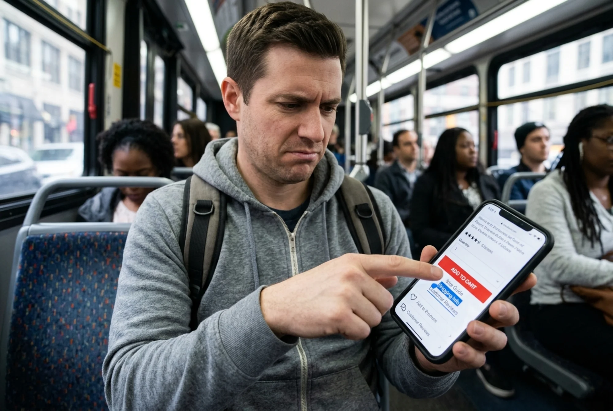
Your customer is on the train, holding the handrail with one hand and trying to book a table at your restaurant with the other. The "Reserve" button is the size of a postage stamp. Their thumb keeps hitting the phone number link by mistake. After three tries, they switch to your competitor.
This is the tap target problem. It is one of the most common mobile usability issues on small business websites, and it is also one of the easiest to fix once you know what to look for.
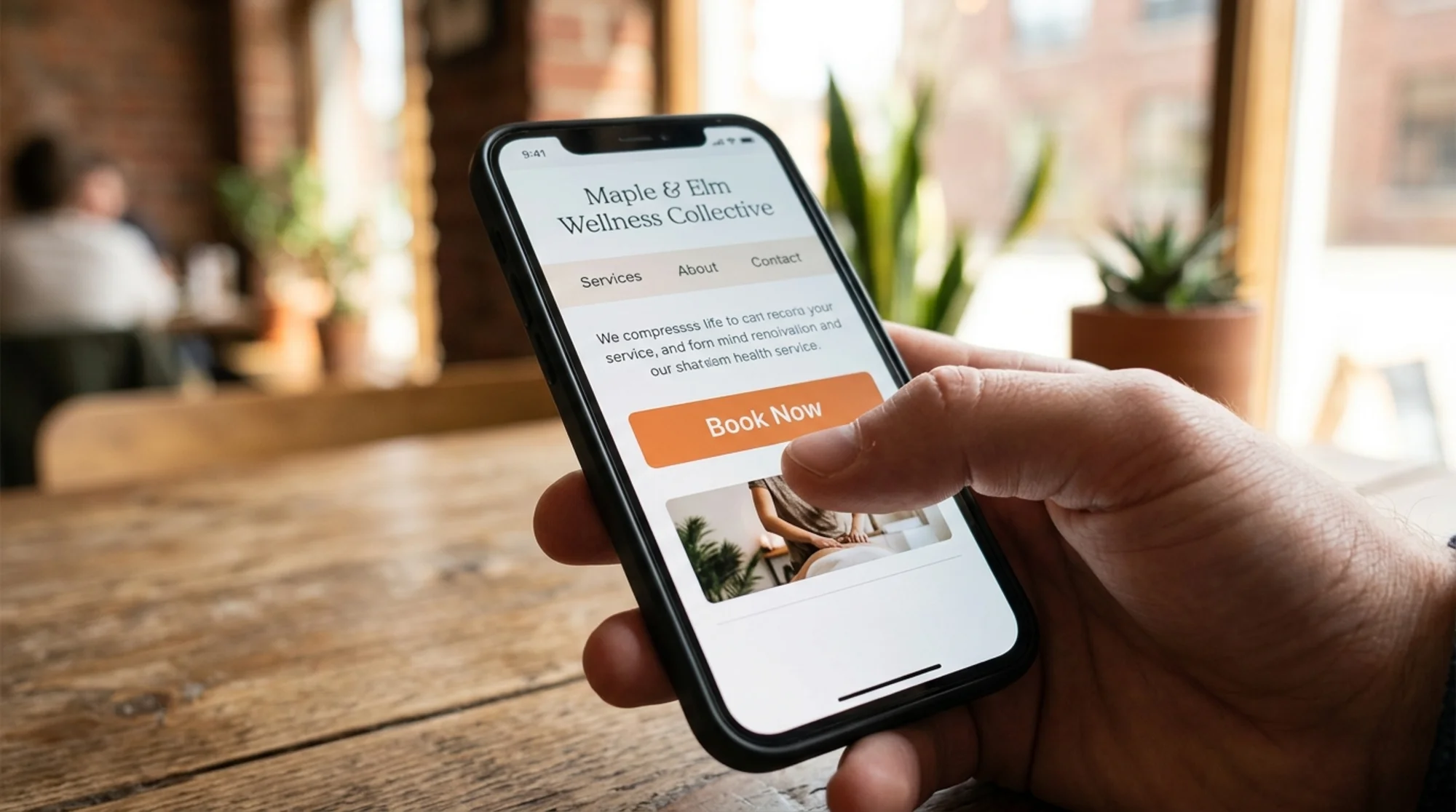
This guide walks through what tap targets are, why they matter for users and search rankings, how to audit your own site without technical skills, and exactly what to change when you find problems.
What is a tap target, and why does size matter?
A tap target is anything a person can press on a mobile screen: a button, a link, a menu icon, a form field, a checkbox, a play button. If a user can interact with it by touching it, it is a tap target.
The challenge is that fingers are not as precise as mouse pointers. A cursor is one or two pixels wide. A thumb pad averages 45 to 57 pixels of contact width on a modern phone. When you design a button at 24 by 24 pixels, you are asking a person to land a coffee cup on a postage stamp.
When tap targets are too small or packed too close together, three things happen:
- Users miss. They tap the wrong link, get sent to the wrong page, then back out and try again.
- Users give up. After two or three misfires, the friction is too much. They leave.
- Search engines notice. Google's mobile usability signals include tap target sizing, and it surfaces in Lighthouse audits and Search Console reports.
The general guideline most platforms agree on: interactive elements should be at least 44 by 44 pixels (Apple Human Interface Guidelines) or 48 by 48 device-independent pixels (Google Material Design and the recommendation referenced in web.dev's Core Web Vitals guidance). Just as important, there should be enough space between targets that an average finger cannot accidentally touch two at once.
How small targets quietly cost you money
Most small business owners never see the problem because they test their own site on their own phone, where they already know exactly where everything is. They are not the typical user.
Here is where small tap targets quietly cause damage:
- Checkout abandonment. Tiny quantity arrows or microscopic "remove item" icons cause frustration at the highest-value moment of the funnel.
- Form errors. Small radio buttons and checkboxes lead to wrong selections and bounces when the order is incorrect.
- Navigation rage. Cramped hamburger menus with eight tightly stacked links open the wrong page over and over.
- Phone number missteps. A "Call Us" button placed too close to a "Directions" link gets tapped by accident, and the user closes the dialer in irritation.
- Lost signups. Newsletter forms with small "Submit" buttons buried next to social icons rarely get filled out on mobile.
A two to five percent drop in mobile conversion from these issues is invisible in your analytics unless you go looking for it. On a site doing 1,000 mobile sessions a month with a $40 average order, that is real money.
The sizes that actually work
You do not need to memorize spec sheets. Keep these numbers in your head:
- Minimum size: 48 by 48 CSS pixels for any tappable element. Below this, you are gambling.
- Comfortable size: 56 to 60 pixels for primary actions like "Add to Cart," "Book Now," or "Submit."
- Minimum spacing: 8 pixels of clear space between two tap targets. If one target's bounding box overlaps another's, that is a fail.
- Thumb zone awareness: The bottom third of the screen is the easiest place for a one-handed user to reach. Put primary actions there when you can.
A rule of thumb you can apply without measuring: if a button is shorter than the height of two stacked text lines, it is probably too small.
A simple five-minute self-audit
You do not need expensive tools to find most tap target problems. Here is the process anyone can run.
Step 1: Pull up your site on a real phone
Not an emulator. Not your laptop with the browser shrunk. An actual phone. Use one you do not normally use for your business, or borrow a family member's, so autocomplete and muscle memory do not help you.
Step 2: Walk the critical paths
Go through your site like a customer. The paths that matter most:
- Home page to a product or service page
- Service page to a contact form or booking flow
- Product page through full checkout
- Blog post to newsletter signup
- Any "Get a Quote" or "Free Trial" call to action
Step 3: Try every interaction with your thumb
Not your index finger. Your thumb, while holding the phone with the same hand. This is how most people actually browse.
Watch for:
- Buttons that need two attempts
- Links you keep tapping next to instead of on
- Menu items where you open the wrong one
- Form controls that feel imprecise
- Anywhere your thumb covers more than just the target
Step 4: Note exactly where you missed
Keep a running list. Be specific: "Hamburger menu links are too close," "Quantity selector is hard to tap," "Footer social icons overlap." Vague notes lead to vague fixes.
Step 5: Hand the phone to someone else
Ideally someone over 50, or anyone with larger hands, or a person who has never used your site. Watch silently. Do not coach. Note every fumble. This is the most valuable five minutes you will spend on your site this quarter.
Tools that find what your hands miss
A manual walk-through catches the obvious problems. For a thorough audit, layer in these checks:
- Google Search Console > Mobile Usability report flags pages with "Clickable elements too close together" and "Tap targets too small" warnings.
- Lighthouse (built into Chrome DevTools) runs a mobile audit and lists every offending element with the specific pixel sizes.
- Chrome DevTools device emulation lets you inspect any element and see its computed size. Right-click a button, choose Inspect, and check the dimensions in the Elements panel.
- A free site audit tool that runs the full battery of mobile checks at once and shows which pages and elements need attention.
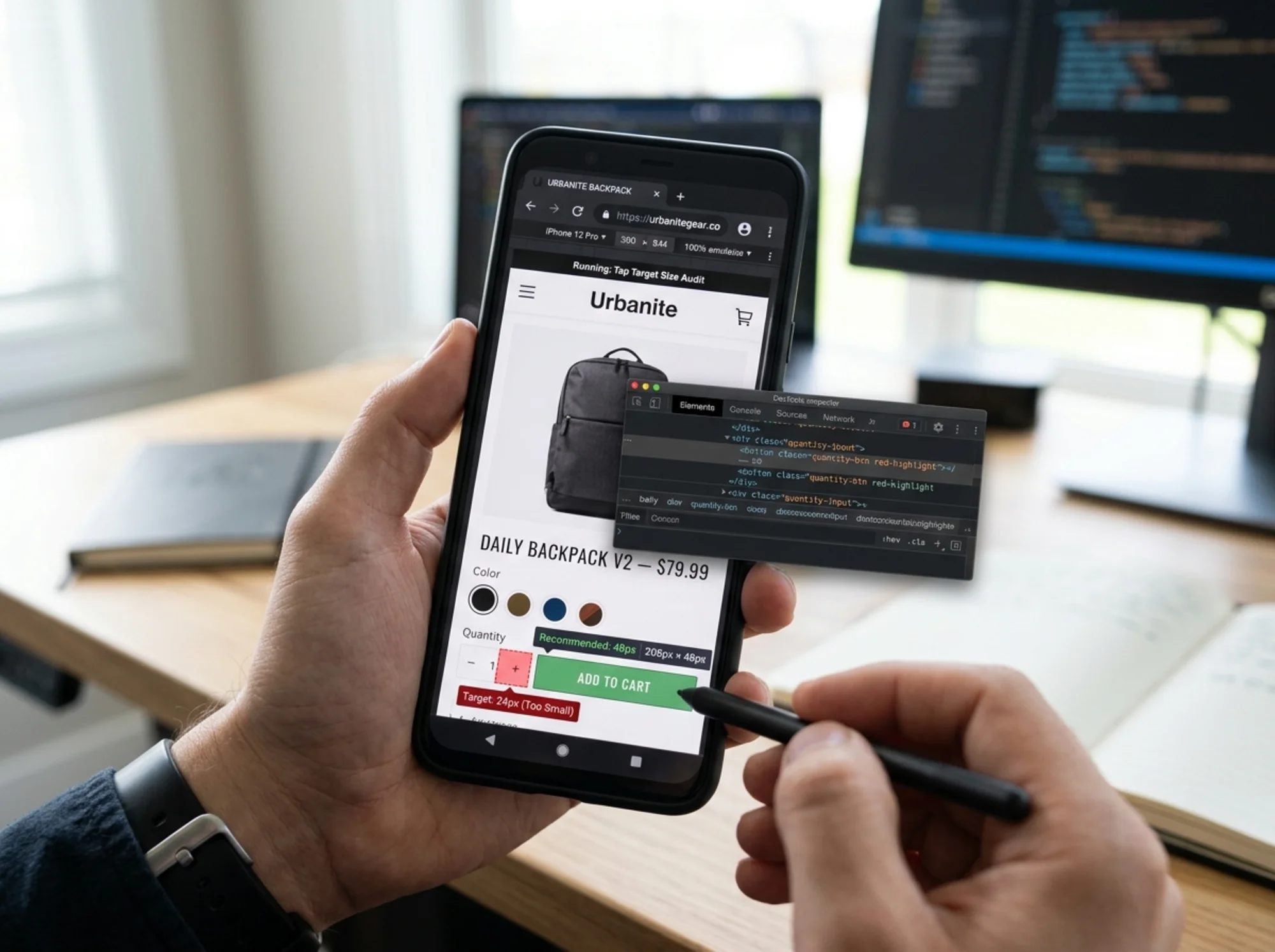
If you want to skip the manual work, run a free website audit and get a list of every tap target issue on your site along with the affected pages.
A real-world walkthrough: the bakery booking page
A small bakery has a mobile page where customers order custom cakes. The page has:
- A header with logo, phone number, and hamburger menu
- Five small thumbnail images in a row showing cake styles
- "Choose Flavor" and "Choose Size" dropdowns
- A quantity selector with tiny plus and minus buttons
- An "Add Special Instructions" link
- A primary "Order Now" button
- Small icons linking to Instagram, Facebook, TikTok
Running the audit reveals:
- The phone number link is 18 pixels tall. Too small. People tap the hamburger menu by accident.
- The five cake thumbnails are 60 by 60 pixels but only 4 pixels apart. The size is fine, the spacing is wrong, so people select the wrong cake.
- The quantity selector plus/minus buttons are 24 by 24 pixels. Far too small. Customers report ordering the wrong number of items.
- The "Order Now" button is 56 pixels tall, well-spaced. This one is fine.
- The footer social icons are 32 pixels with 6 pixels between them. People tap the wrong network.
The fixes:
- Make the phone number link a full button: 48 pixels tall, with a phone icon and the number, filling the right side of the header.
- Increase the gap between cake thumbnails to 12 pixels.
- Resize the quantity buttons to 44 by 44 pixels with a 32-pixel display in between.
- Bump social icons to 44 by 44 with 12 pixels of space between them.
None of these are expensive changes. Most are CSS adjustments a developer can do in under an hour. The bakery sees a measurable lift in completed custom cake orders within the first weekend.
What to check on every page type
Different page types have different tap target hotspots.
Home page
- Primary call-to-action button (booking, contact, shop)
- Top navigation menu items
- Phone number or address links
- Featured product or service tiles
Product or service detail page
- "Add to Cart," "Book," or "Get Quote" button
- Quantity selectors and variant choosers
- Image gallery thumbnails and arrows
- Wishlist or favorite icons
- Reviews section pagination
Checkout or contact form
- Every form field tap target (not just the button)
- Radio buttons and checkboxes
- Country and state dropdowns
- "Apply Coupon" link
- Submit button (should be the largest button on the page)
Blog post or article
- Share buttons
- Newsletter sign-up
- Author bio links
- Related post tiles
For e-commerce specifically, the mobile usability fixes for product pages tend to deliver the highest revenue lift because they sit closest to the purchase moment.
Common mistakes that cause tap target failures
After auditing thousands of small business sites, the same five mistakes show up over and over.
1. Icon-only buttons without padding. A 24-pixel icon is too small. Wrap it in a button container with at least 12 pixels of padding on each side, giving you a 48-pixel target.
2. Text links sitting next to each other. Footer rows like "About | Contact | Privacy | Terms" are common offenders. Stack them vertically with vertical spacing, or wrap each in a padded button.
3. Tiny pagination numbers. "1 2 3 4 5 6" with 4 pixels between digits is a guaranteed mistap. Use 44 by 44 boxes per number.
4. Phone numbers as plain text. When a phone number is text that happens to be a link, the tap area follows the text height, which is too small. Wrap it in a proper button.
5. Sticky bars that overlap content. A sticky "Buy Now" bar at the bottom is great, but if it overlaps form fields or other CTAs, you have shrunk those targets to zero. Test for overlap with the keyboard open.
What "fixed" looks like
Once you have addressed tap target sizes, the experience changes in ways that are easy to feel and hard to fake.
- People complete forms on the first try
- Mobile conversion rate ticks up, often within the first week
- Search Console's Mobile Usability report stops flagging the affected pages
- Lighthouse mobile scores improve
- Support emails about "I can't find the order button" disappear
You do not need a redesign. You need a tighter set of buttons.

A 30-minute fix plan
If you want a concrete action plan:
- Minutes 0 to 5: Walk through your site on a phone with your thumb. Note every mistap.
- Minutes 5 to 10: Open Google Search Console and check the Mobile Usability report for flagged pages.
- Minutes 10 to 15: Run a Lighthouse mobile audit on your three most-visited pages.
- Minutes 15 to 20: Combine the lists. Sort by page importance (home, top product/service, checkout, contact).
- Minutes 20 to 30: Send the list to your developer with screenshots and pixel measurements, or adjust button sizes yourself in your page builder.
Most of the fixes are ten-line CSS changes. The hardest part is finding them and prioritizing them.
When to revisit the audit
Tap target issues creep back in. Every time you:
- Install a new theme, template, or page builder block
- Add a plugin that injects buttons (chat widgets, exit-intent popups, cookie banners)
- Run a promotion that swaps in temporary banners
- Update your checkout or contact form
...re-audit. Bookmark a few critical pages and walk through them on a phone after every site change. Add a recurring monthly audit to your calendar so nothing slips for too long.
The takeaway
Tap target size is not a glamorous topic. It will not be the subject of a viral case study. But it is the kind of detail that separates sites that quietly convert from sites that quietly leak customers.
Spend half an hour. Find the small buttons. Make them bigger. Space them out. Your customers will not thank you, because they will not notice. They will just successfully do what they came to do, and they will come back.
Ready to find every tap target issue on your site automatically? Run a free FreeSiteAudit scan and get a prioritized list of mobile usability issues, with the exact pages and elements that need attention.
Sources
Related Tools
Check your website for free
Get an instant score and your top 3 critical issues in under 60 seconds.
Get Your Free Audit →