WCAG 2.2 Updates: What Changed and What You Need to Fix
Plain-English guide to WCAG 2.2 accessibility updates for small business owners: what changed in 2023, what to fix first, and how to self-check your site.
# WCAG 2.2 Updates: What Changed and What You Need to Fix
If you run a small business website, you've probably heard "WCAG" thrown around — usually right after someone mentions a lawsuit. The Web Content Accessibility Guidelines are the international standard for making websites usable by people with disabilities, and the latest version, WCAG 2.2, became an official W3C Recommendation in October 2023.
The good news: WCAG 2.2 didn't tear up the rulebook. It added nine new success criteria on top of WCAG 2.1 and retired one. If your site was already in decent shape, you're not starting from scratch.
The less-good news: a few of the new criteria target things small business sites get wrong constantly — tiny tap targets, invisible keyboard focus, and login flows that demand memorization. Those are the parts most likely to trip you up.

A quick refresher: WCAG levels
WCAG is organized into three conformance levels:
- Level A — the minimum. Skip these and your site is essentially unusable for some people.
- Level AA — the practical target. This is what most laws (ADA in the US, the European Accessibility Act, AODA in Ontario) reference.
- Level AAA — the gold standard. Most sites don't aim for this across the board.
When people say "we need to be WCAG compliant," they almost always mean Level AA.
WCAG 2.2 is backward compatible with 2.1 and 2.0, so meeting 2.2 automatically covers the older versions. That matters because some regulations still reference 2.1 or even 2.0 — adopting 2.2 covers all of them.
What's actually new in WCAG 2.2
Nine new success criteria were added. Six are Level A or AA — the ones you have to care about for typical compliance. Three are Level AAA.
Here's the practical short list, in plain English:
- Focus Not Obscured (AA) — When someone tabs through your page with a keyboard, the focused element can't be hidden behind a sticky header, cookie banner, or chat widget.
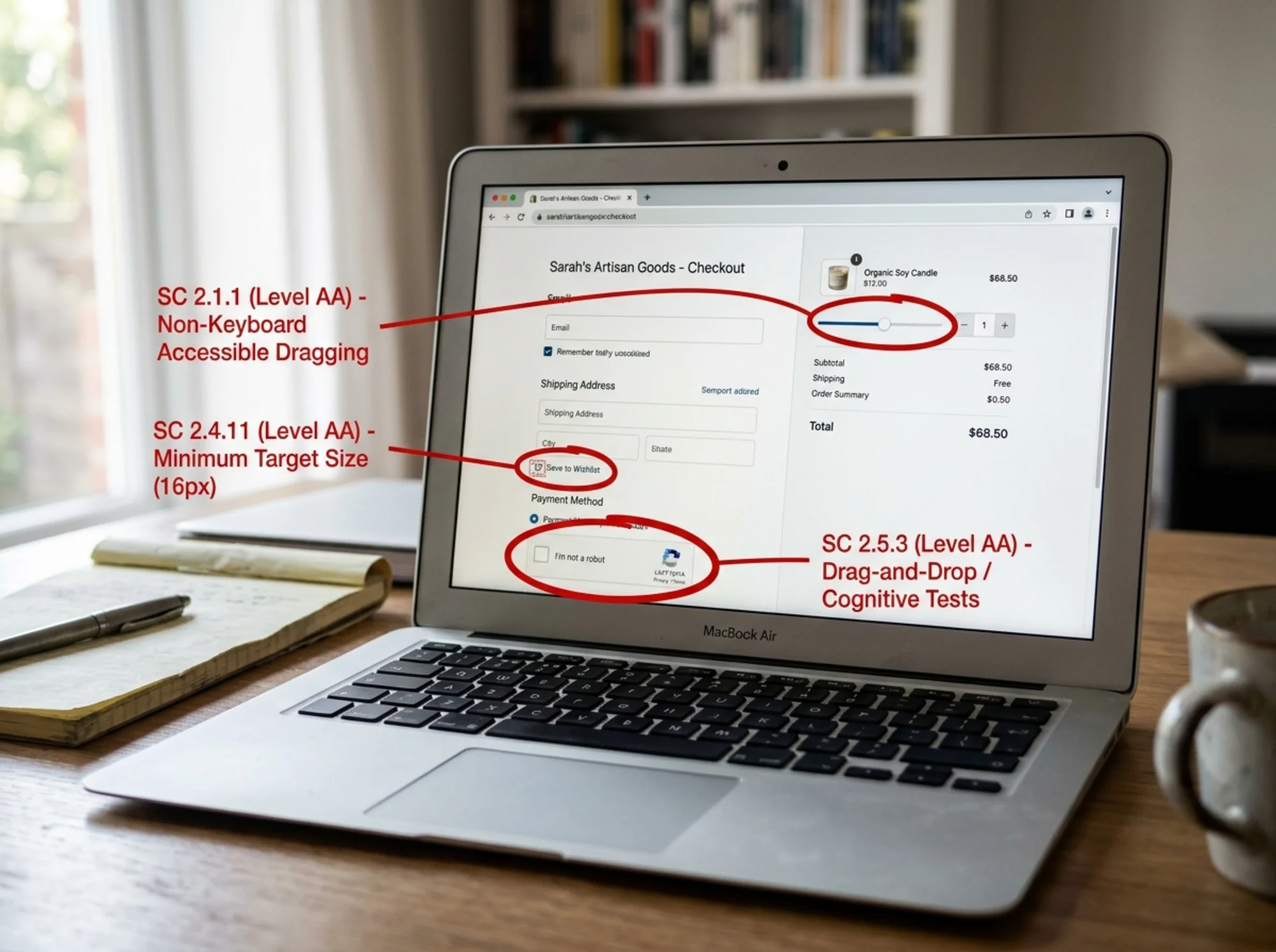
- Dragging Movements (AA) — If your site asks users to drag something (a slider, a map pin, a reorderable list), there must also be a way to do the same thing with a single click or tap.
- Target Size, Minimum (AA) — Buttons and links you tap with a finger need to be at least 24×24 CSS pixels, with narrow exceptions for inline text links and unavoidable cases.
- Consistent Help (A) — If you have a help link, contact info, or chat widget, it has to appear in the same place across pages. No moving it around.
- Redundant Entry (A) — Don't make users re-type information they've already given you in the same session (like asking for their email twice in one checkout).
- Accessible Authentication, Minimum (AA) — Logins can't force users to solve a puzzle, remember a specific string, or transcribe a code between devices. Password managers and copy-paste must work.
The three AAA additions — Focus Not Obscured (Enhanced), Focus Appearance, and Accessible Authentication (Enhanced) — are worth knowing but not where to start.
One criterion was removed: "Parsing" (4.1.1). Modern browsers handle malformed HTML gracefully, so it no longer measured a real accessibility barrier.
Why these changes matter for small businesses
Most of the new criteria target patterns that came out of mobile-first design and modern UX trends — patterns that often look slick but quietly exclude people. They help:
- Older customers (a big chunk of small business audiences) who struggle with tiny tap targets and low-contrast focus rings.
- People with motor impairments who can't reliably drag a slider or hold a precise tap.
- People with cognitive or memory issues who can't solve CAPTCHAs or memorize codes during login.
- Keyboard-only users, including many screen reader users, who get lost when focus disappears behind a banner.
These aren't edge cases. The CDC estimates roughly 1 in 4 US adults lives with some form of disability.

The five fixes most small business sites need
Fix 1: Make your tap targets at least 24×24 pixels
Open your site on your phone and check:
- Social media icons in the footer
- "X" buttons on banners or popups
- Pagination arrows
- Icon-only buttons (hamburger menus, search icons)
- Checkboxes and radio buttons in forms
If any feel hard to tap, they probably fail the 24×24 minimum. The fix is usually CSS — add padding to expand the clickable area, even if the visual icon stays small. The clickable region is what counts.
Fix 2: Make keyboard focus visible
Press Tab on your homepage repeatedly. Can you see where you are at every step? If the outline disappears, blends into the background, or gets cut off by a sticky header — you have a problem.
Common culprits:
- A CSS reset that wiped out
:focusstyles - A sticky header that covers focused elements when you tab into the page body
- Cookie banners or chat widgets that overlap focused buttons
Restore or strengthen your :focus-visible styles and make sure overlays don't obscure focused content. If you use a page builder (Webflow, Squarespace, Shopify themes), most modern themes have accessibility toggles for this.
Fix 3: Don't trap users in drag-only interactions
Audit any interaction that requires a drag:
- Image carousels controlled by swipe
- Quantity sliders in checkout
- Reorderable lists ("drag to prioritize")
- Map pin placement
- Signature fields
Each needs a non-drag alternative. For a quantity slider, add +/- buttons. For an image carousel, add arrow buttons. For a reorderable list, add up/down buttons next to each item. The drag interaction can stay — you just need a tap-friendly alternative beside it.
Fix 4: Stop making people retype things
Walk through your own checkout, signup, or contact flow. Common offenders:
- Billing address that doesn't autofill from shipping address
- Multi-step forms that ask for name and email on page 1 and again on page 3
- "Confirm your email" fields (autofill and validation usually do the job)
If users gave you a piece of data already in this session, auto-populate it or make it optional. Re-entry is allowed when it's genuinely needed for security (like confirming a password change) — but it should be the exception, not the rule.
Fix 5: Fix your login
Look at your login page through fresh eyes. Does it:
- Block paste into the password field?
- Use a CAPTCHA that requires identifying images or solving puzzles?
- Send a code by SMS that the user must transcribe into another device?
- Force users to remember a security question answer?
All can fail the Accessible Authentication criterion. The simple fixes:
- Allow paste in password fields (this is also a modern security best practice — it lets people use password managers)
- Replace puzzle CAPTCHAs with invisible/risk-based alternatives like Cloudflare Turnstile or hCaptcha's invisible mode
- Offer magic links or passkeys as login options
- If you use 2FA, support authenticator apps, not just SMS
A walkthrough: auditing a small bakery's website
Imagine you run a small bakery on Shopify. Here's how a WCAG 2.2 quick-check might go.
Homepage. You tab through with the keyboard. Focus jumps from the logo to the "Order Online" button — but the button is half-hidden behind your sticky announcement bar. Issue: Focus Not Obscured. Fix: Adjust the sticky bar's z-index or add scroll-padding-top so focused elements scroll into view.
Product page. Customers pick a quantity using a drag slider with no +/- buttons. Issue: Dragging Movements. Fix: Add +/- buttons; both can coexist. The "Add to Cart" button is fine — 48px tall and clearly outlined — but the heart-shaped favorites icon is 16×16px. Issue: Target Size. Fix: Expand the touch target to at least 24×24px with padding.
Cart and checkout. You're asked for your email at the cart stage and again at checkout. Issue: Redundant Entry. Fix: Prefill the second field from the first, or remove the duplicate.
Login. Your login uses reCAPTCHA v2 with the "select all crosswalks" puzzle. Issue: Accessible Authentication. Fix: Switch to reCAPTCHA v3 (invisible) or Turnstile.
That's roughly 30 minutes of self-checking. None of these fixes require a developer for more than a couple of hours.
How to check your site in 15 minutes
You don't need a fancy tool to start:
- Tab through every key page — homepage, product/service page, contact form, checkout. Watch for focus rings.
- Use your site on your phone with one thumb. Note every tap that takes more than one try.
- Try to log in without your password manager. If it's painful for you, it's worse for someone with motor or cognitive challenges.
- Open your contact and checkout forms. Count how many times you're asked for the same piece of info.
- Resize your browser to 320px wide. Make sure nothing breaks, overlaps, or gets cut off.
Automated audits catch issues like color contrast, missing alt text, and form labels — but roughly 30–40% of WCAG issues require manual review, especially the new 2.2 criteria around focus and target size.
Three things small businesses get wrong about accessibility
- "It's only a legal issue for big companies." Demand letters and lawsuits routinely target small businesses, especially in e-commerce, healthcare, and professional services. Settlement costs are usually higher than fixing the issues would have been.
- "An overlay widget will solve it." Accessibility overlays — the floating icons offering "accessibility menus" — have become lawsuit targets themselves and are widely criticized by disability advocates. They don't replace real fixes.
- "Our template is accessible because it's premium." Themes vary wildly. Even premium templates often fail multiple WCAG criteria out of the box.

A realistic timeline for getting compliant
If you're starting from scratch with a typical small business site (10–50 pages, a contact form, maybe a simple store):
Week 1: Run an automated audit. Fix the easy stuff — alt text, form labels, color contrast.
Week 2: Do the manual checks above. Fix focus visibility and tap target issues. Most are CSS adjustments.
Week 3: Tackle forms and authentication. Remove redundant entries, fix CAPTCHAs, allow paste.
Week 4: Test with real assistive tech. Turn on VoiceOver (Mac/iOS) or NVDA (free, Windows) and try to complete a purchase or submission. You'll find issues no automated tool will.
After that, the work shifts to maintenance — making sure new pages don't introduce regressions.
Run an audit on your own site
The fastest way to find out where you stand is to run an automated scan. Run a free website audit with FreeSiteAudit — it flags the most common WCAG issues, including the new 2.2 criteria where automated detection is reliable. You'll see exactly which pages need work, ranked by severity, and you can use the report as a starting point for fixes you do yourself or hand to a developer.
For deeper dives, our accessibility check tool walks through individual fixes, and the focus visible and target size fix guides include copy-paste CSS for the most common scenarios. If you run an online store, our e-commerce industry guide covers patterns specific to product pages and checkouts.
WCAG 2.2 isn't a reason to panic. For most small business sites, it's a few hours of focused work to cover the biggest gaps — and the customers who benefit will notice.
Sources
- W3C Web Content Accessibility Guidelines (WCAG) 2.2 — https://www.w3.org/TR/WCAG22/
- W3C "What's New in WCAG 2.2" — https://www.w3.org/WAI/standards-guidelines/wcag/new-in-22/
- US Department of Justice ADA Web Accessibility Guidance — https://www.ada.gov/resources/web-guidance/
Check your website for free
Get an instant score and your top 3 critical issues in under 60 seconds.
Get Your Free Audit →