Website Accessibility Audit for Ecommerce Sites: A Practical Guide for Store Owners
A practical accessibility audit guide for ecommerce sites, covering product pages, checkout, alt text, keyboard navigation, and the fixes that lift revenue.
# Website Accessibility Audit for Ecommerce Sites: A Practical Guide for Store Owners
If you run an online store, accessibility is not a side topic. It is the difference between a shopper finishing checkout and abandoning their cart because the "Add to Cart" button does not respond to their keyboard. It is the difference between a screen reader announcing "Blue cotton t-shirt, size medium, $24" and announcing "image image image button button."
Roughly one in four adults in the United States has some form of disability, and many use assistive technology to shop online. Beyond that, accessibility improvements help everyone: clearer buttons, better contrast, smoother forms, faster pages. This guide walks you through what to audit on an ecommerce site, how to do it without a developer team, and which fixes give you the most lift for the least effort.

Why accessibility matters for ecommerce specifically
Ecommerce sites have more friction points than most websites. A blog has paragraphs and a search bar. A store has product grids, filters, color swatches, size pickers, quantity steppers, cart drawers, address forms, payment fields, and confirmation flows. Every one of those is a place where accessibility can break.
When a screen reader user cannot read your variant labels, they cannot buy. When a keyboard user cannot tab into your filter sidebar, they leave. When a customer with low vision cannot read your price because it is light gray on white, they bounce. None of these customers email you to complain. They just leave.
Two practical pressures push accessibility into the foreground:
- Legal risk. Lawsuits over inaccessible ecommerce sites have become common in the US, UK, and EU. Small businesses are not exempt.
- Search and AI. Google's helpful content guidance rewards pages that are easy to use and understand. Many accessibility signals (clear headings, labeled forms, alt text, proper HTML) overlap directly with what search engines and AI summarizers use to interpret your pages.
Good accessibility is good ecommerce hygiene.
The five areas to audit on any store
You do not need to memorize the entire WCAG specification. For an ecommerce site, focus on these five areas, in order:
- Images (especially product images)
- Color and contrast
- Forms (search, filters, address, payment)
- Keyboard navigation
- Structure and labels (headings, landmarks, button text)
1. Images
Every product image needs alt text. Not "image1.jpg." Not "product." Real alt text that tells someone what they would see.
A good rule of thumb for product alt text:
- Include the product type
- Include the most relevant attribute (color, material, style)
- Skip generic words like "image of" or "picture of"
Examples:
- Bad:
alt="shirt" - Bad:
alt="IMG_3421" - Bad:
alt=""(if the image conveys meaning) - Good:
alt="Navy blue cotton crewneck t-shirt, front view" - Good:
alt="Walnut wood dining table with tapered legs, seats six"
Decorative images (background patterns, dividers) should use alt="" so screen readers skip them. The empty alt is intentional. A missing alt attribute is what causes screen readers to announce the file name instead.
If your site has thousands of products, this is where bulk tools and CSV exports earn their keep. Most ecommerce platforms (Shopify, WooCommerce, BigCommerce) let you export product data, edit alt text in a spreadsheet, and re-import.
2. Color and contrast
Run a contrast checker on:
- Body text against page background
- Button text against button background
- Price text against background
- Sale badges and labels
- Form labels and placeholder text
- Error and success messages
The standard threshold is a 4.5:1 ratio for normal text and 3:1 for large text. Light gray placeholder text on white almost always fails. So do trendy combinations like beige-on-cream or pale pink CTAs on white.
A specific ecommerce gotcha: do not rely on color alone to signal product state. If your "out of stock" indicator is just a red dot, a colorblind shopper cannot tell. Add a text label or an icon with text.
3. Forms
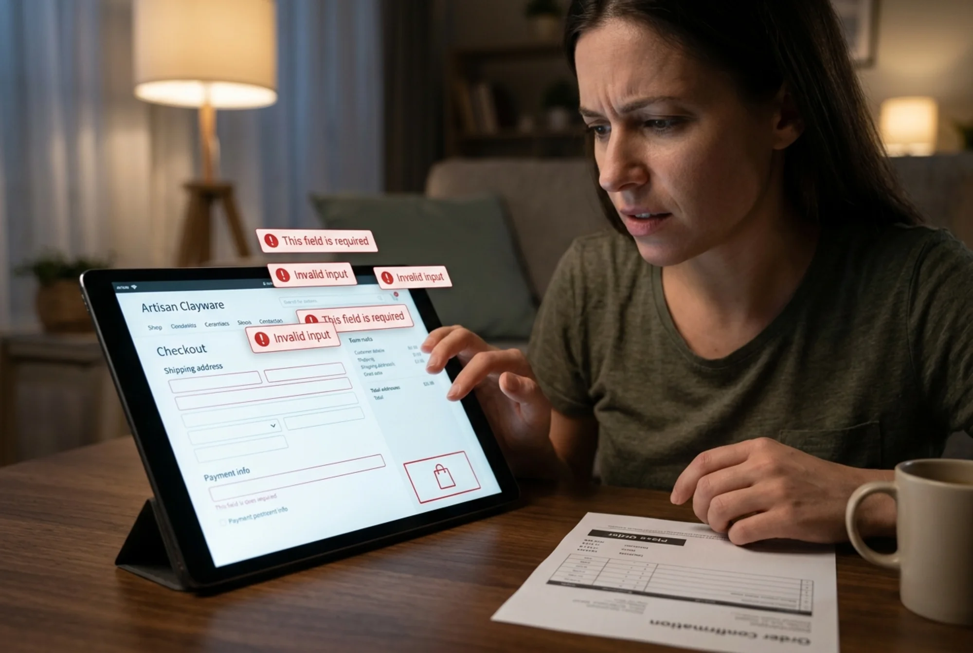
Forms are where most ecommerce audits find the biggest issues. Checkout abandonment correlates closely with form friction, and inaccessible forms drive that abandonment up.
Audit checklist for every form on your site:
- Every input has a visible label (placeholder text is not a label)
- Labels are connected to inputs with
forandidattributes, or the input is nested inside the label - Required fields are marked clearly in text, not just with a red asterisk
- Error messages are tied to the specific field with
aria-describedbyso screen readers announce them - Error messages explain what to fix, not just "Invalid input"
- The form can be completed using only a keyboard
- Autocomplete attributes are set correctly (
autocomplete="email",autocomplete="cc-number", etc.)
Correct autocomplete attributes matter more than people realize. They help users with motor impairments, users on mobile, and users with cognitive disabilities by letting their browser fill in known information.
4. Keyboard navigation
Test your store the way a keyboard user does. Unplug your mouse. Open your homepage. Use only Tab, Shift+Tab, Enter, Space, and arrow keys to:
- Open the main navigation menu
- Search for a product
- Open a product page
- Select a variant (size, color)
- Add to cart
- Open the cart
- Begin checkout
- Fill in shipping information
- Reach the payment fields
Each step should work, and you should always see where you are. A visible focus ring (the outline around the focused element) is essential. Many themes remove it with CSS like outline: none, which is one of the most common accessibility failures on the web. If you cannot see what is focused, you cannot use the site without a mouse.
5. Structure and labels
Screen readers navigate by landmarks and headings, not by visual layout. Your page should have:
- One
per page (usually the product name on a product page) - Logical heading order: h1, then h2, then h3, without skipping levels
- A
landmark wrapping the primary content - A
landmark for navigation - Descriptive link text ("View running shoes" not "Click here")
- Descriptive button text ("Add to cart" not just an icon)
If a button uses only an icon (a heart for "save to wishlist," a magnifying glass for search), add an aria-label:
html
Without that label, the screen reader announces "button" with no context.
A walkthrough: auditing a product page
Let's run through an audit on a single product page for a hypothetical store selling handmade ceramics. The product is a stoneware mug priced at $32.
Step 1: Read the page with a screen reader.
Turn on VoiceOver (Mac), Narrator (Windows), or install NVDA (free, Windows). Navigate to the product page and listen.
Things that should announce clearly:
- The product name as the page heading
- The price
- Image alt text describing the mug
- Size and color options as labeled controls
- Quantity stepper with current value
- "Add to cart" button
- Product description
Common failures to listen for:
- "Image image image" (missing alt text on product gallery)
- "Button" with no description (icon-only controls)
- The size picker reads as unrelated buttons instead of a group
- The price is in an image instead of text
Step 2: Tab through with the keyboard.
Can you reach every interactive element? Can you change the color variant? Can you add to cart and open the cart drawer? When the cart drawer opens, does focus move into it? When you close it, does focus return to where you were?
A common bug: the cart drawer opens but focus stays behind it on the page, so keyboard users have no way to interact with the cart without tabbing through every product on the page first.
Step 3: Check contrast on the page.
Use the browser's developer tools or the WAVE extension. On a typical product page, watch for:
- "Sale" badges with weak contrast
- Star rating text
- Stock status ("Only 2 left")
- The "Add to cart" button hover state
- Reviewer names and dates
Step 4: Audit the form fields below the fold.
If your product page has a reviews form, a "notify me when back in stock" form, or a quantity input, audit each one for labels, errors, and keyboard access.
Step 5: Run an automated scan.
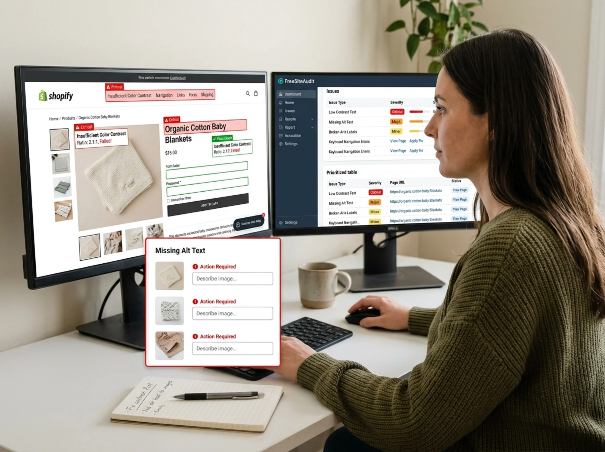
Automated tools catch about 30 to 40 percent of accessibility issues. They are excellent at finding missing alt text, low contrast, missing labels, and invalid HTML. They cannot tell you if your alt text is meaningful or if your keyboard order makes sense. Use them as a first pass, not a final answer.
Running a free website audit gives you a prioritized list of issues by page, so you can fix the highest-impact problems first instead of getting overwhelmed by a 500-item report.
The fixes that move the needle
If you are short on time, prioritize these fixes in this order:
Week 1: Alt text and contrast
- Add or improve alt text on product images, hero banners, and category tiles
- Fix any text that fails 4.5:1 contrast
- Add visible focus styles back if they have been removed
These are the highest-volume issues and the easiest to fix without a developer.
Week 2: Forms
- Add visible labels to every input
- Connect labels to inputs properly
- Set autocomplete attributes on checkout fields
- Improve error messages
- Test the full checkout flow with the keyboard
Week 3: Navigation and structure
- Fix heading order on key page templates (home, category, product, cart, checkout)
- Add
aria-labelto icon-only buttons - Ensure modals, drawers, and dropdowns trap focus correctly
- Add skip links if your top navigation is long
Ongoing: Process changes
- Require an alt text field in your product upload workflow
- Add an accessibility check to design review for new templates or campaigns
- Re-audit quarterly, or after any major theme update
Mini-checklist: ecommerce accessibility quick scan
Run through this for any page you launch:
- [ ] Every product image has descriptive alt text
- [ ] All text meets 4.5:1 contrast (3:1 for large text)
- [ ] Color is never the only signal (out of stock, errors, required fields)
- [ ] All form inputs have visible, connected labels
- [ ] Required fields are marked in text
- [ ] Error messages are specific and announced
- [ ] Every interactive element is reachable by keyboard
- [ ] Focus is always visible
- [ ] Icon-only buttons have
aria-label - [ ] One
per page; headings in logical order - [ ] Cart drawer and modals trap focus and return it on close
- [ ] Checkout works end to end with keyboard only
What about overlay widgets?
You have probably seen accessibility overlay widgets that promise to make any site compliant with one line of code. The accessibility community broadly considers these unreliable. They can break screen readers, miss the underlying issues, and create a false sense of compliance. They do not replace fixing your actual code.
If you have one installed, treat it as a stopgap at best. The real work is in the markup, content, and templates.
Connecting accessibility to the rest of your site health
Accessibility does not live in a silo. Many of the same fixes improve SEO, conversion, and Core Web Vitals. Clear heading structure helps search engines understand your pages. Labeled buttons help AI assistants summarize and recommend your products. Simpler templates improve LCP and CLS. Better forms reduce checkout abandonment.
Treat accessibility as one part of overall site health rather than a separate compliance project, and the work compounds. Each audit cycle improves a little of everything.
Run a free accessibility audit
If you want a starting point, run a free website audit with FreeSiteAudit. You get a prioritized list of accessibility issues, contrast failures, missing alt text, and form problems across your store, page by page. From there you can decide what to fix yourself and what to hand to a developer.
For deeper guidance on the issues we surface, see our alt text fix guide, color contrast fix guide, and our broader ecommerce industry resources.
Accessibility is one of those investments where the payoff is real but quiet. You will not get thank-you emails from every customer who can finally complete checkout. You will just see fewer abandoned carts, fewer support tickets, and a store that works for everyone who shows up.
Sources
Check your website for free
Get an instant score and your top 3 critical issues in under 60 seconds.
Get Your Free Audit →