Website Accessibility Audit: WCAG Basics for Small Businesses
A plain-English WCAG 2.1 AA audit guide for small business websites: checklists, common failures, a 30-minute self-audit, and a real dentist site walkthrough.
# Website Accessibility Audit: WCAG Basics for Small Businesses
If your website is hard to use for someone with low vision, a motor impairment, or even just a cracked phone screen in bright sunlight, you're losing customers — and you probably won't hear about it. They just leave.
Roughly one in four adults in the United States lives with some form of disability, and almost everyone hits a "temporary disability" at some point: a broken wrist, a noisy environment, an aging parent borrowing your phone. A site that works for people with disabilities works better for everyone.
This guide is for small business owners who don't have a developer on staff. We'll cover what WCAG actually is, what to check first, and how to fix the most common problems without rewriting your site.
What WCAG Actually Is
WCAG stands for Web Content Accessibility Guidelines. It's maintained by the World Wide Web Consortium (W3C) and is the global standard most courts, governments, and large companies reference. The current widely-cited version is WCAG 2.1, with WCAG 2.2 also published.
There are three conformance levels:
- Level A — the absolute minimum. Failing this means parts of your site are unusable.
- Level AA — the practical target. This is what most laws and lawsuits cite.
- Level AAA — the gold standard, rarely achievable site-wide.
Aim for WCAG 2.1 Level AA. That's the level the US Department of Justice has cited in ADA web cases, and it maps closely to European Accessibility Act expectations.
WCAG is organized under four principles, abbreviated POUR:
- Perceivable — users can see or hear the content
- Operable — users can interact with all controls
- Understandable — content and navigation make sense
- Robust — content works with assistive technology like screen readers
You don't need to memorize all 78 success criteria. You need the ten or so that matter most for a typical small business site.
Why This Matters for Small Businesses
Legal risk. Plaintiffs' firms send demand letters that cite WCAG 2.1 AA to businesses of every size. Settling one costs more than fixing the underlying issues.
Revenue. If a screen reader can't read your product page, that customer can't buy. If your contact form can't be tabbed through, that lead is gone.
SEO overlap. Many accessibility wins are SEO wins. Alt text helps Google understand images. Clear heading structure helps both screen readers and search crawlers. Pages that follow Google's helpful content guidance tend to score better on accessibility too.

The Most Common Failures on Small Business Sites
The same handful of issues come up over and over. Fix these and you'll resolve most real-world barriers.
1. Low color contrast
Pale gray text on white. Light blue links on a colored background. Modern in mockups, unreadable on a phone in sunlight.
WCAG AA requirement: body text needs a contrast ratio of at least 4.5:1 against its background. Large text (18pt+, or 14pt+ bold) needs 3:1.
Quick check: open your homepage on your phone outdoors. Can you read every paragraph without strain? Run any suspicious text through a free contrast checker.
2. Missing or useless alt text
A screen reader reads alt text aloud. With no alt attribute, it either says nothing or reads the filename ("IMG_2847.jpg"). If every alt says "image" or "logo," that's almost as bad.
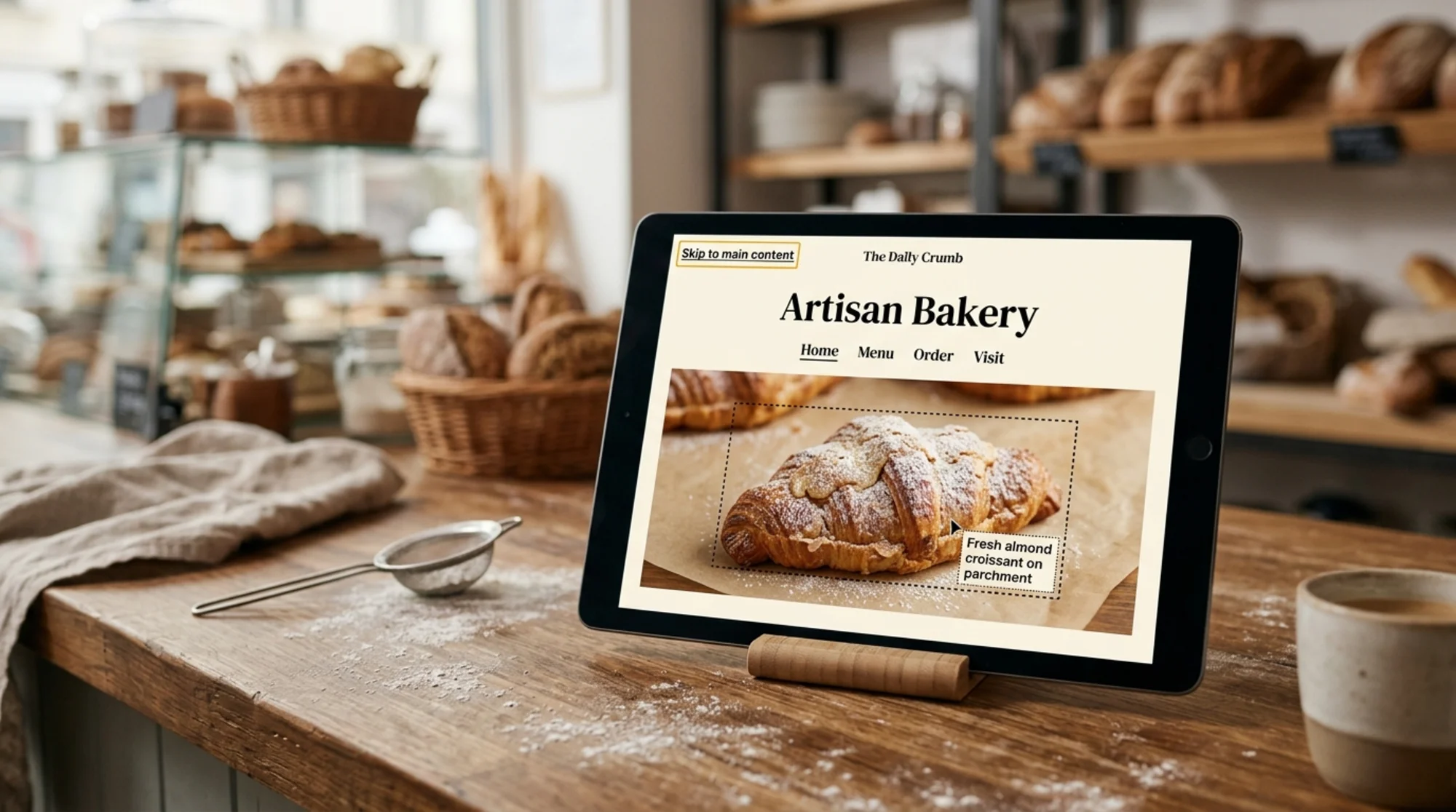
Good alt text: "Chef placing fresh sourdough loaves on a wooden cooling rack"
Bad alt text: "bread", "image1", "IMG_2847.jpg", or nothing
Decorative images that add no information should have an empty alt (alt="") so screen readers skip them cleanly.
3. Form fields without labels
A search box, email signup, or contact form where the placeholder text vanishes the moment you click — and there's no visible label — is unusable for screen readers and confusing for everyone else. Every input needs a visible, persistent label. Placeholders alone don't count.
4. Links that just say "click here" or "read more"
Screen reader users often navigate by pulling up a list of every link on a page. Fifteen "read more" entries tell them nothing. Link text should describe the destination: "Read our 2026 pricing guide" beats "click here."
5. No keyboard navigation
Try this now: open your site, put your mouse aside, and press Tab repeatedly. Can you reach every menu item, button, and form field? Can you see a visible outline (a focus ring) on the active element?
Custom menus, modal popups, and image carousels are the worst offenders. If you can't tab into your booking widget, neither can a customer with a tremor or a broken mouse.
6. Auto-playing audio or video with no controls
Anything that starts making noise on page load, with no obvious pause button, fails WCAG and annoys everyone. If you must auto-play a hero video, mute it and provide an accessible play/pause control.
7. Confusing heading structure
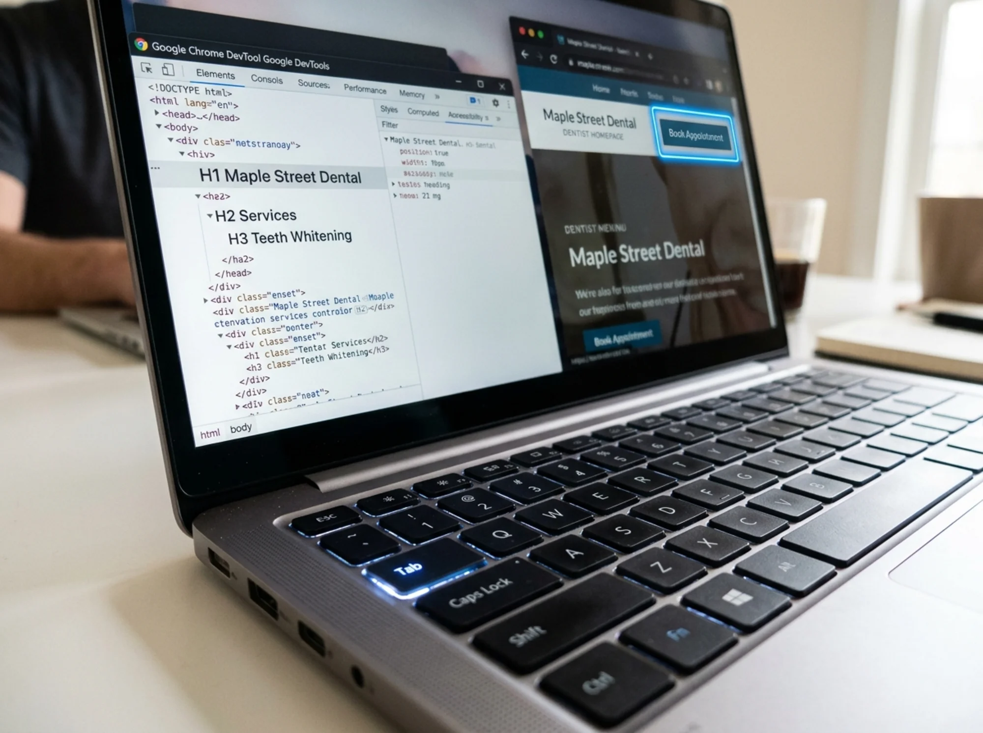
Screen readers use headings to build a page outline. If you use for big text and for smaller text — skipping — the structure breaks. One per page, then for major sections, for subsections. Don't skip levels.
8. Touch targets too small
WCAG 2.2 sets a 24×24 pixel minimum for interactive targets; the practical recommendation is closer to 44×44. Tiny social icons, cramped navigation, and 16px close buttons are common offenders.
A Mini-Audit You Can Run in 30 Minutes
You don't need a consultant to find the worst problems. Do this on your laptop now:
Step 1 — Keyboard test (5 min). Put your mouse aside. Press Tab through the homepage. Note every place where the focus ring disappears, a menu won't open, a button won't activate with Enter or Space, or you get stuck in a loop.
Step 2 — Screen reader test (10 min). On a Mac, press Cmd+F5 for VoiceOver. On Windows, install NVDA (free) or use the built-in Narrator. Close your eyes and try to use your contact form.
Step 3 — Zoom test (3 min). Press Ctrl+ (or Cmd+) four times to reach 200% zoom. Does the layout collapse? Do text and buttons overlap? Anything cut off?
Step 4 — Contrast spot check (5 min). Look at your three most-visited pages. Highlight every block of text that looks faint or sits on a colored background. Run those colors through a contrast checker.
Step 5 — Alt text spot check (5 min). Right-click any image and choose "Inspect." Look for the alt attribute. Is it descriptive? Missing? Repeat for product images, hero images, and team photos.
Step 6 — Form labels (2 min). Click into every form field. Is the label still visible while you're typing? If the placeholder disappears and there's no separate label, that's a failure.
A Real Scenario: Auditing a Dentist's Website
A small dental practice has a five-page WordPress site: home, about, services, contact, blog. Here's what we'd find and how we'd prioritize.
Home page:
- Hero image alt reads "hero-image-v2.jpg." We'd rewrite it: "Patient smiling after a teeth whitening appointment at Maple Street Dental."
- The phone number is light gray (#999) on white. Contrast ratio 2.85:1 — fails AA. We'd darken it to #333.
- The "Book Appointment" button is a custom JavaScript modal. Tab doesn't reach it. This is the biggest issue — a direct revenue blocker.
Services page:
- Each service uses an
inside a tile, but there's nobetween the pageand thes. Screen readers can't build a clean outline. - "Read more" appears five times — once under each service. We'd change each to "Learn about teeth whitening," "Learn about Invisalign," etc.
Contact form:
- Placeholder-only labels. When a user types their name, the word "Name" disappears. We'd add visible
elements above each field. - Error messages only show as red text, no programmatic alert. We'd wrap them in an
aria-liveregion so screen readers announce them.
Priority order:
- Fix the booking modal keyboard access — blocking sales today.
- Fix contact form labels and error messages — also revenue-affecting.
- Fix contrast issues sitewide — a quick CSS change.
- Rewrite alt text across all images — batchable content work.
- Restructure headings — small CMS edits per page.
Accessibility checklists feel overwhelming. Fix what blocks transactions first.
Where Accessibility and SEO Overlap
Google has been clear that user experience matters for ranking. The Core Web Vitals signals — Largest Contentful Paint, Interaction to Next Paint, Cumulative Layout Shift — are partly proxies for accessibility-friendly design. A stable, readable, quickly interactive page helps everyone.
- Clear headings help Google understand structure and help screen readers navigate.
- Descriptive alt text improves image search and screen reader output.
- Logical link text improves crawl context and screen reader navigation.
- Stable layouts (low CLS) prevent both shift frustration and accidental misclicks for users with motor impairments.
If you're publishing articles with proper structured data, you're already doing some of this work. Extend it intentionally.
Common Myths
"We're too small to be sued." Plaintiffs' firms send demand letters to local businesses constantly. You're not too small.
"Our theme is popular, so we're fine." Most popular themes ship with accessibility issues. Plug-ins often make them worse.
"An overlay widget will fix it." Accessibility overlay widgets — the ones that pop up a wheelchair icon and offer to "fix" your site — have themselves been the subject of lawsuits. Real users and disability advocates generally consider them harmful. Fix the underlying HTML and CSS.
"AI alt text is good enough." Auto-generated alt text is a starting point, not a finish line. Always review it. AI often describes the wrong thing or misses context that matters to your business.
Ongoing Maintenance Checklist
Accessibility isn't a one-time project. Every new blog post, product page, or landing page should pass this short check:
- [ ] Page has one clear
- [ ] Heading levels descend logically (no skipping)
- [ ] Every image has appropriate alt text (or empty alt for decoration)
- [ ] All link text describes its destination
- [ ] All form fields have visible labels
- [ ] Text color contrast passes 4.5:1
- [ ] Page is fully keyboard navigable with visible focus rings
- [ ] Videos have captions; audio has a transcript
- [ ] Page works at 200% zoom without horizontal scrolling
- [ ] Custom widgets (modals, accordions, tabs) work with keyboard and screen reader
Print it. Tape it next to your monitor.
When to Get Help
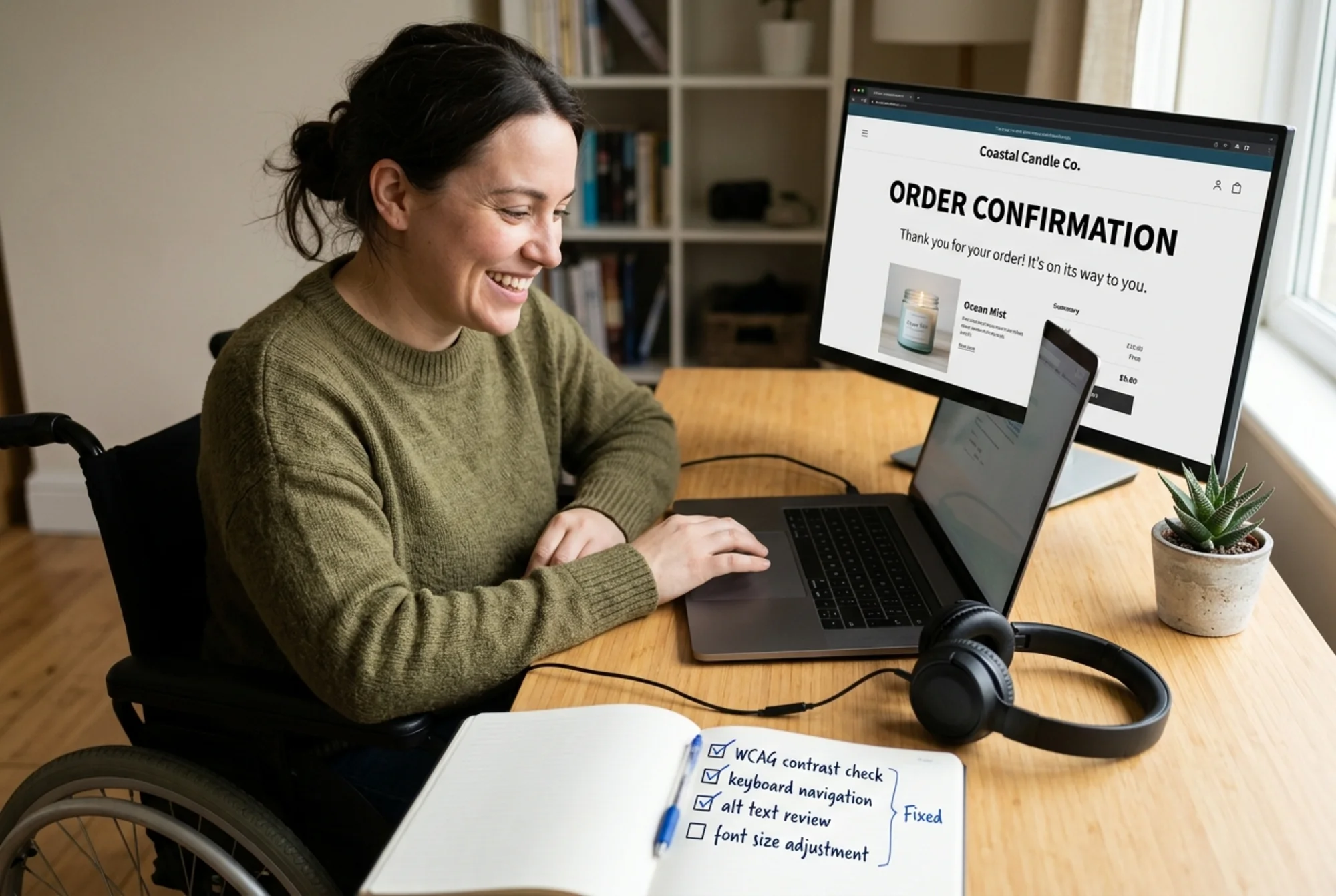
You can handle most accessibility maintenance yourself once the baseline is fixed. For the initial audit and trickier custom components — booking widgets, e-commerce carts, multi-step forms — you may want a second pair of eyes. A practical starting point: run an automated audit to surface the obvious failures, then do manual review on the pages that drive revenue.
Run a Free Accessibility Audit
FreeSiteAudit scans your website for the most common WCAG 2.1 AA failures: missing alt text, low contrast, missing form labels, broken heading structure, keyboard traps, and more. You'll get a prioritized report in plain English, with specific fixes for each issue — no developer jargon, no overwhelming PDFs.
Run a free audit on your website and see exactly which accessibility issues are affecting your customers right now. It takes about 60 seconds — no signup required for the basic report.
You don't need to be a developer. You just need to know where to look and how to prioritize.
Sources
Check your website for free
Get an instant score and your top 3 critical issues in under 60 seconds.
Get Your Free Audit →