Website Audit for Ecommerce Product Pages: What Actually Matters
A plain-English ecommerce product page audit covering speed, Core Web Vitals, content, Product schema, and trust signals that move conversions and rankings.
# Website Audit for Ecommerce Product Pages: What Actually Matters
Product pages are where browsing turns into buying. Everything else on your store — the homepage, category pages, blog — exists to push someone toward one. So when you audit an ecommerce site, the product page deserves more attention than anything else.
The problem is that most audit advice is written for enterprises with developer teams. If you run a small shop on Shopify, WooCommerce, Squarespace, or BigCommerce, you don't need a 200-page report. You need to know which handful of things actually move the needle.
This guide walks through exactly that: what to check on an ecommerce product page, why each item matters, and how to fix it without a developer if you can.
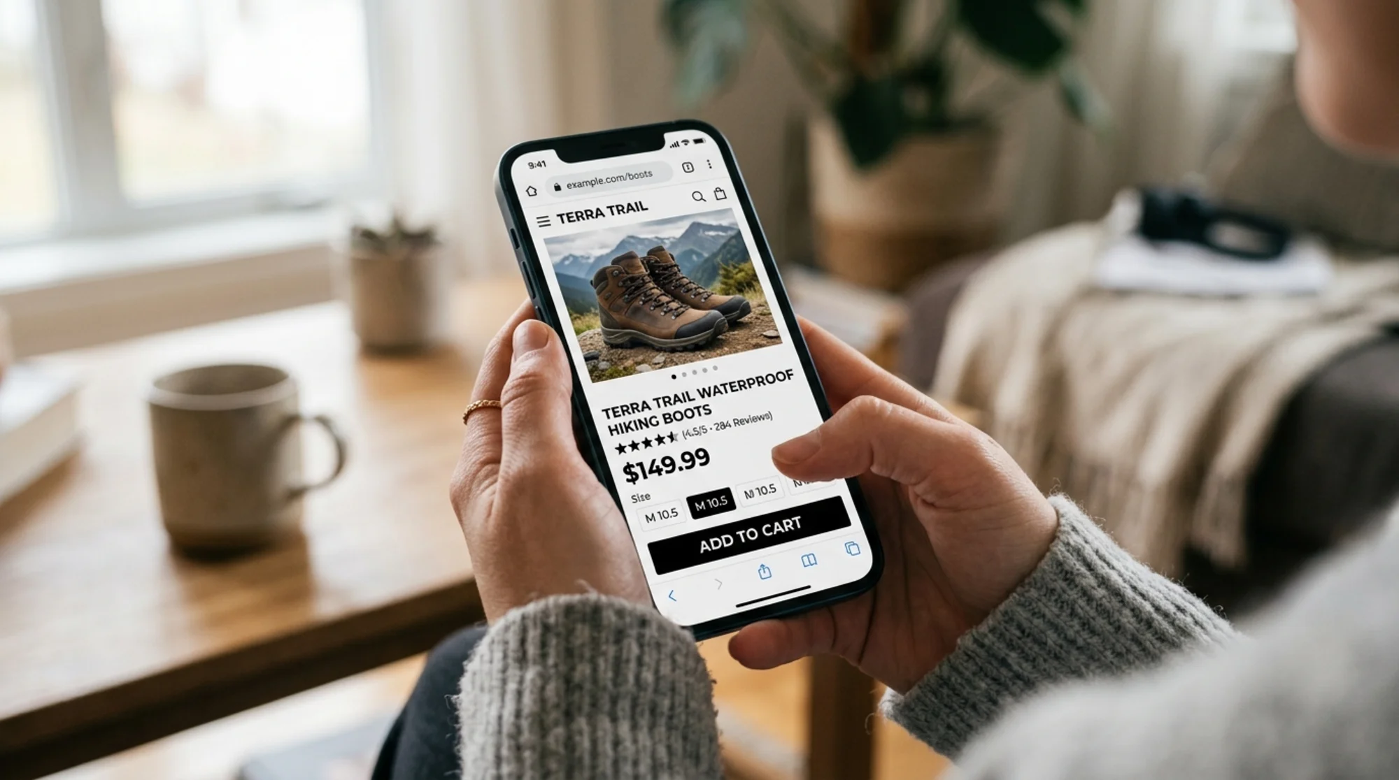
What an "audit" really means for a product page
A product page audit is a structured check against three questions:
- Can a search engine understand and rank it?
- Can a shopper load it quickly and trust it?
- Is the page actually helping someone decide to buy?
If a page passes all three, it converts. If it fails any one, you leak revenue. You don't need fancy software for most of this — just a checklist, a phone, and ten minutes per page.
The 12-point ecommerce product page audit
1. Page speed and Core Web Vitals
Google publishes three speed-related metrics that affect both rankings and conversion: Largest Contentful Paint (LCP), Interaction to Next Paint (INP), and Cumulative Layout Shift (CLS). The thresholds are worth memorizing: LCP under 2.5 seconds, INP under 200 ms, CLS under 0.1.
What to check:
- Open the page on a mid-range phone, not your laptop.
- Use PageSpeed Insights or any free audit tool to pull the numbers.
- The usual culprits on product pages are oversized hero images, third-party review widgets, and chat scripts that block rendering.
Fixes that don't need a developer: compress images to WebP under 200KB, lazy-load below-the-fold content, and remove any plugin you're not actively using.
2. The product image
This is the single most important element on the page. Shoppers decide whether to keep reading based on the hero image.
- Is the main image at least 1000px wide and in WebP or AVIF format?
- Is there more than one image (front, back, scale, in-use)?
- Does at least one image show the product in context (worn, held, in a kitchen, on a desk)?
- Is the file name descriptive (
black-leather-hiking-boot-side.webp), notIMG_4421.jpg? - Does each image have a real alt attribute describing what's in the photo?
Alt text matters for accessibility and image search traffic. "Brown waterproof hiking boot with red laces, side view" beats "boot."
3. The H1 and product title
The H1 should match what the customer typed into Google. If someone searches "men's waterproof hiking boots" and your H1 reads "SUMMIT-PRO X9" with no other words, you've thrown away the match.
A good product H1 includes:
- The product type ("hiking boot")
- A defining attribute ("waterproof," "size 10," "leather")
- The brand or model if relevant
Keep it natural. "Men's Waterproof Leather Hiking Boots — Summit-Pro X9" is fine.
4. The product description
Google's helpful-content guidance is direct: write for people, demonstrate first-hand experience, and avoid copy that exists only to rank. On product pages, that translates to a simple test — could you read the description out loud to a customer and have it sound useful?
What a product description should include:
- One or two sentences answering "what is this and who is it for?"
- A bulleted list of specs (size, weight, materials, fit, compatibility)
- A short section on what makes it different from similar products
- Care, sizing, or use instructions where relevant
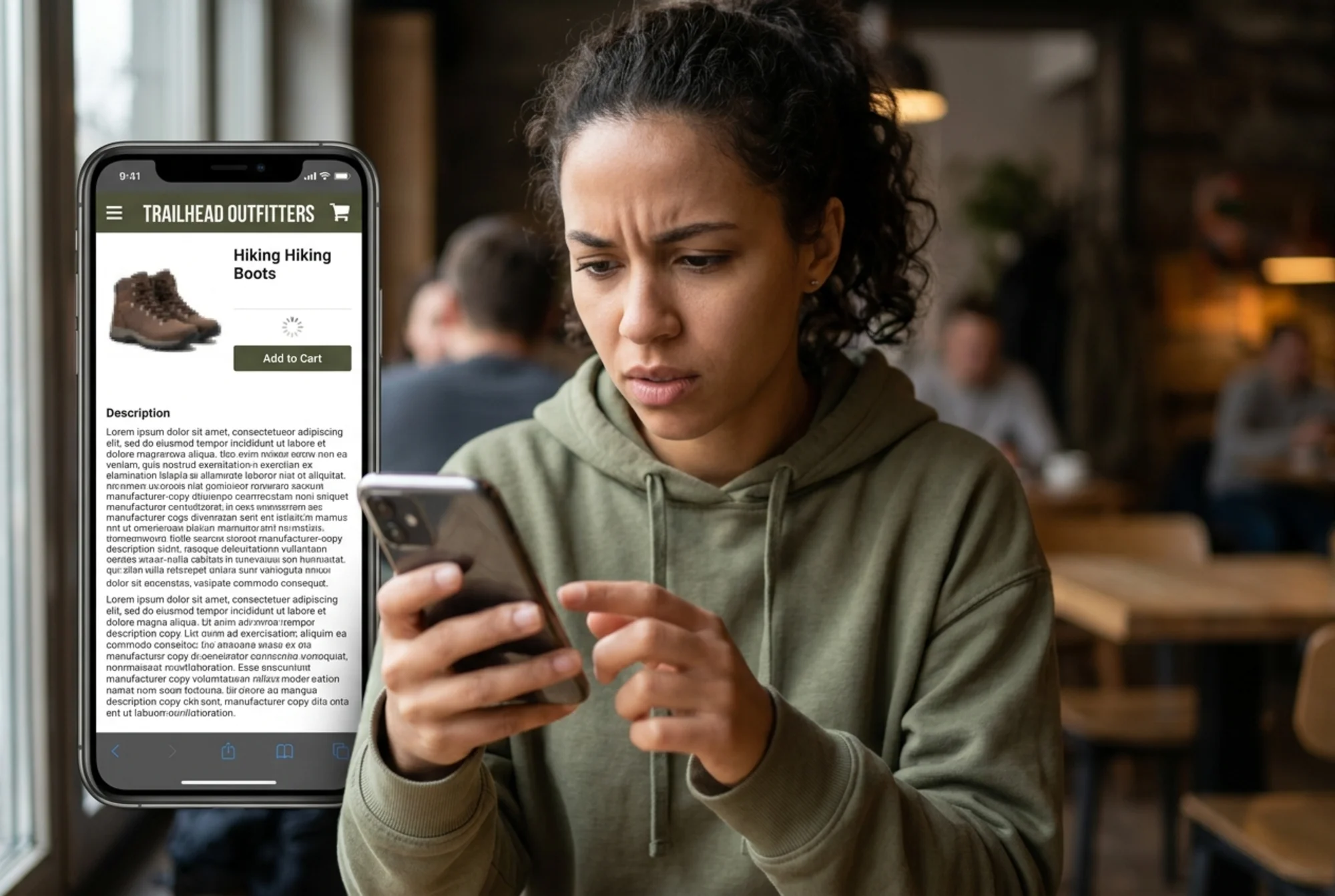
Avoid copy-pasting the manufacturer's blurb. The same text exists on a hundred other sites and Google treats it as duplicate.
5. Price visibility
This sounds obvious, but plenty of pages bury the price. The price must be:
- Visible without scrolling on mobile
- In a font size larger than the body text
- Clearly marked as sale vs. regular if applicable
- Free of currency confusion (€19 vs. $19 vs. 19)
If your store ships internationally, decide whether to localize prices and stick with it.
6. The add-to-cart button
The button is a decision point. Make it impossible to miss.
- Solid color that contrasts with the background
- Clear label ("Add to Cart," not "Submit")
- Sticky on mobile so it stays visible as the customer scrolls through reviews
- At least a 44 × 44 px touch target
If your platform shows out-of-stock as a grayed-out button with no explanation, change the label to "Notify me when back in stock" and capture the email.
7. Reviews and social proof
Shoppers who see reviews convert at noticeably higher rates than those who don't. Even five short reviews beat zero.
- Are reviews visible on the page, not buried in a tab?
- Is the average rating shown near the top?
- Are there at least three reviews per product? If not, you have a review-collection problem to fix, not a layout problem.
- Are reviews marked up with structured data (more below)?
8. Structured data (Product schema)
This is the technical bit that small business owners skip, but it's worth the ten minutes. Google's Product structured data lets your page show price, availability, and review stars directly in search results.
The minimum fields to include:
nameimagedescriptionbrandofferswithprice,priceCurrency, andavailabilityaggregateRatingif you have reviews
Shopify, WooCommerce, and BigCommerce emit this automatically through themes or plugins. Test your output with Google's Rich Results Test. If anything's missing or invalid, you're leaving rich snippets on the table.
9. Trust signals near the buy button
A shopper deciding whether to buy from a brand they've never heard of needs reassurance within one screen of the add-to-cart button. Include:
- Shipping speed ("Ships in 1 business day")
- Return policy in plain language ("Free 30-day returns")
- Payment options (cards, Apple Pay, Klarna, etc.)
- A real stock indicator if true ("Only 4 left")
- A small contact link ("Questions? Reply to chat")
Don't fake urgency. Fake countdown timers and inflated "23 people viewing now" widgets erode trust the moment a shopper recognizes them.
10. Mobile layout
Most ecommerce traffic is mobile. Audit on a real phone, not desktop dev tools.
- Are the price and add-to-cart both visible on first scroll?
- Are tappable elements spaced enough to hit accurately?
- Does the image gallery swipe naturally?
- Does the keyboard cover form fields when you tap them?
11. Internal linking
A product page should not be a dead end.
- A "related products" or "you might also like" section
- A breadcrumb back to the category
- A link to the size guide, care guide, or shipping policy if relevant
12. Metadata and shareability
Open the page source or use a free tool to confirm:
- The
</code> tag is unique and under ~60 characters</li><li>The meta description is written for a human and includes the product type</li><li>An Open Graph image is set (so links shared in iMessage, WhatsApp, and Slack show the product photo, not a generic logo)</li><li>The canonical tag points to the right URL — especially important if your platform creates duplicate URLs for variants</li></ul><h2 class="text-2xl font-bold text-text-primary mt-10 mb-4">A real walkthrough: auditing one product page</h2><p class="text-text-secondary leading-relaxed my-4">A store sells outdoor gear. The product is a men's waterproof hiking boot called the Summit-Pro X9. The owner runs the shop solo, mostly from a phone.</p><p class="text-text-secondary leading-relaxed my-4">She opens the page on her phone. The hero image takes three seconds to appear. PageSpeed Insights reports LCP 4.1s and CLS 0.28. Both fail.</p><p class="text-text-secondary leading-relaxed my-4">She scrolls. The H1 reads "SUMMIT-PRO X9." That's it. No "hiking boot." No "waterproof." Google can only guess unless it reads the description, and the description is the manufacturer's copy that's word-for-word on twelve other retailers.</p><p class="text-text-secondary leading-relaxed my-4">The price is there but sits at the same font size as the body text. The add-to-cart button is gray on white. The four reviews are at the bottom of the page behind a tab.</p><p class="text-text-secondary leading-relaxed my-4">She views the page source. There's a Product schema block, but <code class="bg-surface-panel px-1.5 py-0.5 rounded text-sm text-accent-strong">aggregateRating</code> and <code class="bg-surface-panel px-1.5 py-0.5 rounded text-sm text-accent-strong">brand</code> are missing. The Rich Results Test confirms it.</p><p class="text-text-secondary leading-relaxed my-4">Her punch list:</p><ol class="list-decimal pl-5 space-y-1.5 my-4 text-text-secondary"><li>Compress and resize the hero image; set explicit width and height to fix CLS</li><li>Rewrite the H1 to "Men's Waterproof Hiking Boot — Summit-Pro X9"</li><li>Replace the manufacturer description with three short sections: what it is, what's different, care</li><li>Increase the price font size and put it in the brand color</li><li>Change the add-to-cart button to a high-contrast color and make it sticky on mobile</li><li>Move the four reviews above the fold, with the star rating near the H1</li><li>Fix the Product schema to include <code class="bg-surface-panel px-1.5 py-0.5 rounded text-sm text-accent-strong">brand</code> and <code class="bg-surface-panel px-1.5 py-0.5 rounded text-sm text-accent-strong">aggregateRating</code></li><li>Add an Open Graph image so the page looks right when shared</li></ol><p class="text-text-secondary leading-relaxed my-4">None of this requires a developer. All of it can be done from a phone in the Shopify or WooCommerce admin. Total time: about two hours per page for someone unfamiliar with the platform, less once you've done a few.</p><figure class="my-8"><img src="/blog-images/blog-website-audit-for-ecommerce-product-pages-3-overhead-view-of-a-printed-mobile-screenshot-of-a-hiking-boo.webp" alt="Overhead view of a printed mobile screenshot of a hiking boot product page on a wooden desk, marked up with a red pen circling the H1, price font size, image alt text, a Product schema JSON snippet, and Core Web Vitals numbers (LCP 4.1s, CLS 0.28), a coffee cup and a small notebook with handwritten checklist items beside it" class="w-full rounded-lg border border-border" loading="lazy"/><figcaption class="text-sm text-text-muted italic mt-2 text-center">Overhead view of a printed mobile screenshot of a hiking boot product page on a wooden desk, marked up with a red pen circling the H1, price font size, image alt text, a Product schema JSON snippet, and Core Web Vitals numbers (LCP 4.1s, CLS 0.28), a coffee cup and a small notebook with handwritten checklist items beside it</figcaption></figure><h2 class="text-2xl font-bold text-text-primary mt-10 mb-4">What to audit first if you only have an hour</h2><p class="text-text-secondary leading-relaxed my-4">If you're staring at a hundred product pages, prioritize like this:</p><ol class="list-decimal pl-5 space-y-1.5 my-4 text-text-secondary"><li><strong class="text-text-primary">Top 5 revenue products.</strong> A 5% lift on a bestseller beats a 50% lift on something nobody buys.</li><li><strong class="text-text-primary">Pages with high traffic but low conversion.</strong> Pull this from Google Analytics or Shopify Analytics. These are pages where something's broken between landing and adding to cart.</li><li><strong class="text-text-primary">Pages with no reviews yet.</strong> Set up a post-purchase review-request email if you don't have one.</li><li><strong class="text-text-primary">Pages with high bounce on mobile.</strong> Almost always a speed or layout problem.</li></ol><p class="text-text-secondary leading-relaxed my-4">Don't try to audit everything. A few pages will drive most of your revenue — fixing them moves real money.</p><h2 class="text-2xl font-bold text-text-primary mt-10 mb-4">Common mistakes on small business product pages</h2><ul class="list-disc pl-5 space-y-1.5 my-4 text-text-secondary"><li><strong class="text-text-primary">Pop-ups that fire instantly.</strong> A shopper hasn't seen the product yet. Don't ask for their email before they know what they're looking at.</li><li><strong class="text-text-primary">Auto-playing video with sound.</strong> Use a muted loop with sound on tap.</li><li><strong class="text-text-primary">No size or fit info for apparel and footwear.</strong> The #1 cause of returns and abandoned carts.</li><li><strong class="text-text-primary">Generic shipping copy ("calculated at checkout").</strong> Be specific: "Ships free in the US over $50."</li><li><strong class="text-text-primary">Hidden return policy.</strong> A one-line "Free 30-day returns" near the buy button removes a real objection.</li><li><strong class="text-text-primary">Variant chaos.</strong> Sixteen color swatches with no preview images. Show the variant change immediately.</li></ul><h2 class="text-2xl font-bold text-text-primary mt-10 mb-4">After you audit: track what changed</h2><p class="text-text-secondary leading-relaxed my-4">The point of an audit is improvement, not paperwork. For each change, note the date and which page changed in a simple spreadsheet. Check the conversion rate and search impressions for that page 14 days later. You don't need attribution-quality data — just directional signal.</p><figure class="my-8"><img src="/blog-images/blog-website-audit-for-ecommerce-product-pages-4-a-small-business-owner-smiling-at-a-tablet-on-a-workbench-in.webp" alt="A small business owner smiling at a tablet on a workbench in a small outdoor gear shop, the tablet showing a cleaned-up hiking boot product page with a fast-loading hero image, large clear price, five-star review module pinned near the title, sticky add-to-cart bar, and a small overlay graph showing a rising conversion rate, late afternoon shop lighting" class="w-full rounded-lg border border-border" loading="lazy"/><figcaption class="text-sm text-text-muted italic mt-2 text-center">A small business owner smiling at a tablet on a workbench in a small outdoor gear shop, the tablet showing a cleaned-up hiking boot product page with a fast-loading hero image, large clear price, five-star review module pinned near the title, sticky add-to-cart bar, and a small overlay graph showing a rising conversion rate, late afternoon shop lighting</figcaption></figure><h2 class="text-2xl font-bold text-text-primary mt-10 mb-4">Run a free audit on your product pages</h2><p class="text-text-secondary leading-relaxed my-4">If this list felt overwhelming, start with one page and a free scan. FreeSiteAudit checks the items above — speed, structured data, metadata, image setup, content quality, mobile usability — and gives you a prioritized list of what to fix first, in plain English.</p><p class="text-text-secondary leading-relaxed my-4"><a href="/tools/free-website-audit" class="text-accent hover:text-accent-strong underline">Run a free website audit</a> on your top product page. It takes about a minute, no credit card. If you sell on Shopify, WooCommerce, BigCommerce, or any other platform, the audit catches the patterns above and tells you which ones matter most for your page.</p><p class="text-text-secondary leading-relaxed my-4">For deeper fixes, see our guides on <a href="/fixes/core-web-vitals" class="text-accent hover:text-accent-strong underline">Core Web Vitals</a> and <a href="/fixes/product-schema" class="text-accent hover:text-accent-strong underline">Product schema</a>, or browse the <a href="/industries/ecommerce" class="text-accent hover:text-accent-strong underline">ecommerce industry resources</a> for more walkthroughs like this one.</p><p class="text-text-secondary leading-relaxed my-4">The audit is a starting point. The work is on the page. But knowing which twelve things to look at — and in what order — is the difference between flailing and shipping.</p><h2 class="text-2xl font-bold text-text-primary mt-10 mb-4">Sources</h2><ul class="list-disc pl-5 space-y-1.5 my-4 text-text-secondary"><li>Google Search Central — Creating helpful, reliable, people-first content: https://developers.google.com/search/docs/fundamentals/creating-helpful-content</li><li>Google Search Central — Product structured data: https://developers.google.com/search/docs/appearance/structured-data/product</li><li>web.dev — Core Web Vitals: https://web.dev/articles/vitals</li></ul></div><div class="mt-12"></div><div class="mt-6 bg-gradient-to-r from-accent-subtle to-accent-subtle/50 border border-accent-border rounded-xl p-8 text-center"><h2 class="text-2xl font-bold mb-2">Check your website for free</h2><p class="text-text-muted mb-6">Get an instant score and your top 3 critical issues in under 60 seconds.</p><a class="inline-block bg-accent hover:bg-accent-strong text-text-inverse font-semibold px-10 py-3.5 rounded-lg transition-colors" href="/#free-audit">Get Your Free Audit →</a></div></article><footer class="border-t border-border mt-auto"><nav aria-label="Footer navigation" class="max-w-6xl mx-auto px-4 py-8 sm:py-12"><div class="grid grid-cols-2 md:grid-cols-3 gap-8 lg:flex lg:flex-row lg:flex-wrap lg:justify-between lg:gap-x-6"><div class="col-span-2 md:col-span-1 lg:max-w-[14rem]"><a class="text-lg font-bold tracking-tight" href="/"><span class="text-accent">Free</span>SiteAudit</a><p class="text-text-muted text-sm mt-3 leading-relaxed">Website audits for business owners and agencies. Find issues, fix them, grow.</p></div><div><h4 class="text-sm font-semibold text-text-secondary mb-3 lg:whitespace-nowrap">Solutions</h4><ul class="space-y-2"><li><a class="text-sm text-text-muted hover:text-text-secondary transition-colors lg:whitespace-nowrap" href="/#free-audit">Free Website Audit</a></li><li><a class="text-sm text-text-muted hover:text-text-secondary transition-colors lg:whitespace-nowrap" href="/agencies">For Agencies</a></li><li><a class="text-sm text-text-muted hover:text-text-secondary transition-colors lg:whitespace-nowrap" href="/pricing">Pricing</a></li><li><a class="text-sm text-text-muted hover:text-text-secondary transition-colors lg:whitespace-nowrap" href="/demo">Demo Report</a></li><li><a class="text-sm text-text-muted hover:text-text-secondary transition-colors lg:whitespace-nowrap" href="/dashboard">Dashboard</a></li></ul></div><div><h4 class="text-sm font-semibold text-text-secondary mb-3 lg:whitespace-nowrap">Industries</h4><ul class="space-y-2"><li><a class="text-sm text-text-muted hover:text-text-secondary transition-colors lg:whitespace-nowrap" href="/industries/saas">SaaS Apps</a></li><li><a class="text-sm text-text-muted hover:text-text-secondary transition-colors lg:whitespace-nowrap" href="/industries/dev-portfolios">Dev Portfolios</a></li><li><a class="text-sm text-text-muted hover:text-text-secondary transition-colors lg:whitespace-nowrap" href="/industries/blogs">Blogs & Content</a></li><li><a class="text-sm text-text-muted hover:text-text-secondary transition-colors lg:whitespace-nowrap" href="/industries/courses">Course Sites</a></li><li><a class="text-sm text-text-muted hover:text-text-secondary transition-colors lg:whitespace-nowrap" href="/industries/agency-sites">Agency Sites</a></li><li><a class="text-sm text-text-muted hover:text-text-secondary transition-colors lg:whitespace-nowrap" href="/industries">All Industries</a></li></ul></div><div><h4 class="text-sm font-semibold text-text-secondary mb-3 lg:whitespace-nowrap">Compare & Results</h4><ul class="space-y-2"><li><a class="text-sm text-text-muted hover:text-text-secondary transition-colors lg:whitespace-nowrap" href="/blog/freesiteaudit-vs-semrush">vs Semrush</a></li><li><a class="text-sm text-text-muted hover:text-text-secondary transition-colors lg:whitespace-nowrap" href="/blog/freesiteaudit-vs-seoptimer-vs-seo-site-checkup">vs SEOptimer</a></li><li><a class="text-sm text-text-muted hover:text-text-secondary transition-colors lg:whitespace-nowrap" href="/case-studies">Success Stories</a></li><li><a class="text-sm text-text-muted hover:text-text-secondary transition-colors lg:whitespace-nowrap" href="https://findbackflowtesters.com">FindBackflowTesters.com</a></li><li><a class="text-sm text-text-muted hover:text-text-secondary transition-colors lg:whitespace-nowrap" href="https://freesiteaudit.com">FreeSiteAudit.com</a></li></ul></div><div><h4 class="text-sm font-semibold text-text-secondary mb-3 lg:whitespace-nowrap">Resources</h4><ul class="space-y-2"><li><a class="text-sm text-text-muted hover:text-text-secondary transition-colors lg:whitespace-nowrap" href="/blog">Blog</a></li><li><a class="text-sm text-text-muted hover:text-text-secondary transition-colors lg:whitespace-nowrap" href="/tools">Free Tools</a></li><li><a class="text-sm text-text-muted hover:text-text-secondary transition-colors lg:whitespace-nowrap" href="/fixes">Fix Library</a></li><li><a class="text-sm text-text-muted hover:text-text-secondary transition-colors lg:whitespace-nowrap" href="/about">About</a></li><li><a class="text-sm text-text-muted hover:text-text-secondary transition-colors lg:whitespace-nowrap" href="mailto:hello@freesiteaudit.com">Contact</a></li></ul></div><div><h4 class="text-sm font-semibold text-text-secondary mb-3 lg:whitespace-nowrap">Legal</h4><ul class="space-y-2"><li><a class="text-sm text-text-muted hover:text-text-secondary transition-colors lg:whitespace-nowrap" href="/privacy">Privacy Policy</a></li><li><a class="text-sm text-text-muted hover:text-text-secondary transition-colors lg:whitespace-nowrap" href="/terms">Terms of Service</a></li></ul></div><div><h4 class="text-sm font-semibold text-text-secondary mb-3 lg:whitespace-nowrap">Platforms</h4><ul class="space-y-2"><li><a class="text-sm text-text-muted hover:text-text-secondary transition-colors lg:whitespace-nowrap" href="/platforms/wordpress">WordPress</a></li><li><a class="text-sm text-text-muted hover:text-text-secondary transition-colors lg:whitespace-nowrap" href="/platforms/shopify">Shopify</a></li><li><a class="text-sm text-text-muted hover:text-text-secondary transition-colors lg:whitespace-nowrap" href="/platforms/webflow">Webflow</a></li><li><a class="text-sm text-text-muted hover:text-text-secondary transition-colors lg:whitespace-nowrap" href="/platforms/wix">Wix</a></li><li><a class="text-sm text-text-muted hover:text-text-secondary transition-colors lg:whitespace-nowrap" href="/platforms/squarespace">Squarespace</a></li></ul></div></div><div class="border-t border-border-subtle mt-10 pt-6 flex flex-col sm:flex-row items-center justify-between gap-3 text-xs text-text-muted"><span>© <!-- -->2026<!-- --> FreeSiteAudit. All rights reserved.</span><div class="flex items-center gap-4"><a class="hover:text-text-secondary transition-colors" href="/privacy">Privacy</a><a class="hover:text-text-secondary transition-colors" href="/terms">Terms</a></div></div></nav></footer></div><!--$--><!--/$--></main><button aria-label="Contact us" class="fixed right-4 z-40 flex items-center gap-2 rounded-full bg-accent text-accent-foreground font-semibold text-sm h-12 px-5 shadow-accent-glow hover:bg-accent-strong hover:shadow-accent-glow-lg transition-all duration-200 bottom-[calc(1rem+env(safe-area-inset-bottom))] sm:bottom-6"><svg class="w-5 h-5" fill="none" viewBox="0 0 24 24" stroke="currentColor" stroke-width="2"><path stroke-linecap="round" stroke-linejoin="round" d="M8.625 12a.375.375 0 11-.75 0 .375.375 0 01.75 0zm4.125 0a.375.375 0 11-.75 0 .375.375 0 01.75 0zm4.125 0a.375.375 0 11-.75 0 .375.375 0 01.75 0zM2.25 12.76c0 1.6 1.123 2.994 2.707 3.227 1.087.16 2.185.283 3.293.369V21l4.076-4.076a1.526 1.526 0 011.037-.443 48.282 48.282 0 005.68-.494c1.584-.233 2.707-1.626 2.707-3.228V6.741c0-1.602-1.123-2.995-2.707-3.228A48.394 48.394 0 0012 3c-2.392 0-4.744.175-7.043.513C3.373 3.746 2.25 5.14 2.25 6.741v6.018z"></path></svg><span class="hidden sm:inline">Contact Us</span></button></div><button aria-label="Switch to light mode" aria-pressed="false" class="fixed right-4 z-40 flex items-center justify-center rounded-full w-10 h-10 border border-border bg-surface-elevated text-text-secondary hover:text-text-primary hover:bg-surface-panel shadow-panel-sm transition-all duration-200 bottom-[calc(1rem+env(safe-area-inset-bottom)+3.75rem)] sm:bottom-[5.25rem]"><svg class="w-[18px] h-[18px]" fill="none" viewBox="0 0 24 24" stroke="currentColor" stroke-width="2"><path stroke-linecap="round" stroke-linejoin="round" d="M12 3v2.25m6.364.386l-1.591 1.591M21 12h-2.25m-.386 6.364l-1.591-1.591M12 18.75V21m-4.773-4.227l-1.591 1.591M5.25 12H3m4.227-4.773L5.636 5.636M15.75 12a3.75 3.75 0 11-7.5 0 3.75 3.75 0 017.5 0z"></path></svg></button><script src="/_next/static/chunks/webpack-092588108e816234.js" id="_R_" async=""></script><script>(self.__next_f=self.__next_f||[]).push([0])</script><script>self.__next_f.push([1,"1:\"$Sreact.fragment\"\n8:I[57150,[],\"\"]\n:HL[\"/_next/static/media/4473ecc91f70f139-s.p.woff\",\"font\",{\"crossOrigin\":\"\",\"type\":\"font/woff\"}]\n:HL[\"/_next/static/media/463dafcda517f24f-s.p.woff\",\"font\",{\"crossOrigin\":\"\",\"type\":\"font/woff\"}]\n:HL[\"/_next/static/css/ce06d03cd29772c1.css\",\"style\"]\n:HL[\"/_next/static/css/5adad2ac1ae9f57d.css\",\"style\"]\n2:Tbac,"])</script><script>self.__next_f.push([1,"{\"@context\":\"https://schema.org\",\"@type\":\"FAQPage\",\"mainEntity\":[{\"@type\":\"Question\",\"name\":\"Is the free audit really free?\",\"acceptedAnswer\":{\"@type\":\"Answer\",\"text\":\"Yes, completely free. Just enter your URL — no account, no email, no credit card. You get your overall score and top issues instantly. Want more? Create a free account to save your report and get 2 pro scan credits.\"}},{\"@type\":\"Question\",\"name\":\"How long until I get my report?\",\"acceptedAnswer\":{\"@type\":\"Answer\",\"text\":\"The Quick Scan is typically under 60 seconds. Paid reports are generated and emailed within 2–3 minutes of payment.\"}},{\"@type\":\"Question\",\"name\":\"What do you analyze?\",\"acceptedAnswer\":{\"@type\":\"Answer\",\"text\":\"9 categories: SEO \u0026 Search Visibility, Website Performance \u0026 Speed, Mobile Experience, Security \u0026 Privacy, Accessibility, Content \u0026 Messaging, Technical Health, Trust \u0026 Credibility, and Local SEO \u0026 Google Business. Each category is scored independently, and we provide specific evidence and fix instructions for every issue found.\"}},{\"@type\":\"Question\",\"name\":\"Do I need technical knowledge?\",\"acceptedAnswer\":{\"@type\":\"Answer\",\"text\":\"Not at all. Reports are written in plain language with prioritized, step-by-step recommendations. Each issue is labeled with who can fix it, and many are things you can do yourself without touching code.\"}},{\"@type\":\"Question\",\"name\":\"How accurate is the analysis?\",\"acceptedAnswer\":{\"@type\":\"Answer\",\"text\":\"We analyze your actual live website, checking real page speed, real HTML structure, and real content. Every finding comes with specific evidence from your site, so you can verify it yourself.\"}},{\"@type\":\"Question\",\"name\":\"Is my data safe?\",\"acceptedAnswer\":{\"@type\":\"Answer\",\"text\":\"Absolutely. We only use your email to deliver your report. No spam, no sharing with third parties. We analyze publicly accessible pages (the same thing Google sees). We never store passwords, we don't access admin panels, and we never sell your data. All connections are encrypted with 256-bit SSL. See our Privacy Policy for full details.\"}},{\"@type\":\"Question\",\"name\":\"Can I see a sample report before buying?\",\"acceptedAnswer\":{\"@type\":\"Answer\",\"text\":\"Yes! Check out our interactive demo report to see exactly what a full audit looks like, with real findings, evidence, and fix instructions you can explore.\"}},{\"@type\":\"Question\",\"name\":\"How do I cancel my subscription?\",\"acceptedAnswer\":{\"@type\":\"Answer\",\"text\":\"You can cancel anytime from your dashboard. Just click \\\"Manage Subscription\\\" to open the billing portal. Your audit access continues until the end of your current billing period.\"}},{\"@type\":\"Question\",\"name\":\"Who built FreeSiteAudit?\",\"acceptedAnswer\":{\"@type\":\"Answer\",\"text\":\"FreeSiteAudit was built by web professionals who wanted to make professional-grade website audits accessible to every business owner. We combined real-world SEO and web development experience with automation to deliver clear, actionable reports.\"}}]}"])</script><script>self.__next_f.push([1,"0:{\"P\":null,\"b\":\"23djxc4YWdrEwqJ0FoqV6\",\"p\":\"\",\"c\":[\"\",\"blog\",\"website-audit-for-ecommerce-product-pages\"],\"i\":false,\"f\":[[[\"\",{\"children\":[\"blog\",{\"children\":[[\"slug\",\"website-audit-for-ecommerce-product-pages\",\"d\"],{\"children\":[\"__PAGE__\",{}]}]}]},\"$undefined\",\"$undefined\",true],[\"\",[\"$\",\"$1\",\"c\",{\"children\":[[[\"$\",\"link\",\"0\",{\"rel\":\"stylesheet\",\"href\":\"/_next/static/css/ce06d03cd29772c1.css\",\"precedence\":\"next\",\"crossOrigin\":\"$undefined\",\"nonce\":\"$undefined\"}],[\"$\",\"link\",\"1\",{\"rel\":\"stylesheet\",\"href\":\"/_next/static/css/5adad2ac1ae9f57d.css\",\"precedence\":\"next\",\"crossOrigin\":\"$undefined\",\"nonce\":\"$undefined\"}]],[\"$\",\"html\",null,{\"lang\":\"en\",\"suppressHydrationWarning\":true,\"children\":[[\"$\",\"head\",null,{\"children\":[[\"$\",\"script\",null,{\"dangerouslySetInnerHTML\":{\"__html\":\"(function(){try{var t=localStorage.getItem('theme');if(!t)t='dark';document.documentElement.classList.add(t);document.documentElement.style.colorScheme=t;var m=document.querySelector('meta[name=\\\"theme-color\\\"]');if(m)m.content=t==='light'?'#faf9fe':'#09090b'}catch(e){document.documentElement.classList.add('dark');document.documentElement.style.colorScheme='dark'}})()\"}}],[\"$\",\"link\",null,{\"rel\":\"icon\",\"href\":\"/favicon.ico\",\"sizes\":\"any\"}],[\"$\",\"meta\",null,{\"name\":\"theme-color\",\"content\":\"#09090b\"}],[\"$\",\"link\",null,{\"rel\":\"preconnect\",\"href\":\"https://js.stripe.com\"}],[\"$\",\"link\",null,{\"rel\":\"dns-prefetch\",\"href\":\"https://js.stripe.com\"}],[\"$\",\"link\",null,{\"rel\":\"preconnect\",\"href\":\"https://api.stripe.com\"}],[\"$\",\"link\",null,{\"rel\":\"dns-prefetch\",\"href\":\"https://api.stripe.com\"}],[[\"$\",\"script\",\"0\",{\"type\":\"application/ld+json\",\"dangerouslySetInnerHTML\":{\"__html\":\"{\\\"@context\\\":\\\"https://schema.org\\\",\\\"@type\\\":\\\"Organization\\\",\\\"@id\\\":\\\"https://freesiteaudit.com/#organization\\\",\\\"name\\\":\\\"FreeSiteAudit\\\",\\\"url\\\":\\\"https://freesiteaudit.com\\\",\\\"logo\\\":{\\\"@type\\\":\\\"ImageObject\\\",\\\"url\\\":\\\"https://freesiteaudit.com/logo.png\\\",\\\"width\\\":\\\"200\\\",\\\"height\\\":\\\"60\\\"},\\\"description\\\":\\\"Free instant website audit tool for small businesses. Check your SEO, speed, mobile-friendliness \u0026 security in seconds.\\\",\\\"sameAs\\\":[],\\\"contactPoint\\\":{\\\"@type\\\":\\\"ContactPoint\\\",\\\"contactType\\\":\\\"Customer Service\\\",\\\"availableLanguage\\\":[\\\"English\\\"]}}\"}}],[\"$\",\"script\",\"1\",{\"type\":\"application/ld+json\",\"dangerouslySetInnerHTML\":{\"__html\":\"{\\\"@context\\\":\\\"https://schema.org\\\",\\\"@type\\\":\\\"ProfessionalService\\\",\\\"@id\\\":\\\"https://freesiteaudit.com/#business\\\",\\\"name\\\":\\\"FreeSiteAudit\\\",\\\"url\\\":\\\"https://freesiteaudit.com\\\",\\\"logo\\\":\\\"https://freesiteaudit.com/logo.png\\\",\\\"description\\\":\\\"Professional website audit and SEO analysis service for small businesses. Get instant insights and actionable recommendations.\\\",\\\"priceRange\\\":\\\"Free - $$\\\",\\\"areaServed\\\":{\\\"@type\\\":\\\"Place\\\",\\\"name\\\":\\\"Worldwide\\\"},\\\"hasOfferCatalog\\\":{\\\"@type\\\":\\\"OfferCatalog\\\",\\\"name\\\":\\\"Website Audit Services\\\",\\\"itemListElement\\\":[{\\\"@type\\\":\\\"Offer\\\",\\\"itemOffered\\\":{\\\"@type\\\":\\\"Service\\\",\\\"name\\\":\\\"Free Website Audit\\\",\\\"description\\\":\\\"2 free website audits per week with AI-powered analysis\\\"},\\\"price\\\":\\\"0\\\",\\\"priceCurrency\\\":\\\"USD\\\"},{\\\"@type\\\":\\\"Offer\\\",\\\"itemOffered\\\":{\\\"@type\\\":\\\"Service\\\",\\\"name\\\":\\\"Starter Plan\\\",\\\"description\\\":\\\"5 website audits per week with priority support\\\"},\\\"price\\\":\\\"19.00\\\",\\\"priceCurrency\\\":\\\"USD\\\"}]}}\"}}],[\"$\",\"script\",\"2\",{\"type\":\"application/ld+json\",\"dangerouslySetInnerHTML\":{\"__html\":\"{\\\"@context\\\":\\\"https://schema.org\\\",\\\"@type\\\":\\\"WebSite\\\",\\\"@id\\\":\\\"https://freesiteaudit.com/#website\\\",\\\"url\\\":\\\"https://freesiteaudit.com\\\",\\\"name\\\":\\\"FreeSiteAudit\\\",\\\"description\\\":\\\"Free website audit tool for small businesses\\\",\\\"publisher\\\":{\\\"@id\\\":\\\"https://freesiteaudit.com/#organization\\\"}}\"}}],[\"$\",\"script\",\"3\",{\"type\":\"application/ld+json\",\"dangerouslySetInnerHTML\":{\"__html\":\"$2\"}}]]]}],\"$L3\"]}]]}],{\"children\":[\"blog\",\"$L4\",{\"children\":[[\"slug\",\"website-audit-for-ecommerce-product-pages\",\"d\"],\"$L5\",{\"children\":[\"__PAGE__\",\"$L6\",{},null,false]},null,false]},null,false]},null,false],\"$L7\",false]],\"m\":\"$undefined\",\"G\":[\"$8\",[]],\"s\":false,\"S\":true}\n"])</script><script>self.__next_f.push([1,"9:I[7143,[\"7177\",\"static/chunks/app/layout-2ca08483bb34668c.js\"],\"GoogleAnalytics\"]\na:I[43347,[\"7177\",\"static/chunks/app/layout-2ca08483bb34668c.js\"],\"PostHogProvider\"]\nb:I[47212,[\"7177\",\"static/chunks/app/layout-2ca08483bb34668c.js\"],\"WebVitals\"]\nc:I[63479,[\"7177\",\"static/chunks/app/layout-2ca08483bb34668c.js\"],\"ThemeProvider\"]\nd:I[9766,[],\"\"]\ne:I[98924,[],\"\"]\nf:I[65534,[\"7177\",\"static/chunks/app/layout-2ca08483bb34668c.js\"],\"ConditionalFooter\"]\n10:I[28923,[\"7177\",\"static/chunks/app/layout-2ca08483bb34668c.js\"],\"default\"]\n11:I[49196,[\"7177\",\"static/chunks/app/layout-2ca08483bb34668c.js\"],\"ThemeToggle\"]\n13:I[24431,[],\"OutletBoundary\"]\n15:I[15278,[],\"AsyncMetadataOutlet\"]\n17:I[24431,[],\"ViewportBoundary\"]\n19:I[24431,[],\"MetadataBoundary\"]\n1a:\"$Sreact.suspense\"\n"])</script><script>self.__next_f.push([1,"3:[\"$\",\"body\",null,{\"className\":\"__variable_1e4310 __variable_c3aa02 antialiased bg-surface-body text-text-primary\",\"children\":[[\"$\",\"a\",null,{\"href\":\"#main-content\",\"className\":\"sr-only focus:not-sr-only focus:fixed focus:top-4 focus:left-4 focus:z-[100] focus:bg-accent focus:text-accent-foreground focus:px-4 focus:py-2 focus:rounded-lg focus:font-semibold focus:text-sm focus:outline-none focus:shadow-lg\",\"children\":\"Skip to main content\"}],[\"$\",\"$L9\",null,{}],[\"$\",\"$La\",null,{}],[\"$\",\"$Lb\",null,{}],[\"$\",\"$Lc\",null,{\"children\":[[\"$\",\"div\",null,{\"className\":\"flex flex-col min-h-screen\",\"children\":[[\"$\",\"main\",null,{\"id\":\"main-content\",\"children\":[\"$\",\"$Ld\",null,{\"parallelRouterKey\":\"children\",\"error\":\"$undefined\",\"errorStyles\":\"$undefined\",\"errorScripts\":\"$undefined\",\"template\":[\"$\",\"$Le\",null,{}],\"templateStyles\":\"$undefined\",\"templateScripts\":\"$undefined\",\"notFound\":[[[\"$\",\"title\",null,{\"children\":\"404: This page could not be found.\"}],[\"$\",\"div\",null,{\"style\":{\"fontFamily\":\"system-ui,\\\"Segoe UI\\\",Roboto,Helvetica,Arial,sans-serif,\\\"Apple Color Emoji\\\",\\\"Segoe UI Emoji\\\"\",\"height\":\"100vh\",\"textAlign\":\"center\",\"display\":\"flex\",\"flexDirection\":\"column\",\"alignItems\":\"center\",\"justifyContent\":\"center\"},\"children\":[\"$\",\"div\",null,{\"children\":[[\"$\",\"style\",null,{\"dangerouslySetInnerHTML\":{\"__html\":\"body{color:#000;background:#fff;margin:0}.next-error-h1{border-right:1px solid rgba(0,0,0,.3)}@media (prefers-color-scheme:dark){body{color:#fff;background:#000}.next-error-h1{border-right:1px solid rgba(255,255,255,.3)}}\"}}],[\"$\",\"h1\",null,{\"className\":\"next-error-h1\",\"style\":{\"display\":\"inline-block\",\"margin\":\"0 20px 0 0\",\"padding\":\"0 23px 0 0\",\"fontSize\":24,\"fontWeight\":500,\"verticalAlign\":\"top\",\"lineHeight\":\"49px\"},\"children\":404}],[\"$\",\"div\",null,{\"style\":{\"display\":\"inline-block\"},\"children\":[\"$\",\"h2\",null,{\"style\":{\"fontSize\":14,\"fontWeight\":400,\"lineHeight\":\"49px\",\"margin\":0},\"children\":\"This page could not be found.\"}]}]]}]}]],[]],\"forbidden\":\"$undefined\",\"unauthorized\":\"$undefined\"}]}],[\"$\",\"$Lf\",null,{}],[\"$\",\"$L10\",null,{}]]}],[\"$\",\"$L11\",null,{}]]}]]}]\n"])</script><script>self.__next_f.push([1,"4:[\"$\",\"$1\",\"c\",{\"children\":[null,[\"$\",\"$Ld\",null,{\"parallelRouterKey\":\"children\",\"error\":\"$undefined\",\"errorStyles\":\"$undefined\",\"errorScripts\":\"$undefined\",\"template\":[\"$\",\"$Le\",null,{}],\"templateStyles\":\"$undefined\",\"templateScripts\":\"$undefined\",\"notFound\":\"$undefined\",\"forbidden\":\"$undefined\",\"unauthorized\":\"$undefined\"}]]}]\n5:[\"$\",\"$1\",\"c\",{\"children\":[null,[\"$\",\"$Ld\",null,{\"parallelRouterKey\":\"children\",\"error\":\"$undefined\",\"errorStyles\":\"$undefined\",\"errorScripts\":\"$undefined\",\"template\":[\"$\",\"$Le\",null,{}],\"templateStyles\":\"$undefined\",\"templateScripts\":\"$undefined\",\"notFound\":\"$undefined\",\"forbidden\":\"$undefined\",\"unauthorized\":\"$undefined\"}]]}]\n6:[\"$\",\"$1\",\"c\",{\"children\":[\"$L12\",null,[\"$\",\"$L13\",null,{\"children\":[\"$L14\",[\"$\",\"$L15\",null,{\"promise\":\"$@16\"}]]}]]}]\n7:[\"$\",\"$1\",\"h\",{\"children\":[null,[[\"$\",\"$L17\",null,{\"children\":\"$L18\"}],[\"$\",\"meta\",null,{\"name\":\"next-size-adjust\",\"content\":\"\"}]],[\"$\",\"$L19\",null,{\"children\":[\"$\",\"div\",null,{\"hidden\":true,\"children\":[\"$\",\"$1a\",null,{\"fallback\":null,\"children\":\"$L1b\"}]}]}]]}]\n"])</script><script>self.__next_f.push([1,"1c:I[41654,[\"5953\",\"static/chunks/app/blog/%5Bslug%5D/page-594ce9f3ae4ecbe2.js\"],\"MarketingNav\"]\n1d:I[23732,[\"5953\",\"static/chunks/app/blog/%5Bslug%5D/page-594ce9f3ae4ecbe2.js\"],\"default\"]\n"])</script><script>self.__next_f.push([1,"12:[[[\"$\",\"script\",\"0\",{\"type\":\"application/ld+json\",\"dangerouslySetInnerHTML\":{\"__html\":\"{\\\"@context\\\":\\\"https://schema.org\\\",\\\"@type\\\":\\\"Article\\\",\\\"headline\\\":\\\"Website Audit for Ecommerce Product Pages: What Actually Matters\\\",\\\"description\\\":\\\"A plain-English ecommerce product page audit covering speed, Core Web Vitals, content, Product schema, and trust signals that move conversions and rankings.\\\",\\\"author\\\":{\\\"@type\\\":\\\"Person\\\",\\\"name\\\":\\\"FreeSiteAudit\\\"},\\\"publisher\\\":{\\\"@id\\\":\\\"https://freesiteaudit.com/#organization\\\"},\\\"datePublished\\\":\\\"2026-03-04T00:00:00.000Z\\\",\\\"dateModified\\\":\\\"2026-03-04T00:00:00.000Z\\\",\\\"mainEntityOfPage\\\":{\\\"@type\\\":\\\"WebPage\\\",\\\"@id\\\":\\\"https://freesiteaudit.com/blog/website-audit-for-ecommerce-product-pages\\\"}}\"}}],[\"$\",\"script\",\"1\",{\"type\":\"application/ld+json\",\"dangerouslySetInnerHTML\":{\"__html\":\"{\\\"@context\\\":\\\"https://schema.org\\\",\\\"@type\\\":\\\"BreadcrumbList\\\",\\\"itemListElement\\\":[{\\\"@type\\\":\\\"ListItem\\\",\\\"position\\\":1,\\\"name\\\":\\\"Home\\\",\\\"item\\\":\\\"https://freesiteaudit.com\\\"},{\\\"@type\\\":\\\"ListItem\\\",\\\"position\\\":2,\\\"name\\\":\\\"Blog\\\",\\\"item\\\":\\\"https://freesiteaudit.com/blog\\\"},{\\\"@type\\\":\\\"ListItem\\\",\\\"position\\\":3,\\\"name\\\":\\\"Website Audit for Ecommerce Product Pages: What Actually Matters\\\",\\\"item\\\":\\\"https://freesiteaudit.com/blog/website-audit-for-ecommerce-product-pages\\\"}]}\"}}]],[\"$\",\"div\",null,{\"className\":\"min-h-screen\",\"children\":[[\"$\",\"$L1c\",null,{}],[\"$\",\"article\",null,{\"className\":\"max-w-3xl mx-auto px-4 py-16\",\"children\":[[\"$\",\"$L1d\",null,{\"items\":[{\"label\":\"Blog\",\"href\":\"/blog\"},{\"label\":\"Website Audit for Ecommerce Product Pages: What Actually Matters\"}]}],[\"$\",\"div\",null,{\"className\":\"mb-8\",\"children\":[[\"$\",\"div\",null,{\"className\":\"flex items-center gap-3 text-sm text-text-muted mb-4\",\"children\":[[\"$\",\"time\",null,{\"children\":\"March 4, 2026\"}],[\"$\",\"span\",null,{\"children\":\"·\"}],[\"$\",\"span\",null,{\"children\":\"13 min read\"}],[[\"$\",\"span\",null,{\"children\":\"·\"}],[\"$\",\"span\",null,{\"className\":\"text-accent/70\",\"children\":\"Checklists\"}]]]}],[\"$\",\"h1\",null,{\"className\":\"text-3xl sm:text-4xl font-bold tracking-tight mb-4\",\"children\":\"Website Audit for Ecommerce Product Pages: What Actually Matters\"}],[\"$\",\"p\",null,{\"className\":\"text-lg text-text-muted\",\"children\":\"A plain-English ecommerce product page audit covering speed, Core Web Vitals, content, Product schema, and trust signals that move conversions and rankings.\"}]]}],[\"$\",\"div\",null,{\"className\":\"border-t border-border pt-8\",\"children\":[[\"$\",\"p\",\"0\",{\"className\":\"text-text-secondary leading-relaxed my-4\",\"dangerouslySetInnerHTML\":{\"__html\":\"# Website Audit for Ecommerce Product Pages: What Actually Matters\"}}],[\"$\",\"p\",\"2\",{\"className\":\"text-text-secondary leading-relaxed my-4\",\"dangerouslySetInnerHTML\":{\"__html\":\"Product pages are where browsing turns into buying. Everything else on your store — the homepage, category pages, blog — exists to push someone toward one. So when you audit an ecommerce site, the product page deserves more attention than anything else.\"}}],[\"$\",\"p\",\"4\",{\"className\":\"text-text-secondary leading-relaxed my-4\",\"dangerouslySetInnerHTML\":{\"__html\":\"The problem is that most audit advice is written for enterprises with developer teams. If you run a small shop on Shopify, WooCommerce, Squarespace, or BigCommerce, you don't need a 200-page report. You need to know which handful of things actually move the needle.\"}}],[\"$\",\"p\",\"6\",{\"className\":\"text-text-secondary leading-relaxed my-4\",\"dangerouslySetInnerHTML\":{\"__html\":\"This guide walks through exactly that: what to check on an ecommerce product page, why each item matters, and how to fix it without a developer if you can.\"}}],[\"$\",\"figure\",\"img-9\",{\"className\":\"my-8\",\"children\":[[\"$\",\"img\",null,{\"src\":\"/blog-images/blog-website-audit-for-ecommerce-product-pages-1-a-close-up-of-a-shopper-s-hands-holding-a-phone-displaying-a.webp\",\"alt\":\"A close-up of a shopper's hands holding a phone displaying an ecommerce product page for a pair of waterproof hiking boots, with a sharp product image, bold price, a high-contrast \\\"Add to Cart\\\" button, and four-and-a-half-star review rating clearly visible above the fold, soft natural window light, warm focused mood\",\"className\":\"w-full rounded-lg border border-border\",\"loading\":\"lazy\"}],\"$L1e\"]}],\"$L1f\",\"$L20\",\"$L21\",\"$L22\",\"$L23\",\"$L24\",\"$L25\",\"$L26\",\"$L27\",\"$L28\",\"$L29\",\"$L2a\",\"$L2b\",\"$L2c\",\"$L2d\",\"$L2e\",\"$L2f\",\"$L30\",\"$L31\",\"$L32\",\"$L33\",\"$L34\",\"$L35\",\"$L36\",\"$L37\",\"$L38\",\"$L39\",\"$L3a\",\"$L3b\",\"$L3c\",\"$L3d\",\"$L3e\",\"$L3f\",\"$L40\",\"$L41\",\"$L42\",\"$L43\",\"$L44\",\"$L45\",\"$L46\",\"$L47\",\"$L48\",\"$L49\",\"$L4a\",\"$L4b\",\"$L4c\",\"$L4d\",\"$L4e\",\"$L4f\",\"$L50\",\"$L51\",\"$L52\",\"$L53\",\"$L54\",\"$L55\",\"$L56\",\"$L57\",\"$L58\",\"$L59\",\"$L5a\",\"$L5b\",\"$L5c\",\"$L5d\",\"$L5e\",\"$L5f\",\"$L60\",\"$L61\",\"$L62\",\"$L63\",\"$L64\",\"$L65\",\"$L66\",\"$L67\",\"$L68\",\"$L69\",\"$L6a\",\"$L6b\",\"$L6c\",\"$L6d\",\"$L6e\"]}],\"$L6f\",\"$L70\",\"$L71\"]}],\"$L72\"]}]]\n"])</script><script>self.__next_f.push([1,"73:I[25266,[\"5953\",\"static/chunks/app/blog/%5Bslug%5D/page-594ce9f3ae4ecbe2.js\"],\"default\"]\n74:I[52619,[\"5953\",\"static/chunks/app/blog/%5Bslug%5D/page-594ce9f3ae4ecbe2.js\"],\"\"]\n1e:[\"$\",\"figcaption\",null,{\"className\":\"text-sm text-text-muted italic mt-2 text-center\",\"children\":\"A close-up of a shopper's hands holding a phone displaying an ecommerce product page for a pair of waterproof hiking boots, with a sharp product image, bold price, a high-contrast \\\"Add to Cart\\\" button, and four-and-a-half-star review rating clearly visible above the fold, soft natural window light, warm focused mood\"}]\n1f:[\"$\",\"h2\",\"11\",{\"className\":\"text-2xl font-bold text-text-primary mt-10 mb-4\",\"children\":\"What an \\\"audit\\\" really means for a product page\"}]\n20:[\"$\",\"p\",\"13\",{\"className\":\"text-text-secondary leading-relaxed my-4\",\"dangerouslySetInnerHTML\":{\"__html\":\"A product page audit is a structured check against three questions:\"}}]\n21:[\"$\",\"ol\",\"ol-18\",{\"className\":\"list-decimal pl-5 space-y-1.5 my-4 text-text-secondary\",\"children\":[[\"$\",\"li\",\"0\",{\"dangerouslySetInnerHTML\":{\"__html\":\"\u003cstrong class=\\\"text-text-primary\\\"\u003eCan a search engine understand and rank it?\u003c/strong\u003e\"}}],[\"$\",\"li\",\"1\",{\"dangerouslySetInnerHTML\":{\"__html\":\"\u003cstrong class=\\\"text-text-primary\\\"\u003eCan a shopper load it quickly and trust it?\u003c/strong\u003e\"}}],[\"$\",\"li\",\"2\",{\"dangerouslySetInnerHTML\":{\"__html\":\"\u003cstrong class=\\\"text-text-primary\\\"\u003eIs the page actually helping someone decide to buy?\u003c/strong\u003e\"}}]]}]\n22:[\"$\",\"p\",\"19\",{\"className\":\"text-text-secondary leading-relaxed my-4\",\"dangerouslySetInnerHTML\":{\"__html\":\"If a page passes all three, it converts. If it fails any one, you leak revenue. You don't need fancy software for most of this — just a checklist, a phone, and ten minutes per page.\"}}]\n23:[\"$\",\"h2\",\"21\",{\"className\":\"text-2xl font-bold text-text-primary mt-10 mb-4\",\"children\":\"The 12-point ecommerce product page audit\"}]\n24:[\"$\",\"h3\",\"23\",{\"className\":\"text-xl font-semibold text-text-primary mt-8 mb-3\",\"children\":\"1. Page speed and Core Web Vitals\"}]\n25"])</script><script>self.__next_f.push([1,":[\"$\",\"p\",\"25\",{\"className\":\"text-text-secondary leading-relaxed my-4\",\"dangerouslySetInnerHTML\":{\"__html\":\"Google publishes three speed-related metrics that affect both rankings and conversion: Largest Contentful Paint (LCP), Interaction to Next Paint (INP), and Cumulative Layout Shift (CLS). The thresholds are worth memorizing: LCP under 2.5 seconds, INP under 200 ms, CLS under 0.1.\"}}]\n26:[\"$\",\"p\",\"27\",{\"className\":\"text-text-secondary leading-relaxed my-4\",\"dangerouslySetInnerHTML\":{\"__html\":\"What to check:\"}}]\n27:[\"$\",\"ul\",\"ul-31\",{\"className\":\"list-disc pl-5 space-y-1.5 my-4 text-text-secondary\",\"children\":[[\"$\",\"li\",\"0\",{\"dangerouslySetInnerHTML\":{\"__html\":\"Open the page on a mid-range phone, not your laptop.\"}}],[\"$\",\"li\",\"1\",{\"dangerouslySetInnerHTML\":{\"__html\":\"Use PageSpeed Insights or any free audit tool to pull the numbers.\"}}],[\"$\",\"li\",\"2\",{\"dangerouslySetInnerHTML\":{\"__html\":\"The usual culprits on product pages are oversized hero images, third-party review widgets, and chat scripts that block rendering.\"}}]]}]\n28:[\"$\",\"p\",\"32\",{\"className\":\"text-text-secondary leading-relaxed my-4\",\"dangerouslySetInnerHTML\":{\"__html\":\"Fixes that don't need a developer: compress images to WebP under 200KB, lazy-load below-the-fold content, and remove any plugin you're not actively using.\"}}]\n29:[\"$\",\"h3\",\"34\",{\"className\":\"text-xl font-semibold text-text-primary mt-8 mb-3\",\"children\":\"2. The product image\"}]\n2a:[\"$\",\"p\",\"36\",{\"className\":\"text-text-secondary leading-relaxed my-4\",\"dangerouslySetInnerHTML\":{\"__html\":\"This is the single most important element on the page. Shoppers decide whether to keep reading based on the hero image.\"}}]\n"])</script><script>self.__next_f.push([1,"2b:[\"$\",\"ul\",\"ul-43\",{\"className\":\"list-disc pl-5 space-y-1.5 my-4 text-text-secondary\",\"children\":[[\"$\",\"li\",\"0\",{\"dangerouslySetInnerHTML\":{\"__html\":\"Is the main image at least 1000px wide and in WebP or AVIF format?\"}}],[\"$\",\"li\",\"1\",{\"dangerouslySetInnerHTML\":{\"__html\":\"Is there more than one image (front, back, scale, in-use)?\"}}],[\"$\",\"li\",\"2\",{\"dangerouslySetInnerHTML\":{\"__html\":\"Does at least one image show the product in context (worn, held, in a kitchen, on a desk)?\"}}],[\"$\",\"li\",\"3\",{\"dangerouslySetInnerHTML\":{\"__html\":\"Is the file name descriptive (\u003ccode class=\\\"bg-surface-panel px-1.5 py-0.5 rounded text-sm text-accent-strong\\\"\u003eblack-leather-hiking-boot-side.webp\u003c/code\u003e), not \u003ccode class=\\\"bg-surface-panel px-1.5 py-0.5 rounded text-sm text-accent-strong\\\"\u003eIMG_4421.jpg\u003c/code\u003e?\"}}],[\"$\",\"li\",\"4\",{\"dangerouslySetInnerHTML\":{\"__html\":\"Does each image have a real alt attribute describing what's in the photo?\"}}]]}]\n"])</script><script>self.__next_f.push([1,"2c:[\"$\",\"p\",\"44\",{\"className\":\"text-text-secondary leading-relaxed my-4\",\"dangerouslySetInnerHTML\":{\"__html\":\"Alt text matters for accessibility and image search traffic. \\\"Brown waterproof hiking boot with red laces, side view\\\" beats \\\"boot.\\\"\"}}]\n2d:[\"$\",\"h3\",\"46\",{\"className\":\"text-xl font-semibold text-text-primary mt-8 mb-3\",\"children\":\"3. The H1 and product title\"}]\n2e:[\"$\",\"p\",\"48\",{\"className\":\"text-text-secondary leading-relaxed my-4\",\"dangerouslySetInnerHTML\":{\"__html\":\"The H1 should match what the customer typed into Google. If someone searches \\\"men's waterproof hiking boots\\\" and your H1 reads \\\"SUMMIT-PRO X9\\\" with no other words, you've thrown away the match.\"}}]\n2f:[\"$\",\"p\",\"50\",{\"className\":\"text-text-secondary leading-relaxed my-4\",\"dangerouslySetInnerHTML\":{\"__html\":\"A good product H1 includes:\"}}]\n30:[\"$\",\"ul\",\"ul-54\",{\"className\":\"list-disc pl-5 space-y-1.5 my-4 text-text-secondary\",\"children\":[[\"$\",\"li\",\"0\",{\"dangerouslySetInnerHTML\":{\"__html\":\"The product type (\\\"hiking boot\\\")\"}}],[\"$\",\"li\",\"1\",{\"dangerouslySetInnerHTML\":{\"__html\":\"A defining attribute (\\\"waterproof,\\\" \\\"size 10,\\\" \\\"leather\\\")\"}}],[\"$\",\"li\",\"2\",{\"dangerouslySetInnerHTML\":{\"__html\":\"The brand or model if relevant\"}}]]}]\n31:[\"$\",\"p\",\"55\",{\"className\":\"text-text-secondary leading-relaxed my-4\",\"dangerouslySetInnerHTML\":{\"__html\":\"Keep it natural. \\\"Men's Waterproof Leather Hiking Boots — Summit-Pro X9\\\" is fine.\"}}]\n32:[\"$\",\"h3\",\"57\",{\"className\":\"text-xl font-semibold text-text-primary mt-8 mb-3\",\"children\":\"4. The product description\"}]\n33:[\"$\",\"p\",\"59\",{\"className\":\"text-text-secondary leading-relaxed my-4\",\"dangerouslySetInnerHTML\":{\"__html\":\"Google's helpful-content guidance is direct: write for people, demonstrate first-hand experience, and avoid copy that exists only to rank. On product pages, that translates to a simple test — could you read the description out loud to a customer and have it sound useful?\"}}]\n34:[\"$\",\"p\",\"61\",{\"className\":\"text-text-secondary leading-relaxed my-4\",\"dangerouslySetInnerHTML\":{\"__h"])</script><script>self.__next_f.push([1,"tml\":\"What a product description should include:\"}}]\n35:[\"$\",\"ul\",\"ul-66\",{\"className\":\"list-disc pl-5 space-y-1.5 my-4 text-text-secondary\",\"children\":[[\"$\",\"li\",\"0\",{\"dangerouslySetInnerHTML\":{\"__html\":\"One or two sentences answering \\\"what is this and who is it for?\\\"\"}}],[\"$\",\"li\",\"1\",{\"dangerouslySetInnerHTML\":{\"__html\":\"A bulleted list of specs (size, weight, materials, fit, compatibility)\"}}],[\"$\",\"li\",\"2\",{\"dangerouslySetInnerHTML\":{\"__html\":\"A short section on what makes it different from similar products\"}}],[\"$\",\"li\",\"3\",{\"dangerouslySetInnerHTML\":{\"__html\":\"Care, sizing, or use instructions where relevant\"}}]]}]\n36:[\"$\",\"p\",\"67\",{\"className\":\"text-text-secondary leading-relaxed my-4\",\"dangerouslySetInnerHTML\":{\"__html\":\"Avoid copy-pasting the manufacturer's blurb. The same text exists on a hundred other sites and Google treats it as duplicate.\"}}]\n37:[\"$\",\"h3\",\"69\",{\"className\":\"text-xl font-semibold text-text-primary mt-8 mb-3\",\"children\":\"5. Price visibility\"}]\n38:[\"$\",\"p\",\"71\",{\"className\":\"text-text-secondary leading-relaxed my-4\",\"dangerouslySetInnerHTML\":{\"__html\":\"This sounds obvious, but plenty of pages bury the price. The price must be:\"}}]\n39:[\"$\",\"ul\",\"ul-76\",{\"className\":\"list-disc pl-5 space-y-1.5 my-4 text-text-secondary\",\"children\":[[\"$\",\"li\",\"0\",{\"dangerouslySetInnerHTML\":{\"__html\":\"Visible without scrolling on mobile\"}}],[\"$\",\"li\",\"1\",{\"dangerouslySetInnerHTML\":{\"__html\":\"In a font size larger than the body text\"}}],[\"$\",\"li\",\"2\",{\"dangerouslySetInnerHTML\":{\"__html\":\"Clearly marked as sale vs. regular if applicable\"}}],[\"$\",\"li\",\"3\",{\"dangerouslySetInnerHTML\":{\"__html\":\"Free of currency confusion (€19 vs. $19 vs. 19)\"}}]]}]\n3a:[\"$\",\"p\",\"77\",{\"className\":\"text-text-secondary leading-relaxed my-4\",\"dangerouslySetInnerHTML\":{\"__html\":\"If your store ships internationally, decide whether to localize prices and stick with it.\"}}]\n3b:[\"$\",\"h3\",\"79\",{\"className\":\"text-xl font-semibold text-text-primary mt-8 mb-3\",\"children\":\"6. The add-to-cart button\"}]\n3c:[\"$\",\"p\",\"81\",{\"className\":\"text-t"])</script><script>self.__next_f.push([1,"ext-secondary leading-relaxed my-4\",\"dangerouslySetInnerHTML\":{\"__html\":\"The button is a decision point. Make it impossible to miss.\"}}]\n3d:[\"$\",\"ul\",\"ul-87\",{\"className\":\"list-disc pl-5 space-y-1.5 my-4 text-text-secondary\",\"children\":[[\"$\",\"li\",\"0\",{\"dangerouslySetInnerHTML\":{\"__html\":\"Solid color that contrasts with the background\"}}],[\"$\",\"li\",\"1\",{\"dangerouslySetInnerHTML\":{\"__html\":\"Clear label (\\\"Add to Cart,\\\" not \\\"Submit\\\")\"}}],[\"$\",\"li\",\"2\",{\"dangerouslySetInnerHTML\":{\"__html\":\"Sticky on mobile so it stays visible as the customer scrolls through reviews\"}}],[\"$\",\"li\",\"3\",{\"dangerouslySetInnerHTML\":{\"__html\":\"At least a 44 × 44 px touch target\"}}]]}]\n3e:[\"$\",\"p\",\"88\",{\"className\":\"text-text-secondary leading-relaxed my-4\",\"dangerouslySetInnerHTML\":{\"__html\":\"If your platform shows out-of-stock as a grayed-out button with no explanation, change the label to \\\"Notify me when back in stock\\\" and capture the email.\"}}]\n3f:[\"$\",\"h3\",\"90\",{\"className\":\"text-xl font-semibold text-text-primary mt-8 mb-3\",\"children\":\"7. Reviews and social proof\"}]\n40:[\"$\",\"p\",\"92\",{\"className\":\"text-text-secondary leading-relaxed my-4\",\"dangerouslySetInnerHTML\":{\"__html\":\"Shoppers who see reviews convert at noticeably higher rates than those who don't. Even five short reviews beat zero.\"}}]\n41:[\"$\",\"ul\",\"ul-98\",{\"className\":\"list-disc pl-5 space-y-1.5 my-4 text-text-secondary\",\"children\":[[\"$\",\"li\",\"0\",{\"dangerouslySetInnerHTML\":{\"__html\":\"Are reviews visible on the page, not buried in a tab?\"}}],[\"$\",\"li\",\"1\",{\"dangerouslySetInnerHTML\":{\"__html\":\"Is the average rating shown near the top?\"}}],[\"$\",\"li\",\"2\",{\"dangerouslySetInnerHTML\":{\"__html\":\"Are there at least three reviews per product? If not, you have a review-collection problem to fix, not a layout problem.\"}}],[\"$\",\"li\",\"3\",{\"dangerouslySetInnerHTML\":{\"__html\":\"Are reviews marked up with structured data (more below)?\"}}]]}]\n42:[\"$\",\"h3\",\"99\",{\"className\":\"text-xl font-semibold text-text-primary mt-8 mb-3\",\"children\":\"8. Structured data (Product schema)\"}]\n43:[\"$\",\"p\",\"101"])</script><script>self.__next_f.push([1,"\",{\"className\":\"text-text-secondary leading-relaxed my-4\",\"dangerouslySetInnerHTML\":{\"__html\":\"This is the technical bit that small business owners skip, but it's worth the ten minutes. Google's Product structured data lets your page show price, availability, and review stars directly in search results.\"}}]\n44:[\"$\",\"p\",\"103\",{\"className\":\"text-text-secondary leading-relaxed my-4\",\"dangerouslySetInnerHTML\":{\"__html\":\"The minimum fields to include:\"}}]\n"])</script><script>self.__next_f.push([1,"45:[\"$\",\"ul\",\"ul-110\",{\"className\":\"list-disc pl-5 space-y-1.5 my-4 text-text-secondary\",\"children\":[[\"$\",\"li\",\"0\",{\"dangerouslySetInnerHTML\":{\"__html\":\"\u003ccode class=\\\"bg-surface-panel px-1.5 py-0.5 rounded text-sm text-accent-strong\\\"\u003ename\u003c/code\u003e\"}}],[\"$\",\"li\",\"1\",{\"dangerouslySetInnerHTML\":{\"__html\":\"\u003ccode class=\\\"bg-surface-panel px-1.5 py-0.5 rounded text-sm text-accent-strong\\\"\u003eimage\u003c/code\u003e\"}}],[\"$\",\"li\",\"2\",{\"dangerouslySetInnerHTML\":{\"__html\":\"\u003ccode class=\\\"bg-surface-panel px-1.5 py-0.5 rounded text-sm text-accent-strong\\\"\u003edescription\u003c/code\u003e\"}}],[\"$\",\"li\",\"3\",{\"dangerouslySetInnerHTML\":{\"__html\":\"\u003ccode class=\\\"bg-surface-panel px-1.5 py-0.5 rounded text-sm text-accent-strong\\\"\u003ebrand\u003c/code\u003e\"}}],[\"$\",\"li\",\"4\",{\"dangerouslySetInnerHTML\":{\"__html\":\"\u003ccode class=\\\"bg-surface-panel px-1.5 py-0.5 rounded text-sm text-accent-strong\\\"\u003eoffers\u003c/code\u003e with \u003ccode class=\\\"bg-surface-panel px-1.5 py-0.5 rounded text-sm text-accent-strong\\\"\u003eprice\u003c/code\u003e, \u003ccode class=\\\"bg-surface-panel px-1.5 py-0.5 rounded text-sm text-accent-strong\\\"\u003epriceCurrency\u003c/code\u003e, and \u003ccode class=\\\"bg-surface-panel px-1.5 py-0.5 rounded text-sm text-accent-strong\\\"\u003eavailability\u003c/code\u003e\"}}],[\"$\",\"li\",\"5\",{\"dangerouslySetInnerHTML\":{\"__html\":\"\u003ccode class=\\\"bg-surface-panel px-1.5 py-0.5 rounded text-sm text-accent-strong\\\"\u003eaggregateRating\u003c/code\u003e if you have reviews\"}}]]}]\n"])</script><script>self.__next_f.push([1,"46:[\"$\",\"p\",\"111\",{\"className\":\"text-text-secondary leading-relaxed my-4\",\"dangerouslySetInnerHTML\":{\"__html\":\"Shopify, WooCommerce, and BigCommerce emit this automatically through themes or plugins. Test your output with Google's Rich Results Test. If anything's missing or invalid, you're leaving rich snippets on the table.\"}}]\n"])</script><script>self.__next_f.push([1,"47:[\"$\",\"figure\",\"img-114\",{\"className\":\"my-8\",\"children\":[[\"$\",\"img\",null,{\"src\":\"/blog-images/blog-website-audit-for-ecommerce-product-pages-2-a-shopper-on-a-mobile-ecommerce-product-page-for-the-same-hi.webp\",\"alt\":\"A shopper on a mobile ecommerce product page for the same hiking boots looking confused, with a tiny blurry product photo, a long wall of unbroken manufacturer-copy description text, a missing price field showing a loading spinner, and no review stars, slightly frustrated expression, dim cafe lighting\",\"className\":\"w-full rounded-lg border border-border\",\"loading\":\"lazy\"}],[\"$\",\"figcaption\",null,{\"className\":\"text-sm text-text-muted italic mt-2 text-center\",\"children\":\"A shopper on a mobile ecommerce product page for the same hiking boots looking confused, with a tiny blurry product photo, a long wall of unbroken manufacturer-copy description text, a missing price field showing a loading spinner, and no review stars, slightly frustrated expression, dim cafe lighting\"}]]}]\n"])</script><script>self.__next_f.push([1,"48:[\"$\",\"h3\",\"116\",{\"className\":\"text-xl font-semibold text-text-primary mt-8 mb-3\",\"children\":\"9. Trust signals near the buy button\"}]\n49:[\"$\",\"p\",\"118\",{\"className\":\"text-text-secondary leading-relaxed my-4\",\"dangerouslySetInnerHTML\":{\"__html\":\"A shopper deciding whether to buy from a brand they've never heard of needs reassurance within one screen of the add-to-cart button. Include:\"}}]\n4a:[\"$\",\"ul\",\"ul-124\",{\"className\":\"list-disc pl-5 space-y-1.5 my-4 text-text-secondary\",\"children\":[[\"$\",\"li\",\"0\",{\"dangerouslySetInnerHTML\":{\"__html\":\"Shipping speed (\\\"Ships in 1 business day\\\")\"}}],[\"$\",\"li\",\"1\",{\"dangerouslySetInnerHTML\":{\"__html\":\"Return policy in plain language (\\\"Free 30-day returns\\\")\"}}],[\"$\",\"li\",\"2\",{\"dangerouslySetInnerHTML\":{\"__html\":\"Payment options (cards, Apple Pay, Klarna, etc.)\"}}],[\"$\",\"li\",\"3\",{\"dangerouslySetInnerHTML\":{\"__html\":\"A real stock indicator if true (\\\"Only 4 left\\\")\"}}],[\"$\",\"li\",\"4\",{\"dangerouslySetInnerHTML\":{\"__html\":\"A small contact link (\\\"Questions? Reply to chat\\\")\"}}]]}]\n4b:[\"$\",\"p\",\"125\",{\"className\":\"text-text-secondary leading-relaxed my-4\",\"dangerouslySetInnerHTML\":{\"__html\":\"Don't fake urgency. Fake countdown timers and inflated \\\"23 people viewing now\\\" widgets erode trust the moment a shopper recognizes them.\"}}]\n4c:[\"$\",\"h3\",\"127\",{\"className\":\"text-xl font-semibold text-text-primary mt-8 mb-3\",\"children\":\"10. Mobile layout\"}]\n4d:[\"$\",\"p\",\"129\",{\"className\":\"text-text-secondary leading-relaxed my-4\",\"dangerouslySetInnerHTML\":{\"__html\":\"Most ecommerce traffic is mobile. Audit on a real phone, not desktop dev tools.\"}}]\n4e:[\"$\",\"ul\",\"ul-134\",{\"className\":\"list-disc pl-5 space-y-1.5 my-4 text-text-secondary\",\"children\":[[\"$\",\"li\",\"0\",{\"dangerouslySetInnerHTML\":{\"__html\":\"Are the price and add-to-cart both visible on first scroll?\"}}],[\"$\",\"li\",\"1\",{\"dangerouslySetInnerHTML\":{\"__html\":\"Are tappable elements spaced enough to hit accurately?\"}}],[\"$\",\"li\",\"2\",{\"dangerouslySetInnerHTML\":{\"__html\":\"Does the image gallery swipe naturally?\"}}],[\"$\",\"li\",\"3\",{\"dangerouslyS"])</script><script>self.__next_f.push([1,"etInnerHTML\":{\"__html\":\"Does the keyboard cover form fields when you tap them?\"}}]]}]\n4f:[\"$\",\"h3\",\"135\",{\"className\":\"text-xl font-semibold text-text-primary mt-8 mb-3\",\"children\":\"11. Internal linking\"}]\n50:[\"$\",\"p\",\"137\",{\"className\":\"text-text-secondary leading-relaxed my-4\",\"dangerouslySetInnerHTML\":{\"__html\":\"A product page should not be a dead end.\"}}]\n51:[\"$\",\"ul\",\"ul-141\",{\"className\":\"list-disc pl-5 space-y-1.5 my-4 text-text-secondary\",\"children\":[[\"$\",\"li\",\"0\",{\"dangerouslySetInnerHTML\":{\"__html\":\"A \\\"related products\\\" or \\\"you might also like\\\" section\"}}],[\"$\",\"li\",\"1\",{\"dangerouslySetInnerHTML\":{\"__html\":\"A breadcrumb back to the category\"}}],[\"$\",\"li\",\"2\",{\"dangerouslySetInnerHTML\":{\"__html\":\"A link to the size guide, care guide, or shipping policy if relevant\"}}]]}]\n52:[\"$\",\"h3\",\"142\",{\"className\":\"text-xl font-semibold text-text-primary mt-8 mb-3\",\"children\":\"12. Metadata and shareability\"}]\n53:[\"$\",\"p\",\"144\",{\"className\":\"text-text-secondary leading-relaxed my-4\",\"dangerouslySetInnerHTML\":{\"__html\":\"Open the page source or use a free tool to confirm:\"}}]\n"])</script><script>self.__next_f.push([1,"54:[\"$\",\"ul\",\"ul-149\",{\"className\":\"list-disc pl-5 space-y-1.5 my-4 text-text-secondary\",\"children\":[[\"$\",\"li\",\"0\",{\"dangerouslySetInnerHTML\":{\"__html\":\"The \u003ccode class=\\\"bg-surface-panel px-1.5 py-0.5 rounded text-sm text-accent-strong\\\"\u003e\u003ctitle\u003e\u003c/code\u003e tag is unique and under ~60 characters\"}}],[\"$\",\"li\",\"1\",{\"dangerouslySetInnerHTML\":{\"__html\":\"The meta description is written for a human and includes the product type\"}}],[\"$\",\"li\",\"2\",{\"dangerouslySetInnerHTML\":{\"__html\":\"An Open Graph image is set (so links shared in iMessage, WhatsApp, and Slack show the product photo, not a generic logo)\"}}],[\"$\",\"li\",\"3\",{\"dangerouslySetInnerHTML\":{\"__html\":\"The canonical tag points to the right URL — especially important if your platform creates duplicate URLs for variants\"}}]]}]\n"])</script><script>self.__next_f.push([1,"55:[\"$\",\"h2\",\"150\",{\"className\":\"text-2xl font-bold text-text-primary mt-10 mb-4\",\"children\":\"A real walkthrough: auditing one product page\"}]\n56:[\"$\",\"p\",\"152\",{\"className\":\"text-text-secondary leading-relaxed my-4\",\"dangerouslySetInnerHTML\":{\"__html\":\"A store sells outdoor gear. The product is a men's waterproof hiking boot called the Summit-Pro X9. The owner runs the shop solo, mostly from a phone.\"}}]\n57:[\"$\",\"p\",\"154\",{\"className\":\"text-text-secondary leading-relaxed my-4\",\"dangerouslySetInnerHTML\":{\"__html\":\"She opens the page on her phone. The hero image takes three seconds to appear. PageSpeed Insights reports LCP 4.1s and CLS 0.28. Both fail.\"}}]\n58:[\"$\",\"p\",\"156\",{\"className\":\"text-text-secondary leading-relaxed my-4\",\"dangerouslySetInnerHTML\":{\"__html\":\"She scrolls. The H1 reads \\\"SUMMIT-PRO X9.\\\" That's it. No \\\"hiking boot.\\\" No \\\"waterproof.\\\" Google can only guess unless it reads the description, and the description is the manufacturer's copy that's word-for-word on twelve other retailers.\"}}]\n59:[\"$\",\"p\",\"158\",{\"className\":\"text-text-secondary leading-relaxed my-4\",\"dangerouslySetInnerHTML\":{\"__html\":\"The price is there but sits at the same font size as the body text. The add-to-cart button is gray on white. The four reviews are at the bottom of the page behind a tab.\"}}]\n5a:[\"$\",\"p\",\"160\",{\"className\":\"text-text-secondary leading-relaxed my-4\",\"dangerouslySetInnerHTML\":{\"__html\":\"She views the page source. There's a Product schema block, but \u003ccode class=\\\"bg-surface-panel px-1.5 py-0.5 rounded text-sm text-accent-strong\\\"\u003eaggregateRating\u003c/code\u003e and \u003ccode class=\\\"bg-surface-panel px-1.5 py-0.5 rounded text-sm text-accent-strong\\\"\u003ebrand\u003c/code\u003e are missing. The Rich Results Test confirms it.\"}}]\n5b:[\"$\",\"p\",\"162\",{\"className\":\"text-text-secondary leading-relaxed my-4\",\"dangerouslySetInnerHTML\":{\"__html\":\"Her punch list:\"}}]\n"])</script><script>self.__next_f.push([1,"5c:[\"$\",\"ol\",\"ol-172\",{\"className\":\"list-decimal pl-5 space-y-1.5 my-4 text-text-secondary\",\"children\":[[\"$\",\"li\",\"0\",{\"dangerouslySetInnerHTML\":{\"__html\":\"Compress and resize the hero image; set explicit width and height to fix CLS\"}}],[\"$\",\"li\",\"1\",{\"dangerouslySetInnerHTML\":{\"__html\":\"Rewrite the H1 to \\\"Men's Waterproof Hiking Boot — Summit-Pro X9\\\"\"}}],[\"$\",\"li\",\"2\",{\"dangerouslySetInnerHTML\":{\"__html\":\"Replace the manufacturer description with three short sections: what it is, what's different, care\"}}],[\"$\",\"li\",\"3\",{\"dangerouslySetInnerHTML\":{\"__html\":\"Increase the price font size and put it in the brand color\"}}],[\"$\",\"li\",\"4\",{\"dangerouslySetInnerHTML\":{\"__html\":\"Change the add-to-cart button to a high-contrast color and make it sticky on mobile\"}}],[\"$\",\"li\",\"5\",{\"dangerouslySetInnerHTML\":{\"__html\":\"Move the four reviews above the fold, with the star rating near the H1\"}}],[\"$\",\"li\",\"6\",{\"dangerouslySetInnerHTML\":{\"__html\":\"Fix the Product schema to include \u003ccode class=\\\"bg-surface-panel px-1.5 py-0.5 rounded text-sm text-accent-strong\\\"\u003ebrand\u003c/code\u003e and \u003ccode class=\\\"bg-surface-panel px-1.5 py-0.5 rounded text-sm text-accent-strong\\\"\u003eaggregateRating\u003c/code\u003e\"}}],[\"$\",\"li\",\"7\",{\"dangerouslySetInnerHTML\":{\"__html\":\"Add an Open Graph image so the page looks right when shared\"}}]]}]\n"])</script><script>self.__next_f.push([1,"5d:[\"$\",\"p\",\"173\",{\"className\":\"text-text-secondary leading-relaxed my-4\",\"dangerouslySetInnerHTML\":{\"__html\":\"None of this requires a developer. All of it can be done from a phone in the Shopify or WooCommerce admin. Total time: about two hours per page for someone unfamiliar with the platform, less once you've done a few.\"}}]\n"])</script><script>self.__next_f.push([1,"5e:[\"$\",\"figure\",\"img-176\",{\"className\":\"my-8\",\"children\":[[\"$\",\"img\",null,{\"src\":\"/blog-images/blog-website-audit-for-ecommerce-product-pages-3-overhead-view-of-a-printed-mobile-screenshot-of-a-hiking-boo.webp\",\"alt\":\"Overhead view of a printed mobile screenshot of a hiking boot product page on a wooden desk, marked up with a red pen circling the H1, price font size, image alt text, a Product schema JSON snippet, and Core Web Vitals numbers (LCP 4.1s, CLS 0.28), a coffee cup and a small notebook with handwritten checklist items beside it\",\"className\":\"w-full rounded-lg border border-border\",\"loading\":\"lazy\"}],[\"$\",\"figcaption\",null,{\"className\":\"text-sm text-text-muted italic mt-2 text-center\",\"children\":\"Overhead view of a printed mobile screenshot of a hiking boot product page on a wooden desk, marked up with a red pen circling the H1, price font size, image alt text, a Product schema JSON snippet, and Core Web Vitals numbers (LCP 4.1s, CLS 0.28), a coffee cup and a small notebook with handwritten checklist items beside it\"}]]}]\n"])</script><script>self.__next_f.push([1,"5f:[\"$\",\"h2\",\"178\",{\"className\":\"text-2xl font-bold text-text-primary mt-10 mb-4\",\"children\":\"What to audit first if you only have an hour\"}]\n60:[\"$\",\"p\",\"180\",{\"className\":\"text-text-secondary leading-relaxed my-4\",\"dangerouslySetInnerHTML\":{\"__html\":\"If you're staring at a hundred product pages, prioritize like this:\"}}]\n"])</script><script>self.__next_f.push([1,"61:[\"$\",\"ol\",\"ol-186\",{\"className\":\"list-decimal pl-5 space-y-1.5 my-4 text-text-secondary\",\"children\":[[\"$\",\"li\",\"0\",{\"dangerouslySetInnerHTML\":{\"__html\":\"\u003cstrong class=\\\"text-text-primary\\\"\u003eTop 5 revenue products.\u003c/strong\u003e A 5% lift on a bestseller beats a 50% lift on something nobody buys.\"}}],[\"$\",\"li\",\"1\",{\"dangerouslySetInnerHTML\":{\"__html\":\"\u003cstrong class=\\\"text-text-primary\\\"\u003ePages with high traffic but low conversion.\u003c/strong\u003e Pull this from Google Analytics or Shopify Analytics. These are pages where something's broken between landing and adding to cart.\"}}],[\"$\",\"li\",\"2\",{\"dangerouslySetInnerHTML\":{\"__html\":\"\u003cstrong class=\\\"text-text-primary\\\"\u003ePages with no reviews yet.\u003c/strong\u003e Set up a post-purchase review-request email if you don't have one.\"}}],[\"$\",\"li\",\"3\",{\"dangerouslySetInnerHTML\":{\"__html\":\"\u003cstrong class=\\\"text-text-primary\\\"\u003ePages with high bounce on mobile.\u003c/strong\u003e Almost always a speed or layout problem.\"}}]]}]\n"])</script><script>self.__next_f.push([1,"62:[\"$\",\"p\",\"187\",{\"className\":\"text-text-secondary leading-relaxed my-4\",\"dangerouslySetInnerHTML\":{\"__html\":\"Don't try to audit everything. A few pages will drive most of your revenue — fixing them moves real money.\"}}]\n63:[\"$\",\"h2\",\"189\",{\"className\":\"text-2xl font-bold text-text-primary mt-10 mb-4\",\"children\":\"Common mistakes on small business product pages\"}]\n"])</script><script>self.__next_f.push([1,"64:[\"$\",\"ul\",\"ul-197\",{\"className\":\"list-disc pl-5 space-y-1.5 my-4 text-text-secondary\",\"children\":[[\"$\",\"li\",\"0\",{\"dangerouslySetInnerHTML\":{\"__html\":\"\u003cstrong class=\\\"text-text-primary\\\"\u003ePop-ups that fire instantly.\u003c/strong\u003e A shopper hasn't seen the product yet. Don't ask for their email before they know what they're looking at.\"}}],[\"$\",\"li\",\"1\",{\"dangerouslySetInnerHTML\":{\"__html\":\"\u003cstrong class=\\\"text-text-primary\\\"\u003eAuto-playing video with sound.\u003c/strong\u003e Use a muted loop with sound on tap.\"}}],[\"$\",\"li\",\"2\",{\"dangerouslySetInnerHTML\":{\"__html\":\"\u003cstrong class=\\\"text-text-primary\\\"\u003eNo size or fit info for apparel and footwear.\u003c/strong\u003e The #1 cause of returns and abandoned carts.\"}}],[\"$\",\"li\",\"3\",{\"dangerouslySetInnerHTML\":{\"__html\":\"\u003cstrong class=\\\"text-text-primary\\\"\u003eGeneric shipping copy (\\\"calculated at checkout\\\").\u003c/strong\u003e Be specific: \\\"Ships free in the US over $50.\\\"\"}}],[\"$\",\"li\",\"4\",{\"dangerouslySetInnerHTML\":{\"__html\":\"\u003cstrong class=\\\"text-text-primary\\\"\u003eHidden return policy.\u003c/strong\u003e A one-line \\\"Free 30-day returns\\\" near the buy button removes a real objection.\"}}],[\"$\",\"li\",\"5\",{\"dangerouslySetInnerHTML\":{\"__html\":\"\u003cstrong class=\\\"text-text-primary\\\"\u003eVariant chaos.\u003c/strong\u003e Sixteen color swatches with no preview images. Show the variant change immediately.\"}}]]}]\n"])</script><script>self.__next_f.push([1,"65:[\"$\",\"h2\",\"198\",{\"className\":\"text-2xl font-bold text-text-primary mt-10 mb-4\",\"children\":\"After you audit: track what changed\"}]\n66:[\"$\",\"p\",\"200\",{\"className\":\"text-text-secondary leading-relaxed my-4\",\"dangerouslySetInnerHTML\":{\"__html\":\"The point of an audit is improvement, not paperwork. For each change, note the date and which page changed in a simple spreadsheet. Check the conversion rate and search impressions for that page 14 days later. You don't need attribution-quality data — just directional signal.\"}}]\n"])</script><script>self.__next_f.push([1,"67:[\"$\",\"figure\",\"img-203\",{\"className\":\"my-8\",\"children\":[[\"$\",\"img\",null,{\"src\":\"/blog-images/blog-website-audit-for-ecommerce-product-pages-4-a-small-business-owner-smiling-at-a-tablet-on-a-workbench-in.webp\",\"alt\":\"A small business owner smiling at a tablet on a workbench in a small outdoor gear shop, the tablet showing a cleaned-up hiking boot product page with a fast-loading hero image, large clear price, five-star review module pinned near the title, sticky add-to-cart bar, and a small overlay graph showing a rising conversion rate, late afternoon shop lighting\",\"className\":\"w-full rounded-lg border border-border\",\"loading\":\"lazy\"}],[\"$\",\"figcaption\",null,{\"className\":\"text-sm text-text-muted italic mt-2 text-center\",\"children\":\"A small business owner smiling at a tablet on a workbench in a small outdoor gear shop, the tablet showing a cleaned-up hiking boot product page with a fast-loading hero image, large clear price, five-star review module pinned near the title, sticky add-to-cart bar, and a small overlay graph showing a rising conversion rate, late afternoon shop lighting\"}]]}]\n"])</script><script>self.__next_f.push([1,"68:[\"$\",\"h2\",\"205\",{\"className\":\"text-2xl font-bold text-text-primary mt-10 mb-4\",\"children\":\"Run a free audit on your product pages\"}]\n69:[\"$\",\"p\",\"207\",{\"className\":\"text-text-secondary leading-relaxed my-4\",\"dangerouslySetInnerHTML\":{\"__html\":\"If this list felt overwhelming, start with one page and a free scan. FreeSiteAudit checks the items above — speed, structured data, metadata, image setup, content quality, mobile usability — and gives you a prioritized list of what to fix first, in plain English.\"}}]\n6a:[\"$\",\"p\",\"209\",{\"className\":\"text-text-secondary leading-relaxed my-4\",\"dangerouslySetInnerHTML\":{\"__html\":\"\u003ca href=\\\"/tools/free-website-audit\\\" class=\\\"text-accent hover:text-accent-strong underline\\\"\u003eRun a free website audit\u003c/a\u003e on your top product page. It takes about a minute, no credit card. If you sell on Shopify, WooCommerce, BigCommerce, or any other platform, the audit catches the patterns above and tells you which ones matter most for your page.\"}}]\n6b:[\"$\",\"p\",\"211\",{\"className\":\"text-text-secondary leading-relaxed my-4\",\"dangerouslySetInnerHTML\":{\"__html\":\"For deeper fixes, see our guides on \u003ca href=\\\"/fixes/core-web-vitals\\\" class=\\\"text-accent hover:text-accent-strong underline\\\"\u003eCore Web Vitals\u003c/a\u003e and \u003ca href=\\\"/fixes/product-schema\\\" class=\\\"text-accent hover:text-accent-strong underline\\\"\u003eProduct schema\u003c/a\u003e, or browse the \u003ca href=\\\"/industries/ecommerce\\\" class=\\\"text-accent hover:text-accent-strong underline\\\"\u003eecommerce industry resources\u003c/a\u003e for more walkthroughs like this one.\"}}]\n6c:[\"$\",\"p\",\"213\",{\"className\":\"text-text-secondary leading-relaxed my-4\",\"dangerouslySetInnerHTML\":{\"__html\":\"The audit is a starting point. The work is on the page. But knowing which twelve things to look at — and in what order — is the difference between flailing and shipping.\"}}]\n6d:[\"$\",\"h2\",\"215\",{\"className\":\"text-2xl font-bold text-text-primary mt-10 mb-4\",\"children\":\"Sources\"}]\n6e:[\"$\",\"ul\",\"ul-220\",{\"className\":\"list-disc pl-5 space-y-1.5 my-4 text-text-secondary\",\"children\":[[\"$\",\"li\",\"0\""])</script><script>self.__next_f.push([1,",{\"dangerouslySetInnerHTML\":{\"__html\":\"Google Search Central — Creating helpful, reliable, people-first content: https://developers.google.com/search/docs/fundamentals/creating-helpful-content\"}}],[\"$\",\"li\",\"1\",{\"dangerouslySetInnerHTML\":{\"__html\":\"Google Search Central — Product structured data: https://developers.google.com/search/docs/appearance/structured-data/product\"}}],[\"$\",\"li\",\"2\",{\"dangerouslySetInnerHTML\":{\"__html\":\"web.dev — Core Web Vitals: https://web.dev/articles/vitals\"}}]]}]\n6f:null\n70:[\"$\",\"div\",null,{\"className\":\"mt-12\",\"children\":[\"$\",\"$L73\",null,{\"sourcePage\":\"/blog\"}]}]\n71:[\"$\",\"div\",null,{\"className\":\"mt-6 bg-gradient-to-r from-accent-subtle to-accent-subtle/50 border border-accent-border rounded-xl p-8 text-center\",\"children\":[[\"$\",\"h2\",null,{\"className\":\"text-2xl font-bold mb-2\",\"children\":\"Check your website for free\"}],[\"$\",\"p\",null,{\"className\":\"text-text-muted mb-6\",\"children\":\"Get an instant score and your top 3 critical issues in under 60 seconds.\"}],[\"$\",\"$L74\",null,{\"href\":\"/#free-audit\",\"className\":\"inline-block bg-accent hover:bg-accent-strong text-text-inverse font-semibold px-10 py-3.5 rounded-lg transition-colors\",\"children\":\"Get Your Free Audit →\"}]]}]\n"])</script><script>self.__next_f.push([1,"72:[\"$\",\"footer\",null,{\"className\":\"border-t border-border mt-auto\",\"children\":[\"$\",\"nav\",null,{\"aria-label\":\"Footer navigation\",\"className\":\"max-w-6xl mx-auto px-4 py-8 sm:py-12\",\"children\":[[\"$\",\"div\",null,{\"className\":\"grid grid-cols-2 md:grid-cols-3 gap-8 lg:flex lg:flex-row lg:flex-wrap lg:justify-between lg:gap-x-6\",\"children\":[[\"$\",\"div\",null,{\"className\":\"col-span-2 md:col-span-1 lg:max-w-[14rem]\",\"children\":[[\"$\",\"$L74\",null,{\"href\":\"/\",\"className\":\"text-lg font-bold tracking-tight\",\"children\":[[\"$\",\"span\",null,{\"className\":\"text-accent\",\"children\":\"Free\"}],\"SiteAudit\"]}],[\"$\",\"p\",null,{\"className\":\"text-text-muted text-sm mt-3 leading-relaxed\",\"children\":\"Website audits for business owners and agencies. Find issues, fix them, grow.\"}]]}],[[\"$\",\"div\",\"Solutions\",{\"children\":[[\"$\",\"h4\",null,{\"className\":\"text-sm font-semibold text-text-secondary mb-3 lg:whitespace-nowrap\",\"children\":\"Solutions\"}],[\"$\",\"ul\",null,{\"className\":\"space-y-2\",\"children\":[[\"$\",\"li\",\"Free Website Audit\",{\"children\":[\"$\",\"$L74\",null,{\"href\":\"/#free-audit\",\"className\":\"text-sm text-text-muted hover:text-text-secondary transition-colors lg:whitespace-nowrap\",\"children\":\"Free Website Audit\"}]}],[\"$\",\"li\",\"For Agencies\",{\"children\":[\"$\",\"$L74\",null,{\"href\":\"/agencies\",\"className\":\"text-sm text-text-muted hover:text-text-secondary transition-colors lg:whitespace-nowrap\",\"children\":\"For Agencies\"}]}],[\"$\",\"li\",\"Pricing\",{\"children\":[\"$\",\"$L74\",null,{\"href\":\"/pricing\",\"className\":\"text-sm text-text-muted hover:text-text-secondary transition-colors lg:whitespace-nowrap\",\"children\":\"Pricing\"}]}],[\"$\",\"li\",\"Demo Report\",{\"children\":[\"$\",\"$L74\",null,{\"href\":\"/demo\",\"className\":\"text-sm text-text-muted hover:text-text-secondary transition-colors lg:whitespace-nowrap\",\"children\":\"Demo Report\"}]}],[\"$\",\"li\",\"Dashboard\",{\"children\":[\"$\",\"$L74\",null,{\"href\":\"/dashboard\",\"className\":\"text-sm text-text-muted hover:text-text-secondary transition-colors lg:whitespace-nowrap\",\"children\":\"Dashboard\"}]}]]}]]}],[\"$\",\"div\",\"Industries\",{\"children\":[[\"$\",\"h4\",null,{\"className\":\"text-sm font-semibold text-text-secondary mb-3 lg:whitespace-nowrap\",\"children\":\"Industries\"}],[\"$\",\"ul\",null,{\"className\":\"space-y-2\",\"children\":[[\"$\",\"li\",\"SaaS Apps\",{\"children\":[\"$\",\"$L74\",null,{\"href\":\"/industries/saas\",\"className\":\"text-sm text-text-muted hover:text-text-secondary transition-colors lg:whitespace-nowrap\",\"children\":\"SaaS Apps\"}]}],[\"$\",\"li\",\"Dev Portfolios\",{\"children\":[\"$\",\"$L74\",null,{\"href\":\"/industries/dev-portfolios\",\"className\":\"text-sm text-text-muted hover:text-text-secondary transition-colors lg:whitespace-nowrap\",\"children\":\"Dev Portfolios\"}]}],[\"$\",\"li\",\"Blogs \u0026 Content\",{\"children\":[\"$\",\"$L74\",null,{\"href\":\"/industries/blogs\",\"className\":\"text-sm text-text-muted hover:text-text-secondary transition-colors lg:whitespace-nowrap\",\"children\":\"Blogs \u0026 Content\"}]}],[\"$\",\"li\",\"Course Sites\",{\"children\":[\"$\",\"$L74\",null,{\"href\":\"/industries/courses\",\"className\":\"text-sm text-text-muted hover:text-text-secondary transition-colors lg:whitespace-nowrap\",\"children\":\"Course Sites\"}]}],[\"$\",\"li\",\"Agency Sites\",{\"children\":[\"$\",\"$L74\",null,{\"href\":\"/industries/agency-sites\",\"className\":\"text-sm text-text-muted hover:text-text-secondary transition-colors lg:whitespace-nowrap\",\"children\":\"Agency Sites\"}]}],[\"$\",\"li\",\"All Industries\",{\"children\":[\"$\",\"$L74\",null,{\"href\":\"/industries\",\"className\":\"text-sm text-text-muted hover:text-text-secondary transition-colors lg:whitespace-nowrap\",\"children\":\"All Industries\"}]}]]}]]}],[\"$\",\"div\",\"Compare \u0026 Results\",{\"children\":[[\"$\",\"h4\",null,{\"className\":\"text-sm font-semibold text-text-secondary mb-3 lg:whitespace-nowrap\",\"children\":\"Compare \u0026 Results\"}],[\"$\",\"ul\",null,{\"className\":\"space-y-2\",\"children\":[[\"$\",\"li\",\"vs Semrush\",{\"children\":[\"$\",\"$L74\",null,{\"href\":\"/blog/freesiteaudit-vs-semrush\",\"className\":\"text-sm text-text-muted hover:text-text-secondary transition-colors lg:whitespace-nowrap\",\"children\":\"vs Semrush\"}]}],[\"$\",\"li\",\"vs SEOptimer\",{\"children\":[\"$\",\"$L74\",null,{\"href\":\"/blog/freesiteaudit-vs-seoptimer-vs-seo-site-checkup\",\"className\":\"text-sm text-text-muted hover:text-text-secondary transition-colors lg:whitespace-nowrap\",\"children\":\"vs SEOptimer\"}]}],\"$L75\",\"$L76\",\"$L77\"]}]]}],\"$L78\",\"$L79\",\"$L7a\"]]}],\"$L7b\"]}]}]\n"])</script><script>self.__next_f.push([1,"75:[\"$\",\"li\",\"Success Stories\",{\"children\":[\"$\",\"$L74\",null,{\"href\":\"/case-studies\",\"className\":\"text-sm text-text-muted hover:text-text-secondary transition-colors lg:whitespace-nowrap\",\"children\":\"Success Stories\"}]}]\n76:[\"$\",\"li\",\"FindBackflowTesters.com\",{\"children\":[\"$\",\"$L74\",null,{\"href\":\"https://findbackflowtesters.com\",\"className\":\"text-sm text-text-muted hover:text-text-secondary transition-colors lg:whitespace-nowrap\",\"children\":\"FindBackflowTesters.com\"}]}]\n77:[\"$\",\"li\",\"FreeSiteAudit.com\",{\"children\":[\"$\",\"$L74\",null,{\"href\":\"https://freesiteaudit.com\",\"className\":\"text-sm text-text-muted hover:text-text-secondary transition-colors lg:whitespace-nowrap\",\"children\":\"FreeSiteAudit.com\"}]}]\n"])</script><script>self.__next_f.push([1,"78:[\"$\",\"div\",\"Resources\",{\"children\":[[\"$\",\"h4\",null,{\"className\":\"text-sm font-semibold text-text-secondary mb-3 lg:whitespace-nowrap\",\"children\":\"Resources\"}],[\"$\",\"ul\",null,{\"className\":\"space-y-2\",\"children\":[[\"$\",\"li\",\"Blog\",{\"children\":[\"$\",\"$L74\",null,{\"href\":\"/blog\",\"className\":\"text-sm text-text-muted hover:text-text-secondary transition-colors lg:whitespace-nowrap\",\"children\":\"Blog\"}]}],[\"$\",\"li\",\"Free Tools\",{\"children\":[\"$\",\"$L74\",null,{\"href\":\"/tools\",\"className\":\"text-sm text-text-muted hover:text-text-secondary transition-colors lg:whitespace-nowrap\",\"children\":\"Free Tools\"}]}],[\"$\",\"li\",\"Fix Library\",{\"children\":[\"$\",\"$L74\",null,{\"href\":\"/fixes\",\"className\":\"text-sm text-text-muted hover:text-text-secondary transition-colors lg:whitespace-nowrap\",\"children\":\"Fix Library\"}]}],[\"$\",\"li\",\"About\",{\"children\":[\"$\",\"$L74\",null,{\"href\":\"/about\",\"className\":\"text-sm text-text-muted hover:text-text-secondary transition-colors lg:whitespace-nowrap\",\"children\":\"About\"}]}],[\"$\",\"li\",\"Contact\",{\"children\":[\"$\",\"$L74\",null,{\"href\":\"mailto:hello@freesiteaudit.com\",\"className\":\"text-sm text-text-muted hover:text-text-secondary transition-colors lg:whitespace-nowrap\",\"children\":\"Contact\"}]}]]}]]}]\n"])</script><script>self.__next_f.push([1,"79:[\"$\",\"div\",\"Legal\",{\"children\":[[\"$\",\"h4\",null,{\"className\":\"text-sm font-semibold text-text-secondary mb-3 lg:whitespace-nowrap\",\"children\":\"Legal\"}],[\"$\",\"ul\",null,{\"className\":\"space-y-2\",\"children\":[[\"$\",\"li\",\"Privacy Policy\",{\"children\":[\"$\",\"$L74\",null,{\"href\":\"/privacy\",\"className\":\"text-sm text-text-muted hover:text-text-secondary transition-colors lg:whitespace-nowrap\",\"children\":\"Privacy Policy\"}]}],[\"$\",\"li\",\"Terms of Service\",{\"children\":[\"$\",\"$L74\",null,{\"href\":\"/terms\",\"className\":\"text-sm text-text-muted hover:text-text-secondary transition-colors lg:whitespace-nowrap\",\"children\":\"Terms of Service\"}]}]]}]]}]\n"])</script><script>self.__next_f.push([1,"7a:[\"$\",\"div\",\"Platforms\",{\"children\":[[\"$\",\"h4\",null,{\"className\":\"text-sm font-semibold text-text-secondary mb-3 lg:whitespace-nowrap\",\"children\":\"Platforms\"}],[\"$\",\"ul\",null,{\"className\":\"space-y-2\",\"children\":[[\"$\",\"li\",\"WordPress\",{\"children\":[\"$\",\"$L74\",null,{\"href\":\"/platforms/wordpress\",\"className\":\"text-sm text-text-muted hover:text-text-secondary transition-colors lg:whitespace-nowrap\",\"children\":\"WordPress\"}]}],[\"$\",\"li\",\"Shopify\",{\"children\":[\"$\",\"$L74\",null,{\"href\":\"/platforms/shopify\",\"className\":\"text-sm text-text-muted hover:text-text-secondary transition-colors lg:whitespace-nowrap\",\"children\":\"Shopify\"}]}],[\"$\",\"li\",\"Webflow\",{\"children\":[\"$\",\"$L74\",null,{\"href\":\"/platforms/webflow\",\"className\":\"text-sm text-text-muted hover:text-text-secondary transition-colors lg:whitespace-nowrap\",\"children\":\"Webflow\"}]}],[\"$\",\"li\",\"Wix\",{\"children\":[\"$\",\"$L74\",null,{\"href\":\"/platforms/wix\",\"className\":\"text-sm text-text-muted hover:text-text-secondary transition-colors lg:whitespace-nowrap\",\"children\":\"Wix\"}]}],[\"$\",\"li\",\"Squarespace\",{\"children\":[\"$\",\"$L74\",null,{\"href\":\"/platforms/squarespace\",\"className\":\"text-sm text-text-muted hover:text-text-secondary transition-colors lg:whitespace-nowrap\",\"children\":\"Squarespace\"}]}]]}]]}]\n"])</script><script>self.__next_f.push([1,"7b:[\"$\",\"div\",null,{\"className\":\"border-t border-border-subtle mt-10 pt-6 flex flex-col sm:flex-row items-center justify-between gap-3 text-xs text-text-muted\",\"children\":[[\"$\",\"span\",null,{\"children\":[\"© \",2026,\" FreeSiteAudit. All rights reserved.\"]}],[\"$\",\"div\",null,{\"className\":\"flex items-center gap-4\",\"children\":[[\"$\",\"$L74\",null,{\"href\":\"/privacy\",\"className\":\"hover:text-text-secondary transition-colors\",\"children\":\"Privacy\"}],[\"$\",\"$L74\",null,{\"href\":\"/terms\",\"className\":\"hover:text-text-secondary transition-colors\",\"children\":\"Terms\"}]]}]]}]\n"])</script><script>self.__next_f.push([1,"18:[[\"$\",\"meta\",\"0\",{\"charSet\":\"utf-8\"}],[\"$\",\"meta\",\"1\",{\"name\":\"viewport\",\"content\":\"width=device-width, initial-scale=1\"}]]\n14:null\n"])</script><script>self.__next_f.push([1,"7c:I[80622,[],\"IconMark\"]\n"])</script><script>self.__next_f.push([1,"16:{\"metadata\":[[\"$\",\"title\",\"0\",{\"children\":\"Website Audit for Ecommerce Product Pages: What Actually Matters - FreeSiteAudit\"}],[\"$\",\"meta\",\"1\",{\"name\":\"description\",\"content\":\"A plain-English ecommerce product page audit covering speed, Core Web Vitals, content, Product schema, and trust signals that move conversions and rankings.\"}],[\"$\",\"meta\",\"2\",{\"name\":\"author\",\"content\":\"FreeSiteAudit\"}],[\"$\",\"link\",\"3\",{\"rel\":\"manifest\",\"href\":\"/site.webmanifest\",\"crossOrigin\":\"$undefined\"}],[\"$\",\"meta\",\"4\",{\"name\":\"keywords\",\"content\":\"free website audit,free site audit,website audit tool,SEO audit free,website checker,site audit,small business website audit,check my website SEO,website score,local business SEO,website performance test,free SEO check\"}],[\"$\",\"meta\",\"5\",{\"name\":\"creator\",\"content\":\"FreeSiteAudit\"}],[\"$\",\"meta\",\"6\",{\"name\":\"robots\",\"content\":\"index, follow\"}],[\"$\",\"meta\",\"7\",{\"name\":\"googlebot\",\"content\":\"index, follow, max-video-preview:-1, max-image-preview:large, max-snippet:-1\"}],[\"$\",\"link\",\"8\",{\"rel\":\"canonical\",\"href\":\"https://freesiteaudit.com/blog/website-audit-for-ecommerce-product-pages\"}],[\"$\",\"meta\",\"9\",{\"property\":\"og:title\",\"content\":\"Website Audit for Ecommerce Product Pages: What Actually Matters\"}],[\"$\",\"meta\",\"10\",{\"property\":\"og:description\",\"content\":\"A plain-English ecommerce product page audit covering speed, Core Web Vitals, content, Product schema, and trust signals that move conversions and rankings.\"}],[\"$\",\"meta\",\"11\",{\"property\":\"og:type\",\"content\":\"article\"}],[\"$\",\"meta\",\"12\",{\"property\":\"article:published_time\",\"content\":\"March 4, 2026\"}],[\"$\",\"meta\",\"13\",{\"name\":\"twitter:card\",\"content\":\"summary_large_image\"}],[\"$\",\"meta\",\"14\",{\"name\":\"twitter:title\",\"content\":\"Free Site Audit | Website SEO Checker\"}],[\"$\",\"meta\",\"15\",{\"name\":\"twitter:description\",\"content\":\"Free website audit for small businesses. Get your score and top issues instantly.\"}],[\"$\",\"meta\",\"16\",{\"name\":\"twitter:image\",\"content\":\"https://freesiteaudit.com/og-image.png\"}],[\"$\",\"link\",\"17\",{\"rel\":\"icon\",\"href\":\"/favicon.ico\",\"sizes\":\"any\"}],[\"$\",\"link\",\"18\",{\"rel\":\"icon\",\"href\":\"/favicon.svg\",\"type\":\"image/svg+xml\"}],[\"$\",\"link\",\"19\",{\"rel\":\"icon\",\"href\":\"/favicon-16x16.png\",\"sizes\":\"16x16\",\"type\":\"image/png\"}],[\"$\",\"link\",\"20\",{\"rel\":\"icon\",\"href\":\"/favicon-32x32.png\",\"sizes\":\"32x32\",\"type\":\"image/png\"}],[\"$\",\"link\",\"21\",{\"rel\":\"apple-touch-icon\",\"href\":\"/apple-touch-icon.png\",\"sizes\":\"180x180\",\"type\":\"image/png\"}],[\"$\",\"$L7c\",\"22\",{}]],\"error\":null,\"digest\":\"$undefined\"}\n"])</script><script>self.__next_f.push([1,"1b:\"$16:metadata\"\n"])</script></body></html>