Website Audit for Financial Advisors and Wealth Managers: A Practical Guide
A plain-English website audit framework for RIAs, wealth managers, and financial planners — covering trust signals, compliance, performance, and lead capture.
# Website Audit for Financial Advisors and Wealth Managers: A Practical Guide
If you manage money for other people, your website is either building trust or quietly bleeding it. There is no neutral state. A prospect researching an advisor before a first call will check your site, your bio, your fee structure, and whether the whole thing reads like a real firm or a half-finished WordPress template.
This guide walks through a practical audit you can run yourself — no jargon, no scoring rubric to memorize. It is built for RIAs, fee-only planners, wealth managers, and small advisory practices that want their site to do real work.

Why advisor websites are different
Most small-business audit advice does not survive contact with financial advice. You operate under constraints other businesses do not:
- Regulatory disclosures. Form ADV, Form CRS, fiduciary status, BrokerCheck links — not optional.
- Trust before conversion. Nobody hires an advisor on impulse. The site has to carry a long, skeptical evaluation.
- High-intent, low-volume traffic. You do not need to rank for millions of queries. You want the right twenty people per month to land on the right page and book a call.
- Reputation risk. A broken disclosures link or stale bio is not just sloppy — it can look like you are hiding something.
A useful audit weighs these against the standard checks every site needs: speed, mobile rendering, search visibility, and on-page hygiene.
The five-part audit
Run these five areas in order.
1. Trust and credibility signals
This is the part most advisor sites get wrong, and the cheapest to fix.
Quick check: open your homepage in a private browser window. Within five seconds, can a stranger tell:
- Who you are (firm name, advisor names, photos of real humans)
- What you do (planning, investment management, retirement, tax)
- Who you serve (physicians, retirees, business owners, families with $1M+)
- How you charge (fee-only, AUM percentage, flat fee)
- How to take the next step
If any of those are missing or buried, that is your first fix. "Helping you achieve financial freedom" does nothing. "Fee-only retirement planning for federal employees in the DMV" does a lot.
Deeper check:
- Are advisor bios on the site, with credentials (CFP, CFA, ChFC) spelled out and a dated work history?
- Is there a real office address, not just a PO box?
- Are testimonials compliant with the SEC Marketing Rule?
- Does the footer link to Form ADV Part 2A, Form CRS, and FINRA BrokerCheck or IAPD?
Common failure: a polished homepage with a "Meet the Team" page that 404s, or bios that still list someone who left two years ago. Click every link in your nav and footer.
2. Compliance hygiene
You do not need to be a compliance officer to spot the obvious problems:
- [ ] Form ADV Part 2A linked from footer, opens correctly
- [ ] Form CRS linked, current version
- [ ] Privacy policy with a current date
- [ ] Disclosures page covers testimonials, third-party rankings, performance claims
- [ ] No language promising specific returns
- [ ] No use of "advisor" if you are technically a broker, and vice versa
- [ ] Any market-commentary post older than 12 months either updated or clearly dated
If you use MarketingPro, Smarsh, or another archiving tool, confirm the site is actually being captured. Ask your vendor when the last successful crawl ran.
3. Performance and Core Web Vitals
A slow site costs more than rankings — it costs the prospect who was already half-skeptical of doing this online. Google's Core Web Vitals measure real user experience: Largest Contentful Paint (load), Interaction to Next Paint (responsiveness), and Cumulative Layout Shift (visual stability).
Targets for your homepage and top service pages:
- LCP under 2.5 seconds
- INP under 200 milliseconds
- CLS under 0.1
Common failures on advisor sites:
- A 4MB hero of a beach or handshake
- An auto-playing video background that murders mobile
- A third-party calculator widget that blocks rendering
- Five tracking scripts (GA, Meta Pixel, LinkedIn Insight, HubSpot, a CRM beacon) firing on every page
Strip what you do not use. Compress images. Lazy-load anything below the fold.

4. Search visibility and helpful content
Google's guidance is direct: write content for the people you serve, not for search engines. The helpful-content framework asks whether a real reader would feel they got what they came for, or whether the page exists mainly to rank.
For each service page, ask:
- Does it answer the questions a prospect would actually ask before hiring me?
- Does it speak to a specific situation (a business owner selling their company, a couple nearing retirement, a widow handling an estate)?
- Is there a clear next step at the end?
Technical hygiene:
- Unique title tag under ~60 characters and a meta description that earns the click
- One H1, then H2s for sections
- Alt text that describes what the image actually shows
- Internal links between related pages (retirement planning → Social Security strategy → Roth conversions)
- Article structured data on blog posts so Google can parse them
A small advisor site does not need 200 blog posts. It needs ten excellent pages that answer the exact questions your best clients had before they hired you.
5. Lead capture and the booking flow
Most advisor sites have a "Contact" page and a phone number. That is a failure of imagination.
Walk through your own flow as a 58-year-old executive thinking about retiring in three years:
- Where on the homepage is the next step? Visible without scrolling?
- Is the CTA specific ("Schedule a 30-minute intro call") or vague ("Get in touch")?
- Does the booking link go to a real calendar (Calendly, SavvyCal, your CRM scheduler) or to a form that gets answered "within 48 hours"?
- On mobile, can the prospect tap the button without zooming?
- After they book, does the confirmation email sound like a human wrote it?
Add at least one secondary capture — a downloadable checklist, a fee comparison worksheet — for the prospect who is not ready to book. Gate it behind an email so you can follow up.
A walkthrough: auditing a fee-only planner's site
Make it concrete. Imagine Maria, a solo CFP in Denver. Squarespace site, three years old, ~400 visitors a month, no audit in over a year.
Trust signals. Homepage headline: "Helping you live your best financial life." Says nothing. Her bio mentions her CFP but not her 12 years at a wirehouse before going independent. Photo is from a wedding eight years ago. No testimonials because she is unsure of the rules.
Compliance. ADV link in the footer points to a 2023 PDF. Form CRS missing entirely. Privacy policy is template text with no date.
Performance. Mobile LCP is 4.8 seconds, mostly from a 6MB hero image of the Rockies. INP is fine. CLS is 0.18 because a chat widget loads late and pushes content down.
Search visibility. She ranks on page two for "fee-only financial advisor Denver" with no page targeting that phrase — Google is matching her homepage. Three blog posts from 2023 have no structured data and no internal links between them.
Lead capture. CTA is "Contact" in the top nav, going to a form. No calendar. No lead magnet.
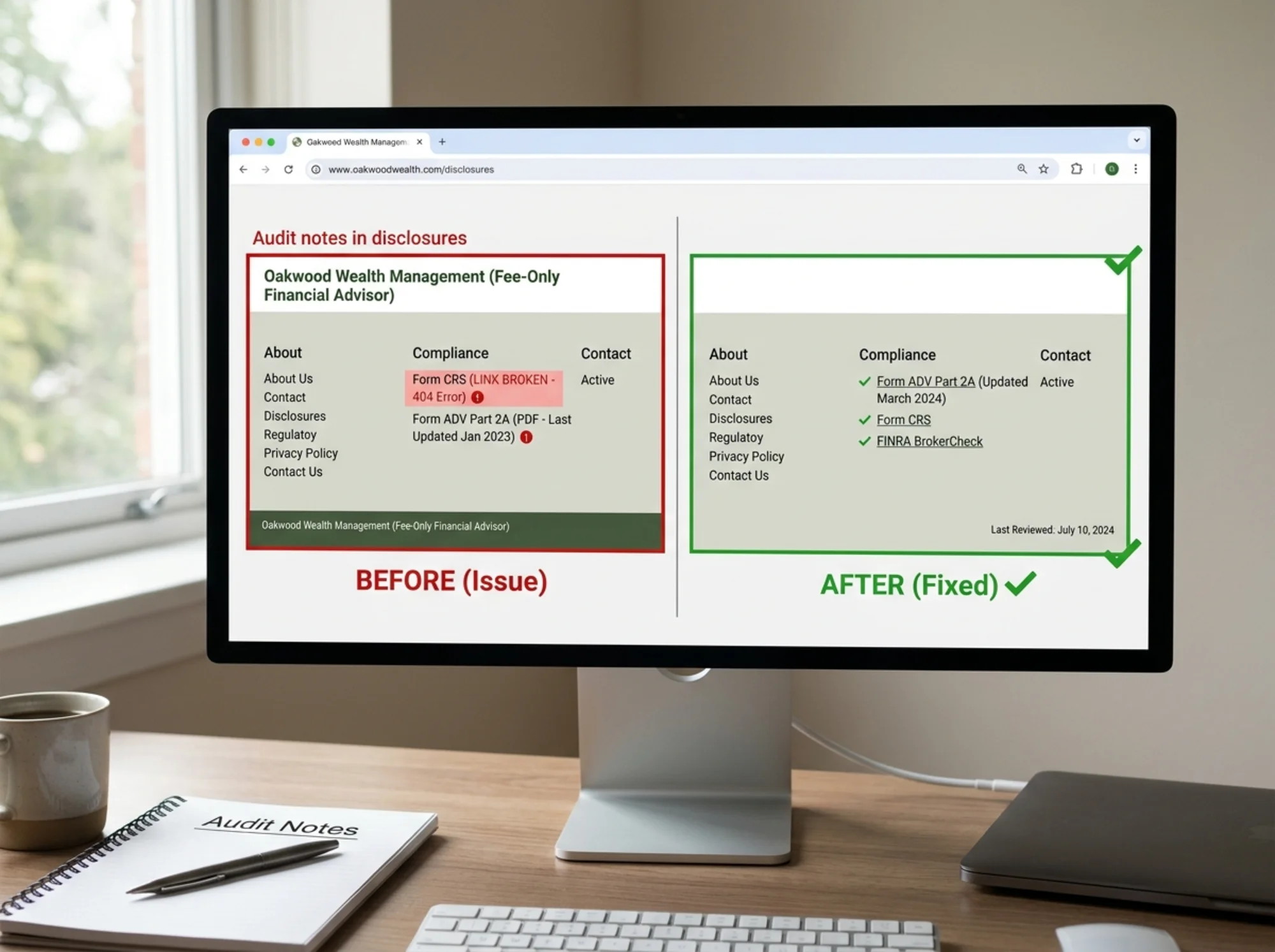
The fix list, in priority order:
- Update ADV and add current Form CRS to footer
- Rewrite homepage headline to "Fee-only retirement planning for Denver professionals nearing 60"
- Replace the hero image with a compressed version under 300KB
- Add a Calendly link with "Schedule a free 30-minute intro" as the primary CTA
- Build a dedicated "Retirement Planning for Denver Professionals" service page
- Add a downloadable "Pre-Retirement Checklist" gated by email
- Internal-link her three retirement-related blog posts
- Add Article structured data to every post
Maria does not need a redesign. She needs to fix those eight things. That is a weekend of work for a real return.
Running this on your own site
You can do most of this manually with a private browser, your phone, and an hour. For the technical pieces — Core Web Vitals scores, structured data validation, broken links, missing meta tags — you want a tool that walks the site for you.
Run a free website audit with FreeSiteAudit on your advisor site. It checks performance, mobile rendering, on-page SEO, structured data, and accessibility basics, then surfaces a prioritized fix list — the same kind Maria got above. No signup gate to see the score.
For industry-specific guidance on the regulatory and trust pieces, the financial advisors industry page goes deeper. For the speed fixes, Core Web Vitals walks through the most common causes of slow LCP and high CLS on small business sites. If your blog posts are not getting picked up as articles in search, structured data fixes covers the Article schema.
What to leave off your site
A few things, no matter how tempting:
- Stock photos of generic "diverse group of smiling executives" — they read as fake
- Specific past performance numbers without proper disclosures
- Chatbots that pretend to be human
- Pop-ups offering a "free retirement assessment" that turn out to be a sales call
- AUM claims that include assets you do not actually manage
The bar for advisor websites is not creative. It is honest, current, fast, and clear. Hit those four and you will out-convert most of your competition.
Sources
Check your website for free
Get an instant score and your top 3 critical issues in under 60 seconds.
Get Your Free Audit →