Website Audit for Freelancers and Creative Agencies: A Practical Guide
A practical website audit playbook for freelancers and creative agencies: improve speed, clarity, case studies, and contact forms to book more client work.
# Website Audit for Freelancers and Creative Agencies: A Practical Guide
Your portfolio site is your storefront. For a freelance designer, illustrator, copywriter, or small creative agency, it's often the only sale rep working while you sleep. And yet most creative sites are built once, launched with a flourish, and then quietly rot.
This is a practical audit you can run on your own site in an afternoon. No jargon. Just the things that actually decide whether a prospect emails you or closes the tab.

Why creative sites need a different kind of audit
Most "website audit" advice is written for ecommerce stores or SaaS landing pages. Creative sites have a different job: prove craft, build trust quickly, and make it easy for a stranger to start a conversation about a project.
That changes what matters. Your bounce rate is less important than whether a prospect can find your case studies, understand your specialty in 10 seconds, and reach you without filling out a 14-field form.
A good audit for a freelancer or agency looks at four things:
- Performance — does the site load fast enough that a prospect doesn't leave?
- Clarity — can a stranger figure out what you do and who you do it for?
- Proof — is your work shown well, with the context that turns a "nice" into a "let's talk"?
- Conversion paths — how easy is it to start a project conversation?
1. Performance: stop losing prospects before they see your work
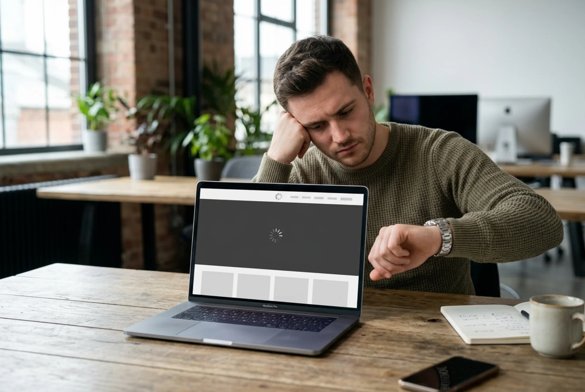
If your homepage takes five seconds to load a 12 MB hero video, half your traffic is gone before your portfolio renders. This is especially brutal on phones, where most first visits happen.
Google publishes a set of speed and stability metrics called Core Web Vitals. The three you need to know:
- LCP (Largest Contentful Paint) — how fast the main content appears. Aim for under 2.5 seconds.
- INP (Interaction to Next Paint) — how snappy the site feels when you tap or click. Aim for under 200 ms.
- CLS (Cumulative Layout Shift) — how much the page jumps around as it loads. Aim for under 0.1.
The full definitions are in the Web Vitals reference linked at the end.
Mini-checklist: performance
- Open your homepage in an incognito window on your phone, on cellular. Count to five. Is your hero visible?
- Are your case study thumbnails compressed? JPEG or WebP, not PNG, for photographic work. Aim for under 200 KB each.
- Is your hero a video? If yes, is it muted, lazy-loaded, and under 2 MB? Could a still image do the job instead?
- Are you loading three different webfont families? Cut to one or two.
- Builder site (Webflow, Squarespace, Framer, WordPress)? Check page weight in your browser's DevTools Network tab. Anything over 3 MB on the homepage is a problem.
A real scenario: the agency homepage killing inbound
A small branding studio I'll call Northline had a beautiful site. Full-bleed video hero. Animated case study reveal on scroll. The works.
Their problem: inbound inquiries had dropped 40% year over year, even though traffic was steady. An audit found three things:
- The homepage was 11.4 MB on first load, mostly from a 9 MB autoplaying hero video.
- LCP on a mid-tier Android phone was 6.8 seconds.
- The contact button was inside a hamburger menu on mobile, three taps away.
They replaced the hero video with a 180 KB looping WebP, lazy-loaded case study thumbnails, and added a persistent "Start a project" button to the mobile header. Within six weeks, mobile inquiries roughly doubled. They didn't redesign anything. They just stopped the site from working against them.
2. Clarity: the 10-second test
Open your homepage. Read only the first screen — no scrolling. Can a complete stranger answer these three questions?
- What do you do? ("Brand identity for B2B SaaS startups.")
- Who is it for? ("Founders raising Series A.")
- Why you? ("We've worked with 14 funded startups since 2021.")
If your headline is "We craft meaningful experiences" or "Where design meets strategy," you've failed the test. Those sentences could describe a yoga studio.
Google's guidance on creating helpful content emphasizes being clear about who you are and what value you provide. Vague positioning doesn't just hurt conversions — it hurts search visibility too, because Google can't tell what queries to match you to.
Mini-checklist: clarity
- Does your H1 name the specific service and the specific audience?
- Is there a one-sentence sub-headline that adds proof or specificity?
- Can a prospect tell within 10 seconds whether you're a fit for their project?
- Are you using portfolio-jargon ("we partner with bold brands") or plain language ("we design logos and brand systems for software companies")?
Plain language wins almost every time. The agencies that book the best work usually describe their work the most boringly.
3. Proof: case studies do 80% of the selling
A creative site lives or dies on its case studies. Most of them are designed for the designer's portfolio, not for the prospect deciding whether to email you.
A prospect reading a case study is asking three things:
- Did this team handle a problem like mine?
- Did the work actually move the client's business?
- What was it like to work with them?
If your case study is six pages of process diagrams and one line that says "the result was a refined brand identity," you're not answering any of those questions.
What a strong case study contains
- The client and their situation. One paragraph. Industry, size, the problem they came in with.
- What you did. The scope. The decisions. Why those decisions, not just what they looked like.
- The outcome. A number, a quote, a launch, a hire, a press hit. Something concrete.
- The work itself. Generous, well-shot, in context. Mockups on real devices. The website running, not just flat screenshots.
For technical credit, Google supports structured data for articles and case studies (linked at the end). Marking up case studies as articles helps them surface in search with richer previews — a small lift, but free.

Mini-checklist: proof
- Does every case study lead with a one-sentence outcome?
- Are client quotes real, attributed, and specific? ("Bookings up 30% in the first quarter" beats "great to work with.")
- Are case study images compressed and lazy-loaded?
- Does every image have descriptive alt text? Not "image1.jpg" — "Northline rebrand: business card front featuring new wordmark in navy and ochre."
- Is there a clear next step at the end of each case study, or does the page just end?
That last one is huge. A prospect who finishes a case study is the most warmed-up traffic on your site. Don't make them hunt for the contact page.
4. Conversion paths: make it stupidly easy to start a conversation
This is where most creative sites quietly bleed money. The work is good, the case studies are tight, and then the prospect hits a contact page with a 12-field form asking for budget, timeline, project type, company size, and their dog's name.
Half of them close the tab.
Mini-checklist: contact and conversion
- Is there a contact CTA on every page, not just the contact page?
- On mobile, is the primary CTA reachable with a thumb without scrolling?
- Is your form three to five fields, max? Name, email, project description, and maybe a budget range if you must.
- Do you offer a fallback? Some prospects hate forms. Show an email address.
- After submission, do you confirm what happens next? ("We'll reply within one business day" is a small thing that does a lot.)
- Does your form actually work? Test it from a phone, on cellular, with autofill on. Submit a real test inquiry once a quarter.
A surprising number of agency sites have broken contact forms. Submissions go to a Gmail address no one checks, or the form silently errors out on certain browsers. If you've never tested your form from a fresh device, do it today.
Quick-win audit: 30 minutes, no tools required
To run a fast pass on your own site right now, here's the order:
- Phone, cellular, incognito. Open your homepage. Time the load. Note anything broken.
- 10-second test. Show your homepage to someone outside your industry. Ask them what you do, who you do it for, and whether they trust you. Listen.
- Click every case study. Are the images sharp? Is there a clear outcome? Is there a next step?
- Submit your own contact form from your phone. Did it work? Did you get a confirmation? Did the email actually arrive?
- Check your meta titles. View page source on your top three pages. Is the
</code> descriptive and unique, or is it "Home | Studio Name" on every page?</li><li><strong class="text-text-primary">Run a free audit.</strong> A tool like <a href="/tools/free-website-audit" class="text-accent hover:text-accent-strong underline">FreeSiteAudit</a> will flag the technical issues you can't see by eye — broken structured data, missing alt text, slow LCP, render-blocking scripts — and give you a prioritized list to work from.</li></ol><figure class="my-8"><img src="/blog-images/blog-website-audit-for-freelancers-agencies-4-mobile-screen-mockup-of-a-redesigned-freelance-illustrator-s.webp" alt="Mobile screen mockup of a redesigned freelance illustrator's inquiry page: crisp hero illustration loaded, a three-field contact form, a thumb-friendly "Start a project" button, and a notification preview reading "New project inquiry from a brand studio"" class="w-full rounded-lg border border-border" loading="lazy"/><figcaption class="text-sm text-text-muted italic mt-2 text-center">Mobile screen mockup of a redesigned freelance illustrator's inquiry page: crisp hero illustration loaded, a three-field contact form, a thumb-friendly "Start a project" button, and a notification preview reading "New project inquiry from a brand studio"</figcaption></figure><h2 class="text-2xl font-bold text-text-primary mt-10 mb-4">What to fix first</h2><p class="text-text-secondary leading-relaxed my-4">You can't do everything. The order that usually wins:</p><ol class="list-decimal pl-5 space-y-1.5 my-4 text-text-secondary"><li><strong class="text-text-primary">Fix anything broken.</strong> Contact forms, 404 links, missing images, mobile layout breaks.</li><li><strong class="text-text-primary">Cut weight.</strong> Compress images, remove unused fonts, kill heavy autoplaying video. This usually moves <a href="/fixes/core-web-vitals" class="text-accent hover:text-accent-strong underline">Core Web Vitals</a> more than any other single change.</li><li><strong class="text-text-primary">Sharpen the homepage headline.</strong> Replace vague positioning with specific positioning.</li><li><strong class="text-text-primary">Rewrite your top three case studies</strong> to lead with the outcome.</li><li><strong class="text-text-primary">Tighten the <a href="/fixes/contact-form-conversion" class="text-accent hover:text-accent-strong underline">contact form</a></strong> to five fields or fewer, and confirm the submission email actually lands.</li><li><strong class="text-text-primary">Layer in the polish.</strong> Structured data, alt text, internal linking between case studies, a properly written About page.</li></ol><p class="text-text-secondary leading-relaxed my-4">Step 6 is real work and matters for SEO. But it doesn't matter at all if step 1 is still broken.</p><h2 class="text-2xl font-bold text-text-primary mt-10 mb-4">A note on redesigns</h2><p class="text-text-secondary leading-relaxed my-4">Freelancers and agencies love a redesign. It's a fun project, and the new site always looks better than the old one in the first month.</p><p class="text-text-secondary leading-relaxed my-4">But most of the time, you don't need a redesign. You need an audit and three weekends of focused fixes. A site that loads in 1.8 seconds, has a clear headline, three strong case studies, and a working contact form will book more work than a beautifully redesigned site that does any of those things badly.</p><p class="text-text-secondary leading-relaxed my-4">Audit before you redesign. You'll either find that fixes are enough, or you'll go into the redesign with a much clearer brief.</p><h2 class="text-2xl font-bold text-text-primary mt-10 mb-4">Run a free audit on your site</h2><p class="text-text-secondary leading-relaxed my-4">You can run a free audit on your site right now. <a href="/tools/free-website-audit" class="text-accent hover:text-accent-strong underline">FreeSiteAudit</a> checks performance, SEO basics, structured data, accessibility, and the technical hygiene issues that quietly cost you inquiries. It takes about 60 seconds and gives you a prioritized list — the kind you can hand to a developer or work through yourself over a weekend.</p><p class="text-text-secondary leading-relaxed my-4">For more industry-specific guidance, see our notes on auditing sites for <a href="/industries/creative-agencies" class="text-accent hover:text-accent-strong underline">creative agencies</a>.</p><p class="text-text-secondary leading-relaxed my-4">Your portfolio site is the most leveraged sales asset you have. An afternoon spent auditing it honestly is almost always worth more than another afternoon spent on the design.</p><h2 class="text-2xl font-bold text-text-primary mt-10 mb-4">Sources</h2><ul class="list-disc pl-5 space-y-1.5 my-4 text-text-secondary"><li><a href="https://developers.google.com/search/docs/fundamentals/creating-helpful-content" class="text-accent hover:text-accent-strong underline">Google Search Central: Creating helpful, reliable, people-first content</a></li><li><a href="https://developers.google.com/search/docs/appearance/structured-data/article" class="text-accent hover:text-accent-strong underline">Google Search Central: Article structured data</a></li><li><a href="https://web.dev/articles/vitals" class="text-accent hover:text-accent-strong underline">web.dev: Web Vitals</a></li></ul></div><div class="mt-12"></div><div class="mt-6 bg-gradient-to-r from-accent-subtle to-accent-subtle/50 border border-accent-border rounded-xl p-8 text-center"><h2 class="text-2xl font-bold mb-2">Check your website for free</h2><p class="text-text-muted mb-6">Get an instant score and your top 3 critical issues in under 60 seconds.</p><a class="inline-block bg-accent hover:bg-accent-strong text-text-inverse font-semibold px-10 py-3.5 rounded-lg transition-colors" href="/#free-audit">Get Your Free Audit →</a></div></article><footer class="border-t border-border mt-auto"><nav aria-label="Footer navigation" class="max-w-6xl mx-auto px-4 py-8 sm:py-12"><div class="grid grid-cols-2 md:grid-cols-3 gap-8 lg:flex lg:flex-row lg:flex-wrap lg:justify-between lg:gap-x-6"><div class="col-span-2 md:col-span-1 lg:max-w-[14rem]"><a class="text-lg font-bold tracking-tight" href="/"><span class="text-accent">Free</span>SiteAudit</a><p class="text-text-muted text-sm mt-3 leading-relaxed">Website audits for business owners and agencies. Find issues, fix them, grow.</p></div><div><h4 class="text-sm font-semibold text-text-secondary mb-3 lg:whitespace-nowrap">Solutions</h4><ul class="space-y-2"><li><a class="text-sm text-text-muted hover:text-text-secondary transition-colors lg:whitespace-nowrap" href="/#free-audit">Free Website Audit</a></li><li><a class="text-sm text-text-muted hover:text-text-secondary transition-colors lg:whitespace-nowrap" href="/agencies">For Agencies</a></li><li><a class="text-sm text-text-muted hover:text-text-secondary transition-colors lg:whitespace-nowrap" href="/pricing">Pricing</a></li><li><a class="text-sm text-text-muted hover:text-text-secondary transition-colors lg:whitespace-nowrap" href="/demo">Demo Report</a></li><li><a class="text-sm text-text-muted hover:text-text-secondary transition-colors lg:whitespace-nowrap" href="/dashboard">Dashboard</a></li></ul></div><div><h4 class="text-sm font-semibold text-text-secondary mb-3 lg:whitespace-nowrap">Industries</h4><ul class="space-y-2"><li><a class="text-sm text-text-muted hover:text-text-secondary transition-colors lg:whitespace-nowrap" href="/industries/saas">SaaS Apps</a></li><li><a class="text-sm text-text-muted hover:text-text-secondary transition-colors lg:whitespace-nowrap" href="/industries/dev-portfolios">Dev Portfolios</a></li><li><a class="text-sm text-text-muted hover:text-text-secondary transition-colors lg:whitespace-nowrap" href="/industries/blogs">Blogs & Content</a></li><li><a class="text-sm text-text-muted hover:text-text-secondary transition-colors lg:whitespace-nowrap" href="/industries/courses">Course Sites</a></li><li><a class="text-sm text-text-muted hover:text-text-secondary transition-colors lg:whitespace-nowrap" href="/industries/agency-sites">Agency Sites</a></li><li><a class="text-sm text-text-muted hover:text-text-secondary transition-colors lg:whitespace-nowrap" href="/industries">All Industries</a></li></ul></div><div><h4 class="text-sm font-semibold text-text-secondary mb-3 lg:whitespace-nowrap">Compare & Results</h4><ul class="space-y-2"><li><a class="text-sm text-text-muted hover:text-text-secondary transition-colors lg:whitespace-nowrap" href="/blog/freesiteaudit-vs-semrush">vs Semrush</a></li><li><a class="text-sm text-text-muted hover:text-text-secondary transition-colors lg:whitespace-nowrap" href="/blog/freesiteaudit-vs-seoptimer-vs-seo-site-checkup">vs SEOptimer</a></li><li><a class="text-sm text-text-muted hover:text-text-secondary transition-colors lg:whitespace-nowrap" href="/case-studies">Success Stories</a></li><li><a class="text-sm text-text-muted hover:text-text-secondary transition-colors lg:whitespace-nowrap" href="https://findbackflowtesters.com">FindBackflowTesters.com</a></li><li><a class="text-sm text-text-muted hover:text-text-secondary transition-colors lg:whitespace-nowrap" href="https://freesiteaudit.com">FreeSiteAudit.com</a></li></ul></div><div><h4 class="text-sm font-semibold text-text-secondary mb-3 lg:whitespace-nowrap">Resources</h4><ul class="space-y-2"><li><a class="text-sm text-text-muted hover:text-text-secondary transition-colors lg:whitespace-nowrap" href="/blog">Blog</a></li><li><a class="text-sm text-text-muted hover:text-text-secondary transition-colors lg:whitespace-nowrap" href="/tools">Free Tools</a></li><li><a class="text-sm text-text-muted hover:text-text-secondary transition-colors lg:whitespace-nowrap" href="/fixes">Fix Library</a></li><li><a class="text-sm text-text-muted hover:text-text-secondary transition-colors lg:whitespace-nowrap" href="/about">About</a></li><li><a class="text-sm text-text-muted hover:text-text-secondary transition-colors lg:whitespace-nowrap" href="mailto:hello@freesiteaudit.com">Contact</a></li></ul></div><div><h4 class="text-sm font-semibold text-text-secondary mb-3 lg:whitespace-nowrap">Legal</h4><ul class="space-y-2"><li><a class="text-sm text-text-muted hover:text-text-secondary transition-colors lg:whitespace-nowrap" href="/privacy">Privacy Policy</a></li><li><a class="text-sm text-text-muted hover:text-text-secondary transition-colors lg:whitespace-nowrap" href="/terms">Terms of Service</a></li></ul></div><div><h4 class="text-sm font-semibold text-text-secondary mb-3 lg:whitespace-nowrap">Platforms</h4><ul class="space-y-2"><li><a class="text-sm text-text-muted hover:text-text-secondary transition-colors lg:whitespace-nowrap" href="/platforms/wordpress">WordPress</a></li><li><a class="text-sm text-text-muted hover:text-text-secondary transition-colors lg:whitespace-nowrap" href="/platforms/shopify">Shopify</a></li><li><a class="text-sm text-text-muted hover:text-text-secondary transition-colors lg:whitespace-nowrap" href="/platforms/webflow">Webflow</a></li><li><a class="text-sm text-text-muted hover:text-text-secondary transition-colors lg:whitespace-nowrap" href="/platforms/wix">Wix</a></li><li><a class="text-sm text-text-muted hover:text-text-secondary transition-colors lg:whitespace-nowrap" href="/platforms/squarespace">Squarespace</a></li></ul></div></div><div class="border-t border-border-subtle mt-10 pt-6 flex flex-col sm:flex-row items-center justify-between gap-3 text-xs text-text-muted"><span>© <!-- -->2026<!-- --> FreeSiteAudit. All rights reserved.</span><div class="flex items-center gap-4"><a class="hover:text-text-secondary transition-colors" href="/privacy">Privacy</a><a class="hover:text-text-secondary transition-colors" href="/terms">Terms</a></div></div></nav></footer></div><!--$--><!--/$--></main><button aria-label="Contact us" class="fixed right-4 z-40 flex items-center gap-2 rounded-full bg-accent text-accent-foreground font-semibold text-sm h-12 px-5 shadow-accent-glow hover:bg-accent-strong hover:shadow-accent-glow-lg transition-all duration-200 bottom-[calc(1rem+env(safe-area-inset-bottom))] sm:bottom-6"><svg class="w-5 h-5" fill="none" viewBox="0 0 24 24" stroke="currentColor" stroke-width="2"><path stroke-linecap="round" stroke-linejoin="round" d="M8.625 12a.375.375 0 11-.75 0 .375.375 0 01.75 0zm4.125 0a.375.375 0 11-.75 0 .375.375 0 01.75 0zm4.125 0a.375.375 0 11-.75 0 .375.375 0 01.75 0zM2.25 12.76c0 1.6 1.123 2.994 2.707 3.227 1.087.16 2.185.283 3.293.369V21l4.076-4.076a1.526 1.526 0 011.037-.443 48.282 48.282 0 005.68-.494c1.584-.233 2.707-1.626 2.707-3.228V6.741c0-1.602-1.123-2.995-2.707-3.228A48.394 48.394 0 0012 3c-2.392 0-4.744.175-7.043.513C3.373 3.746 2.25 5.14 2.25 6.741v6.018z"></path></svg><span class="hidden sm:inline">Contact Us</span></button></div><button aria-label="Switch to light mode" aria-pressed="false" class="fixed right-4 z-40 flex items-center justify-center rounded-full w-10 h-10 border border-border bg-surface-elevated text-text-secondary hover:text-text-primary hover:bg-surface-panel shadow-panel-sm transition-all duration-200 bottom-[calc(1rem+env(safe-area-inset-bottom)+3.75rem)] sm:bottom-[5.25rem]"><svg class="w-[18px] h-[18px]" fill="none" viewBox="0 0 24 24" stroke="currentColor" stroke-width="2"><path stroke-linecap="round" stroke-linejoin="round" d="M12 3v2.25m6.364.386l-1.591 1.591M21 12h-2.25m-.386 6.364l-1.591-1.591M12 18.75V21m-4.773-4.227l-1.591 1.591M5.25 12H3m4.227-4.773L5.636 5.636M15.75 12a3.75 3.75 0 11-7.5 0 3.75 3.75 0 017.5 0z"></path></svg></button><script src="/_next/static/chunks/webpack-092588108e816234.js" id="_R_" async=""></script><script>(self.__next_f=self.__next_f||[]).push([0])</script><script>self.__next_f.push([1,"1:\"$Sreact.fragment\"\n8:I[57150,[],\"\"]\n:HL[\"/_next/static/media/4473ecc91f70f139-s.p.woff\",\"font\",{\"crossOrigin\":\"\",\"type\":\"font/woff\"}]\n:HL[\"/_next/static/media/463dafcda517f24f-s.p.woff\",\"font\",{\"crossOrigin\":\"\",\"type\":\"font/woff\"}]\n:HL[\"/_next/static/css/ce06d03cd29772c1.css\",\"style\"]\n:HL[\"/_next/static/css/5adad2ac1ae9f57d.css\",\"style\"]\n2:Tbac,"])</script><script>self.__next_f.push([1,"{\"@context\":\"https://schema.org\",\"@type\":\"FAQPage\",\"mainEntity\":[{\"@type\":\"Question\",\"name\":\"Is the free audit really free?\",\"acceptedAnswer\":{\"@type\":\"Answer\",\"text\":\"Yes, completely free. Just enter your URL — no account, no email, no credit card. You get your overall score and top issues instantly. Want more? Create a free account to save your report and get 2 pro scan credits.\"}},{\"@type\":\"Question\",\"name\":\"How long until I get my report?\",\"acceptedAnswer\":{\"@type\":\"Answer\",\"text\":\"The Quick Scan is typically under 60 seconds. Paid reports are generated and emailed within 2–3 minutes of payment.\"}},{\"@type\":\"Question\",\"name\":\"What do you analyze?\",\"acceptedAnswer\":{\"@type\":\"Answer\",\"text\":\"9 categories: SEO \u0026 Search Visibility, Website Performance \u0026 Speed, Mobile Experience, Security \u0026 Privacy, Accessibility, Content \u0026 Messaging, Technical Health, Trust \u0026 Credibility, and Local SEO \u0026 Google Business. Each category is scored independently, and we provide specific evidence and fix instructions for every issue found.\"}},{\"@type\":\"Question\",\"name\":\"Do I need technical knowledge?\",\"acceptedAnswer\":{\"@type\":\"Answer\",\"text\":\"Not at all. Reports are written in plain language with prioritized, step-by-step recommendations. Each issue is labeled with who can fix it, and many are things you can do yourself without touching code.\"}},{\"@type\":\"Question\",\"name\":\"How accurate is the analysis?\",\"acceptedAnswer\":{\"@type\":\"Answer\",\"text\":\"We analyze your actual live website, checking real page speed, real HTML structure, and real content. Every finding comes with specific evidence from your site, so you can verify it yourself.\"}},{\"@type\":\"Question\",\"name\":\"Is my data safe?\",\"acceptedAnswer\":{\"@type\":\"Answer\",\"text\":\"Absolutely. We only use your email to deliver your report. No spam, no sharing with third parties. We analyze publicly accessible pages (the same thing Google sees). We never store passwords, we don't access admin panels, and we never sell your data. All connections are encrypted with 256-bit SSL. See our Privacy Policy for full details.\"}},{\"@type\":\"Question\",\"name\":\"Can I see a sample report before buying?\",\"acceptedAnswer\":{\"@type\":\"Answer\",\"text\":\"Yes! Check out our interactive demo report to see exactly what a full audit looks like, with real findings, evidence, and fix instructions you can explore.\"}},{\"@type\":\"Question\",\"name\":\"How do I cancel my subscription?\",\"acceptedAnswer\":{\"@type\":\"Answer\",\"text\":\"You can cancel anytime from your dashboard. Just click \\\"Manage Subscription\\\" to open the billing portal. Your audit access continues until the end of your current billing period.\"}},{\"@type\":\"Question\",\"name\":\"Who built FreeSiteAudit?\",\"acceptedAnswer\":{\"@type\":\"Answer\",\"text\":\"FreeSiteAudit was built by web professionals who wanted to make professional-grade website audits accessible to every business owner. We combined real-world SEO and web development experience with automation to deliver clear, actionable reports.\"}}]}"])</script><script>self.__next_f.push([1,"0:{\"P\":null,\"b\":\"23djxc4YWdrEwqJ0FoqV6\",\"p\":\"\",\"c\":[\"\",\"blog\",\"website-audit-for-freelancers-agencies\"],\"i\":false,\"f\":[[[\"\",{\"children\":[\"blog\",{\"children\":[[\"slug\",\"website-audit-for-freelancers-agencies\",\"d\"],{\"children\":[\"__PAGE__\",{}]}]}]},\"$undefined\",\"$undefined\",true],[\"\",[\"$\",\"$1\",\"c\",{\"children\":[[[\"$\",\"link\",\"0\",{\"rel\":\"stylesheet\",\"href\":\"/_next/static/css/ce06d03cd29772c1.css\",\"precedence\":\"next\",\"crossOrigin\":\"$undefined\",\"nonce\":\"$undefined\"}],[\"$\",\"link\",\"1\",{\"rel\":\"stylesheet\",\"href\":\"/_next/static/css/5adad2ac1ae9f57d.css\",\"precedence\":\"next\",\"crossOrigin\":\"$undefined\",\"nonce\":\"$undefined\"}]],[\"$\",\"html\",null,{\"lang\":\"en\",\"suppressHydrationWarning\":true,\"children\":[[\"$\",\"head\",null,{\"children\":[[\"$\",\"script\",null,{\"dangerouslySetInnerHTML\":{\"__html\":\"(function(){try{var t=localStorage.getItem('theme');if(!t)t='dark';document.documentElement.classList.add(t);document.documentElement.style.colorScheme=t;var m=document.querySelector('meta[name=\\\"theme-color\\\"]');if(m)m.content=t==='light'?'#faf9fe':'#09090b'}catch(e){document.documentElement.classList.add('dark');document.documentElement.style.colorScheme='dark'}})()\"}}],[\"$\",\"link\",null,{\"rel\":\"icon\",\"href\":\"/favicon.ico\",\"sizes\":\"any\"}],[\"$\",\"meta\",null,{\"name\":\"theme-color\",\"content\":\"#09090b\"}],[\"$\",\"link\",null,{\"rel\":\"preconnect\",\"href\":\"https://js.stripe.com\"}],[\"$\",\"link\",null,{\"rel\":\"dns-prefetch\",\"href\":\"https://js.stripe.com\"}],[\"$\",\"link\",null,{\"rel\":\"preconnect\",\"href\":\"https://api.stripe.com\"}],[\"$\",\"link\",null,{\"rel\":\"dns-prefetch\",\"href\":\"https://api.stripe.com\"}],[[\"$\",\"script\",\"0\",{\"type\":\"application/ld+json\",\"dangerouslySetInnerHTML\":{\"__html\":\"{\\\"@context\\\":\\\"https://schema.org\\\",\\\"@type\\\":\\\"Organization\\\",\\\"@id\\\":\\\"https://freesiteaudit.com/#organization\\\",\\\"name\\\":\\\"FreeSiteAudit\\\",\\\"url\\\":\\\"https://freesiteaudit.com\\\",\\\"logo\\\":{\\\"@type\\\":\\\"ImageObject\\\",\\\"url\\\":\\\"https://freesiteaudit.com/logo.png\\\",\\\"width\\\":\\\"200\\\",\\\"height\\\":\\\"60\\\"},\\\"description\\\":\\\"Free instant website audit tool for small businesses. Check your SEO, speed, mobile-friendliness \u0026 security in seconds.\\\",\\\"sameAs\\\":[],\\\"contactPoint\\\":{\\\"@type\\\":\\\"ContactPoint\\\",\\\"contactType\\\":\\\"Customer Service\\\",\\\"availableLanguage\\\":[\\\"English\\\"]}}\"}}],[\"$\",\"script\",\"1\",{\"type\":\"application/ld+json\",\"dangerouslySetInnerHTML\":{\"__html\":\"{\\\"@context\\\":\\\"https://schema.org\\\",\\\"@type\\\":\\\"ProfessionalService\\\",\\\"@id\\\":\\\"https://freesiteaudit.com/#business\\\",\\\"name\\\":\\\"FreeSiteAudit\\\",\\\"url\\\":\\\"https://freesiteaudit.com\\\",\\\"logo\\\":\\\"https://freesiteaudit.com/logo.png\\\",\\\"description\\\":\\\"Professional website audit and SEO analysis service for small businesses. Get instant insights and actionable recommendations.\\\",\\\"priceRange\\\":\\\"Free - $$\\\",\\\"areaServed\\\":{\\\"@type\\\":\\\"Place\\\",\\\"name\\\":\\\"Worldwide\\\"},\\\"hasOfferCatalog\\\":{\\\"@type\\\":\\\"OfferCatalog\\\",\\\"name\\\":\\\"Website Audit Services\\\",\\\"itemListElement\\\":[{\\\"@type\\\":\\\"Offer\\\",\\\"itemOffered\\\":{\\\"@type\\\":\\\"Service\\\",\\\"name\\\":\\\"Free Website Audit\\\",\\\"description\\\":\\\"2 free website audits per week with AI-powered analysis\\\"},\\\"price\\\":\\\"0\\\",\\\"priceCurrency\\\":\\\"USD\\\"},{\\\"@type\\\":\\\"Offer\\\",\\\"itemOffered\\\":{\\\"@type\\\":\\\"Service\\\",\\\"name\\\":\\\"Starter Plan\\\",\\\"description\\\":\\\"5 website audits per week with priority support\\\"},\\\"price\\\":\\\"19.00\\\",\\\"priceCurrency\\\":\\\"USD\\\"}]}}\"}}],[\"$\",\"script\",\"2\",{\"type\":\"application/ld+json\",\"dangerouslySetInnerHTML\":{\"__html\":\"{\\\"@context\\\":\\\"https://schema.org\\\",\\\"@type\\\":\\\"WebSite\\\",\\\"@id\\\":\\\"https://freesiteaudit.com/#website\\\",\\\"url\\\":\\\"https://freesiteaudit.com\\\",\\\"name\\\":\\\"FreeSiteAudit\\\",\\\"description\\\":\\\"Free website audit tool for small businesses\\\",\\\"publisher\\\":{\\\"@id\\\":\\\"https://freesiteaudit.com/#organization\\\"}}\"}}],[\"$\",\"script\",\"3\",{\"type\":\"application/ld+json\",\"dangerouslySetInnerHTML\":{\"__html\":\"$2\"}}]]]}],\"$L3\"]}]]}],{\"children\":[\"blog\",\"$L4\",{\"children\":[[\"slug\",\"website-audit-for-freelancers-agencies\",\"d\"],\"$L5\",{\"children\":[\"__PAGE__\",\"$L6\",{},null,false]},null,false]},null,false]},null,false],\"$L7\",false]],\"m\":\"$undefined\",\"G\":[\"$8\",[]],\"s\":false,\"S\":true}\n"])</script><script>self.__next_f.push([1,"9:I[7143,[\"7177\",\"static/chunks/app/layout-2ca08483bb34668c.js\"],\"GoogleAnalytics\"]\na:I[43347,[\"7177\",\"static/chunks/app/layout-2ca08483bb34668c.js\"],\"PostHogProvider\"]\nb:I[47212,[\"7177\",\"static/chunks/app/layout-2ca08483bb34668c.js\"],\"WebVitals\"]\nc:I[63479,[\"7177\",\"static/chunks/app/layout-2ca08483bb34668c.js\"],\"ThemeProvider\"]\nd:I[9766,[],\"\"]\ne:I[98924,[],\"\"]\nf:I[65534,[\"7177\",\"static/chunks/app/layout-2ca08483bb34668c.js\"],\"ConditionalFooter\"]\n10:I[28923,[\"7177\",\"static/chunks/app/layout-2ca08483bb34668c.js\"],\"default\"]\n11:I[49196,[\"7177\",\"static/chunks/app/layout-2ca08483bb34668c.js\"],\"ThemeToggle\"]\n13:I[24431,[],\"OutletBoundary\"]\n15:I[15278,[],\"AsyncMetadataOutlet\"]\n17:I[24431,[],\"ViewportBoundary\"]\n19:I[24431,[],\"MetadataBoundary\"]\n1a:\"$Sreact.suspense\"\n"])</script><script>self.__next_f.push([1,"3:[\"$\",\"body\",null,{\"className\":\"__variable_1e4310 __variable_c3aa02 antialiased bg-surface-body text-text-primary\",\"children\":[[\"$\",\"a\",null,{\"href\":\"#main-content\",\"className\":\"sr-only focus:not-sr-only focus:fixed focus:top-4 focus:left-4 focus:z-[100] focus:bg-accent focus:text-accent-foreground focus:px-4 focus:py-2 focus:rounded-lg focus:font-semibold focus:text-sm focus:outline-none focus:shadow-lg\",\"children\":\"Skip to main content\"}],[\"$\",\"$L9\",null,{}],[\"$\",\"$La\",null,{}],[\"$\",\"$Lb\",null,{}],[\"$\",\"$Lc\",null,{\"children\":[[\"$\",\"div\",null,{\"className\":\"flex flex-col min-h-screen\",\"children\":[[\"$\",\"main\",null,{\"id\":\"main-content\",\"children\":[\"$\",\"$Ld\",null,{\"parallelRouterKey\":\"children\",\"error\":\"$undefined\",\"errorStyles\":\"$undefined\",\"errorScripts\":\"$undefined\",\"template\":[\"$\",\"$Le\",null,{}],\"templateStyles\":\"$undefined\",\"templateScripts\":\"$undefined\",\"notFound\":[[[\"$\",\"title\",null,{\"children\":\"404: This page could not be found.\"}],[\"$\",\"div\",null,{\"style\":{\"fontFamily\":\"system-ui,\\\"Segoe UI\\\",Roboto,Helvetica,Arial,sans-serif,\\\"Apple Color Emoji\\\",\\\"Segoe UI Emoji\\\"\",\"height\":\"100vh\",\"textAlign\":\"center\",\"display\":\"flex\",\"flexDirection\":\"column\",\"alignItems\":\"center\",\"justifyContent\":\"center\"},\"children\":[\"$\",\"div\",null,{\"children\":[[\"$\",\"style\",null,{\"dangerouslySetInnerHTML\":{\"__html\":\"body{color:#000;background:#fff;margin:0}.next-error-h1{border-right:1px solid rgba(0,0,0,.3)}@media (prefers-color-scheme:dark){body{color:#fff;background:#000}.next-error-h1{border-right:1px solid rgba(255,255,255,.3)}}\"}}],[\"$\",\"h1\",null,{\"className\":\"next-error-h1\",\"style\":{\"display\":\"inline-block\",\"margin\":\"0 20px 0 0\",\"padding\":\"0 23px 0 0\",\"fontSize\":24,\"fontWeight\":500,\"verticalAlign\":\"top\",\"lineHeight\":\"49px\"},\"children\":404}],[\"$\",\"div\",null,{\"style\":{\"display\":\"inline-block\"},\"children\":[\"$\",\"h2\",null,{\"style\":{\"fontSize\":14,\"fontWeight\":400,\"lineHeight\":\"49px\",\"margin\":0},\"children\":\"This page could not be found.\"}]}]]}]}]],[]],\"forbidden\":\"$undefined\",\"unauthorized\":\"$undefined\"}]}],[\"$\",\"$Lf\",null,{}],[\"$\",\"$L10\",null,{}]]}],[\"$\",\"$L11\",null,{}]]}]]}]\n"])</script><script>self.__next_f.push([1,"4:[\"$\",\"$1\",\"c\",{\"children\":[null,[\"$\",\"$Ld\",null,{\"parallelRouterKey\":\"children\",\"error\":\"$undefined\",\"errorStyles\":\"$undefined\",\"errorScripts\":\"$undefined\",\"template\":[\"$\",\"$Le\",null,{}],\"templateStyles\":\"$undefined\",\"templateScripts\":\"$undefined\",\"notFound\":\"$undefined\",\"forbidden\":\"$undefined\",\"unauthorized\":\"$undefined\"}]]}]\n5:[\"$\",\"$1\",\"c\",{\"children\":[null,[\"$\",\"$Ld\",null,{\"parallelRouterKey\":\"children\",\"error\":\"$undefined\",\"errorStyles\":\"$undefined\",\"errorScripts\":\"$undefined\",\"template\":[\"$\",\"$Le\",null,{}],\"templateStyles\":\"$undefined\",\"templateScripts\":\"$undefined\",\"notFound\":\"$undefined\",\"forbidden\":\"$undefined\",\"unauthorized\":\"$undefined\"}]]}]\n6:[\"$\",\"$1\",\"c\",{\"children\":[\"$L12\",null,[\"$\",\"$L13\",null,{\"children\":[\"$L14\",[\"$\",\"$L15\",null,{\"promise\":\"$@16\"}]]}]]}]\n7:[\"$\",\"$1\",\"h\",{\"children\":[null,[[\"$\",\"$L17\",null,{\"children\":\"$L18\"}],[\"$\",\"meta\",null,{\"name\":\"next-size-adjust\",\"content\":\"\"}]],[\"$\",\"$L19\",null,{\"children\":[\"$\",\"div\",null,{\"hidden\":true,\"children\":[\"$\",\"$1a\",null,{\"fallback\":null,\"children\":\"$L1b\"}]}]}]]}]\n"])</script><script>self.__next_f.push([1,"1c:I[41654,[\"5953\",\"static/chunks/app/blog/%5Bslug%5D/page-594ce9f3ae4ecbe2.js\"],\"MarketingNav\"]\n1d:I[23732,[\"5953\",\"static/chunks/app/blog/%5Bslug%5D/page-594ce9f3ae4ecbe2.js\"],\"default\"]\n"])</script><script>self.__next_f.push([1,"12:[[[\"$\",\"script\",\"0\",{\"type\":\"application/ld+json\",\"dangerouslySetInnerHTML\":{\"__html\":\"{\\\"@context\\\":\\\"https://schema.org\\\",\\\"@type\\\":\\\"Article\\\",\\\"headline\\\":\\\"Website Audit for Freelancers and Creative Agencies: A Practical Guide\\\",\\\"description\\\":\\\"A practical website audit playbook for freelancers and creative agencies: improve speed, clarity, case studies, and contact forms to book more client work.\\\",\\\"author\\\":{\\\"@type\\\":\\\"Person\\\",\\\"name\\\":\\\"FreeSiteAudit\\\"},\\\"publisher\\\":{\\\"@id\\\":\\\"https://freesiteaudit.com/#organization\\\"},\\\"datePublished\\\":\\\"2026-03-12T00:00:00.000Z\\\",\\\"dateModified\\\":\\\"2026-03-12T00:00:00.000Z\\\",\\\"mainEntityOfPage\\\":{\\\"@type\\\":\\\"WebPage\\\",\\\"@id\\\":\\\"https://freesiteaudit.com/blog/website-audit-for-freelancers-agencies\\\"}}\"}}],[\"$\",\"script\",\"1\",{\"type\":\"application/ld+json\",\"dangerouslySetInnerHTML\":{\"__html\":\"{\\\"@context\\\":\\\"https://schema.org\\\",\\\"@type\\\":\\\"BreadcrumbList\\\",\\\"itemListElement\\\":[{\\\"@type\\\":\\\"ListItem\\\",\\\"position\\\":1,\\\"name\\\":\\\"Home\\\",\\\"item\\\":\\\"https://freesiteaudit.com\\\"},{\\\"@type\\\":\\\"ListItem\\\",\\\"position\\\":2,\\\"name\\\":\\\"Blog\\\",\\\"item\\\":\\\"https://freesiteaudit.com/blog\\\"},{\\\"@type\\\":\\\"ListItem\\\",\\\"position\\\":3,\\\"name\\\":\\\"Website Audit for Freelancers and Creative Agencies: A Practical Guide\\\",\\\"item\\\":\\\"https://freesiteaudit.com/blog/website-audit-for-freelancers-agencies\\\"}]}\"}}]],[\"$\",\"div\",null,{\"className\":\"min-h-screen\",\"children\":[[\"$\",\"$L1c\",null,{}],[\"$\",\"article\",null,{\"className\":\"max-w-3xl mx-auto px-4 py-16\",\"children\":[[\"$\",\"$L1d\",null,{\"items\":[{\"label\":\"Blog\",\"href\":\"/blog\"},{\"label\":\"Website Audit for Freelancers and Creative Agencies: A Practical Guide\"}]}],[\"$\",\"div\",null,{\"className\":\"mb-8\",\"children\":[[\"$\",\"div\",null,{\"className\":\"flex items-center gap-3 text-sm text-text-muted mb-4\",\"children\":[[\"$\",\"time\",null,{\"children\":\"March 12, 2026\"}],[\"$\",\"span\",null,{\"children\":\"·\"}],[\"$\",\"span\",null,{\"children\":\"11 min read\"}],[[\"$\",\"span\",null,{\"children\":\"·\"}],[\"$\",\"span\",null,{\"className\":\"text-accent/70\",\"children\":\"Industries\"}]]]}],[\"$\",\"h1\",null,{\"className\":\"text-3xl sm:text-4xl font-bold tracking-tight mb-4\",\"children\":\"Website Audit for Freelancers and Creative Agencies: A Practical Guide\"}],[\"$\",\"p\",null,{\"className\":\"text-lg text-text-muted\",\"children\":\"A practical website audit playbook for freelancers and creative agencies: improve speed, clarity, case studies, and contact forms to book more client work.\"}]]}],[\"$\",\"div\",null,{\"className\":\"border-t border-border pt-8\",\"children\":[[\"$\",\"p\",\"0\",{\"className\":\"text-text-secondary leading-relaxed my-4\",\"dangerouslySetInnerHTML\":{\"__html\":\"# Website Audit for Freelancers and Creative Agencies: A Practical Guide\"}}],[\"$\",\"p\",\"2\",{\"className\":\"text-text-secondary leading-relaxed my-4\",\"dangerouslySetInnerHTML\":{\"__html\":\"Your portfolio site is your storefront. For a freelance designer, illustrator, copywriter, or small creative agency, it's often the only sale rep working while you sleep. And yet most creative sites are built once, launched with a flourish, and then quietly rot.\"}}],[\"$\",\"p\",\"4\",{\"className\":\"text-text-secondary leading-relaxed my-4\",\"dangerouslySetInnerHTML\":{\"__html\":\"This is a practical audit you can run on your own site in an afternoon. No jargon. Just the things that actually decide whether a prospect emails you or closes the tab.\"}}],[\"$\",\"figure\",\"img-7\",{\"className\":\"my-8\",\"children\":[[\"$\",\"img\",null,{\"src\":\"/blog-images/blog-website-audit-for-freelancers-agencies-1-freelance-graphic-designer-on-a-tablet-reviewing-her-portfol.webp\",\"alt\":\"Freelance graphic designer on a tablet reviewing her portfolio homepage, with a corkboard of color swatches, type specimens, and a half-finished logo mockup behind her, warm natural light, photographic style\",\"className\":\"w-full rounded-lg border border-border\",\"loading\":\"lazy\"}],\"$L1e\"]}],\"$L1f\",\"$L20\",\"$L21\",\"$L22\",\"$L23\",\"$L24\",\"$L25\",\"$L26\",\"$L27\",\"$L28\",\"$L29\",\"$L2a\",\"$L2b\",\"$L2c\",\"$L2d\",\"$L2e\",\"$L2f\",\"$L30\",\"$L31\",\"$L32\",\"$L33\",\"$L34\",\"$L35\",\"$L36\",\"$L37\",\"$L38\",\"$L39\",\"$L3a\",\"$L3b\",\"$L3c\",\"$L3d\",\"$L3e\",\"$L3f\",\"$L40\",\"$L41\",\"$L42\",\"$L43\",\"$L44\",\"$L45\",\"$L46\",\"$L47\",\"$L48\",\"$L49\",\"$L4a\",\"$L4b\",\"$L4c\",\"$L4d\",\"$L4e\",\"$L4f\",\"$L50\",\"$L51\",\"$L52\",\"$L53\",\"$L54\",\"$L55\",\"$L56\",\"$L57\",\"$L58\",\"$L59\",\"$L5a\",\"$L5b\",\"$L5c\"]}],\"$L5d\",\"$L5e\",\"$L5f\"]}],\"$L60\"]}]]\n"])</script><script>self.__next_f.push([1,"61:I[25266,[\"5953\",\"static/chunks/app/blog/%5Bslug%5D/page-594ce9f3ae4ecbe2.js\"],\"default\"]\n62:I[52619,[\"5953\",\"static/chunks/app/blog/%5Bslug%5D/page-594ce9f3ae4ecbe2.js\"],\"\"]\n1e:[\"$\",\"figcaption\",null,{\"className\":\"text-sm text-text-muted italic mt-2 text-center\",\"children\":\"Freelance graphic designer on a tablet reviewing her portfolio homepage, with a corkboard of color swatches, type specimens, and a half-finished logo mockup behind her, warm natural light, photographic style\"}]\n1f:[\"$\",\"h2\",\"9\",{\"className\":\"text-2xl font-bold text-text-primary mt-10 mb-4\",\"children\":\"Why creative sites need a different kind of audit\"}]\n20:[\"$\",\"p\",\"11\",{\"className\":\"text-text-secondary leading-relaxed my-4\",\"dangerouslySetInnerHTML\":{\"__html\":\"Most \\\"website audit\\\" advice is written for ecommerce stores or SaaS landing pages. Creative sites have a different job: prove craft, build trust quickly, and make it easy for a stranger to start a conversation about a project.\"}}]\n21:[\"$\",\"p\",\"13\",{\"className\":\"text-text-secondary leading-relaxed my-4\",\"dangerouslySetInnerHTML\":{\"__html\":\"That changes what matters. Your bounce rate is less important than whether a prospect can find your case studies, understand your specialty in 10 seconds, and reach you without filling out a 14-field form.\"}}]\n22:[\"$\",\"p\",\"15\",{\"className\":\"text-text-secondary leading-relaxed my-4\",\"dangerouslySetInnerHTML\":{\"__html\":\"A good audit for a freelancer or agency looks at four things:\"}}]\n"])</script><script>self.__next_f.push([1,"23:[\"$\",\"ol\",\"ol-21\",{\"className\":\"list-decimal pl-5 space-y-1.5 my-4 text-text-secondary\",\"children\":[[\"$\",\"li\",\"0\",{\"dangerouslySetInnerHTML\":{\"__html\":\"\u003cstrong class=\\\"text-text-primary\\\"\u003ePerformance\u003c/strong\u003e — does the site load fast enough that a prospect doesn't leave?\"}}],[\"$\",\"li\",\"1\",{\"dangerouslySetInnerHTML\":{\"__html\":\"\u003cstrong class=\\\"text-text-primary\\\"\u003eClarity\u003c/strong\u003e — can a stranger figure out what you do and who you do it for?\"}}],[\"$\",\"li\",\"2\",{\"dangerouslySetInnerHTML\":{\"__html\":\"\u003cstrong class=\\\"text-text-primary\\\"\u003eProof\u003c/strong\u003e — is your work shown well, with the context that turns a \\\"nice\\\" into a \\\"let's talk\\\"?\"}}],[\"$\",\"li\",\"3\",{\"dangerouslySetInnerHTML\":{\"__html\":\"\u003cstrong class=\\\"text-text-primary\\\"\u003eConversion paths\u003c/strong\u003e — how easy is it to start a project conversation?\"}}]]}]\n"])</script><script>self.__next_f.push([1,"24:[\"$\",\"h2\",\"22\",{\"className\":\"text-2xl font-bold text-text-primary mt-10 mb-4\",\"children\":\"1. Performance: stop losing prospects before they see your work\"}]\n25:[\"$\",\"p\",\"24\",{\"className\":\"text-text-secondary leading-relaxed my-4\",\"dangerouslySetInnerHTML\":{\"__html\":\"If your homepage takes five seconds to load a 12 MB hero video, half your traffic is gone before your portfolio renders. This is especially brutal on phones, where most first visits happen.\"}}]\n26:[\"$\",\"p\",\"26\",{\"className\":\"text-text-secondary leading-relaxed my-4\",\"dangerouslySetInnerHTML\":{\"__html\":\"Google publishes a set of speed and stability metrics called Core Web Vitals. The three you need to know:\"}}]\n"])</script><script>self.__next_f.push([1,"27:[\"$\",\"ul\",\"ul-31\",{\"className\":\"list-disc pl-5 space-y-1.5 my-4 text-text-secondary\",\"children\":[[\"$\",\"li\",\"0\",{\"dangerouslySetInnerHTML\":{\"__html\":\"\u003cstrong class=\\\"text-text-primary\\\"\u003eLCP (Largest Contentful Paint)\u003c/strong\u003e — how fast the main content appears. Aim for under 2.5 seconds.\"}}],[\"$\",\"li\",\"1\",{\"dangerouslySetInnerHTML\":{\"__html\":\"\u003cstrong class=\\\"text-text-primary\\\"\u003eINP (Interaction to Next Paint)\u003c/strong\u003e — how snappy the site feels when you tap or click. Aim for under 200 ms.\"}}],[\"$\",\"li\",\"2\",{\"dangerouslySetInnerHTML\":{\"__html\":\"\u003cstrong class=\\\"text-text-primary\\\"\u003eCLS (Cumulative Layout Shift)\u003c/strong\u003e — how much the page jumps around as it loads. Aim for under 0.1.\"}}]]}]\n"])</script><script>self.__next_f.push([1,"28:[\"$\",\"p\",\"32\",{\"className\":\"text-text-secondary leading-relaxed my-4\",\"dangerouslySetInnerHTML\":{\"__html\":\"The full definitions are in the Web Vitals reference linked at the end.\"}}]\n29:[\"$\",\"h3\",\"34\",{\"className\":\"text-xl font-semibold text-text-primary mt-8 mb-3\",\"children\":\"Mini-checklist: performance\"}]\n"])</script><script>self.__next_f.push([1,"2a:[\"$\",\"ul\",\"ul-41\",{\"className\":\"list-disc pl-5 space-y-1.5 my-4 text-text-secondary\",\"children\":[[\"$\",\"li\",\"0\",{\"dangerouslySetInnerHTML\":{\"__html\":\"Open your homepage in an incognito window on your phone, on cellular. Count to five. Is your hero visible?\"}}],[\"$\",\"li\",\"1\",{\"dangerouslySetInnerHTML\":{\"__html\":\"Are your case study thumbnails compressed? JPEG or WebP, not PNG, for photographic work. Aim for under 200 KB each.\"}}],[\"$\",\"li\",\"2\",{\"dangerouslySetInnerHTML\":{\"__html\":\"Is your hero a video? If yes, is it muted, lazy-loaded, and under 2 MB? Could a still image do the job instead?\"}}],[\"$\",\"li\",\"3\",{\"dangerouslySetInnerHTML\":{\"__html\":\"Are you loading three different webfont families? Cut to one or two.\"}}],[\"$\",\"li\",\"4\",{\"dangerouslySetInnerHTML\":{\"__html\":\"Builder site (Webflow, Squarespace, Framer, WordPress)? Check page weight in your browser's DevTools Network tab. Anything over 3 MB on the homepage is a problem.\"}}]]}]\n"])</script><script>self.__next_f.push([1,"2b:[\"$\",\"figure\",\"img-43\",{\"className\":\"my-8\",\"children\":[[\"$\",\"img\",null,{\"src\":\"/blog-images/blog-website-audit-for-freelancers-agencies-2-creative-agency-portfolio-site-stuck-loading-on-a-laptop-bla.webp\",\"alt\":\"Creative agency portfolio site stuck loading on a laptop: blank hero where a video should play, gray placeholder thumbnails where case studies belong, spinner over the navigation, with a potential client glancing at his watch\",\"className\":\"w-full rounded-lg border border-border\",\"loading\":\"lazy\"}],[\"$\",\"figcaption\",null,{\"className\":\"text-sm text-text-muted italic mt-2 text-center\",\"children\":\"Creative agency portfolio site stuck loading on a laptop: blank hero where a video should play, gray placeholder thumbnails where case studies belong, spinner over the navigation, with a potential client glancing at his watch\"}]]}]\n"])</script><script>self.__next_f.push([1,"2c:[\"$\",\"h3\",\"45\",{\"className\":\"text-xl font-semibold text-text-primary mt-8 mb-3\",\"children\":\"A real scenario: the agency homepage killing inbound\"}]\n2d:[\"$\",\"p\",\"47\",{\"className\":\"text-text-secondary leading-relaxed my-4\",\"dangerouslySetInnerHTML\":{\"__html\":\"A small branding studio I'll call Northline had a beautiful site. Full-bleed video hero. Animated case study reveal on scroll. The works.\"}}]\n2e:[\"$\",\"p\",\"49\",{\"className\":\"text-text-secondary leading-relaxed my-4\",\"dangerouslySetInnerHTML\":{\"__html\":\"Their problem: inbound inquiries had dropped 40% year over year, even though traffic was steady. An audit found three things:\"}}]\n2f:[\"$\",\"ul\",\"ul-54\",{\"className\":\"list-disc pl-5 space-y-1.5 my-4 text-text-secondary\",\"children\":[[\"$\",\"li\",\"0\",{\"dangerouslySetInnerHTML\":{\"__html\":\"The homepage was 11.4 MB on first load, mostly from a 9 MB autoplaying hero video.\"}}],[\"$\",\"li\",\"1\",{\"dangerouslySetInnerHTML\":{\"__html\":\"LCP on a mid-tier Android phone was 6.8 seconds.\"}}],[\"$\",\"li\",\"2\",{\"dangerouslySetInnerHTML\":{\"__html\":\"The contact button was inside a hamburger menu on mobile, three taps away.\"}}]]}]\n30:[\"$\",\"p\",\"55\",{\"className\":\"text-text-secondary leading-relaxed my-4\",\"dangerouslySetInnerHTML\":{\"__html\":\"They replaced the hero video with a 180 KB looping WebP, lazy-loaded case study thumbnails, and added a persistent \\\"Start a project\\\" button to the mobile header. Within six weeks, mobile inquiries roughly doubled. They didn't redesign anything. They just stopped the site from working against them.\"}}]\n31:[\"$\",\"h2\",\"57\",{\"className\":\"text-2xl font-bold text-text-primary mt-10 mb-4\",\"children\":\"2. Clarity: the 10-second test\"}]\n32:[\"$\",\"p\",\"59\",{\"className\":\"text-text-secondary leading-relaxed my-4\",\"dangerouslySetInnerHTML\":{\"__html\":\"Open your homepage. Read only the first screen — no scrolling. Can a complete stranger answer these three questions?\"}}]\n33:[\"$\",\"ul\",\"ul-64\",{\"className\":\"list-disc pl-5 space-y-1.5 my-4 text-text-secondary\",\"children\":[[\"$\",\"li\",\"0\",{\"dangerouslySetInnerHTML\":{\"__html\":\""])</script><script>self.__next_f.push([1,"\u003cstrong class=\\\"text-text-primary\\\"\u003eWhat do you do?\u003c/strong\u003e (\\\"Brand identity for B2B SaaS startups.\\\")\"}}],[\"$\",\"li\",\"1\",{\"dangerouslySetInnerHTML\":{\"__html\":\"\u003cstrong class=\\\"text-text-primary\\\"\u003eWho is it for?\u003c/strong\u003e (\\\"Founders raising Series A.\\\")\"}}],[\"$\",\"li\",\"2\",{\"dangerouslySetInnerHTML\":{\"__html\":\"\u003cstrong class=\\\"text-text-primary\\\"\u003eWhy you?\u003c/strong\u003e (\\\"We've worked with 14 funded startups since 2021.\\\")\"}}]]}]\n34:[\"$\",\"p\",\"65\",{\"className\":\"text-text-secondary leading-relaxed my-4\",\"dangerouslySetInnerHTML\":{\"__html\":\"If your headline is \\\"We craft meaningful experiences\\\" or \\\"Where design meets strategy,\\\" you've failed the test. Those sentences could describe a yoga studio.\"}}]\n35:[\"$\",\"p\",\"67\",{\"className\":\"text-text-secondary leading-relaxed my-4\",\"dangerouslySetInnerHTML\":{\"__html\":\"Google's guidance on creating helpful content emphasizes being clear about who you are and what value you provide. Vague positioning doesn't just hurt conversions — it hurts search visibility too, because Google can't tell what queries to match you to.\"}}]\n36:[\"$\",\"h3\",\"69\",{\"className\":\"text-xl font-semibold text-text-primary mt-8 mb-3\",\"children\":\"Mini-checklist: clarity\"}]\n"])</script><script>self.__next_f.push([1,"37:[\"$\",\"ul\",\"ul-75\",{\"className\":\"list-disc pl-5 space-y-1.5 my-4 text-text-secondary\",\"children\":[[\"$\",\"li\",\"0\",{\"dangerouslySetInnerHTML\":{\"__html\":\"Does your H1 name the specific service and the specific audience?\"}}],[\"$\",\"li\",\"1\",{\"dangerouslySetInnerHTML\":{\"__html\":\"Is there a one-sentence sub-headline that adds proof or specificity?\"}}],[\"$\",\"li\",\"2\",{\"dangerouslySetInnerHTML\":{\"__html\":\"Can a prospect tell within 10 seconds whether you're a fit for their project?\"}}],[\"$\",\"li\",\"3\",{\"dangerouslySetInnerHTML\":{\"__html\":\"Are you using portfolio-jargon (\\\"we partner with bold brands\\\") or plain language (\\\"we design logos and brand systems for software companies\\\")?\"}}]]}]\n"])</script><script>self.__next_f.push([1,"38:[\"$\",\"p\",\"76\",{\"className\":\"text-text-secondary leading-relaxed my-4\",\"dangerouslySetInnerHTML\":{\"__html\":\"Plain language wins almost every time. The agencies that book the best work usually describe their work the most boringly.\"}}]\n39:[\"$\",\"h2\",\"78\",{\"className\":\"text-2xl font-bold text-text-primary mt-10 mb-4\",\"children\":\"3. Proof: case studies do 80% of the selling\"}]\n3a:[\"$\",\"p\",\"80\",{\"className\":\"text-text-secondary leading-relaxed my-4\",\"dangerouslySetInnerHTML\":{\"__html\":\"A creative site lives or dies on its case studies. Most of them are designed for the designer's portfolio, not for the prospect deciding whether to email you.\"}}]\n3b:[\"$\",\"p\",\"82\",{\"className\":\"text-text-secondary leading-relaxed my-4\",\"dangerouslySetInnerHTML\":{\"__html\":\"A prospect reading a case study is asking three things:\"}}]\n3c:[\"$\",\"ul\",\"ul-87\",{\"className\":\"list-disc pl-5 space-y-1.5 my-4 text-text-secondary\",\"children\":[[\"$\",\"li\",\"0\",{\"dangerouslySetInnerHTML\":{\"__html\":\"Did this team handle a problem like mine?\"}}],[\"$\",\"li\",\"1\",{\"dangerouslySetInnerHTML\":{\"__html\":\"Did the work actually move the client's business?\"}}],[\"$\",\"li\",\"2\",{\"dangerouslySetInnerHTML\":{\"__html\":\"What was it like to work with them?\"}}]]}]\n3d:[\"$\",\"p\",\"88\",{\"className\":\"text-text-secondary leading-relaxed my-4\",\"dangerouslySetInnerHTML\":{\"__html\":\"If your case study is six pages of process diagrams and one line that says \\\"the result was a refined brand identity,\\\" you're not answering any of those questions.\"}}]\n3e:[\"$\",\"h3\",\"90\",{\"className\":\"text-xl font-semibold text-text-primary mt-8 mb-3\",\"children\":\"What a strong case study contains\"}]\n"])</script><script>self.__next_f.push([1,"3f:[\"$\",\"ul\",\"ul-96\",{\"className\":\"list-disc pl-5 space-y-1.5 my-4 text-text-secondary\",\"children\":[[\"$\",\"li\",\"0\",{\"dangerouslySetInnerHTML\":{\"__html\":\"\u003cstrong class=\\\"text-text-primary\\\"\u003eThe client and their situation.\u003c/strong\u003e One paragraph. Industry, size, the problem they came in with.\"}}],[\"$\",\"li\",\"1\",{\"dangerouslySetInnerHTML\":{\"__html\":\"\u003cstrong class=\\\"text-text-primary\\\"\u003eWhat you did.\u003c/strong\u003e The scope. The decisions. Why those decisions, not just what they looked like.\"}}],[\"$\",\"li\",\"2\",{\"dangerouslySetInnerHTML\":{\"__html\":\"\u003cstrong class=\\\"text-text-primary\\\"\u003eThe outcome.\u003c/strong\u003e A number, a quote, a launch, a hire, a press hit. Something concrete.\"}}],[\"$\",\"li\",\"3\",{\"dangerouslySetInnerHTML\":{\"__html\":\"\u003cstrong class=\\\"text-text-primary\\\"\u003eThe work itself.\u003c/strong\u003e Generous, well-shot, in context. Mockups on real devices. The website running, not just flat screenshots.\"}}]]}]\n"])</script><script>self.__next_f.push([1,"40:[\"$\",\"p\",\"97\",{\"className\":\"text-text-secondary leading-relaxed my-4\",\"dangerouslySetInnerHTML\":{\"__html\":\"For technical credit, Google supports structured data for articles and case studies (linked at the end). Marking up case studies as articles helps them surface in search with richer previews — a small lift, but free.\"}}]\n"])</script><script>self.__next_f.push([1,"41:[\"$\",\"figure\",\"img-100\",{\"className\":\"my-8\",\"children\":[[\"$\",\"img\",null,{\"src\":\"/blog-images/blog-website-audit-for-freelancers-agencies-3-two-person-agency-team-at-a-small-table-marking-up-a-printed.webp\",\"alt\":\"Two-person agency team at a small table marking up a printed audit of their own site: sticky notes flagging a 6.8s LCP score, an 11MB homepage, a 12-field contact form, and missing alt text on a case study image\",\"className\":\"w-full rounded-lg border border-border\",\"loading\":\"lazy\"}],[\"$\",\"figcaption\",null,{\"className\":\"text-sm text-text-muted italic mt-2 text-center\",\"children\":\"Two-person agency team at a small table marking up a printed audit of their own site: sticky notes flagging a 6.8s LCP score, an 11MB homepage, a 12-field contact form, and missing alt text on a case study image\"}]]}]\n"])</script><script>self.__next_f.push([1,"42:[\"$\",\"h3\",\"102\",{\"className\":\"text-xl font-semibold text-text-primary mt-8 mb-3\",\"children\":\"Mini-checklist: proof\"}]\n"])</script><script>self.__next_f.push([1,"43:[\"$\",\"ul\",\"ul-109\",{\"className\":\"list-disc pl-5 space-y-1.5 my-4 text-text-secondary\",\"children\":[[\"$\",\"li\",\"0\",{\"dangerouslySetInnerHTML\":{\"__html\":\"Does every case study lead with a one-sentence outcome?\"}}],[\"$\",\"li\",\"1\",{\"dangerouslySetInnerHTML\":{\"__html\":\"Are client quotes real, attributed, and specific? (\\\"Bookings up 30% in the first quarter\\\" beats \\\"great to work with.\\\")\"}}],[\"$\",\"li\",\"2\",{\"dangerouslySetInnerHTML\":{\"__html\":\"Are case study images compressed and lazy-loaded?\"}}],[\"$\",\"li\",\"3\",{\"dangerouslySetInnerHTML\":{\"__html\":\"Does every image have descriptive alt text? Not \\\"image1.jpg\\\" — \\\"Northline rebrand: business card front featuring new wordmark in navy and ochre.\\\"\"}}],[\"$\",\"li\",\"4\",{\"dangerouslySetInnerHTML\":{\"__html\":\"Is there a clear next step at the end of each case study, or does the page just end?\"}}]]}]\n"])</script><script>self.__next_f.push([1,"44:[\"$\",\"p\",\"110\",{\"className\":\"text-text-secondary leading-relaxed my-4\",\"dangerouslySetInnerHTML\":{\"__html\":\"That last one is huge. A prospect who finishes a case study is the most warmed-up traffic on your site. Don't make them hunt for the contact page.\"}}]\n45:[\"$\",\"h2\",\"112\",{\"className\":\"text-2xl font-bold text-text-primary mt-10 mb-4\",\"children\":\"4. Conversion paths: make it stupidly easy to start a conversation\"}]\n46:[\"$\",\"p\",\"114\",{\"className\":\"text-text-secondary leading-relaxed my-4\",\"dangerouslySetInnerHTML\":{\"__html\":\"This is where most creative sites quietly bleed money. The work is good, the case studies are tight, and then the prospect hits a contact page with a 12-field form asking for budget, timeline, project type, company size, and their dog's name.\"}}]\n47:[\"$\",\"p\",\"116\",{\"className\":\"text-text-secondary leading-relaxed my-4\",\"dangerouslySetInnerHTML\":{\"__html\":\"Half of them close the tab.\"}}]\n48:[\"$\",\"h3\",\"118\",{\"className\":\"text-xl font-semibold text-text-primary mt-8 mb-3\",\"children\":\"Mini-checklist: contact and conversion\"}]\n"])</script><script>self.__next_f.push([1,"49:[\"$\",\"ul\",\"ul-126\",{\"className\":\"list-disc pl-5 space-y-1.5 my-4 text-text-secondary\",\"children\":[[\"$\",\"li\",\"0\",{\"dangerouslySetInnerHTML\":{\"__html\":\"Is there a contact CTA on every page, not just the contact page?\"}}],[\"$\",\"li\",\"1\",{\"dangerouslySetInnerHTML\":{\"__html\":\"On mobile, is the primary CTA reachable with a thumb without scrolling?\"}}],[\"$\",\"li\",\"2\",{\"dangerouslySetInnerHTML\":{\"__html\":\"Is your form three to five fields, max? Name, email, project description, and maybe a budget range if you must.\"}}],[\"$\",\"li\",\"3\",{\"dangerouslySetInnerHTML\":{\"__html\":\"Do you offer a fallback? Some prospects hate forms. Show an email address.\"}}],[\"$\",\"li\",\"4\",{\"dangerouslySetInnerHTML\":{\"__html\":\"After submission, do you confirm what happens next? (\\\"We'll reply within one business day\\\" is a small thing that does a lot.)\"}}],[\"$\",\"li\",\"5\",{\"dangerouslySetInnerHTML\":{\"__html\":\"Does your form actually work? Test it from a phone, on cellular, with autofill on. Submit a real test inquiry once a quarter.\"}}]]}]\n"])</script><script>self.__next_f.push([1,"4a:[\"$\",\"p\",\"127\",{\"className\":\"text-text-secondary leading-relaxed my-4\",\"dangerouslySetInnerHTML\":{\"__html\":\"A surprising number of agency sites have broken contact forms. Submissions go to a Gmail address no one checks, or the form silently errors out on certain browsers. If you've never tested your form from a fresh device, do it today.\"}}]\n4b:[\"$\",\"h2\",\"129\",{\"className\":\"text-2xl font-bold text-text-primary mt-10 mb-4\",\"children\":\"Quick-win audit: 30 minutes, no tools required\"}]\n4c:[\"$\",\"p\",\"131\",{\"className\":\"text-text-secondary leading-relaxed my-4\",\"dangerouslySetInnerHTML\":{\"__html\":\"To run a fast pass on your own site right now, here's the order:\"}}]\n"])</script><script>self.__next_f.push([1,"4d:[\"$\",\"ol\",\"ol-139\",{\"className\":\"list-decimal pl-5 space-y-1.5 my-4 text-text-secondary\",\"children\":[[\"$\",\"li\",\"0\",{\"dangerouslySetInnerHTML\":{\"__html\":\"\u003cstrong class=\\\"text-text-primary\\\"\u003ePhone, cellular, incognito.\u003c/strong\u003e Open your homepage. Time the load. Note anything broken.\"}}],[\"$\",\"li\",\"1\",{\"dangerouslySetInnerHTML\":{\"__html\":\"\u003cstrong class=\\\"text-text-primary\\\"\u003e10-second test.\u003c/strong\u003e Show your homepage to someone outside your industry. Ask them what you do, who you do it for, and whether they trust you. Listen.\"}}],[\"$\",\"li\",\"2\",{\"dangerouslySetInnerHTML\":{\"__html\":\"\u003cstrong class=\\\"text-text-primary\\\"\u003eClick every case study.\u003c/strong\u003e Are the images sharp? Is there a clear outcome? Is there a next step?\"}}],[\"$\",\"li\",\"3\",{\"dangerouslySetInnerHTML\":{\"__html\":\"\u003cstrong class=\\\"text-text-primary\\\"\u003eSubmit your own contact form\u003c/strong\u003e from your phone. Did it work? Did you get a confirmation? Did the email actually arrive?\"}}],[\"$\",\"li\",\"4\",{\"dangerouslySetInnerHTML\":{\"__html\":\"\u003cstrong class=\\\"text-text-primary\\\"\u003eCheck your meta titles.\u003c/strong\u003e View page source on your top three pages. Is the \u003ccode class=\\\"bg-surface-panel px-1.5 py-0.5 rounded text-sm text-accent-strong\\\"\u003e\u003ctitle\u003e\u003c/code\u003e descriptive and unique, or is it \\\"Home | Studio Name\\\" on every page?\"}}],[\"$\",\"li\",\"5\",{\"dangerouslySetInnerHTML\":{\"__html\":\"\u003cstrong class=\\\"text-text-primary\\\"\u003eRun a free audit.\u003c/strong\u003e A tool like \u003ca href=\\\"/tools/free-website-audit\\\" class=\\\"text-accent hover:text-accent-strong underline\\\"\u003eFreeSiteAudit\u003c/a\u003e will flag the technical issues you can't see by eye — broken structured data, missing alt text, slow LCP, render-blocking scripts — and give you a prioritized list to work from.\"}}]]}]\n"])</script><script>self.__next_f.push([1,"4e:[\"$\",\"figure\",\"img-141\",{\"className\":\"my-8\",\"children\":[[\"$\",\"img\",null,{\"src\":\"/blog-images/blog-website-audit-for-freelancers-agencies-4-mobile-screen-mockup-of-a-redesigned-freelance-illustrator-s.webp\",\"alt\":\"Mobile screen mockup of a redesigned freelance illustrator's inquiry page: crisp hero illustration loaded, a three-field contact form, a thumb-friendly \\\"Start a project\\\" button, and a notification preview reading \\\"New project inquiry from a brand studio\\\"\",\"className\":\"w-full rounded-lg border border-border\",\"loading\":\"lazy\"}],[\"$\",\"figcaption\",null,{\"className\":\"text-sm text-text-muted italic mt-2 text-center\",\"children\":\"Mobile screen mockup of a redesigned freelance illustrator's inquiry page: crisp hero illustration loaded, a three-field contact form, a thumb-friendly \\\"Start a project\\\" button, and a notification preview reading \\\"New project inquiry from a brand studio\\\"\"}]]}]\n"])</script><script>self.__next_f.push([1,"4f:[\"$\",\"h2\",\"143\",{\"className\":\"text-2xl font-bold text-text-primary mt-10 mb-4\",\"children\":\"What to fix first\"}]\n50:[\"$\",\"p\",\"145\",{\"className\":\"text-text-secondary leading-relaxed my-4\",\"dangerouslySetInnerHTML\":{\"__html\":\"You can't do everything. The order that usually wins:\"}}]\n"])</script><script>self.__next_f.push([1,"51:[\"$\",\"ol\",\"ol-153\",{\"className\":\"list-decimal pl-5 space-y-1.5 my-4 text-text-secondary\",\"children\":[[\"$\",\"li\",\"0\",{\"dangerouslySetInnerHTML\":{\"__html\":\"\u003cstrong class=\\\"text-text-primary\\\"\u003eFix anything broken.\u003c/strong\u003e Contact forms, 404 links, missing images, mobile layout breaks.\"}}],[\"$\",\"li\",\"1\",{\"dangerouslySetInnerHTML\":{\"__html\":\"\u003cstrong class=\\\"text-text-primary\\\"\u003eCut weight.\u003c/strong\u003e Compress images, remove unused fonts, kill heavy autoplaying video. This usually moves \u003ca href=\\\"/fixes/core-web-vitals\\\" class=\\\"text-accent hover:text-accent-strong underline\\\"\u003eCore Web Vitals\u003c/a\u003e more than any other single change.\"}}],[\"$\",\"li\",\"2\",{\"dangerouslySetInnerHTML\":{\"__html\":\"\u003cstrong class=\\\"text-text-primary\\\"\u003eSharpen the homepage headline.\u003c/strong\u003e Replace vague positioning with specific positioning.\"}}],[\"$\",\"li\",\"3\",{\"dangerouslySetInnerHTML\":{\"__html\":\"\u003cstrong class=\\\"text-text-primary\\\"\u003eRewrite your top three case studies\u003c/strong\u003e to lead with the outcome.\"}}],[\"$\",\"li\",\"4\",{\"dangerouslySetInnerHTML\":{\"__html\":\"\u003cstrong class=\\\"text-text-primary\\\"\u003eTighten the \u003ca href=\\\"/fixes/contact-form-conversion\\\" class=\\\"text-accent hover:text-accent-strong underline\\\"\u003econtact form\u003c/a\u003e\u003c/strong\u003e to five fields or fewer, and confirm the submission email actually lands.\"}}],[\"$\",\"li\",\"5\",{\"dangerouslySetInnerHTML\":{\"__html\":\"\u003cstrong class=\\\"text-text-primary\\\"\u003eLayer in the polish.\u003c/strong\u003e Structured data, alt text, internal linking between case studies, a properly written About page.\"}}]]}]\n"])</script><script>self.__next_f.push([1,"52:[\"$\",\"p\",\"154\",{\"className\":\"text-text-secondary leading-relaxed my-4\",\"dangerouslySetInnerHTML\":{\"__html\":\"Step 6 is real work and matters for SEO. But it doesn't matter at all if step 1 is still broken.\"}}]\n53:[\"$\",\"h2\",\"156\",{\"className\":\"text-2xl font-bold text-text-primary mt-10 mb-4\",\"children\":\"A note on redesigns\"}]\n54:[\"$\",\"p\",\"158\",{\"className\":\"text-text-secondary leading-relaxed my-4\",\"dangerouslySetInnerHTML\":{\"__html\":\"Freelancers and agencies love a redesign. It's a fun project, and the new site always looks better than the old one in the first month.\"}}]\n55:[\"$\",\"p\",\"160\",{\"className\":\"text-text-secondary leading-relaxed my-4\",\"dangerouslySetInnerHTML\":{\"__html\":\"But most of the time, you don't need a redesign. You need an audit and three weekends of focused fixes. A site that loads in 1.8 seconds, has a clear headline, three strong case studies, and a working contact form will book more work than a beautifully redesigned site that does any of those things badly.\"}}]\n56:[\"$\",\"p\",\"162\",{\"className\":\"text-text-secondary leading-relaxed my-4\",\"dangerouslySetInnerHTML\":{\"__html\":\"Audit before you redesign. You'll either find that fixes are enough, or you'll go into the redesign with a much clearer brief.\"}}]\n57:[\"$\",\"h2\",\"164\",{\"className\":\"text-2xl font-bold text-text-primary mt-10 mb-4\",\"children\":\"Run a free audit on your site\"}]\n58:[\"$\",\"p\",\"166\",{\"className\":\"text-text-secondary leading-relaxed my-4\",\"dangerouslySetInnerHTML\":{\"__html\":\"You can run a free audit on your site right now. \u003ca href=\\\"/tools/free-website-audit\\\" class=\\\"text-accent hover:text-accent-strong underline\\\"\u003eFreeSiteAudit\u003c/a\u003e checks performance, SEO basics, structured data, accessibility, and the technical hygiene issues that quietly cost you inquiries. It takes about 60 seconds and gives you a prioritized list — the kind you can hand to a developer or work through yourself over a weekend.\"}}]\n59:[\"$\",\"p\",\"168\",{\"className\":\"text-text-secondary leading-relaxed my-4\",\"dangerouslySetInnerHTML\":{\"__html\":\"For more industry-s"])</script><script>self.__next_f.push([1,"pecific guidance, see our notes on auditing sites for \u003ca href=\\\"/industries/creative-agencies\\\" class=\\\"text-accent hover:text-accent-strong underline\\\"\u003ecreative agencies\u003c/a\u003e.\"}}]\n5a:[\"$\",\"p\",\"170\",{\"className\":\"text-text-secondary leading-relaxed my-4\",\"dangerouslySetInnerHTML\":{\"__html\":\"Your portfolio site is the most leveraged sales asset you have. An afternoon spent auditing it honestly is almost always worth more than another afternoon spent on the design.\"}}]\n5b:[\"$\",\"h2\",\"172\",{\"className\":\"text-2xl font-bold text-text-primary mt-10 mb-4\",\"children\":\"Sources\"}]\n"])</script><script>self.__next_f.push([1,"5c:[\"$\",\"ul\",\"ul-177\",{\"className\":\"list-disc pl-5 space-y-1.5 my-4 text-text-secondary\",\"children\":[[\"$\",\"li\",\"0\",{\"dangerouslySetInnerHTML\":{\"__html\":\"\u003ca href=\\\"https://developers.google.com/search/docs/fundamentals/creating-helpful-content\\\" class=\\\"text-accent hover:text-accent-strong underline\\\"\u003eGoogle Search Central: Creating helpful, reliable, people-first content\u003c/a\u003e\"}}],[\"$\",\"li\",\"1\",{\"dangerouslySetInnerHTML\":{\"__html\":\"\u003ca href=\\\"https://developers.google.com/search/docs/appearance/structured-data/article\\\" class=\\\"text-accent hover:text-accent-strong underline\\\"\u003eGoogle Search Central: Article structured data\u003c/a\u003e\"}}],[\"$\",\"li\",\"2\",{\"dangerouslySetInnerHTML\":{\"__html\":\"\u003ca href=\\\"https://web.dev/articles/vitals\\\" class=\\\"text-accent hover:text-accent-strong underline\\\"\u003eweb.dev: Web Vitals\u003c/a\u003e\"}}]]}]\n"])</script><script>self.__next_f.push([1,"5d:null\n5e:[\"$\",\"div\",null,{\"className\":\"mt-12\",\"children\":[\"$\",\"$L61\",null,{\"sourcePage\":\"/blog\"}]}]\n5f:[\"$\",\"div\",null,{\"className\":\"mt-6 bg-gradient-to-r from-accent-subtle to-accent-subtle/50 border border-accent-border rounded-xl p-8 text-center\",\"children\":[[\"$\",\"h2\",null,{\"className\":\"text-2xl font-bold mb-2\",\"children\":\"Check your website for free\"}],[\"$\",\"p\",null,{\"className\":\"text-text-muted mb-6\",\"children\":\"Get an instant score and your top 3 critical issues in under 60 seconds.\"}],[\"$\",\"$L62\",null,{\"href\":\"/#free-audit\",\"className\":\"inline-block bg-accent hover:bg-accent-strong text-text-inverse font-semibold px-10 py-3.5 rounded-lg transition-colors\",\"children\":\"Get Your Free Audit →\"}]]}]\n"])</script><script>self.__next_f.push([1,"60:[\"$\",\"footer\",null,{\"className\":\"border-t border-border mt-auto\",\"children\":[\"$\",\"nav\",null,{\"aria-label\":\"Footer navigation\",\"className\":\"max-w-6xl mx-auto px-4 py-8 sm:py-12\",\"children\":[[\"$\",\"div\",null,{\"className\":\"grid grid-cols-2 md:grid-cols-3 gap-8 lg:flex lg:flex-row lg:flex-wrap lg:justify-between lg:gap-x-6\",\"children\":[[\"$\",\"div\",null,{\"className\":\"col-span-2 md:col-span-1 lg:max-w-[14rem]\",\"children\":[[\"$\",\"$L62\",null,{\"href\":\"/\",\"className\":\"text-lg font-bold tracking-tight\",\"children\":[[\"$\",\"span\",null,{\"className\":\"text-accent\",\"children\":\"Free\"}],\"SiteAudit\"]}],[\"$\",\"p\",null,{\"className\":\"text-text-muted text-sm mt-3 leading-relaxed\",\"children\":\"Website audits for business owners and agencies. Find issues, fix them, grow.\"}]]}],[[\"$\",\"div\",\"Solutions\",{\"children\":[[\"$\",\"h4\",null,{\"className\":\"text-sm font-semibold text-text-secondary mb-3 lg:whitespace-nowrap\",\"children\":\"Solutions\"}],[\"$\",\"ul\",null,{\"className\":\"space-y-2\",\"children\":[[\"$\",\"li\",\"Free Website Audit\",{\"children\":[\"$\",\"$L62\",null,{\"href\":\"/#free-audit\",\"className\":\"text-sm text-text-muted hover:text-text-secondary transition-colors lg:whitespace-nowrap\",\"children\":\"Free Website Audit\"}]}],[\"$\",\"li\",\"For Agencies\",{\"children\":[\"$\",\"$L62\",null,{\"href\":\"/agencies\",\"className\":\"text-sm text-text-muted hover:text-text-secondary transition-colors lg:whitespace-nowrap\",\"children\":\"For Agencies\"}]}],[\"$\",\"li\",\"Pricing\",{\"children\":[\"$\",\"$L62\",null,{\"href\":\"/pricing\",\"className\":\"text-sm text-text-muted hover:text-text-secondary transition-colors lg:whitespace-nowrap\",\"children\":\"Pricing\"}]}],[\"$\",\"li\",\"Demo Report\",{\"children\":[\"$\",\"$L62\",null,{\"href\":\"/demo\",\"className\":\"text-sm text-text-muted hover:text-text-secondary transition-colors lg:whitespace-nowrap\",\"children\":\"Demo Report\"}]}],[\"$\",\"li\",\"Dashboard\",{\"children\":[\"$\",\"$L62\",null,{\"href\":\"/dashboard\",\"className\":\"text-sm text-text-muted hover:text-text-secondary transition-colors lg:whitespace-nowrap\",\"children\":\"Dashboard\"}]}]]}]]}],[\"$\",\"div\",\"Industries\",{\"children\":[[\"$\",\"h4\",null,{\"className\":\"text-sm font-semibold text-text-secondary mb-3 lg:whitespace-nowrap\",\"children\":\"Industries\"}],[\"$\",\"ul\",null,{\"className\":\"space-y-2\",\"children\":[[\"$\",\"li\",\"SaaS Apps\",{\"children\":[\"$\",\"$L62\",null,{\"href\":\"/industries/saas\",\"className\":\"text-sm text-text-muted hover:text-text-secondary transition-colors lg:whitespace-nowrap\",\"children\":\"SaaS Apps\"}]}],[\"$\",\"li\",\"Dev Portfolios\",{\"children\":[\"$\",\"$L62\",null,{\"href\":\"/industries/dev-portfolios\",\"className\":\"text-sm text-text-muted hover:text-text-secondary transition-colors lg:whitespace-nowrap\",\"children\":\"Dev Portfolios\"}]}],[\"$\",\"li\",\"Blogs \u0026 Content\",{\"children\":[\"$\",\"$L62\",null,{\"href\":\"/industries/blogs\",\"className\":\"text-sm text-text-muted hover:text-text-secondary transition-colors lg:whitespace-nowrap\",\"children\":\"Blogs \u0026 Content\"}]}],[\"$\",\"li\",\"Course Sites\",{\"children\":[\"$\",\"$L62\",null,{\"href\":\"/industries/courses\",\"className\":\"text-sm text-text-muted hover:text-text-secondary transition-colors lg:whitespace-nowrap\",\"children\":\"Course Sites\"}]}],[\"$\",\"li\",\"Agency Sites\",{\"children\":[\"$\",\"$L62\",null,{\"href\":\"/industries/agency-sites\",\"className\":\"text-sm text-text-muted hover:text-text-secondary transition-colors lg:whitespace-nowrap\",\"children\":\"Agency Sites\"}]}],[\"$\",\"li\",\"All Industries\",{\"children\":[\"$\",\"$L62\",null,{\"href\":\"/industries\",\"className\":\"text-sm text-text-muted hover:text-text-secondary transition-colors lg:whitespace-nowrap\",\"children\":\"All Industries\"}]}]]}]]}],[\"$\",\"div\",\"Compare \u0026 Results\",{\"children\":[[\"$\",\"h4\",null,{\"className\":\"text-sm font-semibold text-text-secondary mb-3 lg:whitespace-nowrap\",\"children\":\"Compare \u0026 Results\"}],[\"$\",\"ul\",null,{\"className\":\"space-y-2\",\"children\":[[\"$\",\"li\",\"vs Semrush\",{\"children\":[\"$\",\"$L62\",null,{\"href\":\"/blog/freesiteaudit-vs-semrush\",\"className\":\"text-sm text-text-muted hover:text-text-secondary transition-colors lg:whitespace-nowrap\",\"children\":\"vs Semrush\"}]}],[\"$\",\"li\",\"vs SEOptimer\",{\"children\":[\"$\",\"$L62\",null,{\"href\":\"/blog/freesiteaudit-vs-seoptimer-vs-seo-site-checkup\",\"className\":\"text-sm text-text-muted hover:text-text-secondary transition-colors lg:whitespace-nowrap\",\"children\":\"vs SEOptimer\"}]}],\"$L63\",\"$L64\",\"$L65\"]}]]}],\"$L66\",\"$L67\",\"$L68\"]]}],\"$L69\"]}]}]\n"])</script><script>self.__next_f.push([1,"63:[\"$\",\"li\",\"Success Stories\",{\"children\":[\"$\",\"$L62\",null,{\"href\":\"/case-studies\",\"className\":\"text-sm text-text-muted hover:text-text-secondary transition-colors lg:whitespace-nowrap\",\"children\":\"Success Stories\"}]}]\n64:[\"$\",\"li\",\"FindBackflowTesters.com\",{\"children\":[\"$\",\"$L62\",null,{\"href\":\"https://findbackflowtesters.com\",\"className\":\"text-sm text-text-muted hover:text-text-secondary transition-colors lg:whitespace-nowrap\",\"children\":\"FindBackflowTesters.com\"}]}]\n65:[\"$\",\"li\",\"FreeSiteAudit.com\",{\"children\":[\"$\",\"$L62\",null,{\"href\":\"https://freesiteaudit.com\",\"className\":\"text-sm text-text-muted hover:text-text-secondary transition-colors lg:whitespace-nowrap\",\"children\":\"FreeSiteAudit.com\"}]}]\n"])</script><script>self.__next_f.push([1,"66:[\"$\",\"div\",\"Resources\",{\"children\":[[\"$\",\"h4\",null,{\"className\":\"text-sm font-semibold text-text-secondary mb-3 lg:whitespace-nowrap\",\"children\":\"Resources\"}],[\"$\",\"ul\",null,{\"className\":\"space-y-2\",\"children\":[[\"$\",\"li\",\"Blog\",{\"children\":[\"$\",\"$L62\",null,{\"href\":\"/blog\",\"className\":\"text-sm text-text-muted hover:text-text-secondary transition-colors lg:whitespace-nowrap\",\"children\":\"Blog\"}]}],[\"$\",\"li\",\"Free Tools\",{\"children\":[\"$\",\"$L62\",null,{\"href\":\"/tools\",\"className\":\"text-sm text-text-muted hover:text-text-secondary transition-colors lg:whitespace-nowrap\",\"children\":\"Free Tools\"}]}],[\"$\",\"li\",\"Fix Library\",{\"children\":[\"$\",\"$L62\",null,{\"href\":\"/fixes\",\"className\":\"text-sm text-text-muted hover:text-text-secondary transition-colors lg:whitespace-nowrap\",\"children\":\"Fix Library\"}]}],[\"$\",\"li\",\"About\",{\"children\":[\"$\",\"$L62\",null,{\"href\":\"/about\",\"className\":\"text-sm text-text-muted hover:text-text-secondary transition-colors lg:whitespace-nowrap\",\"children\":\"About\"}]}],[\"$\",\"li\",\"Contact\",{\"children\":[\"$\",\"$L62\",null,{\"href\":\"mailto:hello@freesiteaudit.com\",\"className\":\"text-sm text-text-muted hover:text-text-secondary transition-colors lg:whitespace-nowrap\",\"children\":\"Contact\"}]}]]}]]}]\n"])</script><script>self.__next_f.push([1,"67:[\"$\",\"div\",\"Legal\",{\"children\":[[\"$\",\"h4\",null,{\"className\":\"text-sm font-semibold text-text-secondary mb-3 lg:whitespace-nowrap\",\"children\":\"Legal\"}],[\"$\",\"ul\",null,{\"className\":\"space-y-2\",\"children\":[[\"$\",\"li\",\"Privacy Policy\",{\"children\":[\"$\",\"$L62\",null,{\"href\":\"/privacy\",\"className\":\"text-sm text-text-muted hover:text-text-secondary transition-colors lg:whitespace-nowrap\",\"children\":\"Privacy Policy\"}]}],[\"$\",\"li\",\"Terms of Service\",{\"children\":[\"$\",\"$L62\",null,{\"href\":\"/terms\",\"className\":\"text-sm text-text-muted hover:text-text-secondary transition-colors lg:whitespace-nowrap\",\"children\":\"Terms of Service\"}]}]]}]]}]\n"])</script><script>self.__next_f.push([1,"68:[\"$\",\"div\",\"Platforms\",{\"children\":[[\"$\",\"h4\",null,{\"className\":\"text-sm font-semibold text-text-secondary mb-3 lg:whitespace-nowrap\",\"children\":\"Platforms\"}],[\"$\",\"ul\",null,{\"className\":\"space-y-2\",\"children\":[[\"$\",\"li\",\"WordPress\",{\"children\":[\"$\",\"$L62\",null,{\"href\":\"/platforms/wordpress\",\"className\":\"text-sm text-text-muted hover:text-text-secondary transition-colors lg:whitespace-nowrap\",\"children\":\"WordPress\"}]}],[\"$\",\"li\",\"Shopify\",{\"children\":[\"$\",\"$L62\",null,{\"href\":\"/platforms/shopify\",\"className\":\"text-sm text-text-muted hover:text-text-secondary transition-colors lg:whitespace-nowrap\",\"children\":\"Shopify\"}]}],[\"$\",\"li\",\"Webflow\",{\"children\":[\"$\",\"$L62\",null,{\"href\":\"/platforms/webflow\",\"className\":\"text-sm text-text-muted hover:text-text-secondary transition-colors lg:whitespace-nowrap\",\"children\":\"Webflow\"}]}],[\"$\",\"li\",\"Wix\",{\"children\":[\"$\",\"$L62\",null,{\"href\":\"/platforms/wix\",\"className\":\"text-sm text-text-muted hover:text-text-secondary transition-colors lg:whitespace-nowrap\",\"children\":\"Wix\"}]}],[\"$\",\"li\",\"Squarespace\",{\"children\":[\"$\",\"$L62\",null,{\"href\":\"/platforms/squarespace\",\"className\":\"text-sm text-text-muted hover:text-text-secondary transition-colors lg:whitespace-nowrap\",\"children\":\"Squarespace\"}]}]]}]]}]\n"])</script><script>self.__next_f.push([1,"69:[\"$\",\"div\",null,{\"className\":\"border-t border-border-subtle mt-10 pt-6 flex flex-col sm:flex-row items-center justify-between gap-3 text-xs text-text-muted\",\"children\":[[\"$\",\"span\",null,{\"children\":[\"© \",2026,\" FreeSiteAudit. All rights reserved.\"]}],[\"$\",\"div\",null,{\"className\":\"flex items-center gap-4\",\"children\":[[\"$\",\"$L62\",null,{\"href\":\"/privacy\",\"className\":\"hover:text-text-secondary transition-colors\",\"children\":\"Privacy\"}],[\"$\",\"$L62\",null,{\"href\":\"/terms\",\"className\":\"hover:text-text-secondary transition-colors\",\"children\":\"Terms\"}]]}]]}]\n"])</script><script>self.__next_f.push([1,"18:[[\"$\",\"meta\",\"0\",{\"charSet\":\"utf-8\"}],[\"$\",\"meta\",\"1\",{\"name\":\"viewport\",\"content\":\"width=device-width, initial-scale=1\"}]]\n14:null\n"])</script><script>self.__next_f.push([1,"6a:I[80622,[],\"IconMark\"]\n"])</script><script>self.__next_f.push([1,"16:{\"metadata\":[[\"$\",\"title\",\"0\",{\"children\":\"Website Audit for Freelancers and Creative Agencies: A Practical Guide - FreeSiteAudit\"}],[\"$\",\"meta\",\"1\",{\"name\":\"description\",\"content\":\"A practical website audit playbook for freelancers and creative agencies: improve speed, clarity, case studies, and contact forms to book more client work.\"}],[\"$\",\"meta\",\"2\",{\"name\":\"author\",\"content\":\"FreeSiteAudit\"}],[\"$\",\"link\",\"3\",{\"rel\":\"manifest\",\"href\":\"/site.webmanifest\",\"crossOrigin\":\"$undefined\"}],[\"$\",\"meta\",\"4\",{\"name\":\"keywords\",\"content\":\"free website audit,free site audit,website audit tool,SEO audit free,website checker,site audit,small business website audit,check my website SEO,website score,local business SEO,website performance test,free SEO check\"}],[\"$\",\"meta\",\"5\",{\"name\":\"creator\",\"content\":\"FreeSiteAudit\"}],[\"$\",\"meta\",\"6\",{\"name\":\"robots\",\"content\":\"index, follow\"}],[\"$\",\"meta\",\"7\",{\"name\":\"googlebot\",\"content\":\"index, follow, max-video-preview:-1, max-image-preview:large, max-snippet:-1\"}],[\"$\",\"link\",\"8\",{\"rel\":\"canonical\",\"href\":\"https://freesiteaudit.com/blog/website-audit-for-freelancers-agencies\"}],[\"$\",\"meta\",\"9\",{\"property\":\"og:title\",\"content\":\"Website Audit for Freelancers and Creative Agencies: A Practical Guide\"}],[\"$\",\"meta\",\"10\",{\"property\":\"og:description\",\"content\":\"A practical website audit playbook for freelancers and creative agencies: improve speed, clarity, case studies, and contact forms to book more client work.\"}],[\"$\",\"meta\",\"11\",{\"property\":\"og:type\",\"content\":\"article\"}],[\"$\",\"meta\",\"12\",{\"property\":\"article:published_time\",\"content\":\"March 12, 2026\"}],[\"$\",\"meta\",\"13\",{\"name\":\"twitter:card\",\"content\":\"summary_large_image\"}],[\"$\",\"meta\",\"14\",{\"name\":\"twitter:title\",\"content\":\"Free Site Audit | Website SEO Checker\"}],[\"$\",\"meta\",\"15\",{\"name\":\"twitter:description\",\"content\":\"Free website audit for small businesses. Get your score and top issues instantly.\"}],[\"$\",\"meta\",\"16\",{\"name\":\"twitter:image\",\"content\":\"https://freesiteaudit.com/og-image.png\"}],[\"$\",\"link\",\"17\",{\"rel\":\"icon\",\"href\":\"/favicon.ico\",\"sizes\":\"any\"}],[\"$\",\"link\",\"18\",{\"rel\":\"icon\",\"href\":\"/favicon.svg\",\"type\":\"image/svg+xml\"}],[\"$\",\"link\",\"19\",{\"rel\":\"icon\",\"href\":\"/favicon-16x16.png\",\"sizes\":\"16x16\",\"type\":\"image/png\"}],[\"$\",\"link\",\"20\",{\"rel\":\"icon\",\"href\":\"/favicon-32x32.png\",\"sizes\":\"32x32\",\"type\":\"image/png\"}],[\"$\",\"link\",\"21\",{\"rel\":\"apple-touch-icon\",\"href\":\"/apple-touch-icon.png\",\"sizes\":\"180x180\",\"type\":\"image/png\"}],[\"$\",\"$L6a\",\"22\",{}]],\"error\":null,\"digest\":\"$undefined\"}\n"])</script><script>self.__next_f.push([1,"1b:\"$16:metadata\"\n"])</script></body></html>