Website Audit for Healthcare Providers and Medical Practices: A Plain-English Guide
A practical website audit guide for clinics, dental offices, and medical practices — what to fix first, what patients need, and how to stay credible online.
# Website Audit for Healthcare Providers and Medical Practices: A Plain-English Guide
If you run a clinic, a dental practice, a physical therapy office, or a solo specialist practice, your website is doing more work than you probably think. It's the first place a worried patient lands at 11 p.m. trying to figure out if their symptoms warrant a visit. It's where the insurance-checking spouse looks up your accepted plans. It's where the elderly parent tries — sometimes painfully — to find your phone number on a small screen.
A website audit for a healthcare provider isn't about chasing SEO trends. It's about making sure the site does its basic job: help real people find you, trust you, and book with you. This guide walks through what to look at, in what order, and how to fix the things that actually matter.

Why healthcare websites are different
Most small business websites have one job: sell something. Healthcare sites carry more weight. A patient is sharing personal context, reading information that may influence a medical decision, and often making a choice under stress.
That changes the audit priorities:
- Trust signals matter more. Credentials, licensing, real provider photos, and clear addresses do real work.
- Accessibility is non-negotiable. Patients include older adults, people with vision impairments, people in pain, and people using screen readers.
- Privacy expectations are higher. Anything that looks like it could leak personal health information will erode trust instantly.
- Local intent dominates. Most searches are "dentist near me," "urgent care open now," or "pediatrician accepting new patients in [city]."
Keep these in mind as we go through the audit.
The five-layer audit for a medical practice
A complete audit covers five layers. Work through them in order. Don't jump to the fun stuff — design, content polish — before the foundation is solid.
- Technical health — does the site load, work on phones, and show up in search?
- Trust and credibility — does the site look like a real, licensed practice?
- Patient task completion — can someone book, call, or get directions in under 30 seconds?
- Content quality — is the information helpful, accurate, and clearly authored?
- Local search presence — does Google know where you are and what you do?
Layer 1: Technical health
This is the layer most practice owners skip because it feels like "developer stuff." But this is where you lose patients silently — they leave before they ever see your homepage.
The three numbers Google actually tracks for page experience are called Core Web Vitals. In plain English they measure: how fast the main content loads, how quickly the page responds when you tap something, and whether the layout jumps around while loading. Google publishes the full definitions and current thresholds on web.dev.
A quick mini-checklist:
- Does the homepage load in under 2.5 seconds on a mid-range phone on 4G?
- When a patient taps a button, does it respond within 200 milliseconds?
- Does the page stay still while loading, or do images push the "Book Now" button down right as someone goes to tap it?
- Is the site served over HTTPS (the lock icon in the browser)?
- Does the site work without horizontal scrolling on an iPhone SE-sized screen?
If you don't know the answers, that's the point of running an audit. Tools like our free website audit will check these automatically and flag what's failing.
Layer 2: Trust and credibility
A patient deciding between two clinics will pick the one that feels more real. Here's what "more real" actually looks like on a page:
- Real photos of real providers. Not stock photos of unrelated smiling people in white coats. If you're a solo practitioner, your face should be on the homepage.
- Credentials clearly stated. Degrees, board certifications, state licenses, years in practice. Put them where they can be seen, not buried in a PDF on the bio page.
- Physical address with a map. A real street address with an embedded map signals legitimacy in a way nothing else does.
- A working phone number that's tappable on mobile. Audit ten healthcare sites and you'll find three where the phone number is an image, not a
tel:link. - Hours, including holiday and weekend variations.
- Insurance accepted, in plain language. "We accept most major plans" is not enough. List them.

Layer 3: Patient task completion
Open your site on your phone right now. Pretend you're a new patient who heard about you from a friend. Time yourself doing these three things:
- Book an appointment.
- Find the phone number and call.
- Get directions to the office.
If any of these take more than 30 seconds, you have a usability problem. If any fail outright — the booking widget doesn't load on mobile, the phone number isn't tappable, the address opens a broken map — you have an emergency.
A practical task-completion checklist:
- "Book Appointment" or "Schedule a Visit" button visible without scrolling on a phone
- Phone number in the header, tappable on mobile
- Address with a "Get Directions" link that opens the user's default maps app
- New patient forms accessible without a login wall
- Clear "I'm a new patient" vs. "I'm an existing patient" path
- No autoplay video or aggressive popups blocking the main content
Tiny details matter. A friction point that costs you 5% of bookings disappears in your analytics — you just never see the patients who gave up.
Layer 4: Content quality
Google's public stance on helpful content is clear: written by real experts, demonstrating first-hand knowledge, with the reader's actual need in mind. The full guidance is in Google's developer docs. For a healthcare site, the practical translation:
- Bylines on every clinical content page. "Reviewed by Dr. Jane Smith, MD, board-certified in family medicine" with a link to her bio.
- Last-reviewed dates. Patients need to know whether information about a treatment is current.
- References to medical sources. Not a citation parade — just enough to show the content isn't invented.
- Plain language. Write for the patient, not the colleague. "High blood pressure" beats "essential hypertension" on a homepage.
- Avoid making promises. "We cure X" is both a clinical and legal problem. "We treat X" is honest.
If your site has a patient education library, every article should have an author, a reviewer (if different), a publication date, a last-reviewed date, and clear scope. This isn't about gaming search — it's about not looking like a content farm.
Layer 5: Local search presence
Most healthcare searches are local. A few things matter here:
- Your name, address, and phone number must match exactly between your website, your Google Business Profile, and any directories (Healthgrades, Zocdoc, Vitals, your insurer's directory).
- Structured data. This is invisible code that tells Google "I'm a medical practice, here's my specialty, here's my address." Google publishes specs for content types like article structured data, and there are equivalent types for
MedicalBusinessandPhysician. Most modern site builders or a small fix can add it. - Service pages for each specialty or location. Three offices means three location pages with unique content, not one page that lists them all.
- Reviews on the right platforms. Google Business Profile reviews matter most. Healthgrades and specialty-specific sites matter for some searches.
A walkthrough: auditing a fictional dental practice
Let's make this concrete. Imagine a two-dentist family practice — call them Riverside Family Dental — with a website built six years ago.
What we'd find on a real audit:
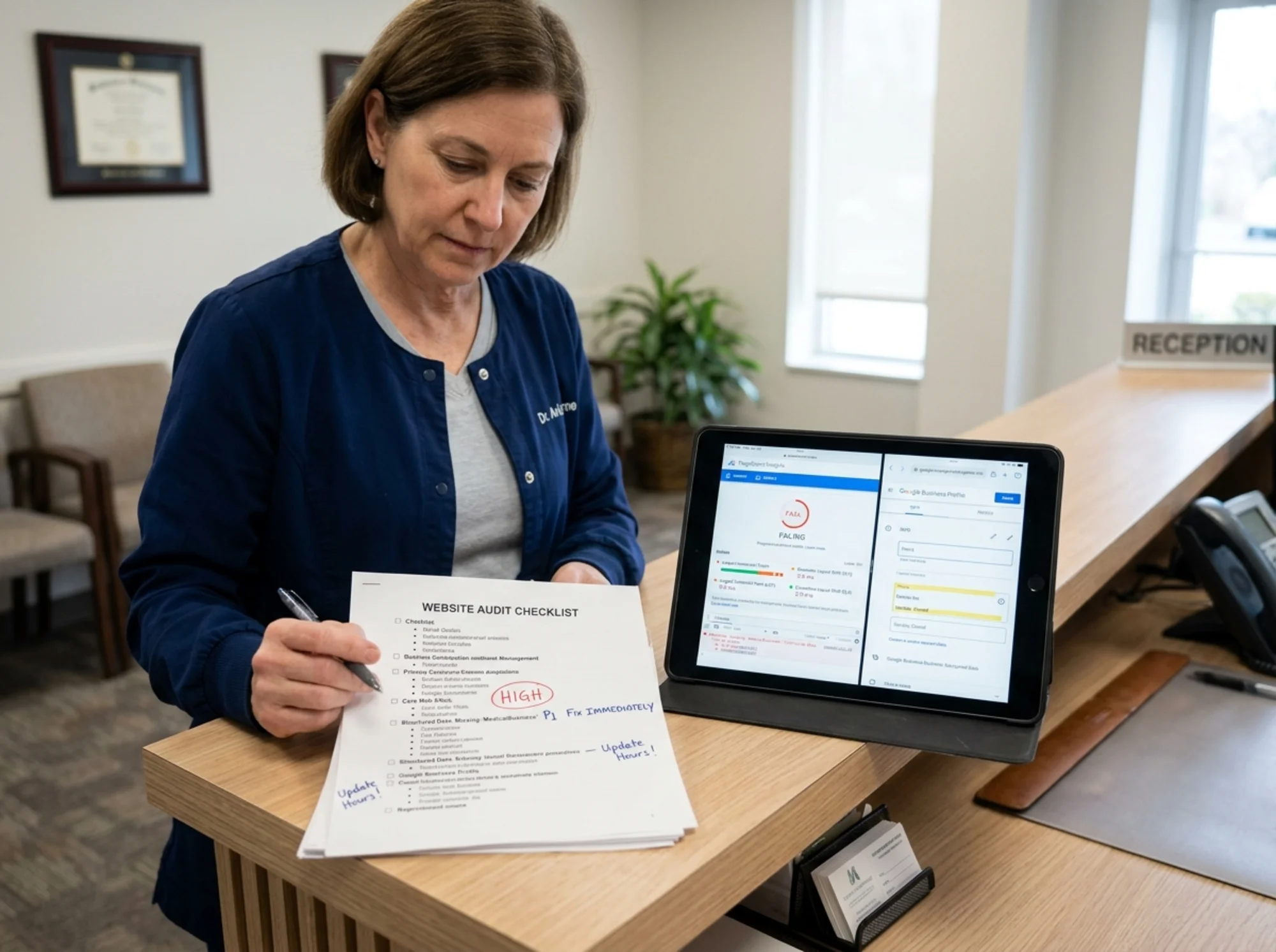
The homepage loads in 5.8 seconds on mobile. The hero image is 4 megabytes, uncompressed. The "Book Appointment" link goes to a third-party portal that doesn't load on Safari on iOS 16+. The phone number is rendered inside the header image, so you can't tap it. There's no structured data. The "About" page lists Dr. A and Dr. B with stock photos and no credentials. The blog has six posts, all written in 2019, all unsigned. There are three location addresses in the footer, but only one location page on the site. The Google Business Profile has different hours than the website.
What we'd fix, in order:
- Compress the hero image and replace the booking link. Quickest wins — this alone will probably double the actual bookings from the site.
- Make the phone number a real
tel:link. A five-minute fix that recovers calls being lost right now. - Reconcile hours between the website and Google Business Profile. Pick one source of truth and update everywhere.
- Add real provider photos and credentials. Replace stock photos. Add board certifications and license numbers.
- Create individual location pages. Each with unique content, embedded map, and parking instructions.
- Add
MedicalBusinessstructured data. So Google understands what the site is and shows it in the right results. - Update or remove the stale blog posts. Outdated medical content is worse than no content.
- Run an accessibility check. Fix color contrast, alt text, and keyboard navigation.
None of these are "redesign the whole site." A useful audit doesn't end in a $40,000 rebuild. It ends in a prioritized list of specific changes someone can actually do.
Accessibility: the layer most practices fail
About 27% of U.S. adults have some form of disability. For older patient populations, the percentage is higher. If your site doesn't work for them, you're losing patients you didn't know you had — and depending on your jurisdiction, you may have legal exposure.
A short accessibility checklist for a healthcare site:
- All images have descriptive alt text (especially before/after photos and provider headshots).
- Text contrast meets WCAG AA (4.5:1 for body text).
- The site is fully navigable with only a keyboard.
- Form fields have visible labels, not just placeholder text.
- Video content has captions.
- Body text is at least 16px, and the site supports browser zoom up to 200% without breaking.
You can pick up most of these issues with an automated scan. The rest require a few minutes of manual testing — close your eyes and try to use the keyboard, or hand your phone to a parent and watch them try to book.
What to do after the audit
A common mistake: practices run an audit, get a 40-page report, feel overwhelmed, and do nothing.
Pick the three highest-impact fixes. Do them this week. Then pick the next three.
A reasonable order of operations for most practices:
- Fix anything blocking phone calls or booking on mobile.
- Fix the slowest pages.
- Add or correct structured data and Google Business Profile information.
- Update provider bios and credentials.
- Address accessibility issues.
- Refresh or remove stale content.
Anything beyond that — a redesign, a content marketing plan, a paid search campaign — should wait until the foundation works.

Run a free audit on your practice site
If you've read this far, the natural next step is to see where your site stands. A free website audit from FreeSiteAudit will check Core Web Vitals, structured data, accessibility basics, mobile usability, and the trust signals patients look for — and give you a prioritized fix list you can actually work through.
You don't need to be technical to read the report. The whole point is that a practice owner can hand it to a web person and say, "Fix these in this order."
A final note on patient trust
Healthcare websites are judged on a different standard than other small business sites. A patient who has a frustrating experience on your site doesn't just bounce — they form a quiet opinion about whether your practice is careful, professional, and current. A site that loads slowly, breaks on mobile, or shows stock photos of fake doctors signals something about how the practice is run.
The opposite is also true. A site that works fast, communicates clearly, shows real people, and respects the patient's time signals exactly what you want it to signal. That's what a website audit is really for: making sure the impression people form before they ever meet you is the one you'd want them to form.
Sources
- Google Search Central — Creating helpful, reliable, people-first content: https://developers.google.com/search/docs/fundamentals/creating-helpful-content
- Google Search Central — Article structured data: https://developers.google.com/search/docs/appearance/structured-data/article
- web.dev — Core Web Vitals: https://web.dev/articles/vitals
Check your website for free
Get an instant score and your top 3 critical issues in under 60 seconds.
Get Your Free Audit →