Website Audit for Tutors and Online Course Creators: A Practical Guide
A practical website audit guide for tutors and online course creators — what to check, what to fix, and how to turn site visitors into enrolled paying students.
# Website Audit for Tutors and Online Course Creators: A Practical Guide
If you teach for a living — one-on-one math tutoring, a self-paced Notion course, group writing cohorts — your website has to convince a stranger that you know your subject, that you're worth their time and money, and that the next step is worth taking. A website audit is just a structured way of checking whether your site is actually doing that job.
This guide walks through what to audit, what matters most for tutors and course creators specifically, and how to fix what turns up. No jargon, no fake stats. Just what moves the needle.
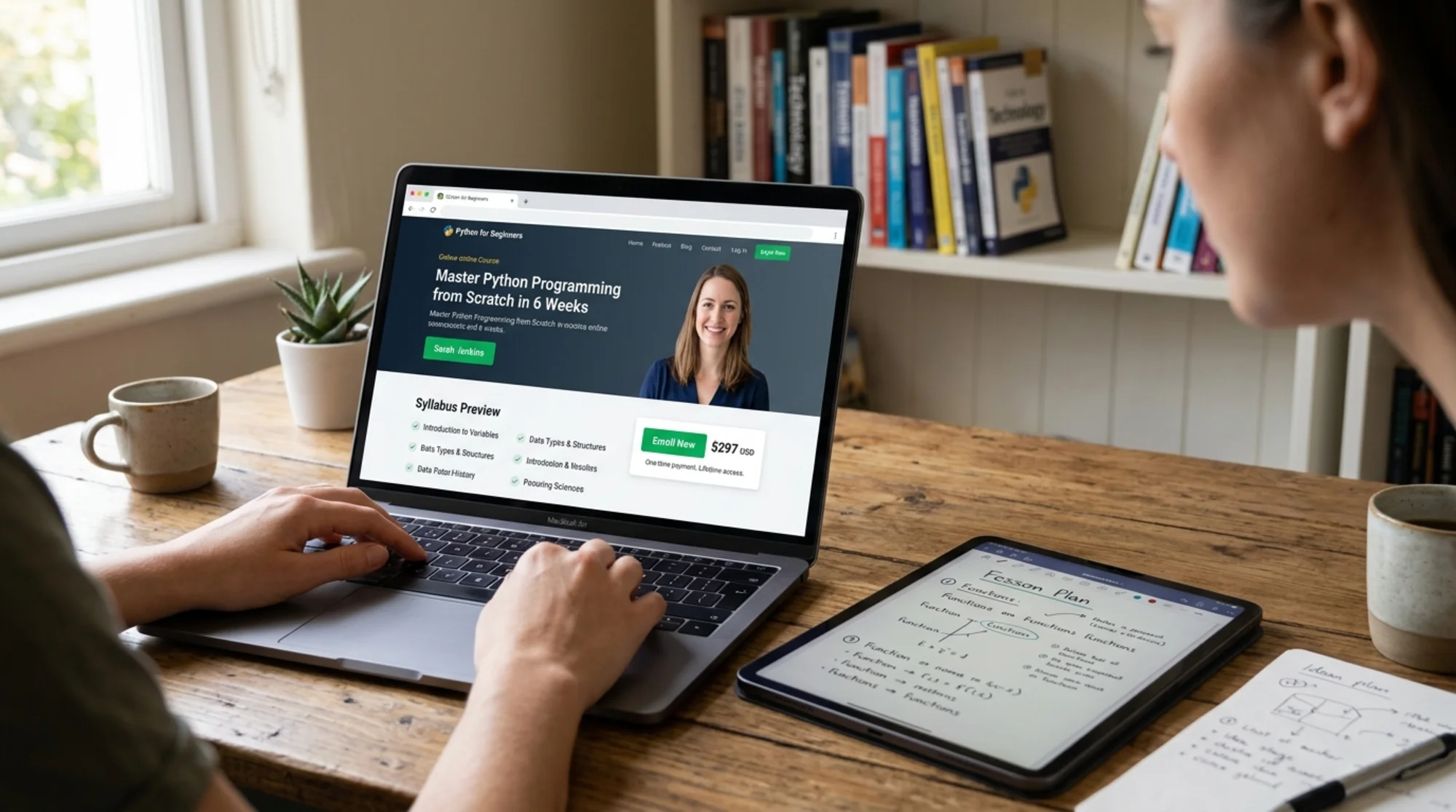
Why tutors and course creators need a different kind of audit
Most general SEO advice was written for ecommerce or SaaS. Teaching businesses have different problems:
- Trust is the entire sale. Nobody books a $200 SAT prep package or a $400 course from a site that looks abandoned.
- You compete with platforms. Udemy, Coursera, Outschool, Wyzant, and Teachable dominate search. Your individual site has to win on specificity, not volume.
- The buyer is often not the student. Parents buy K-12 tutoring. Managers buy professional courses for their teams. Pages have to speak to both.
- Pricing transparency is a wedge. Tutors who show prices tend to convert better because they pre-qualify visitors.
- Free content is your funnel. Blog posts, sample lessons, and short videos are how people decide if they like how you teach.
A good audit covers all five, not just whether your meta descriptions are filled in.
The five-layer framework
- Technical health — Can Google crawl and render your site? Does it load fast?
- Content clarity — Does each page answer one question well?
- Trust signals — Credentials, testimonials, real photos, refund policy.
- Conversion path — Can a visitor actually figure out how to enroll?
- Structured data — Is your course or article marked up so search engines understand it?
1. Technical health: the bare minimum
Google's Core Web Vitals are three measurements you don't have to memorize but do have to pass: Largest Contentful Paint (how fast the main content shows up), Interaction to Next Paint (how quickly the page responds when tapped), and Cumulative Layout Shift (how much stuff jumps around as it loads).
For tutors and course creators, the usual culprits are:
- Huge hero images. A 4 MB photo of you at a chalkboard will tank LCP on mobile. Compress everything under 200 KB unless you have a reason not to.
- Video autoplay at the top. A YouTube embed often blocks interactivity. Use a thumbnail with a click-to-play pattern.
- Bloated course-platform themes. Some Teachable and Thinkific themes drag in scripts you don't use. Disable what you can.
- Stacked tracking pixels. Every chat widget, calendar embed, and analytics pixel adds load time. Audit quarterly and remove anything unused.
Quick test: open your homepage on your phone using mobile data, not Wi-Fi. If the main headline takes more than three seconds, that's your first fix.
Mini-checklist: technical
- [ ] Main content shows under 2.5 seconds on mobile
- [ ] Images compressed and served as WebP or AVIF
- [ ] No autoplay videos above the fold
- [ ] HTTPS everywhere, no mixed content warnings
- [ ] Mobile menu doesn't overlap the enroll button
- [ ] No broken links on the top 10 most-visited pages
2. Content clarity: one page, one job
Google's helpful content guidance is, paraphrased: write pages that exist for the reader, not the search engine. For tutors and course creators, that means each page should answer a single question clearly.
A common mistake is a homepage that tries to do everything — who you are, what you teach, your philosophy, testimonials, blog teasers, a contact form, and a free download. Visitors bounce because they can't tell what to do next.
Better: one page per concrete thing.
/sat-prep— what's in the program, schedule, price, sample lesson, book a trial/algebra-tutoring— same structure, different subject/about— who you are, why you teach, credentials/results— student outcomes with real names (with permission) and specifics/blog/...— answers to questions parents and students actually search for
Each page should pass the "stranger test": if someone landed here from Google with no other context, would they understand what this is and what to do next within five seconds?
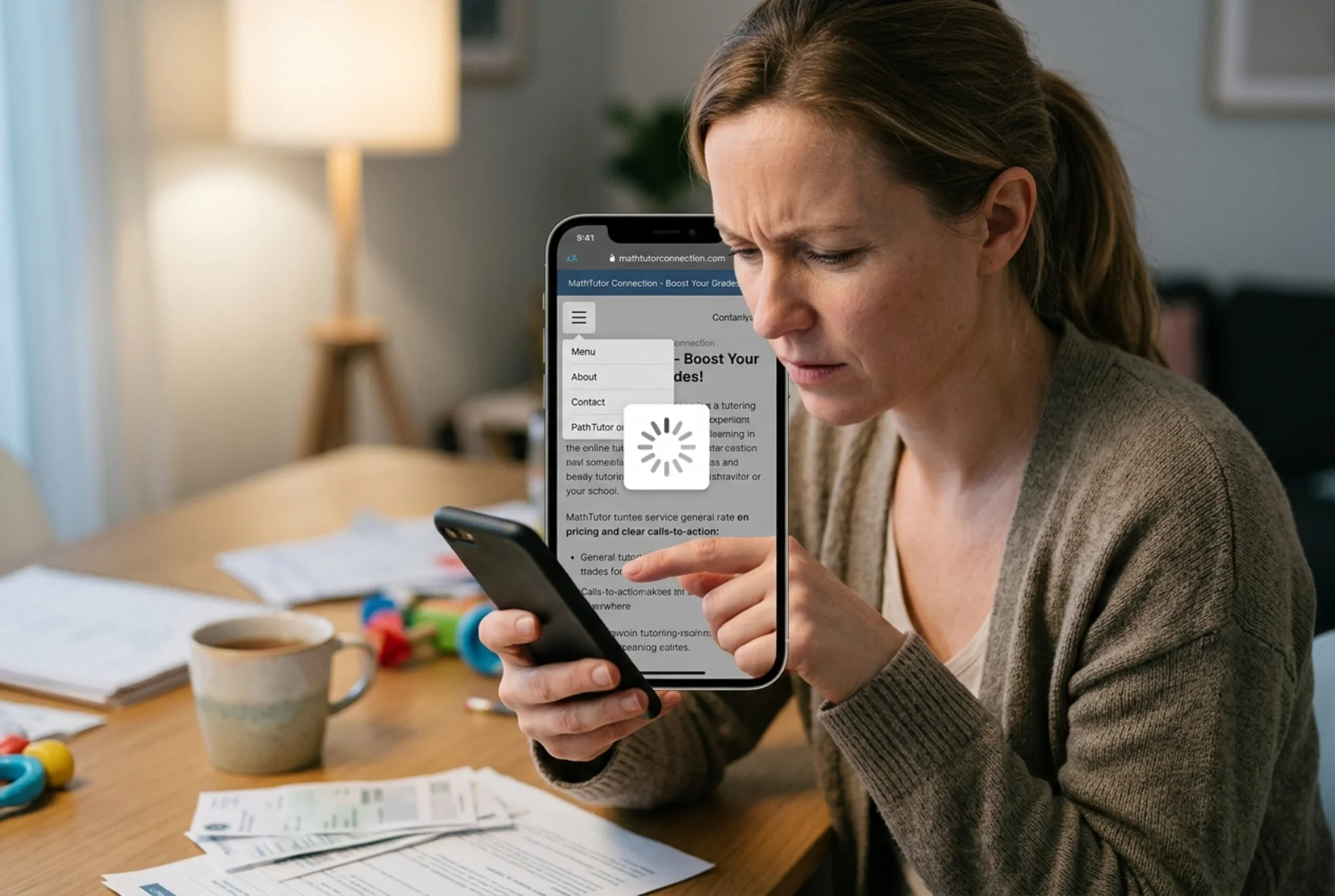
Walkthrough: auditing a single course landing page
Say you sell a $297 self-paced course called "Conversational Spanish in 60 Days." Open the page and check:
- Headline. Does it name the outcome, not the topic? "Hold a 10-minute conversation in Spanish after 60 days" beats "Conversational Spanish Course."
- Subhead. Does it name the audience? "For adult beginners who tried Duolingo and want to actually speak."
- Proof in the first screen. A testimonial quote, a real "students taught" number, or a credential.
- What's in it. Module list with concrete examples. "Module 3: Ordering food at a restaurant — vocabulary, role-play scripts, audio practice" beats "Module 3: Real-world Spanish."
- Instructor. A real photo (not a stock illustration), one sentence on why you can teach this, and a link to your full bio.
- Price. Show it. If you must hide it, explain why ("custom quote based on group size").
- FAQ. Address actual objections: "Do I need any Spanish background?" "What if I fall behind?" "Is there a refund?"
- CTA. One primary button. "Enroll for $297" or "Start Module 1 free." Not five competing buttons.
Missing more than two? That's your content fix list.
3. Trust signals: where most tutor sites fail
This is the biggest opportunity for most teaching sites, and the fix is almost always free.
Real photos. A stock photo of a smiling teacher is worse than no photo. A genuine shot of you at your workspace, even on a phone, beats the most polished stock library.
Specific testimonials. "Great tutor!" is worthless. "My daughter went from a C+ to an A- in pre-calc over one semester with Maya. She also stopped dreading her homework." is gold. Ask past students or parents for permission to use a first name and a real outcome.
Relevant credentials. "Stanford PhD in Mathematics" matters for advanced calculus. It matters less for elementary reading. List what's relevant to the page you're on.
A clear refund or trial policy. Even "If your child isn't engaged after the first session, no charge" reduces friction enormously.
Your face on every page. A small instructor photo in the header or sidebar reminds visitors there's a real person behind the site.
Mini-checklist: trust
- [ ] At least one real photo of you on every page
- [ ] 3+ specific testimonials with first names and outcomes
- [ ] Credentials listed where relevant
- [ ] Refund, cancellation, or trial policy visible
- [ ] Contact method beyond a form (email or scheduling link)
- [ ] No empty or "Coming Soon" testimonial sections
4. Conversion path: can they actually enroll?
This is where a 10-minute test from a friend who doesn't know your business is invaluable. Hand them your phone, open your homepage, and ask them to "sign up for a trial lesson." Don't help. Watch where they get stuck.
Common problems:
- The "Enroll" or "Book a Trial" button sits below three screens of scrolling
- The booking calendar opens on a separate site with a different style, so visitors think they left
- Payment requires creating an account first, then choosing a course, then paying
- The mobile menu hides the main CTA behind a hamburger icon
- The form asks for 12 fields when it could ask for 3
Fix the worst friction first. One CTA repeated three times as the visitor scrolls (top, middle, bottom) almost always beats ten different links.
5. Structured data: how search engines understand you
This is the technical-sounding part that's actually straightforward. Structured data is a small block of code that tells search engines what each page is about in a format they can parse.
For tutors and course creators, the useful types are:
- Course schema for course pages (name, description, provider, instructor, price, mode of delivery)
- Article schema for blog posts (headline, author, date published, image)
- Person schema for your about page
- FAQPage schema for FAQ sections
- Review or AggregateRating if you have genuine reviews
Google's Article structured data documentation is a useful reference for what fields matter on blog posts. Don't fake reviews or stuff schema with keywords — Google treats that as spam and you can lose rich result eligibility.
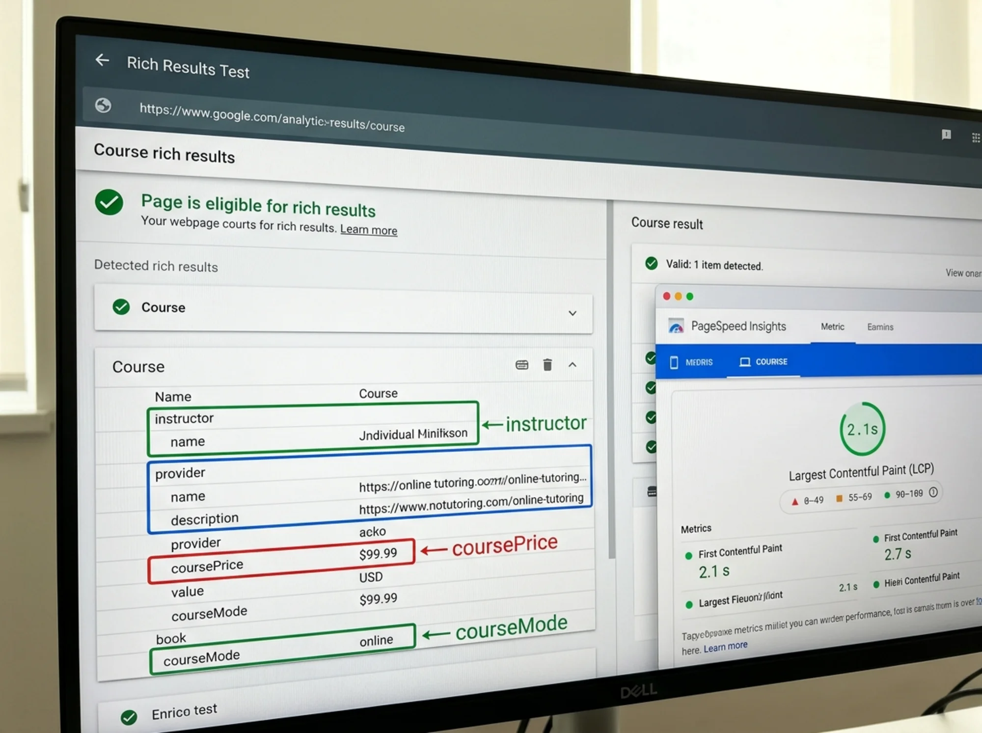
On Teachable, Kajabi, or Thinkific, most of this is generated automatically. Confirm it's actually present using Google's Rich Results Test on a few key pages. On WordPress, plugins like Yoast or RankMath handle most of it.
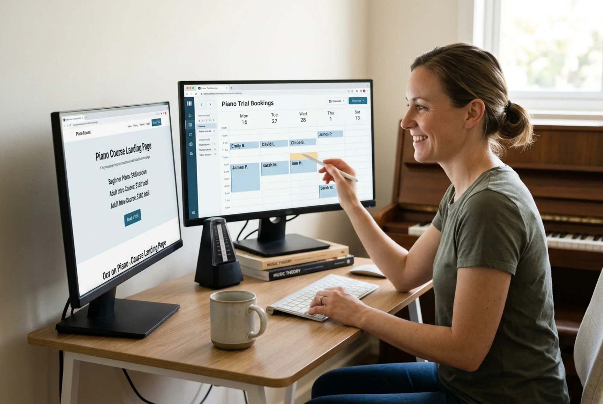
A concrete scenario: auditing a piano tutor's site
Imagine Elena, a piano tutor whose site gets traffic but few bookings.
Findings after a 30-minute audit:
- Homepage takes 4.8 seconds to load on mobile because of a 3 MB video background
- "Book a Lesson" button only appears after scrolling past three sections
- Three testimonials, all "Elena is wonderful!" with no last names, no outcomes
- Prices not listed anywhere
- No structured data on the lesson pages
- Blog has 12 posts titled things like "Why Music Matters" — nothing matching what parents actually search for
Prioritized fix list:
- Replace the video background with a single high-quality photo (immediate LCP fix)
- Add a sticky header with "Book a Trial Lesson" visible on every scroll
- Email past students for permission to use specific outcomes in testimonials
- Publish a pricing page: "$60 / 30-min trial, $90 / hour ongoing, package discounts available"
- Add Course schema to each lesson-type page
- Write three new posts: "How to choose a piano teacher for a 7-year-old," "Online vs in-person piano lessons," "What to expect from your first lesson"
Each item has a clear owner, a clear action, and is measurable. That's an audit doing its job.
How often to audit
A full audit once or twice a year is reasonable for a small site. A lightweight check — load speed, broken links, working forms — every quarter. After any major change (new theme, new pricing, new course launch), spot-check the affected pages immediately.
If you have one critical conversion page — your top course or your trial booking page — keep an eye on its speed and uptime continuously. Automated tools can flag regressions before they cost you signups.
Run a free audit
If you'd rather have a tool do the first pass for you, FreeSiteAudit will scan your site and give you a prioritized list of issues — performance, content gaps, structured data problems, and trust signal gaps — without you needing to know what any of those terms mean in detail. It's free, takes about a minute, and gives you the same kind of fix list a consultant would charge for.
You can also browse our tutors and course creators industry guide, or jump straight to common fixes for Core Web Vitals and structured data.
The bottom line
A website audit for a tutor or course creator isn't really about SEO scores. It's about whether a parent visiting your site at 10 p.m. on a Tuesday, looking for someone to help their struggling eighth grader, can find what they need, trust you, and book the trial — all in under three minutes. Fix what gets in the way of that, and the SEO mostly takes care of itself.
Start with the page that gets the most traffic. Run through the five layers. Pick the three biggest problems. Fix them this week. Then move to the next page. Compound improvement over a year beats any single redesign.
Sources
Check your website for free
Get an instant score and your top 3 critical issues in under 60 seconds.
Get Your Free Audit →