Why Hero Images Are Often the Biggest Performance Mistake
That stunning banner image may be your site's biggest speed bottleneck. Learn to diagnose and fix oversized hero images that tank your Core Web Vitals.
# Why Hero Images Are Often the Biggest Performance Mistake
You spent hours picking the perfect banner image for your homepage. It looks stunning on your widescreen monitor. The colors pop. The composition draws the eye right to your headline.
And it's quietly driving customers away.
Hero images — those large, full-width photos or graphics at the top of a webpage — are one of the most common performance killers on small business websites. Not because they exist, but because of how they're implemented. A single oversized hero image can add three to five seconds to your page load time, and most site owners never realize it because the page loads just fine on their office Wi-Fi.
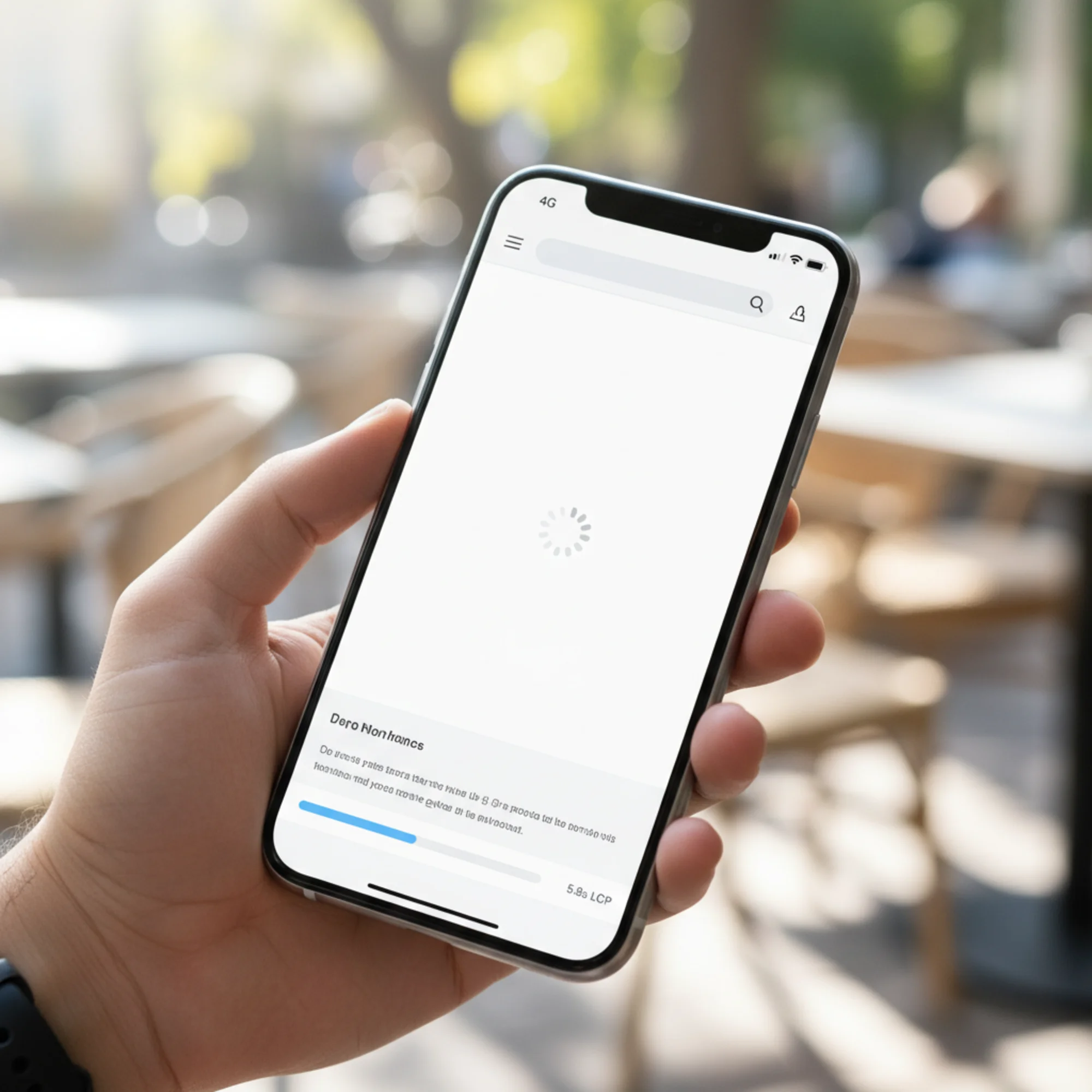
The irony is painful: the element you chose to make a great first impression is creating a terrible one. While you see a stunning photograph, your potential customer on a phone sees a blank white rectangle, a spinning loader, and a reason to hit the back button.
What Is a Hero Image?
A hero image is the large visual at the top of a webpage, usually spanning the full width of the screen. Most business websites use one on their homepage, and many use them on every page — a bakery showing fresh bread, a roofer displaying a completed project, a SaaS product featuring a dashboard screenshot, a dentist's office with a smiling patient.
The hero image itself isn't the problem. Used well, hero images establish credibility, set an emotional tone, and give visitors an immediate sense of what your business does. The problem is that most small business websites serve hero images that are far too large, in the wrong format, and without any optimization. What should be a 200KB asset arrives as a 3–5MB behemoth that chokes the connection before anything else on the page has a chance to load.
Why Hero Images Cause So Much Damage
Browsers load what's at the top of the page first. Your hero image sits right there, above the fold, demanding to be downloaded before the visitor can see anything meaningful. When that image is a 3MB JPEG straight from a photographer's camera or a stock photo site, this is what happens:
- The browser starts downloading the image immediately
- Everything else — your CSS, your fonts, your headline text — competes for bandwidth
- The visitor stares at a blank or half-loaded screen
- Other page resources are delayed, making the entire experience feel sluggish
- After several seconds, the image finally appears
- A significant percentage of visitors have already left
Google measures this with Largest Contentful Paint (LCP) — the time it takes for the largest visible element to fully render. On most business homepages, the hero image is that element. According to Google's Core Web Vitals thresholds, LCP should be 2.5 seconds or less to be rated "good." Between 2.5 and 4 seconds is "needs improvement." Above 4 seconds is "poor." An unoptimized hero image alone can push LCP past 5 or even 8 seconds on a mobile connection.
This matters because every second counts. Research from Google shows that as page load time goes from 1 second to 3 seconds, the probability of a visitor bouncing increases by 32%. From 1 to 5 seconds, that number jumps to 90%. Your hero image is often the single factor that determines which side of that line you land on.
The Real Numbers: How Big Are Most Hero Images?
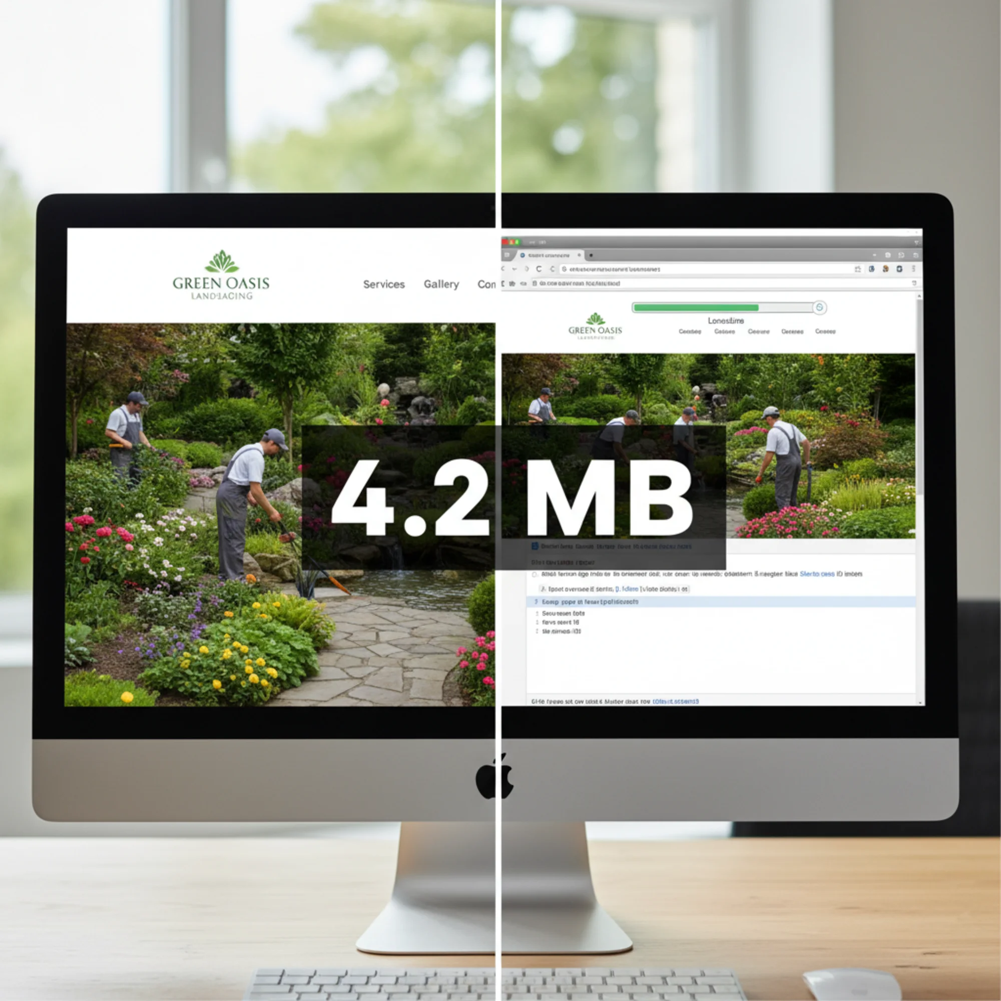
Sarah runs a landscaping business. Her web designer used a photo from a recent project shoot — a gorgeous backyard transformation with a stone patio, native plantings, and a water feature. The original photo: 5472 × 3648 pixels at 4.2MB, uploaded directly as the hero image without any resizing or compression.
Here's what that means in practice:
| What | Sarah's site | What it should be |
|---|---|---|
| File size | 4.2 MB | 150–300 KB |
| Dimensions | 5472 × 3648 px | 1600 × 900 px (max) |
| Format | JPEG | WebP or AVIF |
| Mobile version | Same 4.2 MB file | Separate 80–150 KB file |
| Load time (4G) | ~6 seconds | < 1 second |
Sarah's hero image is roughly 15 to 25 times larger than it needs to be. This is not unusual — it's the norm. Data from the HTTP Archive consistently shows that images account for the largest share of total page weight, and hero images are typically the single heaviest asset on any given page. The median webpage now transfers over 2MB of images alone, and hero images often represent a third or more of that total.
What makes this worse is that Sarah's site looks fine when she checks it. She's on a fast broadband connection at her office. The 4.2MB file loads in under a second on her machine. But her customers — the homeowner browsing on a phone during their lunch break, the couple searching for landscapers while sitting in their backyard on cellular data — get a completely different experience.
Five Mistakes and How to Fix Each One
Mistake 1: Uploading the Original File
Photos from cameras, phones, or stock sites are designed for print or large-format use. A DSLR camera produces images at 6000+ pixels wide. Stock photo sites default to their highest resolution download. A website never needs a 4000+ pixel wide image — no commonly used monitor displays that many physical pixels for a single image.
Fix: Resize before uploading. For a full-width hero:
- Desktop: 1600px wide is sufficient for virtually all screens, including 1920×1080 monitors
- Retina/HiDPI: 2000px wide at most, only if your audience skews toward high-end displays
- Height: depends on your design, but 800–1000px is typical for a hero section
Free tools like Squoosh (squoosh.app), the Preview app on Mac (Tools → Adjust Size), or Paint on Windows can handle basic resizing. If you use Photoshop or similar software, use "Save for Web" rather than a standard export.
Mistake 2: Using JPEG Instead of WebP or AVIF
JPEG dates from 1992. It was groundbreaking at the time, but modern formats do the same job with dramatically smaller files. WebP, developed by Google and supported by all modern browsers since 2020, produces files 25–35% smaller at equivalent visual quality. AVIF, a newer format based on the AV1 video codec, cuts another 20% beyond that, though browser support is still catching up — Safari only added full support recently.
Fix: Convert your hero image to WebP. This single change can cut your file size by a third with zero visible quality loss. If your CMS supports automatic WebP conversion, enable it. Most modern platforms — Squarespace, Wix, Shopify, and WordPress with plugins like ShortPixel or Imagify — can handle this automatically. For manual conversion, Squoosh lets you compare the original JPEG side-by-side with the WebP output so you can verify quality before saving.
If you want to future-proof your site, serve AVIF with a WebP fallback using the HTML
Mistake 3: Serving the Same Image to Mobile and Desktop
A phone screen is 375 to 430 pixels wide. Sending it a 1600px image wastes enormous bandwidth — the phone downloads all that data and then discards roughly 75% of the pixels, scaling the image down to fit the screen. Your visitor paid for that bandwidth with their data plan and their time, and got nothing in return.
This is especially damaging on cellular connections. A 4G connection averages 10–30 Mbps in good conditions, but real-world speeds fluctuate. In a building, on a crowded network, or in a rural area, effective speeds can drop to 2–5 Mbps. At 3 Mbps, a 1MB image takes over 2.5 seconds to download. A properly sized 100KB mobile image takes a quarter of a second.
Fix: Use responsive images. In HTML, the srcset attribute provides multiple sizes so the browser can choose the appropriate one:
html
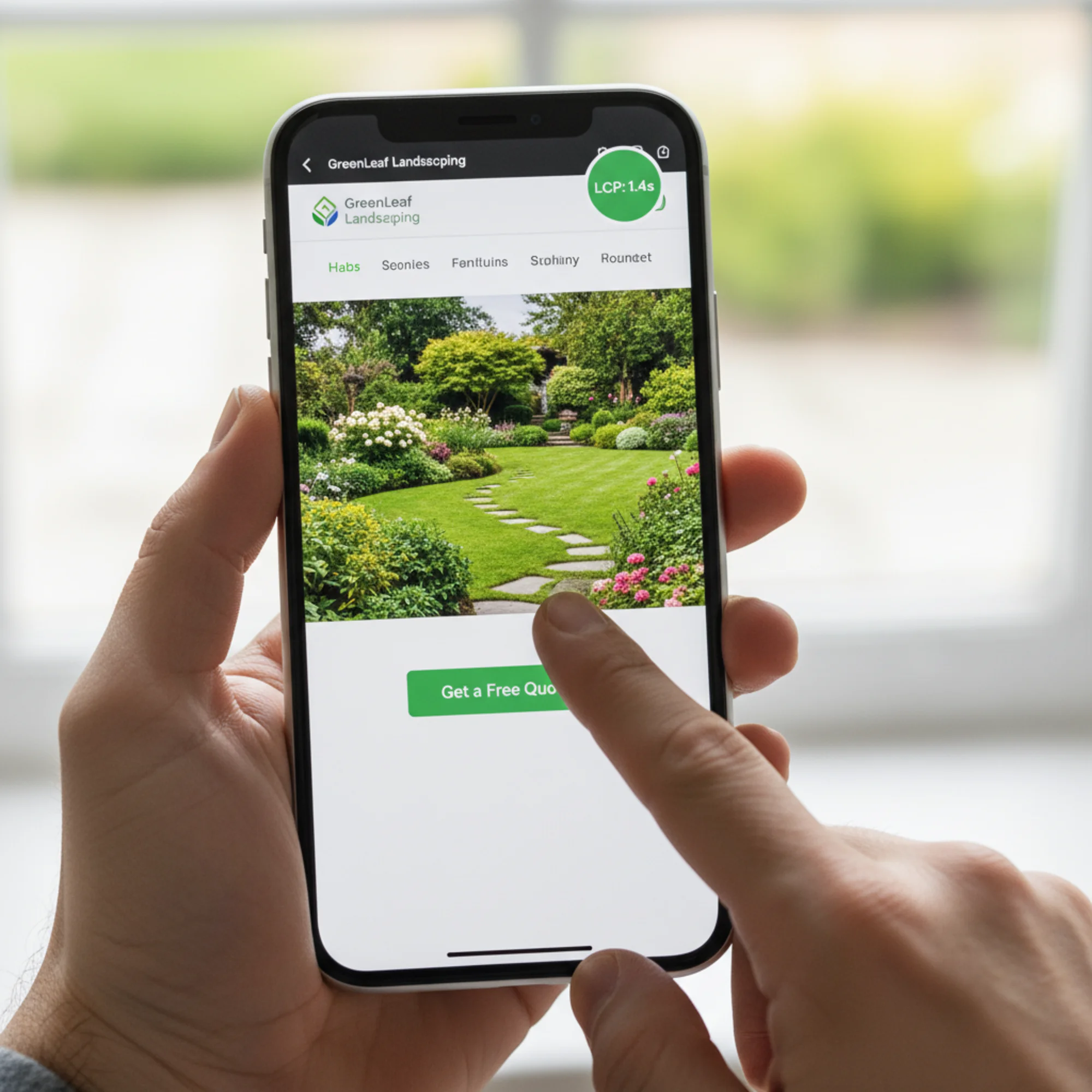
src="hero-800.webp" srcset="hero-400.webp 400w, hero-800.webp 800w, hero-1600.webp 1600w" sizes="100vw" alt="Finished backyard landscaping project with stone patio" width="1600" height="900" fetchpriority="high" > The browser automatically selects the smallest image that fits the visitor's screen. A phone gets the 400w version. A tablet gets the 800w version. A desktop gets the 1600w version. Everyone sees a sharp image, but nobody downloads more than they need. On a website builder, look for "responsive images" or "automatic image resizing" in your platform's settings. Most modern builders handle this — but not all of them do it for hero images specifically, since heroes are often implemented as CSS backgrounds rather than standard Even at the right dimensions and format, an image saved at maximum quality can be twice as large as necessary. The difference between 95% quality and 80% quality is almost invisible to the human eye, especially for photographs displayed at screen resolution. But the file size difference is dramatic — a 95% quality WebP might be 350KB where an 80% quality version of the same image is 150KB. Fix: Compress to 75–85% quality. For photographs (not graphics, logos, or text overlays), this produces virtually no visible quality loss at the sizes displayed on websites. Use Squoosh to preview before and after at the same zoom level. If you can't tell the difference — and you almost certainly can't — use the smaller file. One nuance: images with large areas of flat color, sharp text, or fine graphic detail (like logos or infographics) are more sensitive to compression artifacts. For these, stay closer to 85–90% quality or consider PNG format instead. When the browser doesn't know image dimensions in advance, it can't reserve the correct amount of space in the layout. As the image downloads and the browser discovers its dimensions, the page layout shifts — text jumps down, buttons move, and the visitor loses their place. Google calls this Cumulative Layout Shift (CLS), another Core Web Vital. This is especially frustrating on mobile. A visitor starts reading your headline, the hero image loads, and suddenly the text they were reading is pushed off-screen. It feels broken, even if everything eventually renders correctly. Fix: Always include Let's fix Sarah's landscaping hero image step by step, showing the file size at each stage. Starting point: Step 1: Resize. Open the image in Squoosh or your preferred editor. Reduce the width to 1600px (height adjusts proportionally to ~1067px). Create a second version at 800px wide for mobile devices. After resizing alone, the desktop file size drops to approximately 800KB — already a 5× improvement, but we're not done. Step 2: Convert to WebP. In Squoosh, select WebP as the output format and set quality to 80%. The desktop version (1600px): ~180KB. The mobile version (800px): ~85KB. Compare the WebP output to the original JPEG at 100% zoom — the difference is imperceptible. Step 3: Upload both versions. Replace the old hero image in your CMS. If your platform supports the Step 4: Add proper attributes. Ensure the image tag includes Step 5: Verify. Load your site on your phone over cellular data (not Wi-Fi — Wi-Fi masks performance problems). Does the hero appear quickly? Does the page feel fast? Run the page through a free performance audit and check that LCP is under 2.5 seconds. Result: Sarah's hero went from 4.2MB to 180KB — a 96% reduction. Mobile load time dropped from over 6 seconds to under 2 seconds. LCP score went from "poor" to "good." The image looks identical to the original at screen resolution. The only difference is that her customers can actually see it before losing patience. You don't need to guess whether your hero image is a problem. Here are three ways to find out in under five minutes. Run your homepage through a free website audit. Look for: If your LCP is slow and the audit flags image issues, your hero image is almost certainly the primary cause. The audit report will identify the exact image files contributing to slow load times and estimate how much time you'd save by optimizing them. In Chrome, right-click your page, select "Inspect," click the "Network" tab, filter by "Img," and reload the page. Sort by size (largest first). If your hero image tops the list — and it usually does — note the file size. Anything over 300KB is worth optimizing. Anything over 1MB is an urgent fix. You can also check the dimensions: click on the image request, look at the response headers or preview, and compare the image's native dimensions to how it's displayed on screen. If the image is 4000px wide but displayed at 1200px, you're wasting bandwidth on pixels nobody sees. Open your site on your phone using cellular data (turn off Wi-Fi). If you can count "one Mississippi, two Mississippi" before the hero image appears, you have a problem. Better yet, ask a friend or family member to load your site on their phone and tell you honestly how fast it feels. Site owners become desensitized to their own load times because they visit their site constantly and the browser caches assets. Use this before publishing any page with a hero image: Print this checklist or bookmark this page. Run through it every time you add or change a hero image. It takes two minutes and can save you seconds of load time — which translates directly into visitors who stay instead of bounce. Lazy loading is a widely recommended best practice for images — it delays downloading until the user scrolls near them, saving bandwidth on images that might never be viewed. Many CMS platforms and optimization plugins now apply lazy loading to all images by default. This is great for images below the fold. But your hero image should never be lazy loaded. Since the hero is the first thing visible when the page loads, lazy loading it actually makes performance worse. The browser initially skips the image (because the lazy loading attribute tells it to wait), then detects that the image is in the viewport, then starts the download — adding an unnecessary delay to the most critical visual element on the page. You've effectively told the browser to deprioritize the one image you need it to prioritize. If you see Different website builders handle hero images differently. Here are quick tips for the most popular platforms: Google has used Core Web Vitals as a ranking signal since 2021. LCP is one of the three metrics, and your hero image usually determines your LCP score. An unoptimized hero image doesn't just slow your site — it directly affects your search rankings. Content relevance still matters more than speed. A perfectly optimized page with thin content won't outrank a comprehensive resource with slower load times. But when two pages compete for the same search result and one loads in 1.5 seconds while the other takes 5, the faster page has a measurable edge. Google has confirmed that page experience is a tiebreaker among pages of similar relevance. More importantly, a slow page means fewer leads, fewer calls, and fewer sales — that's the real cost regardless of rankings. A visitor who bounces because your hero image took 5 seconds to load never sees your phone number, your portfolio, or your pricing. Speed isn't an abstract metric. It's the gate between your marketing and your revenue. Sometimes the best optimization is removing the hero image altogether. Consider this if: A clean, fast-loading page with a strong headline and clear call to action will outperform a beautiful but slow page almost every time. If you do skip the hero, your LCP element becomes your largest text block — which typically renders in under 1 second, giving you an excellent Core Web Vitals score with zero image optimization needed. If you're unsure, test it. Remove the hero image for a week and watch your bounce rate and conversion metrics. You might be surprised. Your hero image might be the single easiest performance win on your site. A five-minute optimization can cut page load time in half and move your Core Web Vitals from "poor" to "good" in one change. Run a free website audit with FreeSiteAudit to see exactly how your hero image and other assets affect your page speed, Core Web Vitals, and overall site health. The report flags specific image issues, shows you the exact file sizes causing problems, and gives you clear steps to fix them. You don't need a developer or expensive tools. You just need to stop serving a 4MB image to someone on a phone.Mistake 4: Not Compressing the Image
Mistake 5: Not Setting Explicit Dimensions
width and height attributes on your image tag, or ensure your CMS sets them automatically. This lets the browser calculate the aspect ratio and reserve space immediately, before the image downloads. Combined with CSS max-width: 100% and height: auto (which most modern CSS frameworks include by default), this eliminates layout shift from images entirely.Optimization Walkthrough
backyard-project.jpg — 4.2MB, 5472 × 3648 pixelssrcset, configure responsive image serving so mobile visitors get the smaller file. If not, even uploading just the 180KB desktop version is a massive improvement over the 4.2MB original.width, height, descriptive alt text, and fetchpriority="high". Remove loading="lazy" if present — your hero image should load immediately, not be deferred.
How to Check Your Own Hero Image
Check 1: Run a Page Speed Test
Check 2: Inspect the Network Tab
Check 3: Test on Mobile
The Hero Image Checklist
fetchpriority="high" is set on the hero imageloading="lazy" is NOT set on the hero imageDon't Lazy Load Your Hero Image
loading="lazy" on your hero image tag, remove it. Replace it with fetchpriority="high" to tell the browser this image should be among the first resources downloaded. If your CMS applies lazy loading globally, look for a way to exclude above-the-fold images or the hero section specifically.Common Platform-Specific Fixes
srcset attributes. Check that lazy loading is disabled for your hero — some themes add it automatically.The SEO Impact
When to Skip the Hero Image Entirely
Take Action Today
Sources
Related Tools
Related Fixes
Check your website for free
Get an instant score and your top 3 critical issues in under 60 seconds.
Get Your Free Audit →