Website Audit Guide for SaaS Landing Pages That Need More Signups
Your SaaS landing page gets traffic but not signups. This step-by-step audit guide shows you exactly what to check and fix to turn visitors into users.
# Website Audit Guide for SaaS Landing Pages That Need More Signups
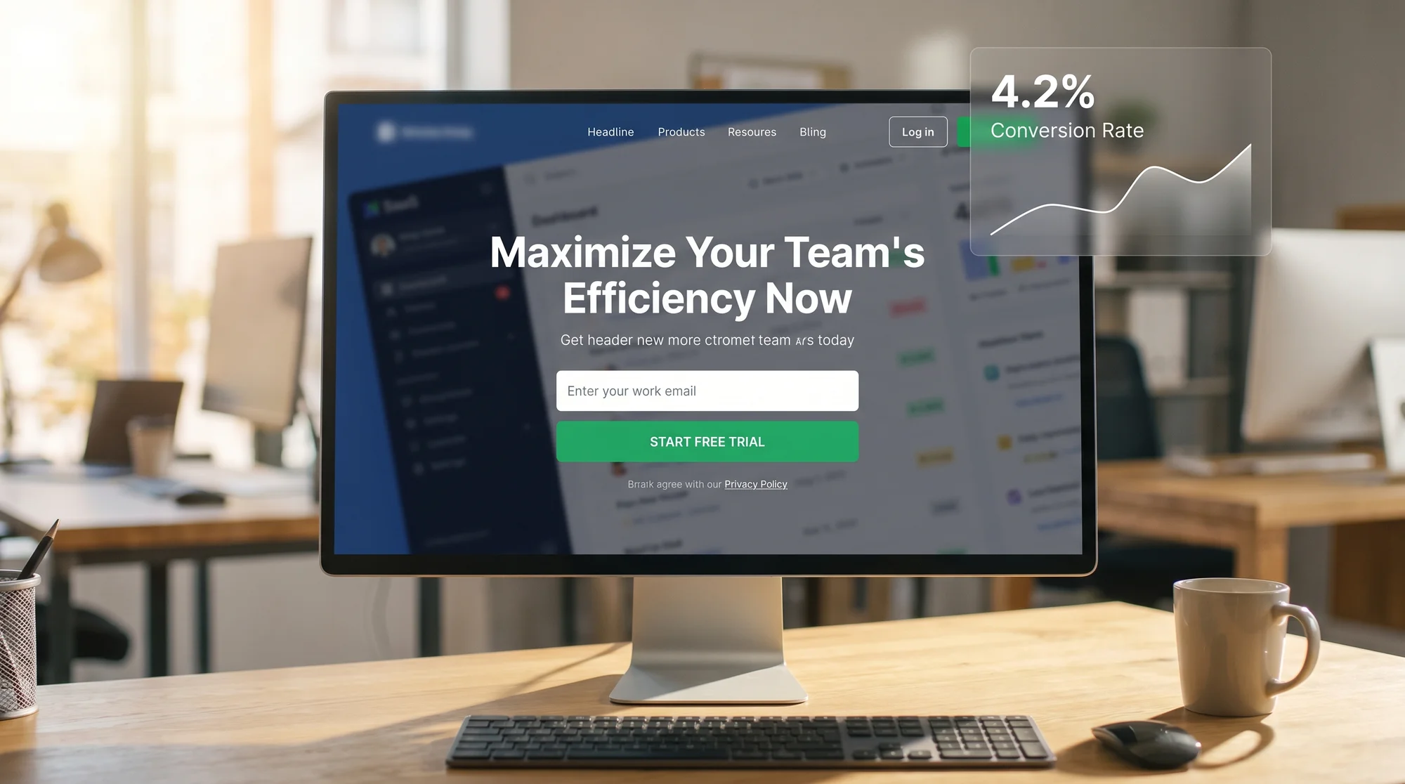
You're getting traffic. People land on your page, look around, and leave. Your signup numbers stay flat. Something is wrong, but you can't pinpoint what.
This is one of the most common problems in SaaS. Your landing page might look fine to you. But "looks fine" and "converts visitors into signups" are two very different things. The gap between them is where an audit comes in.
This guide walks you through a structured audit of your SaaS landing page. Not theory. Not vague advice. A practical checklist you can work through this week to find what's costing you signups and fix it.
Why SaaS Landing Pages Fail to Convert
Most SaaS landing pages don't fail because the product is bad. They fail because the page makes one or more of these mistakes:
- The headline doesn't say what the product does. Visitors can't sign up for something they don't understand.
- There's no clear next step. The page has three buttons, two navigation menus, and a chatbot, but no obvious path to "try it."
- The page is slow. If it takes more than 3 seconds to load, a large share of visitors are already gone.
- It looks broken on mobile. More than half your traffic is probably on a phone. If the signup form is cut off or the button is tiny, those are lost signups.
- There's too much friction. Asking for a credit card, a company name, a phone number, and a job title before someone can try your free plan is a fast way to kill conversions.
None of these are hard to fix. But you have to find them first.
Step 1: Audit Your Above-the-Fold Content
The first screen a visitor sees before they scroll is the most important real estate on your page. You have roughly 5 seconds to answer three questions:
- What does this product do?
- Who is it for?
- What should I do next?
Check your headline. Read it out loud. If it could apply to any software product, it's too vague. "Supercharge your workflow" tells the visitor nothing. "Send invoices in 30 seconds" tells them everything.
Check your subheadline. This should add one specific detail: who the product is for, or what's the main benefit. Keep it to one sentence.
Check your CTA button. It should be visible without scrolling. The text should say what happens when you click it. "Start free trial" is better than "Get started." "Try it free, no card needed" is even better if that's true.
Quick test: screenshot your landing page, show it to someone who's never seen it, and ask them what the product does. If they can't tell you in 10 seconds, your above-the-fold content needs work.
For tips on writing effective headlines and title tags that also help with search, check out our guide on homepage vs. service page title tags.
Step 2: Audit for Signup Friction
Every extra field, every extra step, every moment of confusion between "I'm interested" and "I'm signed up" is friction. Friction kills conversions.
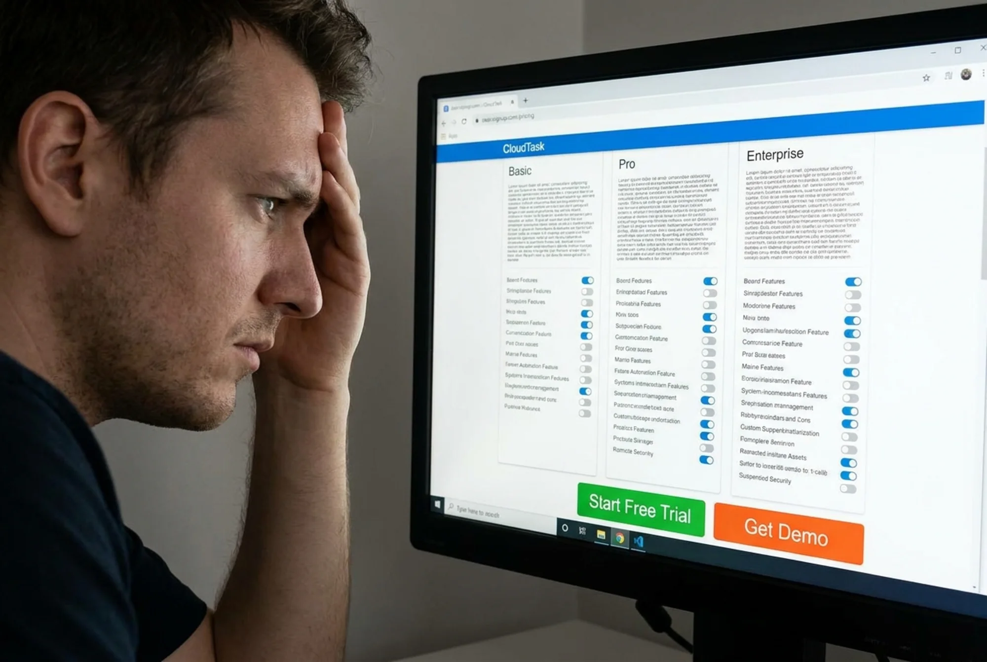
Run through your own signup flow. Time yourself. Count the fields. Note every moment where you have to think. Then ask: does my free trial really need all of this?
Friction checklist for SaaS signup forms:
- [ ] Can someone sign up with just an email address (or email + password)?
- [ ] Is the signup form visible on the landing page, or buried on a separate page?
- [ ] Does the form ask for a credit card before the user gets any value?
- [ ] Are there fewer than 5 form fields?
- [ ] Does the CTA button text describe the outcome ("Create your free account") rather than a generic action ("Submit")?
- [ ] Does the page work correctly on mobile? Can you tap the fields and button easily?
- [ ] If you use a chat widget, does it cover the signup form on mobile?
That last one is more common than you'd think. A chat widget that overlaps your CTA can quietly kill signups for weeks before anyone notices.
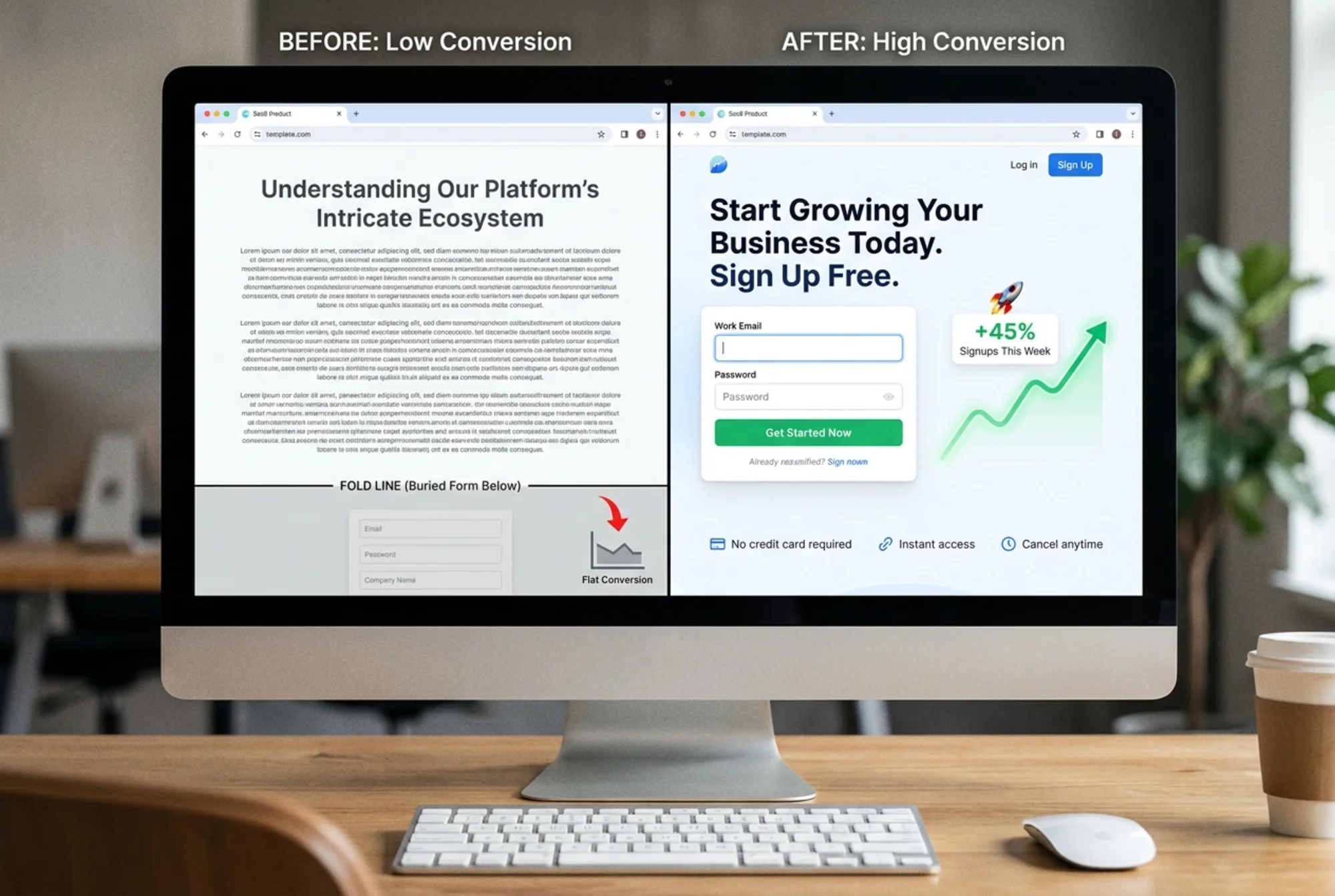
Scenario: The 7-Field Signup Form
Say you run a project management tool for freelancers. Your signup form asks for: first name, last name, email, password, company name, team size, and how they heard about you.
A visitor lands from a Google search. They're curious. They scroll to the signup form, see seven fields, and think "I'll come back later." They never come back.
Now imagine you cut it to two fields: email and password. Everything else gets collected during onboarding, after the user has seen the product. That single change could double your signup rate. The "company name" and "how did you hear about us" fields serve your analytics, not the visitor. Collect that data after they're already in.
Step 3: Audit Page Speed
A slow landing page is a leaky bucket. You can write the perfect headline and design the cleanest signup form, but if the page takes 4 seconds to load, many visitors will never see either one.
Google's Core Web Vitals give you three metrics to focus on:
- LCP (Largest Contentful Paint): How fast the main content appears. Aim for under 2.5 seconds. If your hero image or headline takes longer than that, you're losing people. See Google's guide on optimizing LCP for specific fixes.
- CLS (Cumulative Layout Shift): Does the page jump around as it loads? If your signup button moves because an image loads late or a banner pushes content down, that's a CLS problem. Fixing layout shift is usually straightforward.
- INP (Interaction to Next Paint): When someone clicks your signup button, does it respond instantly? Sluggish responses make people click again or give up.
You can check your page speed right now with our speed snapshot tool. It will show you exactly where the bottlenecks are.
Common speed killers on SaaS landing pages:
- Uncompressed hero images (a 3MB PNG that could be a 200KB WebP)
- Third-party scripts loading before your content (analytics, chat widgets, ad pixels)
- Render-blocking CSS that delays everything above the fold
- Heavy animation libraries for effects that don't improve conversions
Step 4: Audit Mobile Experience
Google uses mobile-first indexing, which means the mobile version of your page is what gets ranked. But beyond SEO, mobile is where most of your visitors are.

Pull out your phone right now and load your landing page. Check these things:
- [ ] Is the headline fully visible without horizontal scrolling?
- [ ] Can you read the subheadline without zooming in?
- [ ] Is the signup button visible within one scroll?
- [ ] Can you tap the signup button easily with your thumb?
- [ ] Do form fields work properly? Does the correct keyboard appear for email fields?
- [ ] Does anything overlap or cover the signup form (cookie banners, chat bubbles, sticky headers)?
- [ ] Does the page load in under 3 seconds on a mobile connection?
A surprising number of SaaS pages look great on a desktop monitor and are nearly unusable on a phone. If you only test on a laptop, you're missing what most of your visitors actually see.
Step 5: Audit Your Meta Tags and Search Appearance
If people find your landing page through search, the first thing they see isn't your page. It's your search result. A weak title tag or vague meta description means fewer clicks, which means fewer chances to convert.
Google's guidelines on title links are worth reading. The short version: your title tag should clearly describe what the page offers and include words your audience actually searches for.
Quick checks:
- [ ] Does your title tag describe the product and its main benefit in under 60 characters?
- [ ] Does your meta description give a specific reason to click, in 150 to 160 characters?
- [ ] Is your meta description unique (not duplicated from another page on your site)?
You can test both with our meta title checker. For tips on writing descriptions that earn more clicks, read our guide on meta descriptions that boost CTR.
Step 6: Audit Trust Signals
SaaS visitors are cautious. They're weighing whether to hand over their email address, and eventually their money. Your page needs to answer the unspoken question: "Can I trust this?"
Look for these trust signals on your page:
- Social proof: Customer logos, testimonial quotes with real names, or a count of active users. "Trusted by 2,000 teams" is specific. A wall of anonymous 5-star reviews is not convincing.
- Security indicators: If you handle sensitive data, say so. "SOC 2 compliant" or "Your data is encrypted" matters for B2B buyers.
- Risk reduction: "Free 14-day trial, no credit card required" removes the biggest objection. Put it next to your CTA button, not buried in the FAQ.
- Real contact info: A link to a real contact page with an email address or support channel. If visitors can't figure out how to reach a human, they'll hesitate to sign up.
Putting It All Together
Here's the full audit condensed into a checklist you can print or copy:
Above the fold: Headline says what the product does. CTA is visible. One clear next step.
Friction: Signup has 3 or fewer fields. No credit card required for free tier. CTA text describes the outcome.
Speed: LCP under 2.5s. No layout shifts. Images compressed. No render-blocking resources.
Mobile: Everything works on a phone. Button is tappable. Nothing overlaps the form.
Search appearance: Title tag is specific. Meta description gives a reason to click.
Trust: Social proof is visible. Risk is addressed near the CTA.
Work through these one section at a time. Fix the easiest, highest-impact issues first. A clearer headline and a shorter signup form will usually move the needle more than anything else.
Run a Free Audit on Your Landing Page
You don't have to do all of this manually. FreeSiteAudit scans your landing page and flags speed issues, mobile problems, meta tag gaps, and other conversion blockers in minutes. It's free, and you'll get a report you can act on.
Run your free website audit now →
Sources
- Web Vitals - Google's Core Web Vitals metrics
- Optimize Largest Contentful Paint - LCP optimization guide
- Optimize Cumulative Layout Shift - CLS fix guide
- Title Links in Search - Google's title tag guidelines
- Mobile-First Indexing - Google's mobile indexing docs
Check your website for free
Get an instant score and your top 3 critical issues in under 60 seconds.
Get Your Free Audit →