How to Audit a Landing Page for Conversions and SEO
Learn how to audit a landing page for SEO and conversions in plain English. Fix the biggest issues first with this practical no-jargon guide for owners.
# How to Audit a Landing Page for Conversions and SEO
A landing page has two jobs. It needs to show up in search results, and it needs to turn visitors into customers. When one job fails, the other stops mattering. A page that ranks well but doesn't convert is a tour bus that drops people at a closed shop.
You don't need to be a developer to spot the biggest problems. You just need to know what to look at, and in what order. This guide walks you through a landing page audit you can do yourself, in an afternoon, with free tools.
Start With the Promise
Open your landing page in a private browser window so you see it the way a stranger does. Look at the top section without scrolling. Ask yourself three questions.
- What does this business do?
- Who is it for?
- What am I supposed to do next?
If you can't answer those in five seconds, your headline and subheadline need work. Most landing pages bury the promise under buzzwords. A roofer's page that says "Premium Roofing Solutions" is weaker than one that says "Roof Repairs in Tucson, Done in 48 Hours."
Be specific. Specific beats clever almost every time. If your page sells a service, name the service, the place, and the result. If it sells a product, name the problem it solves and the kind of person it's for.

The Quick Audit Checklist
Before we go deep, here's a checklist you can run on any landing page in about 20 minutes. We'll cover each item in more detail below.
- [ ] Headline answers what the page is, who it's for, and the result
- [ ] One main call to action, repeated where it makes sense
- [ ] Phone number and address visible if you're a local business
- [ ] At least three trust signals (reviews, logos, certifications, photos)
- [ ] Page loads in under 3 seconds on mobile
- [ ] Title tag under 60 characters and includes the main keyword
- [ ] Meta description between 150 and 160 characters
- [ ] One H1, then H2s and H3s in a logical order
- [ ] Two or three internal links to related pages on your site
- [ ] Form has the fewest fields you can get away with
- [ ] Mobile layout doesn't make people pinch or zoom
- [ ] No broken images, no placeholder text, no Lorem Ipsum
- [ ] Privacy policy and terms linked in the footer
If you can check all 13 of these, you're already ahead of most pages on the internet.
SEO Basics on a Landing Page
SEO on a landing page isn't mysterious. Google publishes a starter guide that covers the basics, and most of it is common sense. Here's what to check.
Title Tag
The title tag is what shows up as the clickable line in Google's search results. Keep it under 60 characters so it doesn't get cut off, and put the most important words near the front. "Tucson Roof Repair | Same-Day Service | Smith Roofing" is better than "Welcome to Smith Roofing's Website." Paste your title into our meta title checker to see how it would look in search.
Meta Description
The meta description is the gray text under the title in search results. Google doesn't use it for ranking, but it heavily affects whether people click. Aim for 150 to 160 characters. Write it like a teaser that promises something specific. We have a longer guide on meta descriptions that boost click-through rate, and our meta description checker will flag if yours is too short or too long.
Heading Structure
Every page should have exactly one H1, and that H1 should match what the page is about. Below it, use H2s for major sections and H3s for sub-points. Don't skip levels. Don't use headings as styling tricks just because you want bigger text. Search engines and screen readers both rely on this structure to understand your page.
Internal Links
Internal links pass authority around your site and help visitors find related content. On a landing page, two or three is plenty. Link to your about page, a related service, or a helpful guide. If you run a local business, our local business website audit guide walks through what to link and where.
Schema
Schema is structured data that tells search engines what your page is about. For most service businesses, LocalBusiness schema is the main one to check. You don't have to write the code yourself, and most platforms have plugins. We covered the why and how in our schema markup audit guide.
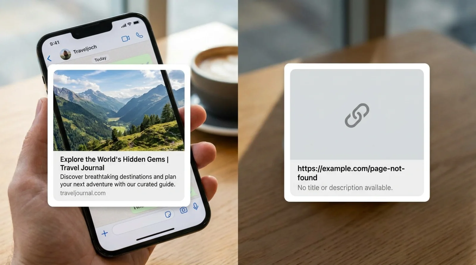
Open Graph Tags
When someone shares your page on Facebook, LinkedIn, or in a text message, Open Graph tags decide what shows up. A page with no OG tags looks like spam. A page with the right tags shows a clean preview with an image, title, and description. Run your URL through our Open Graph checker to see what your previews actually look like, or read our primer on OG and Twitter cards.
Page Speed and Core Web Vitals
Speed matters for two reasons. Visitors leave slow pages, and Google uses speed signals as a ranking factor. The metrics Google cares about most are called Core Web Vitals. There are three.
Largest Contentful Paint (LCP) measures how fast the biggest visible thing on your page loads. Aim for under 2.5 seconds. Big hero images that aren't optimized are the most common cause of bad LCP scores.
Interaction to Next Paint (INP) measures how quickly the page responds when someone clicks or taps. Aim for under 200 milliseconds. Heavy JavaScript is usually the culprit when this metric tanks.
Cumulative Layout Shift (CLS) measures how much stuff jumps around as the page loads. Aim for under 0.1. The fix is usually setting width and height on images and reserving space for ads or embeds.
Run your page through our speed snapshot tool to see your real numbers.
A few things that almost always speed up a slow landing page:
- Compress images and serve them in modern formats like WebP
- Remove plugins or scripts you're not using
- Defer or lazy-load anything below the fold
Mobile Experience
Most of your traffic is on a phone. If your page is hard to use on a small screen, it doesn't matter how good it looks on a 27-inch monitor.
Open your page on your actual phone, not just a browser resizer. Then check:
- Text is readable without pinching
- Buttons are big enough to tap with a thumb
- Forms don't require landscape mode
- The phone number is a tap-to-call link
- Pop-ups don't cover the whole screen
- The hamburger menu actually works
Our mobile-friendly test catches the obvious issues. For deeper advice on mobile conversion, our guide on converting more mobile visitors with better CTAs is worth a read.
A common mistake is treating mobile as an afterthought. Design for mobile first, then make sure it scales up. If something has to go on mobile, it probably wasn't earning its space anyway.
Trust Signals
People don't buy from strangers. Trust signals are the visual proof that your business is real, capable, and safe to deal with. The Nielsen Norman Group has been studying this since the 1990s, and the basic finding hasn't changed. Visitors are looking for reasons to trust you, and they make up their minds fast.
The trust signals that move the needle most:
- Real photos of your team, your work, your office. Stock photos hurt more than they help.
- Customer reviews with full names and ideally photos. Five real reviews beat 50 fake-looking ones.
- Logos of clients, certifications, or media mentions. Just make sure you have permission to use them.
- Specific numbers like "Serving Phoenix since 2014" or "Over 1,200 audits completed." Vague claims feel like marketing. Specific ones feel true.
- A real address and phone number, ideally above the fold for local businesses.
- HTTPS, a privacy policy, and a terms page. Missing any of these is a red flag.
If your page is a contact or lead-capture page, the trust signals do even more work. Our guide on contact pages that turn visitors into leads goes deeper on this.
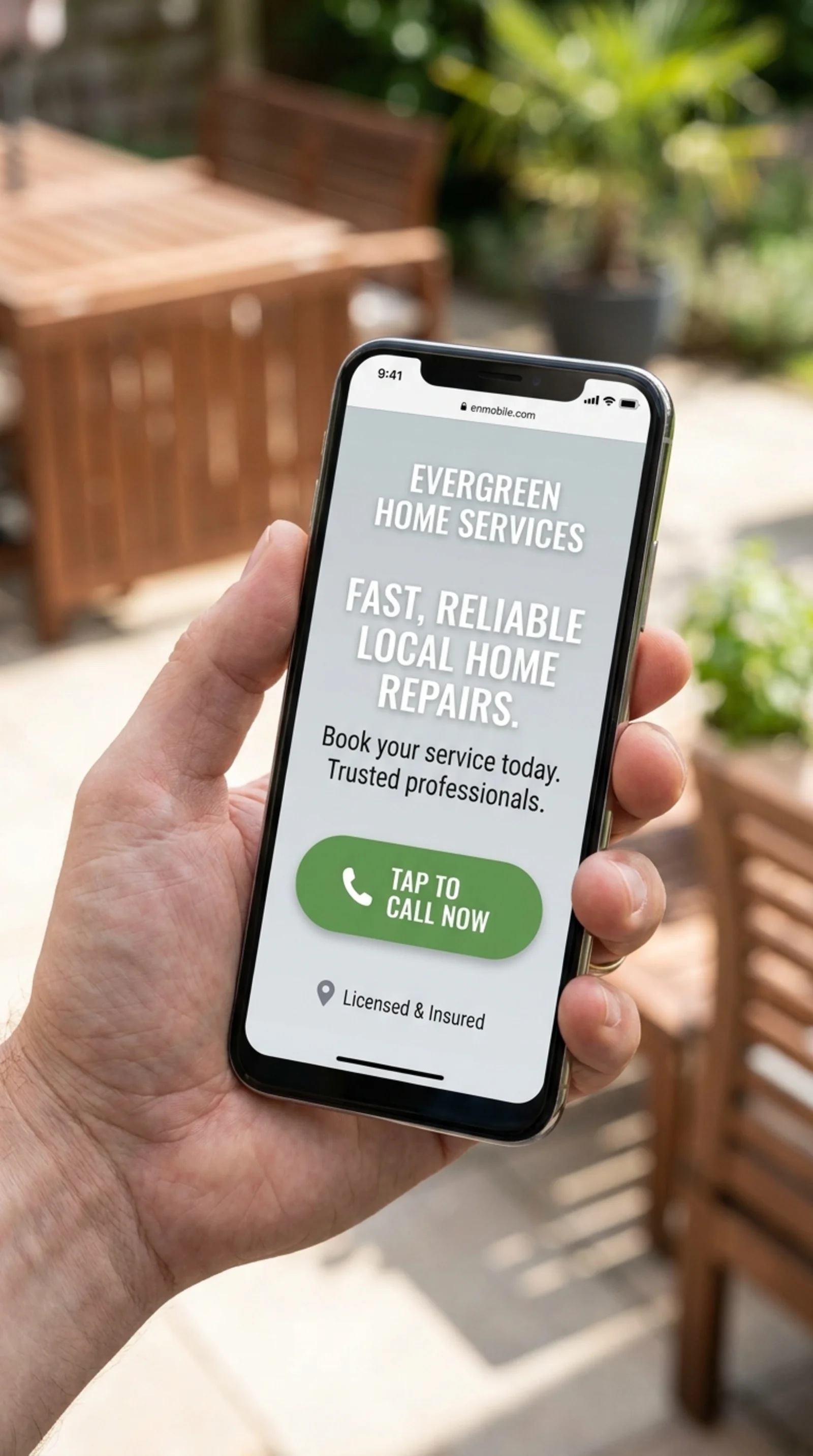
Calls to Action and Form Friction
A call to action, or CTA, is the thing you want the visitor to do. Buy now, book a call, get a quote, download the guide. The biggest mistake on most landing pages is having too many CTAs that compete with each other. Pick one primary action. Repeat it. Make it impossible to miss.
Some CTA rules of thumb:
- The button text should describe what happens next. "Get My Free Audit" beats "Submit."
- Color matters less than contrast. The button should pop against its background.
- The CTA should appear at least twice on a long page, once near the top and once near the bottom.
- If you're asking for a phone call, make the number a tap-to-call link.
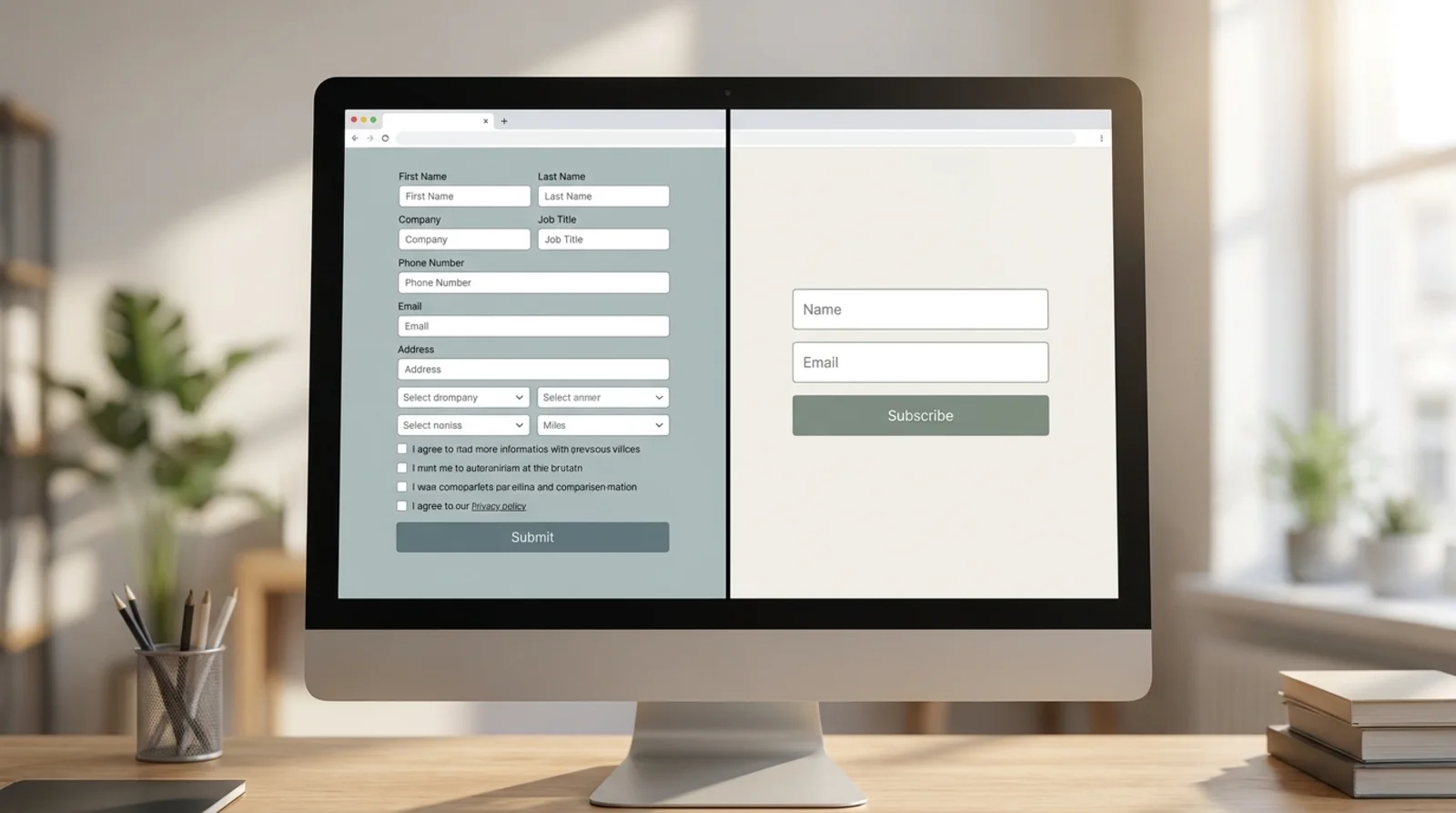
Now look at your form. Every field is a tax. The more fields, the fewer people will finish. For each field, ask "do I really need this to do the next step?" If the answer is no or maybe, cut it. Name and email is usually enough. Phone number is fine if you actually call leads. Anything beyond that needs a good reason.
For longer forms, break them into steps. A two-step form often converts better because the first step feels easy and creates commitment.
Putting It All Together
Don't try to fix everything at once. Run the checklist, write down the issues, and tackle them in this order:
- Clarity first. If the headline, promise, and CTA aren't clear, nothing else matters.
- Speed and mobile next. These are the foundations. A slow or broken-on-mobile page wastes every other improvement.
- Trust signals third. Add reviews, photos, and proof. This is usually the cheapest big win.
- SEO basics fourth. Title tag, meta description, heading structure, schema. Important, but rarely the bottleneck on conversion rate.
- Polish last. Animations, fancy fonts, A/B tests. Save these for when the basics are solid.
A landing page audit isn't a one-time thing. Pages drift. Plugins break. Stock photos sneak back in. Recheck the page every quarter, or any time conversion rate dips.
If you want a structured way to do this, we built FreeSiteAudit to run most of these checks automatically and tell you what to fix first. But honestly, the checklist above will get you 80 percent of the way there on its own.
Sources
Check your website for free
Get an instant score and your top 3 critical issues in under 60 seconds.
Get Your Free Audit →