Why Mobile Visitors Leave Your Site Without Calling (and How to Fix Your CTAs)
Most mobile visitors leave because your CTA is too small, hidden, or confusing. Here are simple, practical fixes that turn more taps into real leads fast.
More than half the people visiting your website right now are on their phones. They found you while sitting in a car, standing in line, or scrolling on the couch. They have a problem. They need a plumber, a dentist, a lawyer, or someone to fix their AC.
And then they leave. No call. No form. No booking. Gone.
Most of the time, it's not because your service is wrong or your prices are too high. It's because your call-to-action was too hard to find, too small to tap, or too confusing to follow.
Let's fix that.
What a CTA Actually Does on Mobile
A CTA is just the thing you want someone to do next. Call you. Fill out a form. Book an appointment. Get a quote.
On a desktop, people will hunt around your page. They'll scroll, read, and click through menus. On a phone, they won't. Mobile visitors are impatient, often distracted, and using one thumb. If the next step isn't obvious within a few seconds, they hit the back button and pick the next result on Google.
Google uses mobile-first indexing, which means the mobile version of your site is the one that matters for search rankings. That includes usability. If your mobile experience frustrates people, it can hurt your rankings too.
This isn't just about design. It's about whether your phone actually rings.
The Biggest Mobile CTA Mistakes
Your Button Is Too Small
Chrome Lighthouse flags tap targets smaller than 48 pixels by 48 pixels. That's roughly the size of your fingertip. If your "Call Now" button is a tiny link buried in a paragraph, people will miss it or tap the wrong thing.
This is especially common on sites built years ago or ones using templates designed for desktop first. A mobile website SEO audit will catch these issues fast.
Your CTA Is Below the Fold
If someone has to scroll past three paragraphs of "Welcome to ABC Plumbing, your trusted local plumber since 1987" before they see a phone number, you've already lost half your visitors.
Your primary CTA needs to be visible without scrolling. Period.
Your Form Asks for Too Much
A contact form on mobile should ask for the bare minimum. Name, phone number, and maybe a short description of the problem. That's it.
Every extra field you add drops your completion rate. Nobody wants to type their full address, pick from a dropdown, and write a detailed message while standing in their kitchen watching water drip from the ceiling.
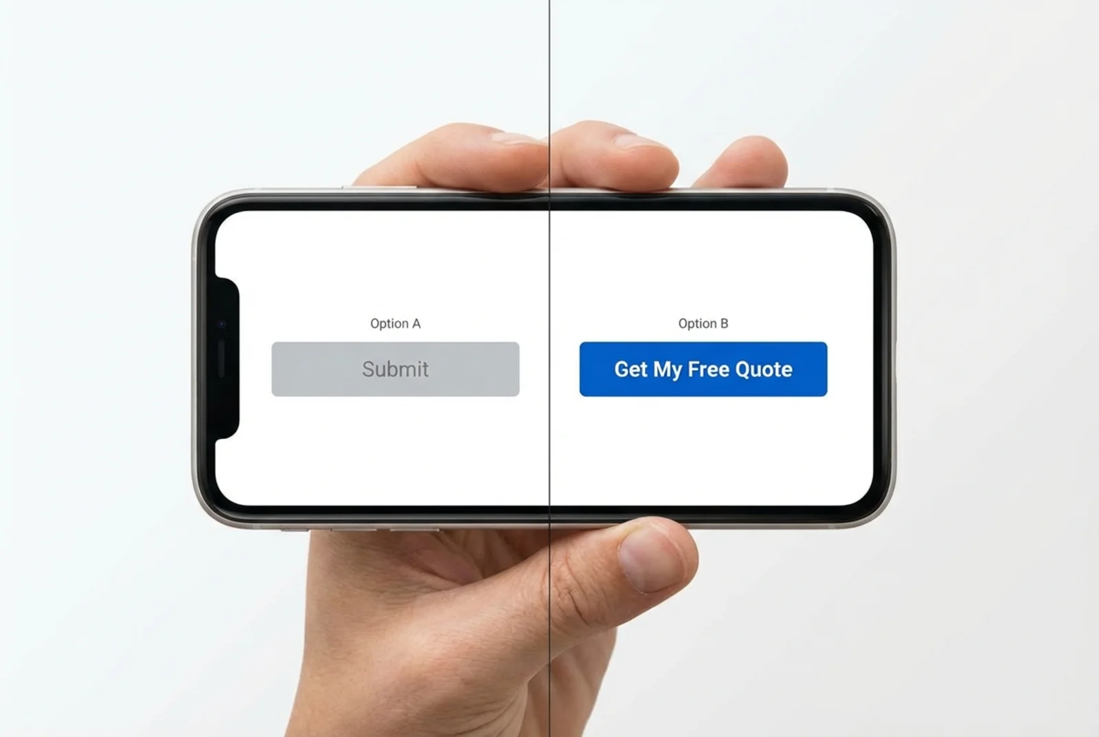
Your CTA Words Are Vague
"Submit" tells people nothing. "Learn More" is fine for a blog link but terrible for your main conversion action. "Click Here" is meaningless on any device.
Compare these:
- Weak: "Submit"
- Strong: "Get My Free Quote"
- Weak: "Contact Us"
- Strong: "Call Now for Same-Day Service"
The best CTAs tell people exactly what happens when they tap.
Practical Fixes That Work
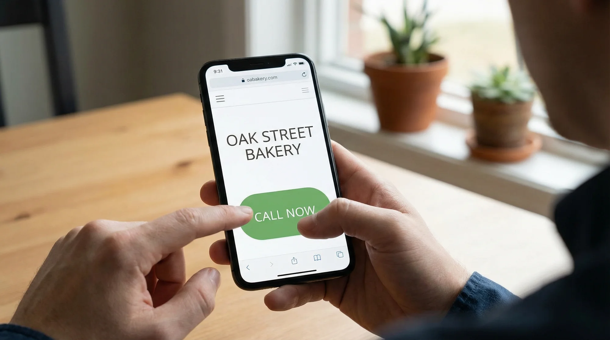
Add a Sticky Call Button
For any local service business, a sticky phone button that stays at the bottom of the screen while people scroll is one of the highest-impact changes you can make. A roofer, HVAC company, or plumber lives and dies by phone calls. Make that button impossible to miss.
If you want to understand just how much a click-to-call button matters for lead generation, it's often the single biggest quick win on a mobile site.
Keep the button:
- At least 48px tall (ideally bigger)
- High contrast color against your background
- Fixed to the bottom of the viewport
- Labeled clearly: "Call Us" or "Tap to Call"
Put Your CTA Above the Fold
Your main action should be visible the moment the page loads. For a dentist, that might be "Book Your Appointment." For a lawyer, "Free Case Review." For an HVAC company, "Schedule a Repair."
Don't make people work to figure out what to do next.
Shorten Your Forms
If your contact page has more than three or four fields on mobile, cut it down. You can always collect more details on the follow-up call.
A good mobile form:
- Name (one field, not first and last separately)
- Phone number
- Brief message (optional)
- One clear submit button with specific text
Add Trust Signals Next to Your CTA
People hesitate before tapping. A small line of text near your button can push them over the edge:
- "Licensed & Insured"
- "4.8 stars on Google (200+ reviews)"
- "Free estimates, no obligation"
- "Response within 30 minutes"
This works for every type of local business. A dentist might say "Accepting new patients" or "Most insurance accepted." A lawyer might say "No fee unless we win."
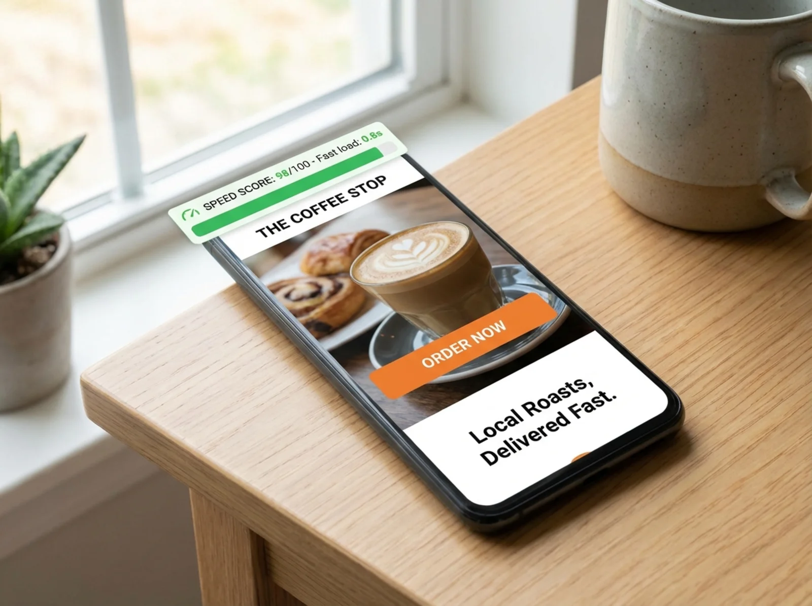
Fix Your Mobile Page Speed
None of this matters if your page takes six seconds to load. Slow pages lose visitors before they ever see your CTA.
Make sure your site has a proper viewport meta tag (width=device-width, initial-scale=1) and that images are compressed. A heavy page on a phone over a cellular connection is a conversion killer.
Running a scan on FreeSiteAudit will flag speed issues, missing viewport tags, and other technical problems that hurt your mobile experience.
Before and After: A Realistic Example
Note: This is an illustrative example based on common patterns, not a specific case study.
A local HVAC company in Phoenix was getting about 1,200 mobile visitors per month to their homepage. Their call-to-action was a small "Contact Us" link in the navigation menu. Their contact form had seven fields. They had no sticky call button.
Before the changes:
- 1,200 mobile visitors/month
- 14 form submissions
- 8 phone calls from the website
- Conversion rate: about 1.8%
After adding a sticky call button, shortening the form to three fields, and changing "Contact Us" to "Get a Free AC Quote":
- 1,200 mobile visitors/month (same traffic)
- 31 form submissions
- 22 phone calls from the website
- Conversion rate: about 4.4%
Same traffic. Same services. Same prices. Just a better mobile experience and clearer CTAs.
Quick Mobile CTA Checklist
Use this to review your own site on your phone right now:
- [ ] Primary CTA is visible without scrolling
- [ ] Buttons are at least 48px by 48px (easy to tap with a thumb)
- [ ] Sticky call button is present on all pages
- [ ] Phone number is a tap-to-call link, not plain text
- [ ] CTA text is specific ("Get a Free Quote" not "Submit")
- [ ] Contact form has four fields or fewer
- [ ] Trust signals (reviews, licenses, guarantees) appear near the CTA
- [ ] Page loads in under three seconds on mobile
- [ ] Viewport meta tag is set correctly
- [ ] No pop-ups blocking the CTA on mobile
If you manage multiple locations, check each location page separately. They often have different templates or different issues.
Where to Start
You don't need to redesign your whole website. Start with the three changes that make the biggest difference:
- Add a sticky call button
- Make your CTA text specific and action-oriented
- Shorten your mobile form
Then run a free audit on FreeSiteAudit to catch the technical issues you can't see just by looking at your site. It checks tap target sizes, viewport settings, page speed, and dozens of other mobile factors that affect whether visitors stay or bounce.
Good meta descriptions get people to your site. Good CTAs turn those visitors into customers. Both matter, but the CTA is where the money is.
Your website doesn't need more traffic. It needs to do more with the traffic it already has. Fix your mobile CTAs, and you'll see the difference in your phone ringing more often.
Sources
- Google Search Central: Mobile-First Indexing: Google's documentation on how mobile content is used for indexing and ranking.
- Chrome Lighthouse: Tap Targets: Lighthouse audit documentation on minimum tap target sizing (48x48px).
- Google Search Central: Viewport Meta Tag: Why pages need a proper viewport configuration for mobile usability.
- Google Search Central: Creating Helpful Content: Google's guidance on making content that serves real user needs.
- web.dev: Fast Load Times: Google's resource on page speed optimization and its impact on user experience.
Related Industries
Check your website for free
Get an instant score and your top 3 critical issues in under 60 seconds.
Get Your Free Audit →