Website Audit for Coaches and Consultants: What to Fix First
A practical website audit guide for coaches and consultants. Find the quiet leaks that cost you discovery calls, applications, and qualified leads each week.
# Website Audit for Coaches and Consultants: What to Fix First
Your website has one job. Turn the right stranger into a discovery call, an application, or a qualified lead. That's it.
If you're a coach or consultant, your site does a lot of heavy lifting. People land on it after hearing you on a podcast, seeing your LinkedIn post, or getting a referral. They have about 8 seconds to figure out who you help, what you do, and whether you're worth a 30-minute call. Most coaching and consulting sites fail that test in the first paragraph.
This guide walks you through a practical audit you can run on your own site this week. No jargon. No fluff. Just the things that quietly cost you bookings.

Start with the homepage hero
Open your homepage on a laptop. Now squint. What's the first sentence above the fold?
If it says something like "Empowering leaders to unlock their fullest potential," your homepage is broken. That sentence describes a feeling, not a service. A visitor can't tell who you help, what they get, or what to do next.
A strong coach or consultant homepage hero answers three questions in five seconds:
- Who do you help? (e.g. "Series A founders," "operations leaders at SaaS companies," "second-career attorneys")
- What outcome do you deliver? (e.g. "land your next role in 90 days," "scale revenue without burning out your team")
- What's the next step? (a clear button, not a paragraph)
Vague positioning is the single biggest leak on coaching and consulting sites. If you're trying to be useful to everyone, you'll feel relevant to no one. Pick a niche, name it on the page, and let the wrong people self-select out. The right people will lean in.
Make the booking link obvious
Count the clicks from your homepage to your scheduling page. If it's more than one, you've got a problem.
Common booking-link mistakes:
- "Contact" buried in the footer with a generic form
- "Book a Call" in the nav that scrolls to a section, not a calendar
- Calendly link gated behind a long sales page
- Discovery call CTA only at the very bottom of the page
- Multiple competing CTAs all fighting for attention
Pick one primary action per page. On the homepage, that's almost always the discovery call. Newsletter signups and lead magnets are fine, but they should be secondary. Make the discovery call button visible in the nav, in the hero, and at least once more before the fold ends. For more on this, see our guide to converting more mobile visitors with better CTAs.
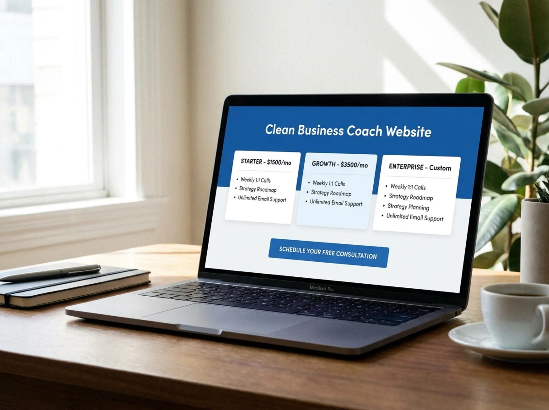
Audit your service pages for buyer intent
A lot of coaches list their services like menu items. "1:1 Coaching." "Group Program." "Intensive."
That's not how buyers think. They land on a service page wanting to know:
- Is this for me? Who specifically does it work for?
- What will I actually get? Sessions, deliverables, access, materials.
- How does it work? Length, format, frequency.
- What's the outcome? Real results, not promises.
- How much is it, or how do I find out?
- What do I do next?
If your service page reads like a brochure for an intangible feeling, rewrite it. Use plain language. Show the real structure of the engagement. Address the question your prospect is silently asking: "Will this actually work for someone like me?"
Consultants especially fall into the trap of writing service pages full of frameworks and methodology names that mean nothing to the buyer. Your prospect doesn't care about your proprietary 7-pillar system. They care whether you've solved their exact problem before.
Strengthen your trust signals
Coaching and consulting are trust businesses. People are buying access to you, your judgment, and your time. The trust signals on your site need to do real work.
Audit each of these:
Testimonials. Are they specific, named, with a photo and a role? Or are they vague one-liners attributed to "Sarah K., Entrepreneur"? Specific testimonials with real names, faces, and outcomes beat generic praise. "I went from 12k MRR to 47k MRR in six months working with Jane" is more persuasive than "Jane changed my life."
Case studies. Even one detailed case study can transform a site. A short writeup of who the client was, what problem they had, what you did, and what changed is enough. If you can't share names because of NDAs, anonymize but keep the specifics.
Logos and credentials. If you've worked with recognizable companies or been featured in known publications, put those logos on the homepage. List the relevant certifications, books, or speaking gigs. Don't list everything.
Social proof numbers. "Worked with 200+ founders." "Helped clients raise $50M+." Real numbers build trust faster than adjectives.
If your site has zero testimonials, fix that first. Email five past clients today and ask for two sentences.
Don't forget the about page
The about page is one of the most-visited pages on coaching and consulting sites. People want to know who they're hiring. They check your bio before booking the call.
A weak about page is short, lists credentials, and has a stiff headshot from 2017. A strong about page tells a real story, shows the human, and connects your background to the outcome you deliver.
Common about-page mistakes:
- Written in the third person when it's clearly just you
- Skips the story and lists certifications
- No photo, or a corporate stock-style headshot
- No mention of who you serve or why
- No call to action at the end
For a deeper breakdown, see our post on about page mistakes that lower trust. Author bylines and author pages also matter for visitor trust and how AI search systems evaluate your site, which we cover in why author pages and bylines matter for SEO and AI trust.
Fix the contact page
If your contact page is just a form with three fields and a "We'll get back to you" message, you're losing leads.
A good contact page for a coach or consultant should:
- Repeat the offer (book a call, apply for a program, request a proposal)
- Give a direct way to reach you (email or scheduling link, not just a form)
- Set expectations on response time
- Show one or two trust signals (a quote, a logo, a result)
A lot of consulting prospects bounce from contact pages because they look like customer-service forms instead of an invitation to talk. More on this in our piece on contact pages that turn visitors into leads.
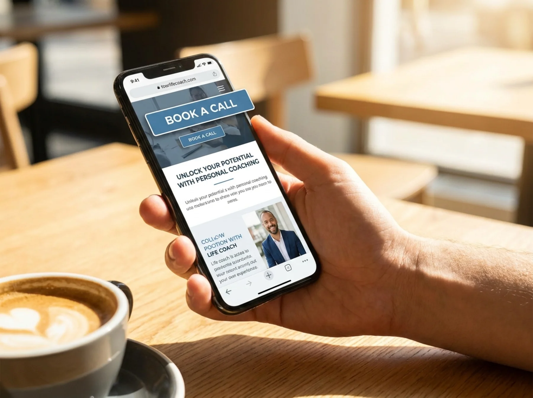
Test the mobile experience
More than half your traffic is probably on a phone. If your site looks great on desktop and falls apart on mobile, you're losing the call before it starts.
Open your site on your phone right now and try to:
- Read the homepage hero without zooming
- Tap the "Book a Call" button without missing
- Fill out the contact form without rage
- Get to the scheduling page in one tap from any page
Common mobile failures:
- Hero text shrinks to 10px or overflows
- CTA buttons stacked too close together
- Calendly embed is broken or wildly oversized
- Pop-ups cover the whole screen with no obvious close button
- Video backgrounds tank load times on cellular
Run your site through our mobile-friendly test and fix what it flags. Google has indexed the mobile version of your site as the primary version for years, so a bad mobile experience hurts both visitors and search visibility.
Speed matters more than you think
Coaching and consulting sites are notorious for being slow. The usual suspects:
- Heavy page builders loading 50 plugins
- Autoplay video backgrounds in the hero
- Big unoptimized hero photos
- Embedded YouTube videos on every page
- Calendly, Intercom, Hotjar, and three other scripts firing on load
- Custom fonts loading from four different sources
If your homepage takes 6 seconds to load on a phone, a meaningful chunk of your prospects are gone before they see your offer.
Run our speed snapshot on your homepage and main service page. If you're confused by the numbers, our plain-English guide to website speed walks you through them.
Quick wins:
- Compress your hero image (use modern formats like WebP)
- Replace autoplay video with a still image
- Remove plugins you don't use
- Lazy-load anything below the fold
- Defer non-critical scripts
Fix titles, meta descriptions, and basic SEO
Your page title and meta description are the first impression in Google search results. If your homepage title is just "Home | Jane Doe Coaching," it's doing nothing.
Strong page titles for coaches and consultants include who you help, what outcome you deliver, and your name or brand. "Executive Coaching for Tech Founders | Jane Doe" beats "Home | Jane Doe Coaching" every time.
Run your site through our meta title checker, meta description checker, and sitemap checker.
Your meta description should read like a real human wrote it. Tell people what they'll find on the page and give them a reason to click. For more, read our notes on meta descriptions that boost CTR.
Make the next step impossible to miss
Every page on your site should answer one question: "What do you want me to do next?"
Walk through your site and check each page for a clear, primary CTA. Not three competing buttons. Not a paragraph that ends with no call to action. One next step.
For most coaches and consultants, that next step is the discovery call. Make it the same button, on every page, in the same place. Visitors shouldn't have to hunt for it.

Run a free audit and find the rest
You can spot a lot of these problems with a slow read of your own site, but blind spots are real. You wrote the copy. You've seen the layout 500 times. Things that confuse visitors look fine to you.
Run a free audit on your site to get a full report on speed, mobile friendliness, on-page SEO, trust signals, and the things prospects notice that you don't. It takes about 60 seconds and gives you a prioritized list of fixes you can knock out this week.
If you want a comparison point for what a strong local-service audit looks like, see our local business website audit guide.
Your week-one checklist
Pick five of these to fix in the next seven days:
- Rewrite your homepage hero so it names your niche and outcome
- Add a "Book a Call" button to the nav and hero
- Add or update three testimonials with full names and roles
- Write or refresh one detailed case study
- Rewrite your about page to lead with story, not credentials
- Replace your contact form with a direct scheduling link
- Compress your hero image and remove unused plugins
- Update page titles and meta descriptions on your top 5 pages
- Test the full booking flow on your phone
- Pick one primary CTA per page and remove the rest
Small changes compound. The coach who fixes five of these this week will outperform the coach with the prettier site that says nothing.
Sources
Check your website for free
Get an instant score and your top 3 critical issues in under 60 seconds.
Get Your Free Audit →